Your Work Here was a massive open call inviting WeTransfer users to submit their art to be featured on the site. Here the judges introduce the winners and explain why they chose them...
Illustration
Judged by Malika Favre, illustrator
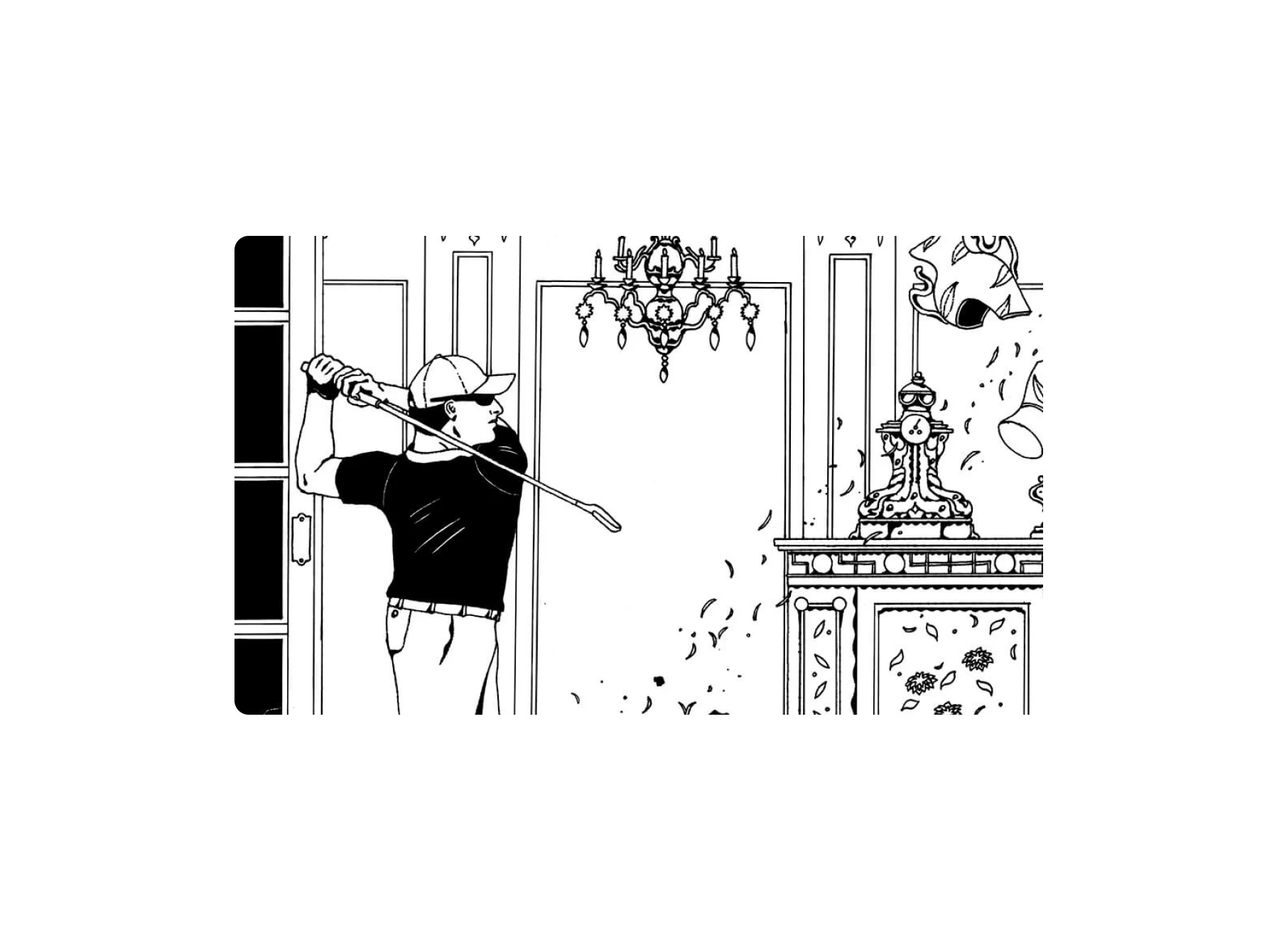
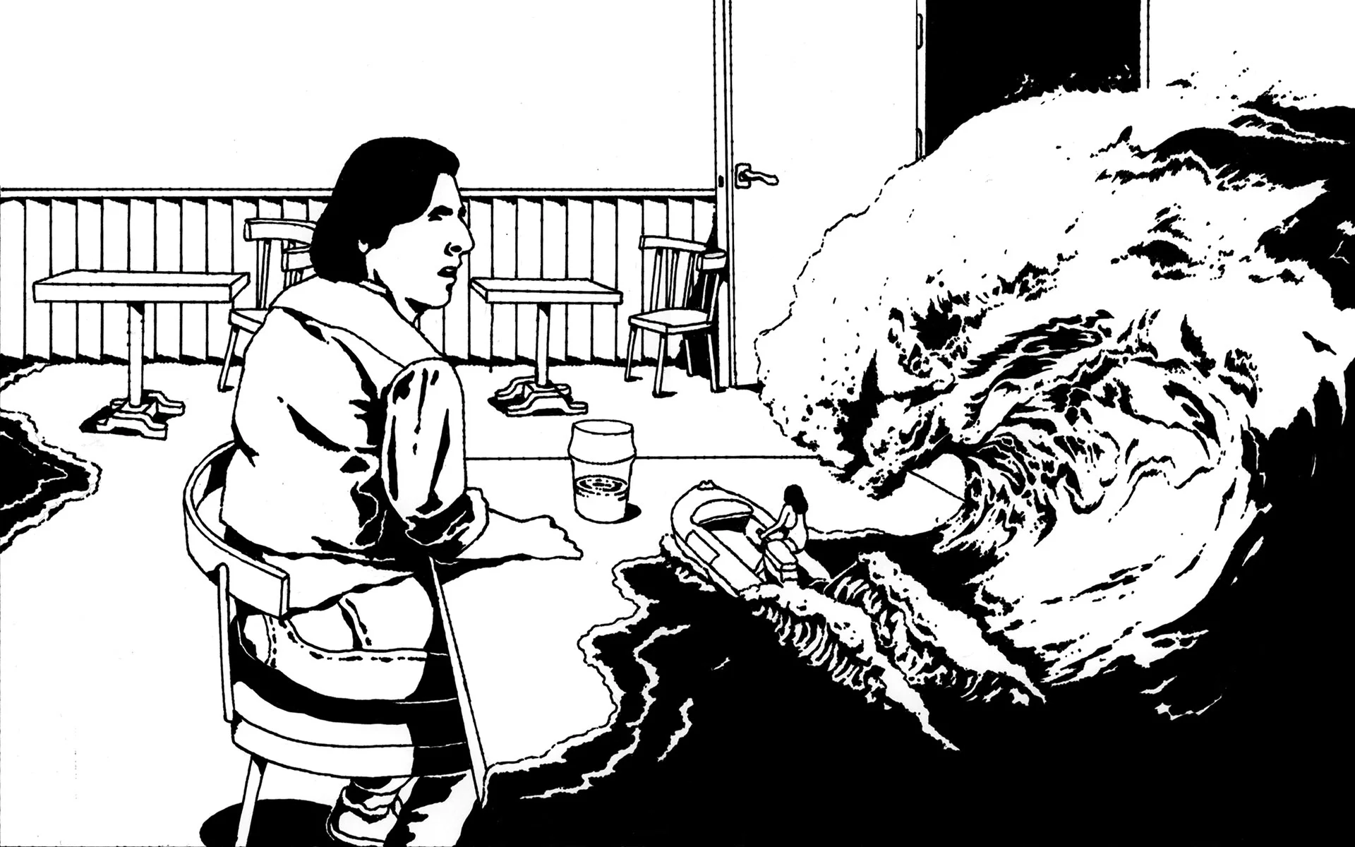
Felix Decombat
Malika: “I thought the narratives in Felix’s illustrations were very powerful, odd and poetical in many ways. Each image can be read on so many different levels and triggers the imagination. Also they look beautiful.”

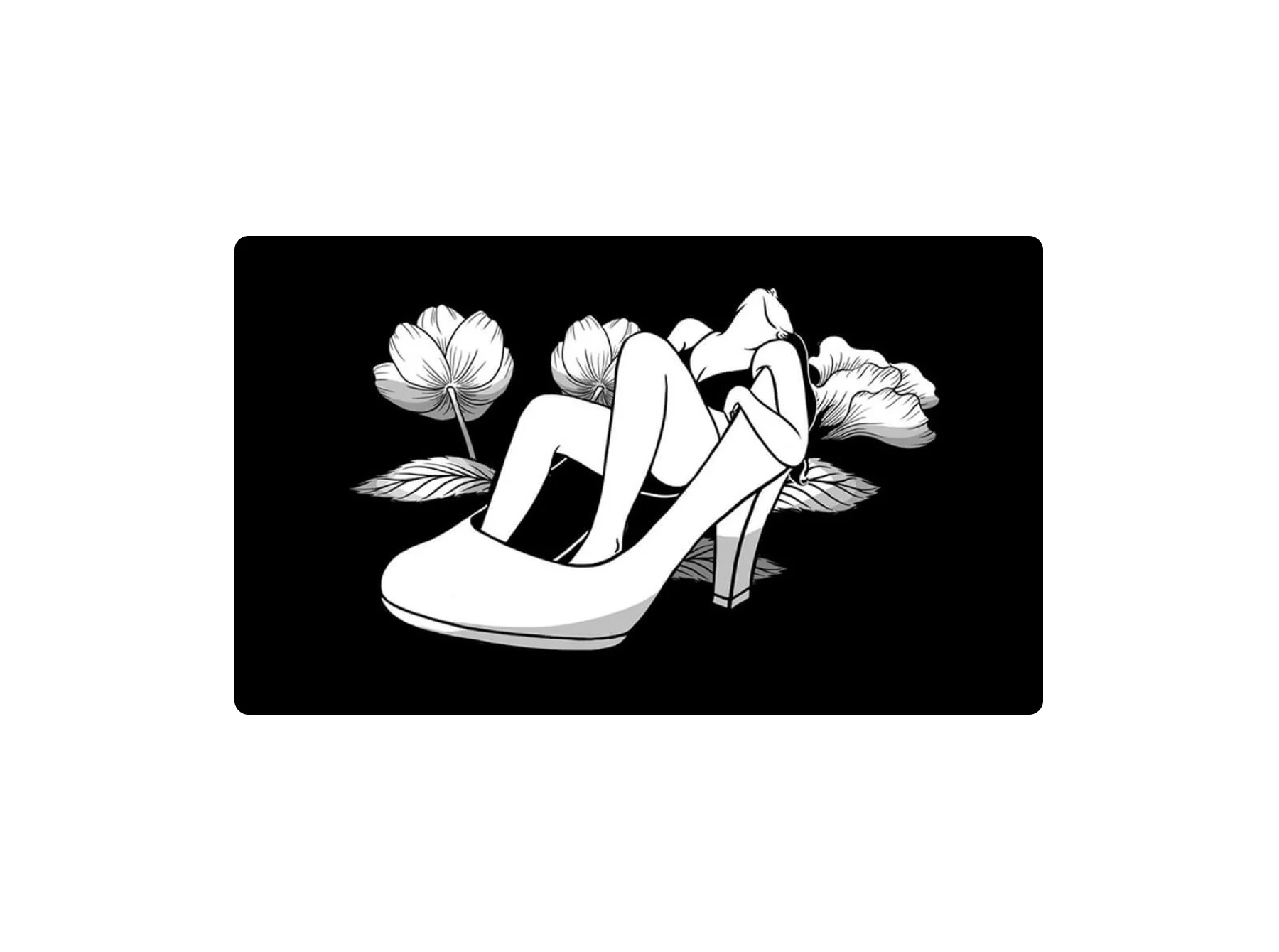
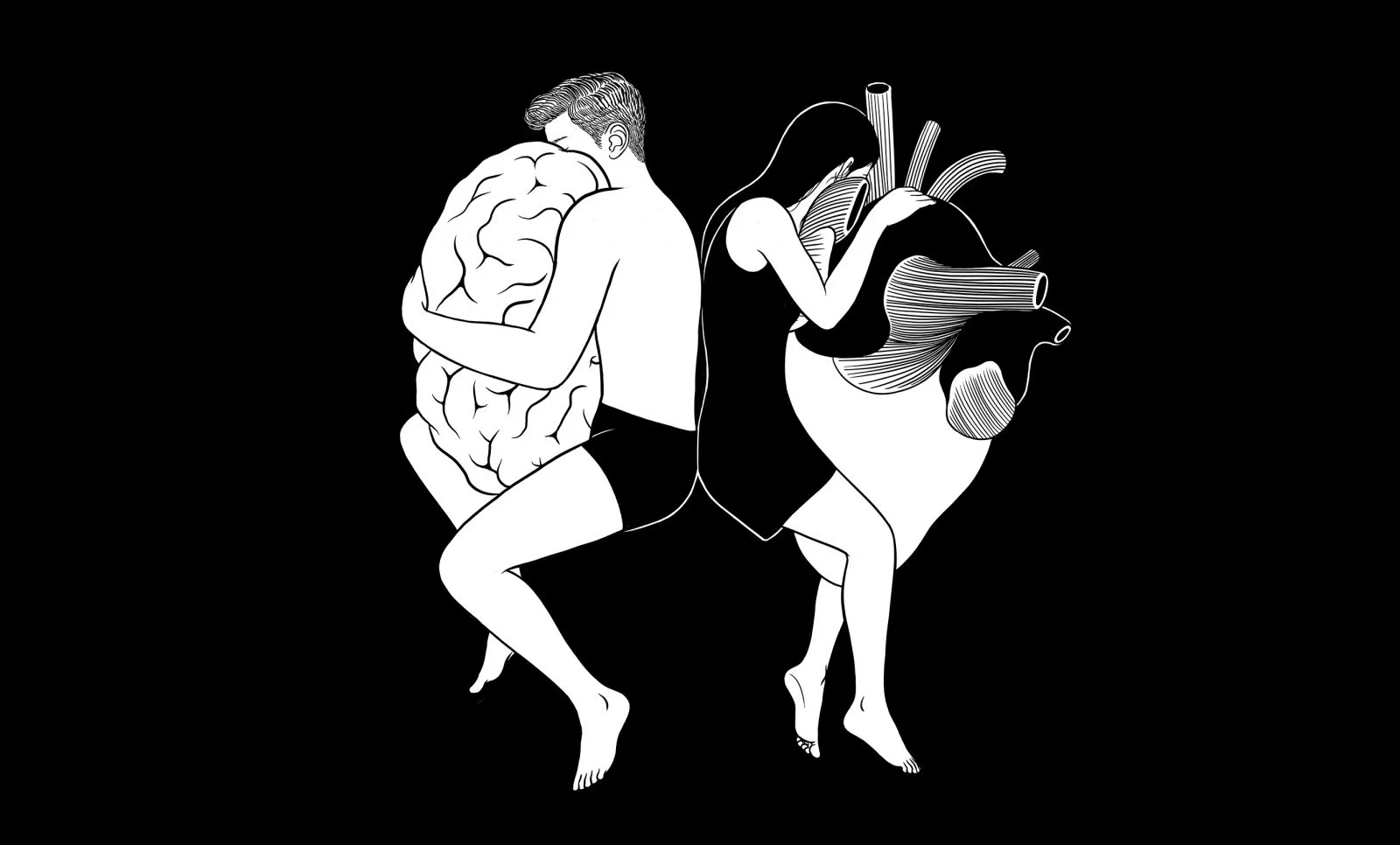
Henn Kim
Malika: “There is something very whimsical and surreal about Henn’s work – a feminine sensibility and softness that really touched me. These are images that resonated a lot with my emotions as well as my brain.”
Art
Judged by Anthony Burrill, graphic artist, print-maker and designer
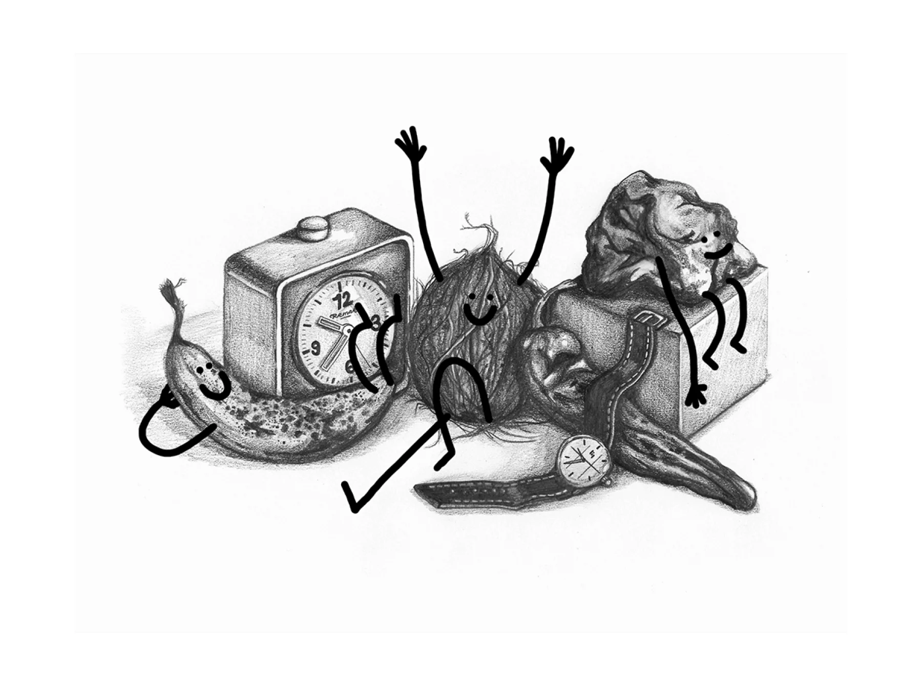
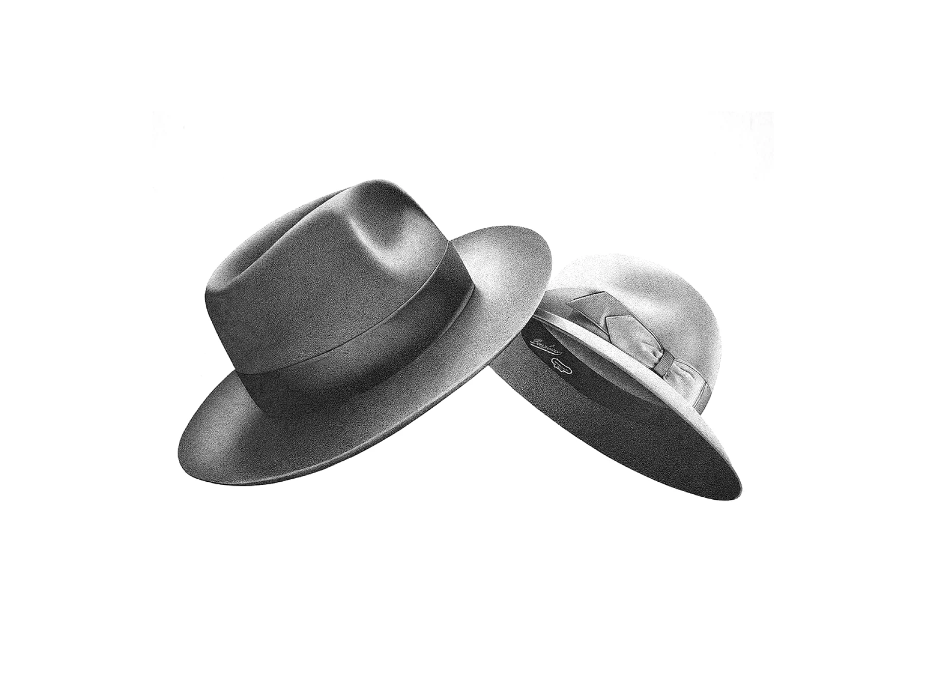
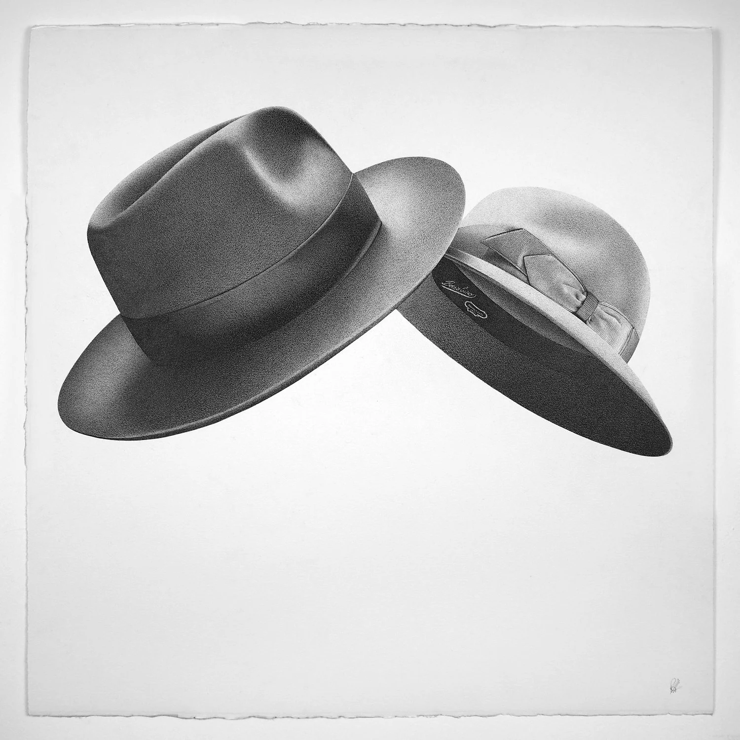
Alessandro Paglia
Anthony: “The level of craft appealed to me in Alessandro’s work, the technical precision of the drawing style is particularly impressive. It was great to see an artist working with simple means to produce work with instant appeal, not only technically but artistically. Alessandro’s work has a strange surreal quality, particularly the drawing of the two hats, they feel like they’ve been trapped in motion, suspended in time.”
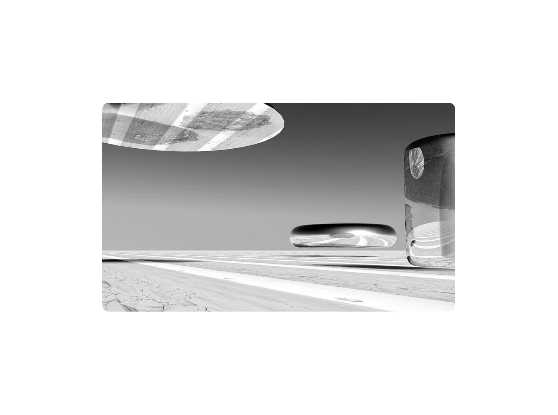
Elisa Gold
Anthony: “The work by Elisa has a wonderful stillness – I could look at these pieces for a long time. Even though they are extremely minimal in their design, they have enough visual information to be appealing and intriguing. I love work that plays with geometry and illusion, it reminds me of my passion for surrealism. I’d like to climb inside these pieces and explore the strange landscape."

Design
Judged by Marcus Fairs, founder of Dezeen
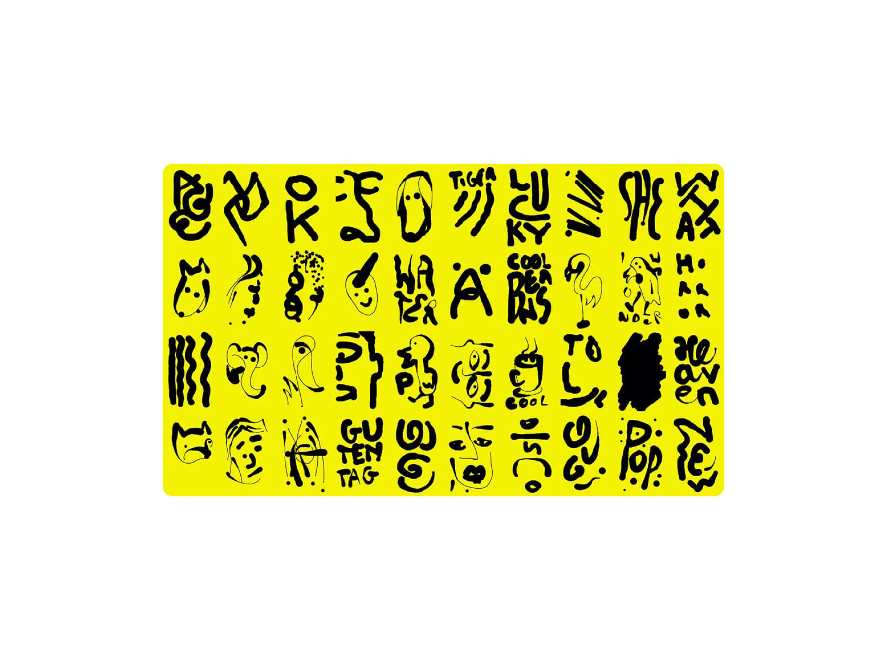
Bartholomäus Zientek
Marcus: “This is an amusing take on something we’ve all experienced. It’s an compelling graphic taxonomy of the highs and lows of a big night out, all drawn in a suitably messy hand.”

Moving Image
Judged by Tiffany Vazquez, Senior Editor at Giphy
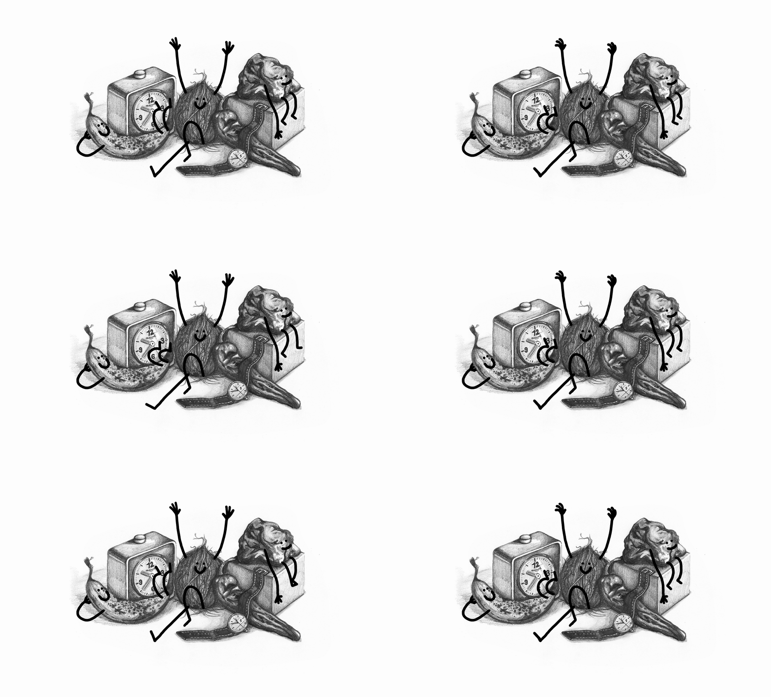
George(s)
Tiffany: “I like George(s) piece because they’re so detailed. It reminds me of a classic film Jezebel, where Bette Davis wears a scandalous red dress, and even though the movie is in black and white, it still somehow comes across as red with shading and other details. Only after looking at this GIF, I read Georges bio and found out he was color blind, which is why most of his work is in black and white.”
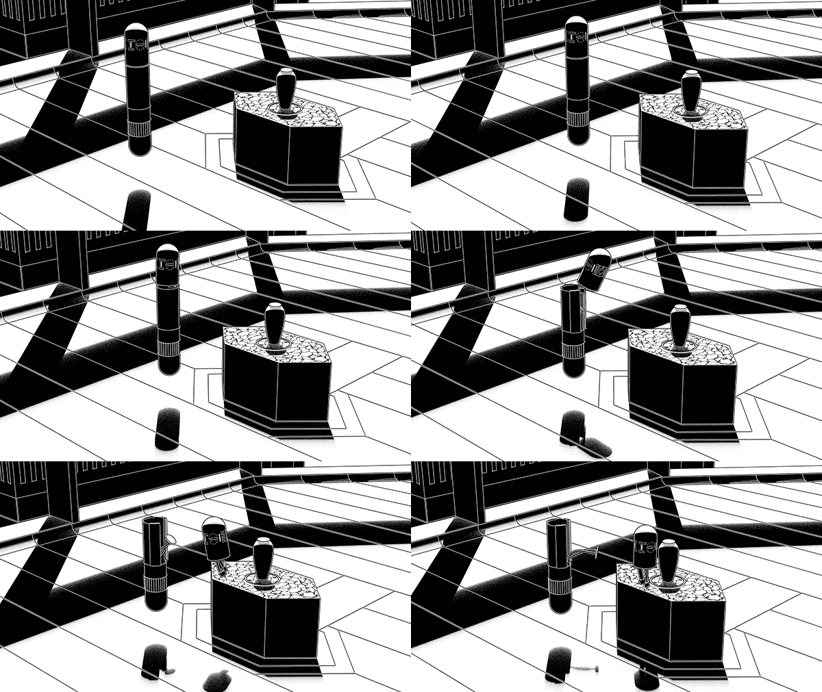
GERIKO
Tiffany: “I like GERIKO’s futuristic society. It’s like a mixture of Blade Runner, Ghost in the Shell, and original concepts that are super interesting and thought-provoking.”
Photography
Judged by Paloma Shutes, Photo Editor at California Sunday Magazine
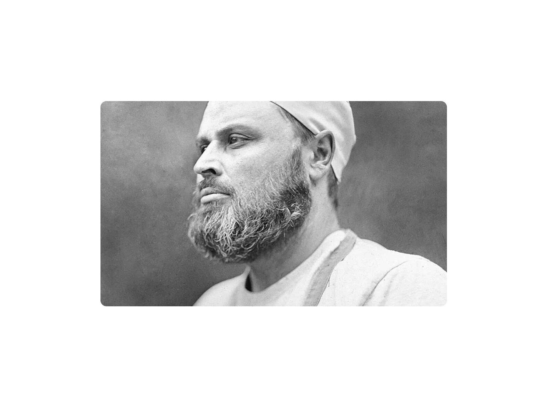
Magda Kuca
WeTransfer editorial team: “Magda’s work portrays a community of Polish crafters. They were asked to bring an object to her studio which reminded them most of their profession. The photos are made with a wet plate collodion technique, giving the vintage vibe to the pictures. This way of developing film is a craft in itself and therefore reflects the aim of the series perfectly.”

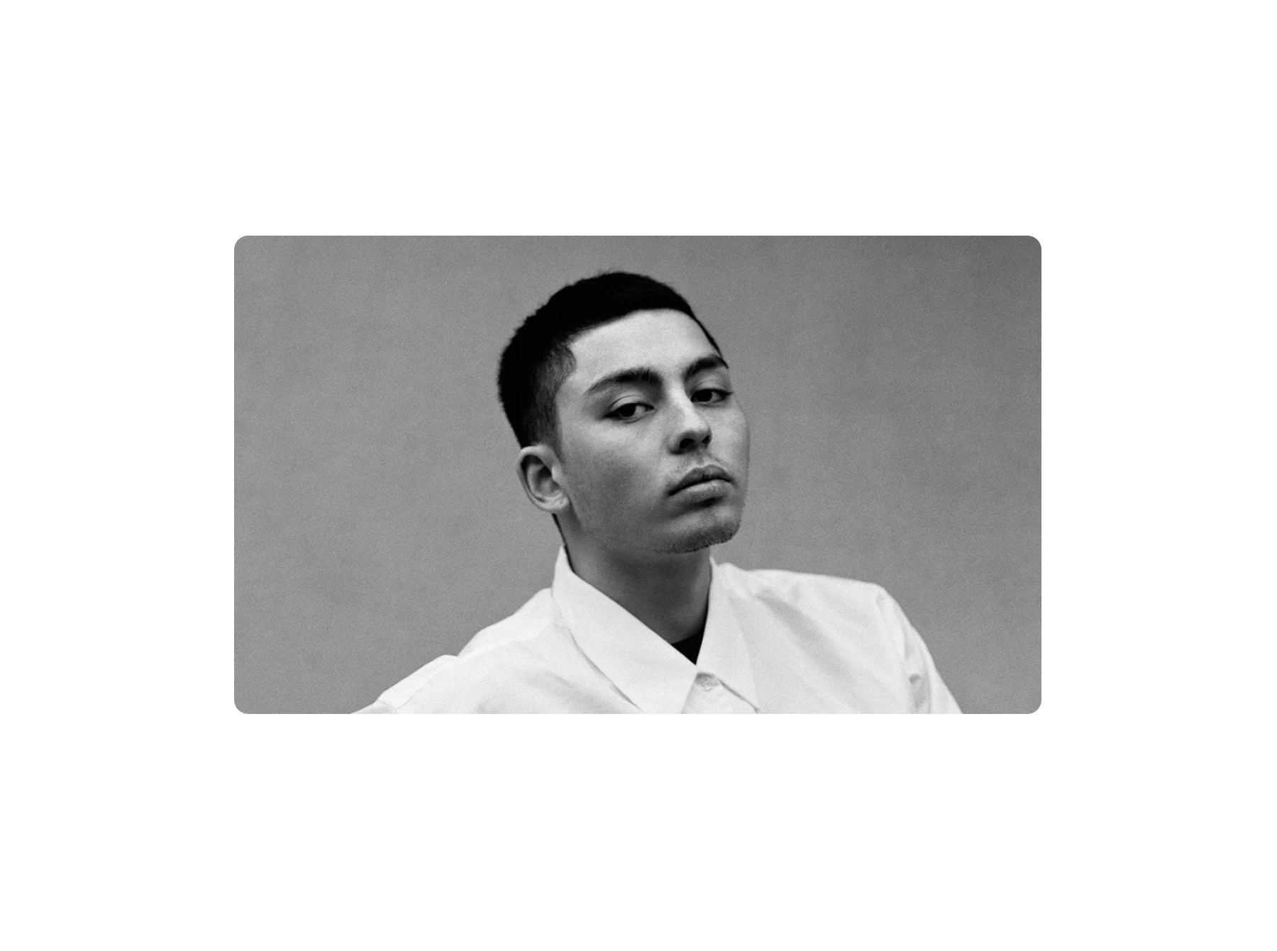
Sergei Pavlov
WeTransfer editorial team: “Sergei’s series shows the beauty of simplicity – it doesn’t need more than just one boy on a plain background. The fact that it’s in black and white adds to the feeling of serenity of these pictures.”

