Your Work Here was a massive open call to WeTransfer users to submit their artwork on the theme of "black and white." Read more and see the whole list of winners here.
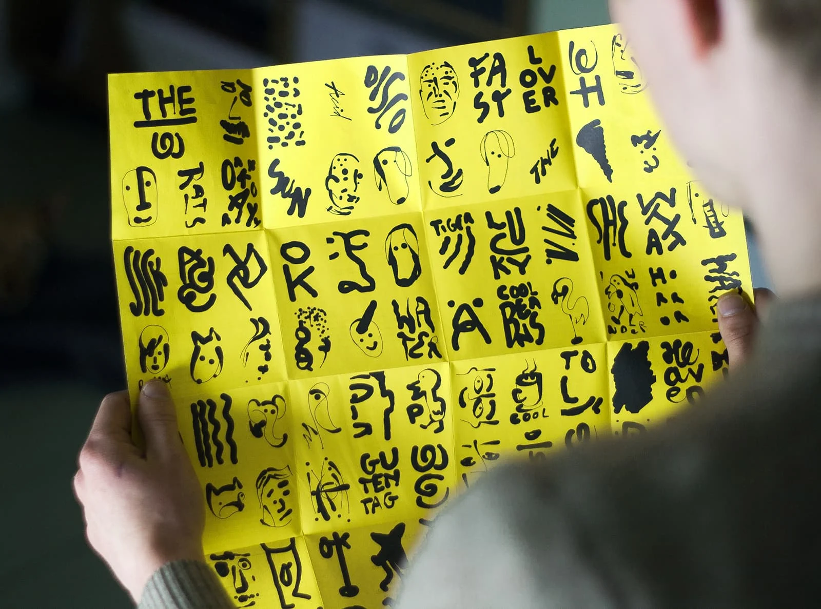
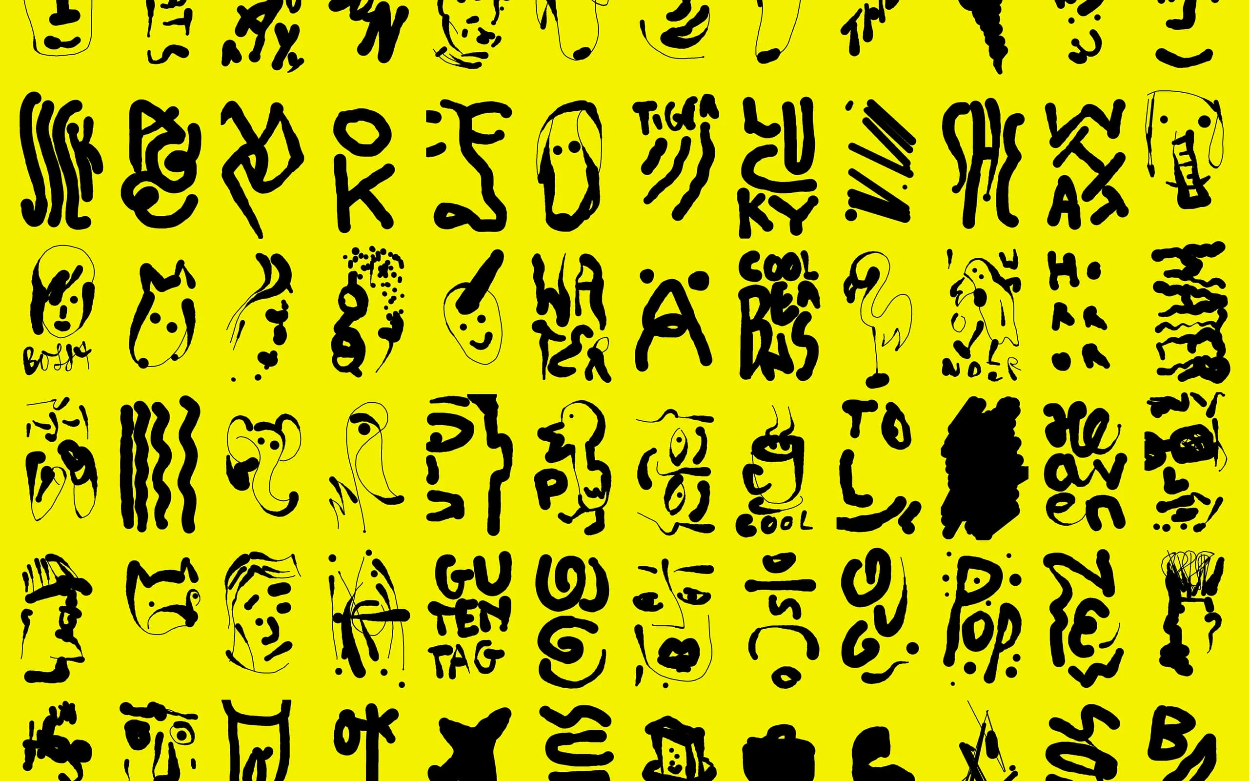
“Berlin nights are long, and sometimes you don’t know when they start or when they end, who or what is waiting behind the next corner.” That’s how graphic designer Bartholomäus Zientek sums up what happens in his home city when darkness falls. His poster for the city’s Watergate club is an attempt to visualise that sense of possibility – the anything-can-happen-and-probably-will spirit of its famous nightlife.
The poster is designed as an “emotional bingo card” capturing some of the things you might come across when out and about in the German capital.
“When I got asked to do the artwork, I wanted to visualize a night out in the city,” he says. “I wanted to make something that shows you what’s going on out there, as far as I can tell. The poster shows positive and negative elements, but that’s in the eye of the beholder – which ones are positive and which are negative. The function of the bright yellow background is definitely to kick your ass to go out, in case you feel lazy. And don’t go home until you have a bingo.”

Bartholomäus has amassed a huge collections of these doodles over the years, reaching for his pen and sketch book whenever he has a quiet moment. For this design, he went through and took all the sketches he had made in Berlin and from there he made a pretty random selection, or “worked with Mr Coincidence” as he puts it.
“I don’t have a favourite, I think it’s about the combination you get,” he says. “But I really like the walking plane (seventh row, fifth image). It’s a symbol for all the party tourism that is going on in Berlin – loved by tourists and hated by locals.”
Looking through his portfolio, Bartholomäus often works with a limited color palette – there’s a lot of monochrome – and he likes the stark effect working with only one or two colors can have.
“I would say black and white is kind of raw, pure, cool, rebellious, confident. It’s a strong decision. There’s nothing soft about it, no compromise between these two extremes. It can be a long-lasting solution, but I would never approach a project and apply black and white just for the sake of using black and white. It always depends on the concept.”
