Your Work Here was a massive open call to WeTransfer users to submit their artwork on the theme of "black and white." Read more and see the whole list of winners here.
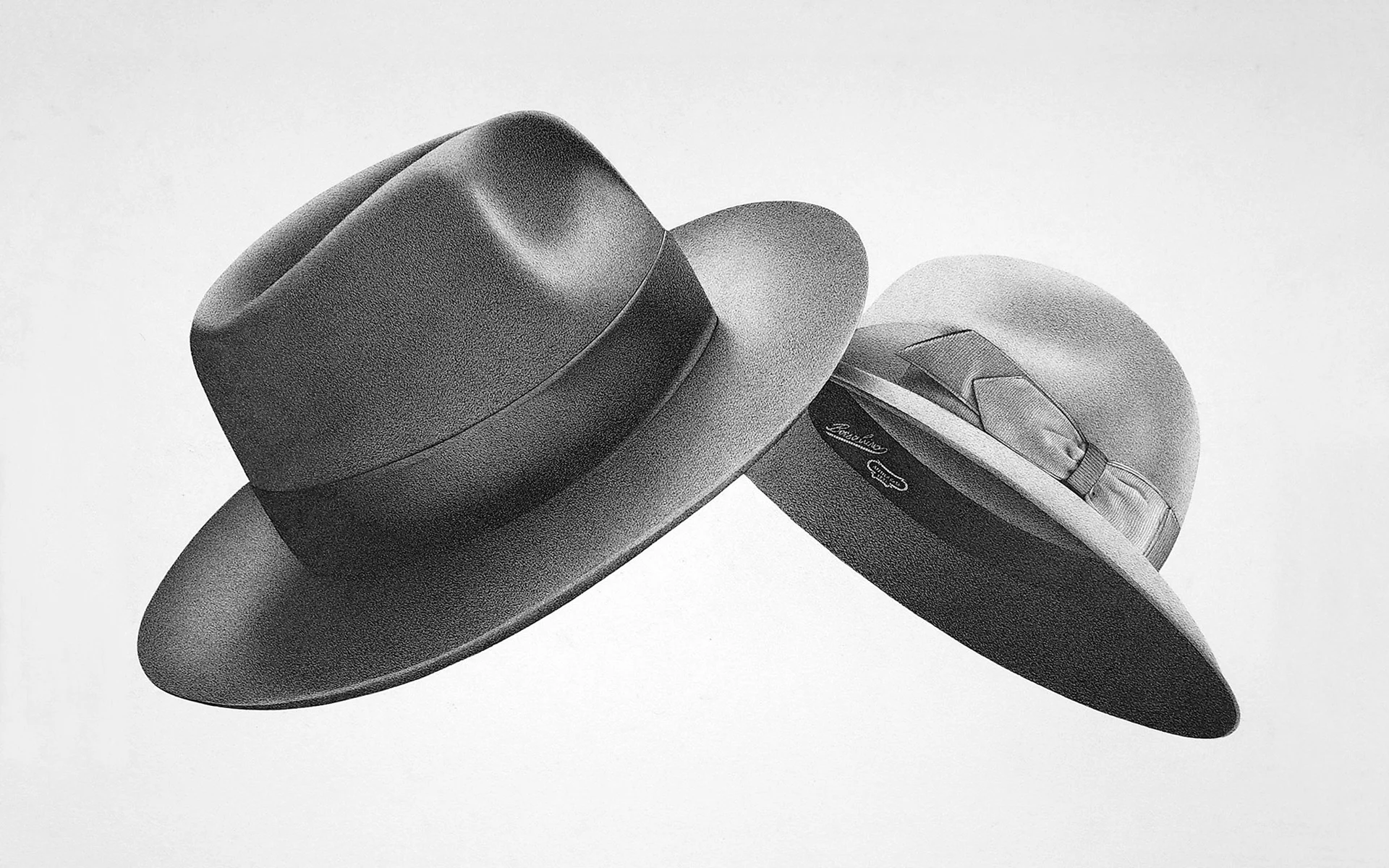
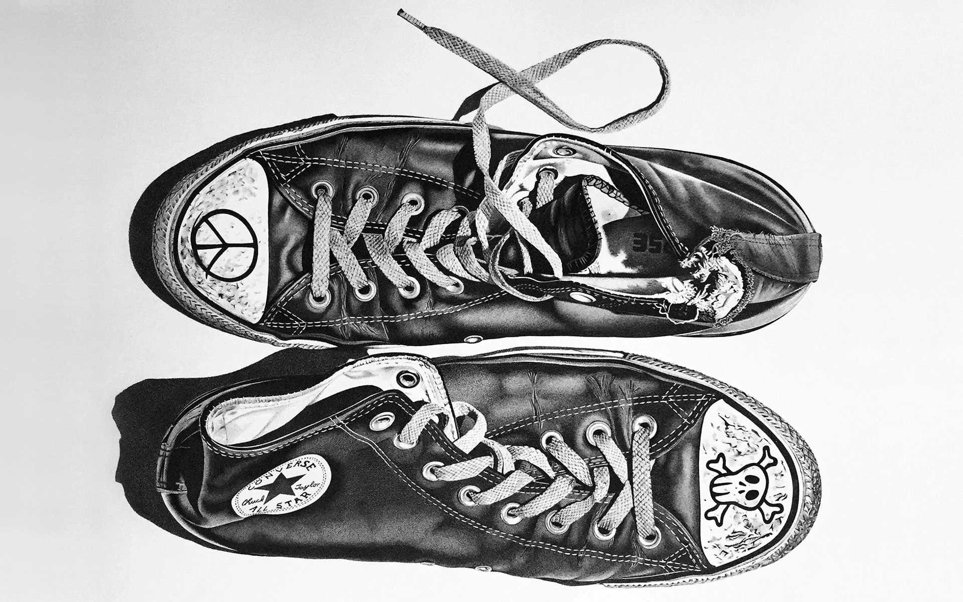
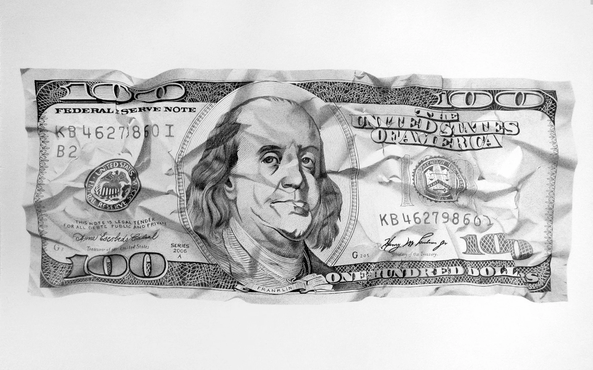
When seeing the work of Milan-based artist Alessandro Paglia, it’s hard to believe we’re looking at a pen and ink drawing rather than a photograph. His photorealistic representations of everyday objects like a pair sneakers, two hats intersecting or a crumpled hundred-dollar bill seem to come alive from the canvas. We chatted with Alessandro to learn about his simple yet meticulous creative process.

You said you are “fascinated by the power and elegance of black and white”. Can you explain that?
I have always drawn in black and white. When I was a boy I used to create ‘dark’ illustrations in the style of the Italian horror comics series Dylan Dog. I don’t love using pencils because you can get very soft shades as opposed to a very intense black. With charcoal, for example, you can get a deep black but you loose some control over the details. By using pens I can fill spaces with a rich texture and more vibrant and graphic nuances, resulting in a nicely contrasted image. The rough surface of the watercolor paper I use further accentuates this effect.
What is the hardest texture or material to get right in your hyper-realistic style?
Reflective and metallic surfaces are both the most beautiful to portray and the hardest to achieve. Beautiful because they feature strong contrasts between light and dark. Difficult because, it’s quite tricky to photograph reflective objects and while drawing, you have to be extremely precise if you want to create a credible image. I recently drew a big furry teddy bear and I still have a headache from it. As they say, “I’ve been there, I’ve seen it and I’ll never go back!”
I’ve read that your pieces can take anywhere between 50 and 250 hours to create – what is the most challenging thing about working on a piece for such a long period of time?
My technique is simple yet quite laborious. Before putting my pen to paper, I need to create the perfect reference image: I come up with the subject, retrieve the objects I need, modify them, devise a good composition, and take the photograph. While drawing I go into a meditation-like state so time passes oddly fast. Using dozens of pens, I superimpose layers of chaotic lines on top of another until I get the right shades, even in the smallest details.
How do you decide which objects to feature?
I am visually omnivorous; I try to be attentive to everything I see both on the web and in real life. It might happen that nothing catches my eye for a few days until suddenly a thread appears and an idea emerges once I pull on it. I also try to pay attention to insignificant things like shop signs, food packaging, or a cobblestone on the street. Often the things I accidentally encounter provide good cues for new pieces.
What story are you trying to tell with your pieces?
I like to draw objects that are familiar to all of us yet have a peculiar aesthetic quality. My first goal is to get an elegant final result; I don’t just reproduce an object as it is but try to present a ‘twist’ on the story that the object recounts with a touch of irony, mystery, surprise or alienation. I try to achieve this through simple interventions like a special coating, a deformation, or by combining several objects.

How did your work as a product designer influence these pieces?
Having worked as a designer has helped me to develop a sort of subtle formal and spatial sensitivity. It has also helped with regards to choosing the subject and arranging the composition. The knowledge of design history has also directly influenced my work – pieces like Fortunato Depero’s Campari bottle and Issey Miyake’s Bao Bao Bag are tributes to these great heroes of mine.
You often present images of your work alongside your pens – why is that?
I like the juxtaposition of such elaborate drawings against the super simple and common tool it was made with. It resembles an ant with an anthill, don’t you think?
