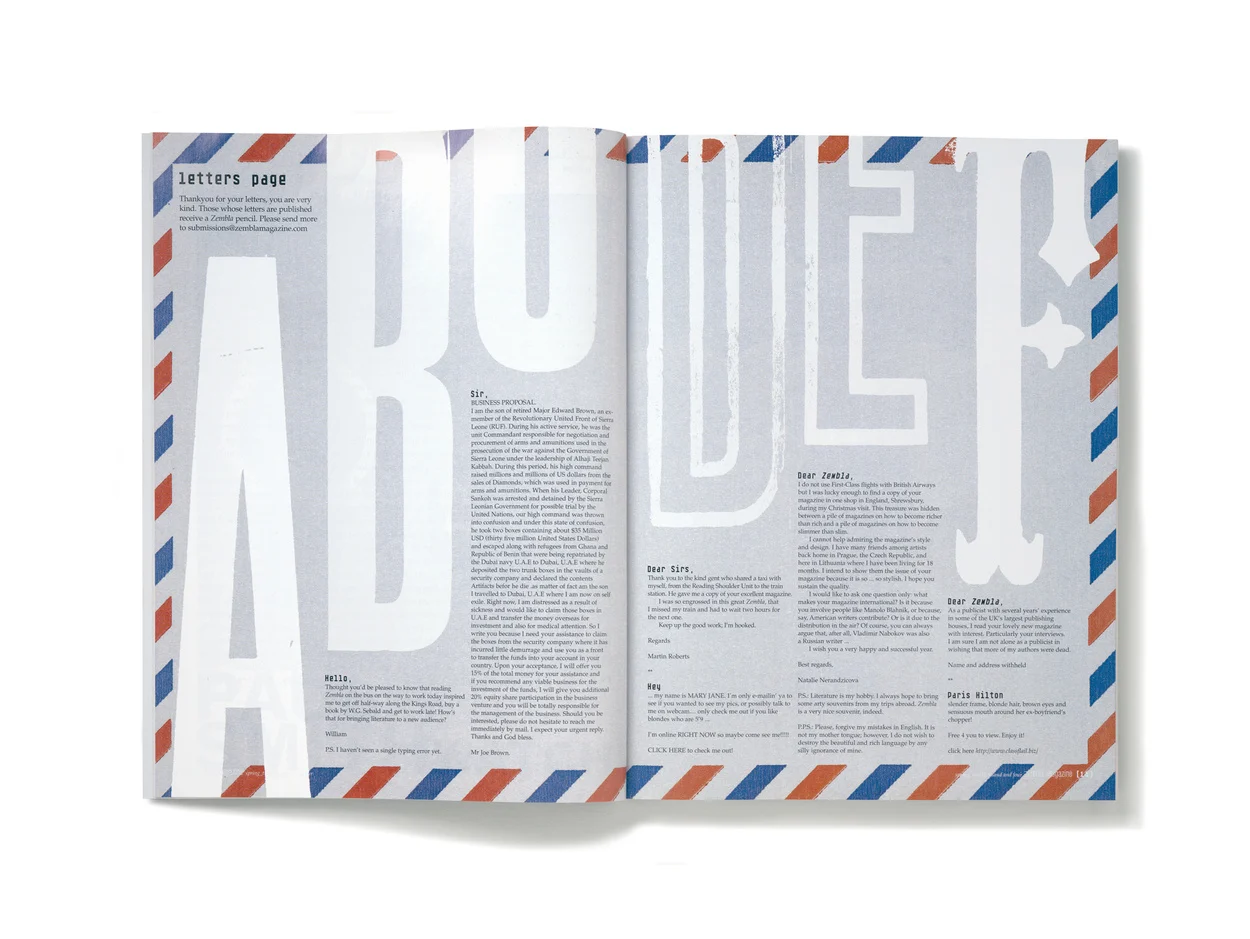
Matt Willey is one of the best graphic designers in the world. From The New York Times Magazine to the title graphics for Killing Eve, he creates concept-rich work which never collapses under the weight of its cleverness. He joined longtime friend and creative collaborator Dan Crowe (the pair launched the magazines Zembla and Port together) to discuss mentors, magazines and why the best ideas happen over beers.
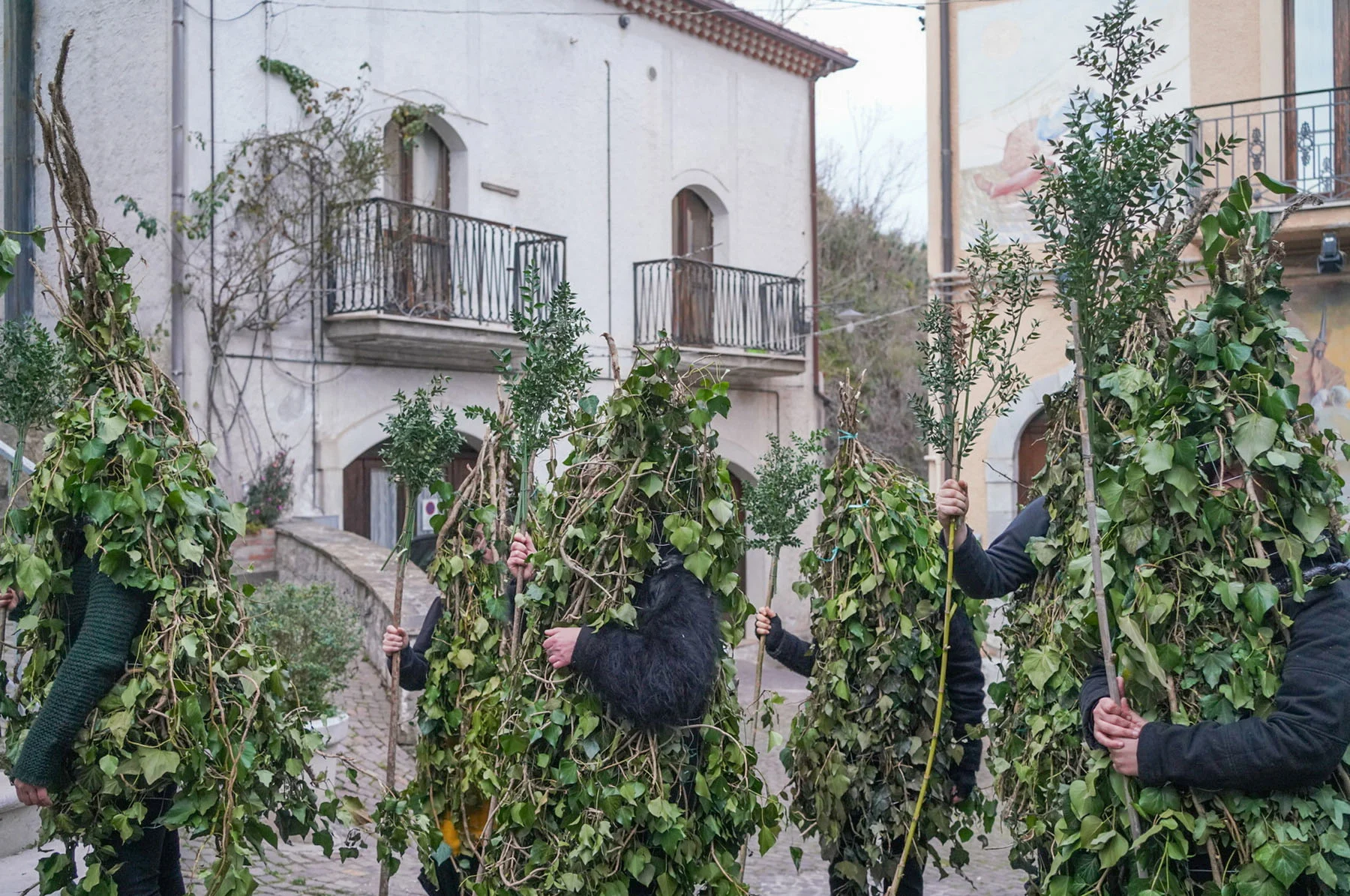
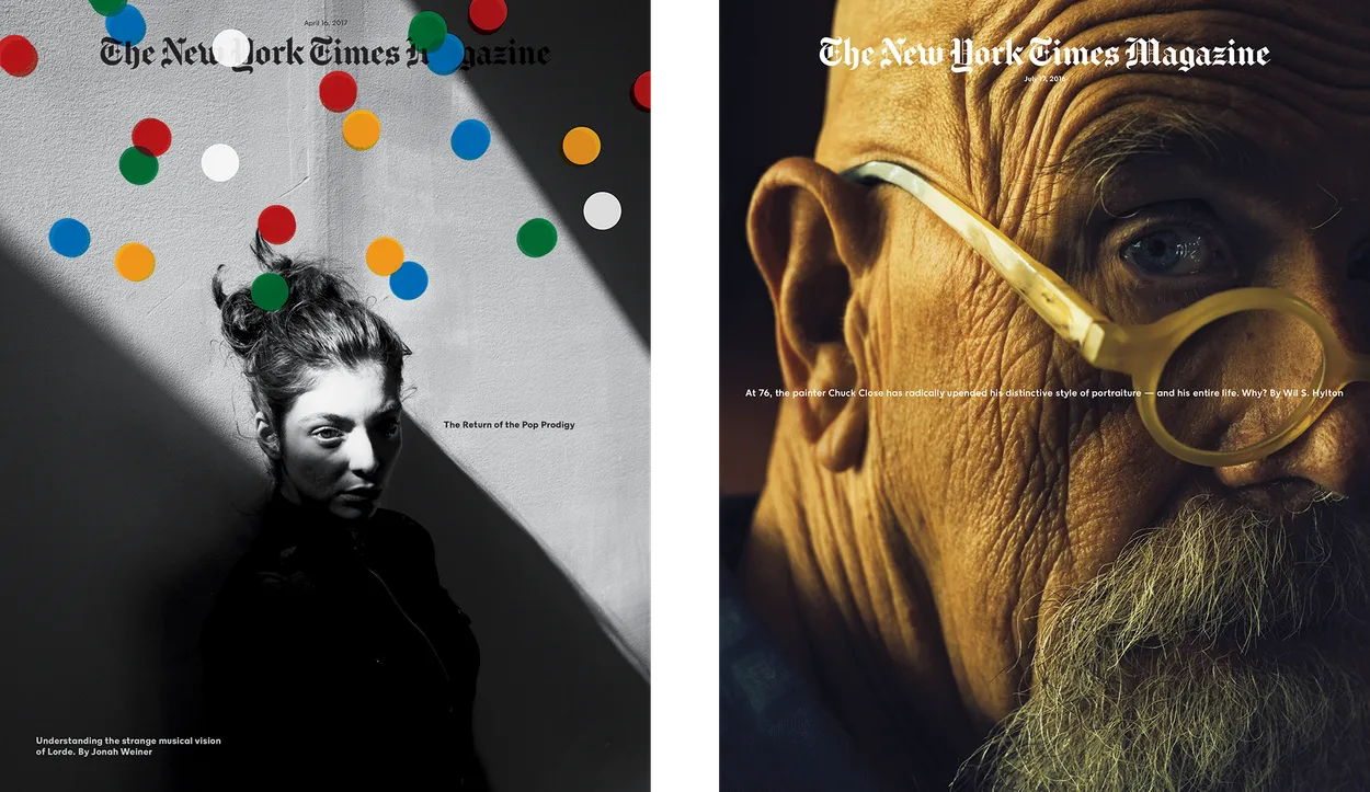
Lorde photographed by Jack Davison.
Chuck Close photographed by Christopher Anderson.
Dan: What design do you recall seeing, when young, that you thought was special?
Matt: The cover of The Passport by Saul Steinberg. That book had a real effect on me when I was a kid, and the cover is wonderful. I only understand that it’s a lovely piece of design now, in retrospect. Back then I just loved the book, in the same way that I loved the Tintin books, and Eddie Fiola’s yellow BMX, and my dad’s Rotring pens, and Lego and how Quink ink smelt. But I was slightly obsessed with The Passport. I own all my dad’s old Steinberg books now.
Dan: Your dad was a poet wasn’t he?
Matt: He was. And one of the best humans I’ve ever met. And a great friend. I miss him enormously.


Dan: Who are, or were, your mentors?
Matt: I suppose, given how things worked out, Vince Frost was a mentor of a sort. Maybe mentor isn’t the right word, but I learnt a lot working with him. In the world of graphic design, I remember being interested in Vaughan Oliver’s work when I was a student, but no more so than Rauschenberg or Robert Frank or Manet or René Burri. I was more interested in painting and photography back then. I still am.
Dan: So why magazines?
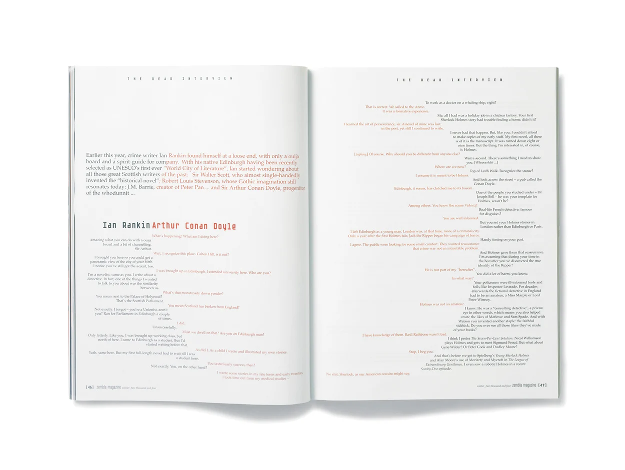
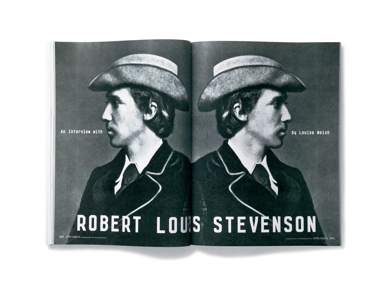
Matt: I never felt like I chose to work on magazines, it’s just the way things panned out. It started with Zembla, working with you and Vince – that was really my first experience of working on a magazine. And I think your portfolio just becomes this sort of strange self-perpetuating thing. After Zembla I was asked to redesign the Royal Academy magazine and then another magazine, and so on.
The more editorial projects I did, the more editorial projects came my way. Zembla was 15 years ago and there hasn’t been a single moment since when I wasn’t working on a magazine project of one sort or another. Often several magazines at the same time. But I don’t think any of that would have happened if it weren’t for Zembla.
For a long time I felt quite ambivalent about the idea of being a graphic designer, and I think I maybe gravitated towards magazines because they offered proximity to other worlds – to writers and editors, to art and photography and film, and illustration, and music and so on.
And I know that’s not unique. Design is almost always – or should almost always be – just a small part of something else. Usually something bigger and more interesting. I don’t think design is much in and of itself; it’s only interesting when it’s in service to something else. But I felt comfortable with magazines, they made some sort of sense to me.


Dan: I find it interesting that often, when working with you, a layout or cover gets resolved very quickly. It seems to pour out of you. What are the conditions you need to make this happen?
Matt: I also get really stuck sometimes too! I get in those ruts where you do version after version of something, trying to make it work, or work better, and you go round in circles. But you’re right, sometimes it all comes together quickly. Actually, I think the best stuff I’ve done has happened that way.
I think the way you and I work, for example, allows that to happen; we’ve worked together a lot, over many years, and there’s some sort of understanding there. There’s very little second-guessing. I think you trust my instincts, which in turn makes me feel more self-assured about what I’m doing, which is crucial for me. It’s hard to explain.
Confidence is a curious thing in relation to what I do, which is often just putting forward my taste in something. It’s subjective. I often have strong instincts about how something should look or work or feel, and sometimes that’s all it is, an instinct. I can’t justify it beyond, “I just really like it.”
Sometimes that’s all it is, an instinct. I can’t justify it beyond that.
It works on some visceral level. Which I think is completely valid, or it should be. And I think it’s why design-by-committee often doesn’t work. Something unusual or interesting or really beautiful can get compromised or dismissed or made less interesting because there’s this peculiar need to over-explain, or over-rationalize what’s been done. Sometimes something just looks great, and that’s it. You don’t have to justify it beyond that.
The last Port cover, the Vincent Cassel one, took me about 15 minutes, and I really like it. But that was a specific set of circumstances. It’s me working at my kitchen table, with a glass of wine, designing something almost entirely on my own terms. Which is a rare thing I guess. A luxury.
If there was ever a justification for going through the pain and hard work of launching your own magazine, it’s that. Doing things as you want to do them. It must be the same for you and the content, no? We’re not answerable to anyone. You liked that cover but I think you also trusted the fact that I liked it. It’s hard to imagine that cover going through rounds of meetings and explanations and coming out the other end unscathed.
Having said that, I currently work somewhere (The New York Times Magazine) where those conversations and meetings, of which there are a lot, can often make something better. But it’s much harder for me to start that process with the same level of confidence.
Dan: Yes, it does feel like that to me. Having almost complete freedom to create seems to foster the confidence to be bold, to be brave, even.
Matt: It was the best part of it for me, in the early days of Port, sitting in the pub with you talking about things that interested us. Which is what friends do – it’s what you and I had been doing for years – but when we launched Port, suddenly we had a place where we could put some of those ideas. That was extremely exciting.
Dan: What is the difference between working on small and big magazines?
Matt: I’d spent more than a decade working on small magazines. A lot of those had been start-ups where the teams were just a handful of people. So The New York Times Magazine is very big compared to what I’d been used to. It’s exciting to work somewhere that has this much editorial clout, this kind of reach and influence, that’s so varied and ambitious, week in, week out.
Ultimately I want to work with great content, with great stories, great ideas, and I think this is about as good as it gets. It's fast paced and there’s an immediacy to it that I like, and a feeling that you’re playing a role in getting out information that’s timely and important, things that people are talking about, that are a part of the news and culture right now.
Ultimately I want to work with great content, with great stories, great ideas, and I think this is about as good as it gets.
But I miss working on small magazines. I miss the feeling of being really integral to something. That sense of autonomy is addictive. I miss the lack of hierarchy. I miss the friendships that are formed out of that way of working. They were often very sociable and, I think, due to a combination of my personality and my hearing difficulties (the two are inextricably entwined), I am better suited to that kind of world, to smaller teams.
The New York Times is a struggle for me in many ways. I don’t always feel like I’m a particularly good fit. When somewhere is large and corporate – which the NYT undeniably is – and when so much has to get done in such a tight space of time, there’s a sort of polite but impersonal efficiency that takes effect. It has to. It’s what professionalism looks like.
In a way, working on small magazines never really felt like a job to me. More often than not those magazines were built out of small teams of people who had other jobs. And that had its downsides, but it also meant that they really wanted to be working on the magazine. People were doing it for the love of it. And that brought about a certain sort of energy, a particular type of working dynamic, which was often very exciting. Often fraught, often chaotic, often tough to sustain, but exciting.
At the NYT I'm a small cog in a big and incredibly impressive machine. The collective effort of that machine – what it's capable of – is an exhilarating thing to be a part of. I’m surrounded by people who are extremely good at what they do: story editors, photo editors, fact checkers, production editors, research editors, designers and so on. It’s intoxicating to be surrounded by all of that, to watch this magazine be put together so brilliantly every week.
It’s interesting to me that I could be somewhere this big and be producing some of the best work I’ve done. When you’re working on a small magazine it feels as though there’s very little between you and what you want to do. It’s just a matter of working hard at it (or convincing the editor, over another drink), and I worried that it would be difficult somehow, at a big magazine, to push things through, that there would be too much bureaucracy, too many people, too much stuff getting in the way.
But that’s just not the case, or at least not to the extent I feared. I’ve had moments where I’ve felt I had a quiet influence on things. Magazines, when they are really good, are the result of a collective push, a combined effort, lots of different things all coming together.
Dan: This is terrible, we’re just talking about magazine design! You have designed many other things: posters, books, newspapers, and have always drawn fonts. Recently you arranged the type for the title sequence of Killing Eve. How did that come about?
Matt: It’s been a lot of fun. A friend introduced me to Sid Gentle Films in London, who were looking for someone to work on the titles for a new TV show they were producing for BBC America. I've always been fascinated by title sequences; it’s something I had always wanted to do. I think some of the most exciting design I’ve seen has come from that world. I’d love to do more of that.
Dan: What work of yours do you value the most?
Matt: Value suddenly seems like an odd word in this context. Some projects worked out better than others. Some projects were great because of the process, or the people involved. The Independent redesign, for example, was a big complicated job. I fought very hard for what I wanted and there was something satisfying about coming out the other end feeling like it had come together as I had hoped.
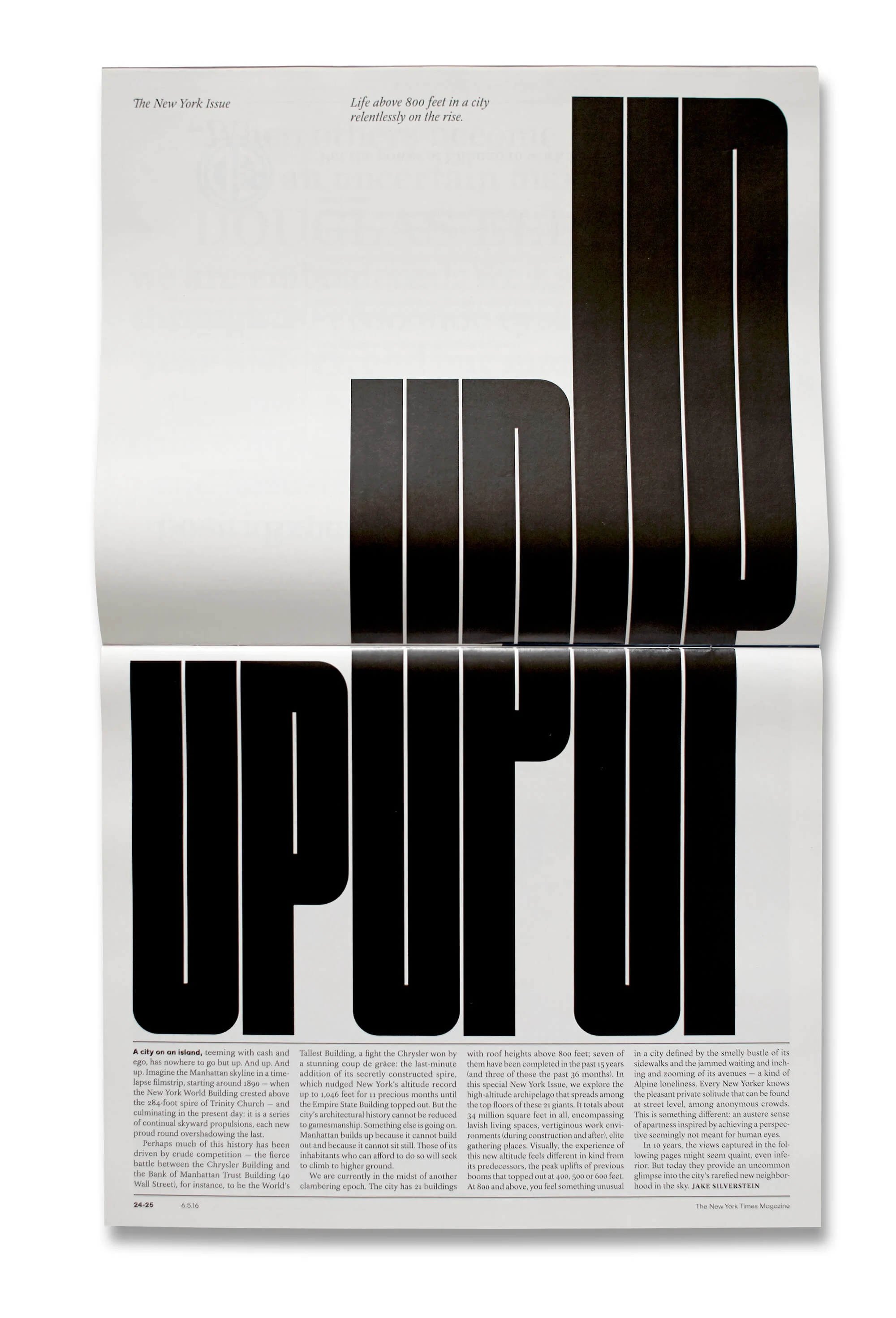
I have a nostalgic fondness for Zembla, and a lot of other magazine start-ups have been great fun to be part of: MAP, Plastique, Elephant, YCN, Avaunt and so on. I loved working with Tom Dixon on his book. I loved working with Giles Revell on our peculiar self-initiated projects. I think a few of the NYT special issues have worked out OK: the New York-themed, sideways issue, for example.
I’ve just finished a couple of book projects, an annual for American Photography and a huge book on Mongolia, which was one of the toughest edits I’ve ever worked on. I think I’ve been extremely lucky – a lot of interesting projects, and a lot of interesting people have come my way.
And I think there’s often real value in actually doing the work. That process can be exciting, but when it’s finished I’m not particularly interested in looking at it. I can’t do anything with it at that point; I can’t change it or make it better. It’s done, you move on to something else.
