As a kid, graphic designer Katrina McHugh wore an eyepatch for a lazy eye. Her dad would draw cartoon eyes on it, which startled her when she’d catch a glimpse of herself in a mirror. “It was the beginning of a long road to not taking myself too seriously,” she says.
Now she’s the co-founder and creative director of the small branding and graphic design studio Flight Design Co in San Francisco. But spending so much of her time on work for clients, Katrina found herself missing out on the chance to just play.

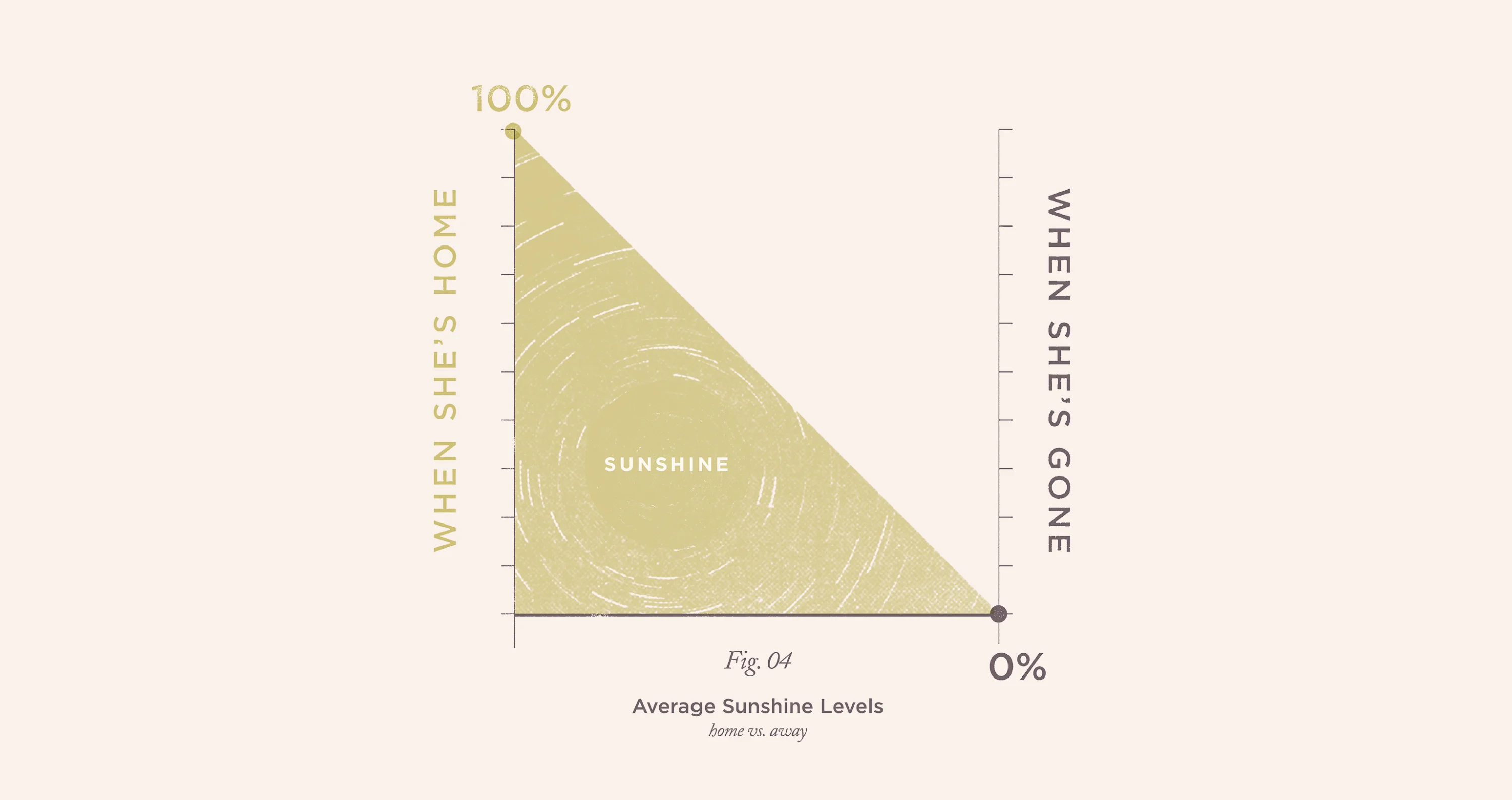
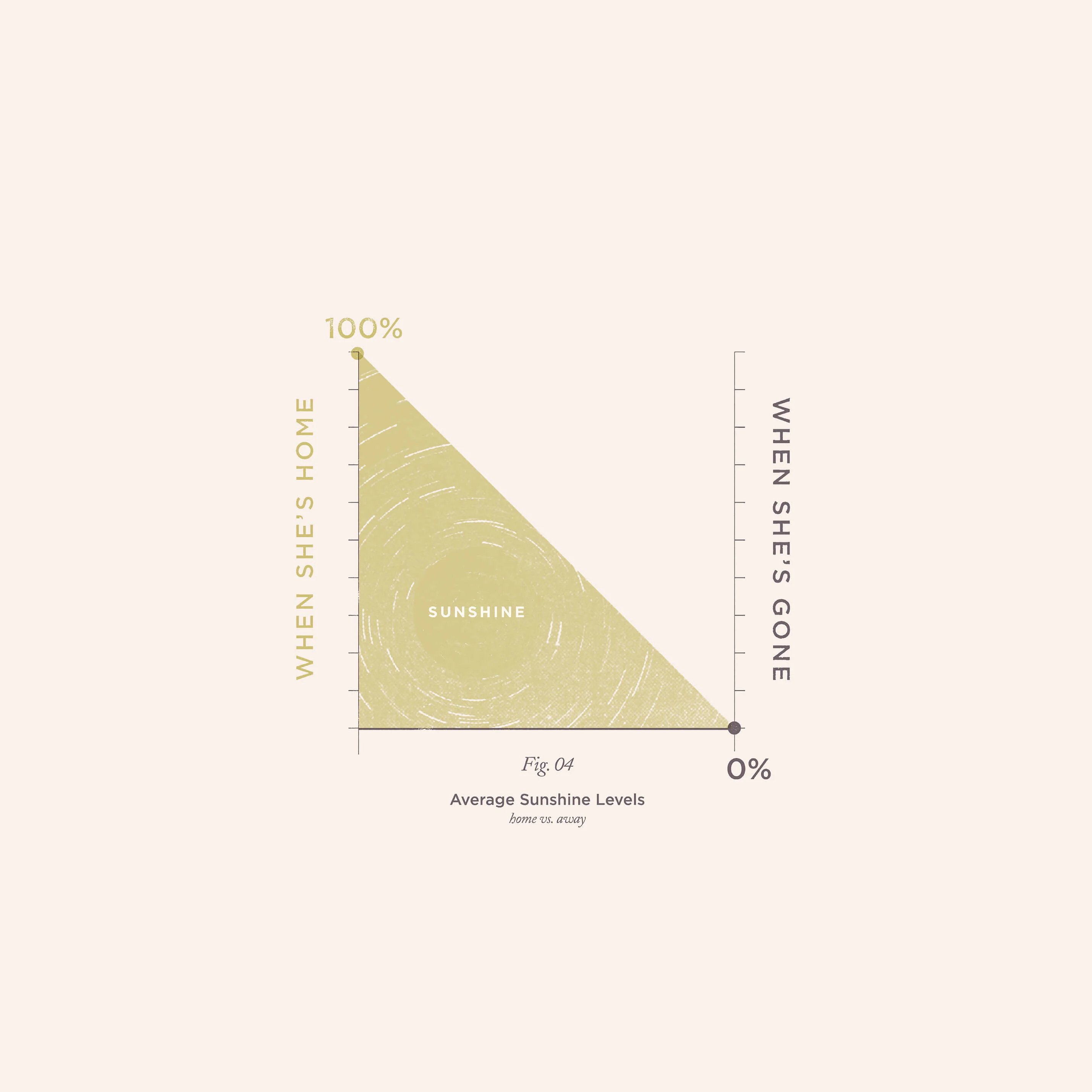
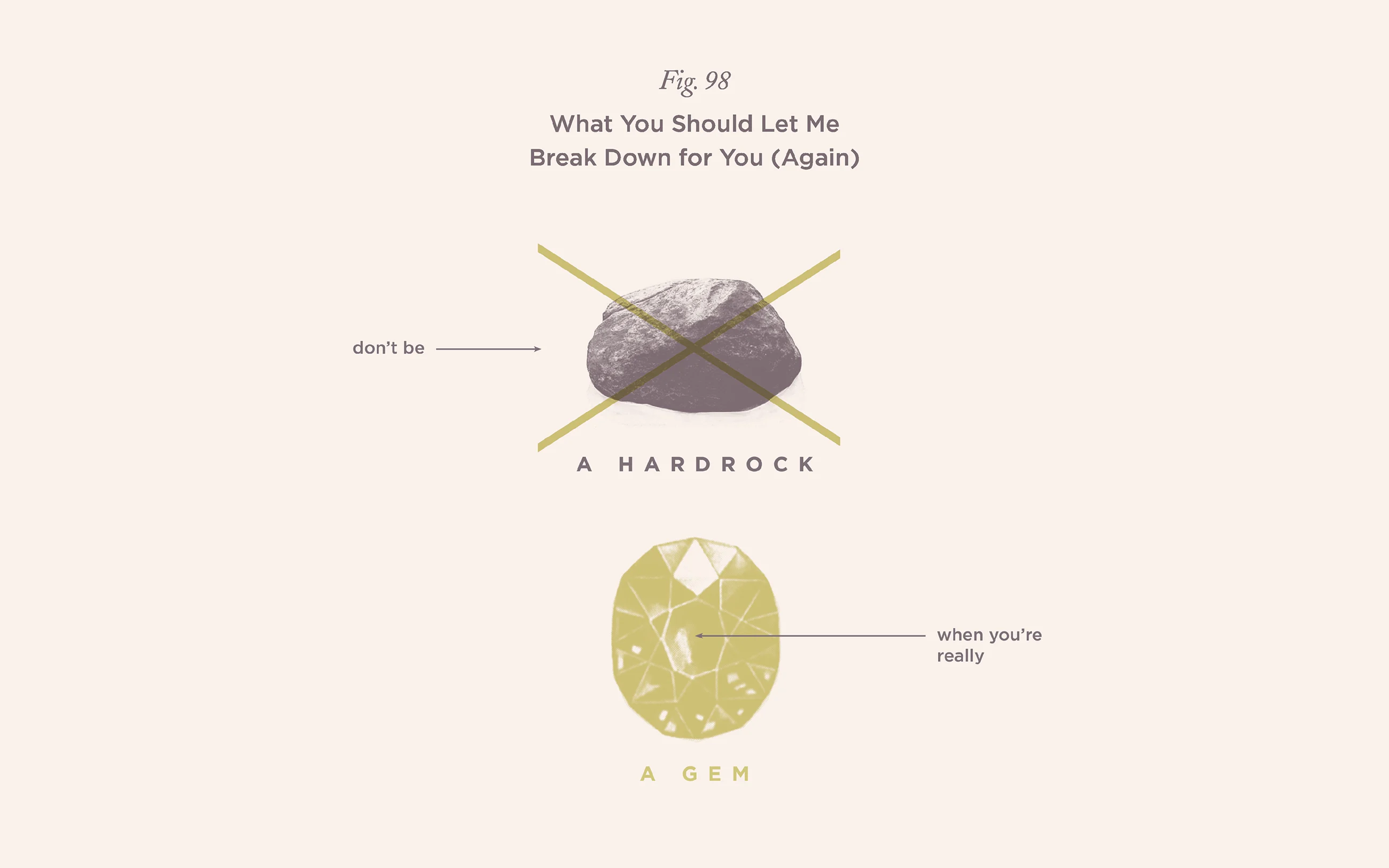
Around this time she became aware of the 100-Day Project, a challenge for creatives to make something new every day for 100 days. In response she looked to two subjects that unify us as human beings: nature and music. She had begun to notice references to natural elements in the lyrics of pop songs from “don’t go chasing waterfalls” to “a hard rain’s a-gonna fall.”
“The variations felt endless,” she says. “As did the sometimes silly nuggets of pop wisdom contained therein. The overlap between nature and music felt like a fun place to explore and play.”
“Lyrical natural sciences” became the theme for her challenge. Carving out time in odd hours and gaps in her to-do list, Katrina initially gave herself just 30 minutes a day to visually interpret natural metaphors in song lyrics as a diagram.
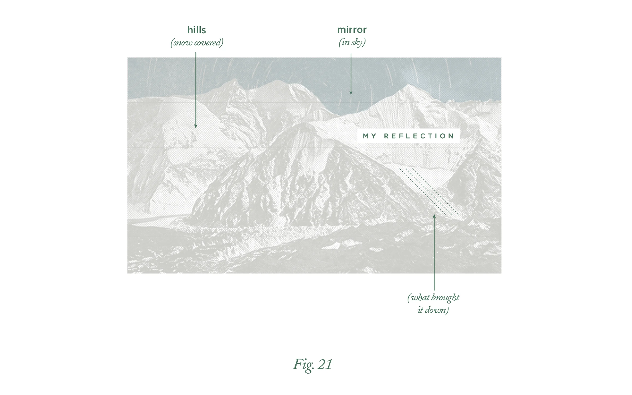
Her daily drawings started out as infographics using data-driven design devices like graphs and charts but became more and more like abstract puzzles to solve as the challenge progressed. The style and colors she used were inspired by a set of encyclopedias she inherited from her grandfather.
“Back in the sixties he subscribed to a set at the grocery store and received one per month for his family until the set was complete. I love flipping through them and have always been especially captivated by the little illustrations.” She also referenced textbooks from the same era. “During the project I feel like I searched for and found a visual voice that was just mine,” she says.
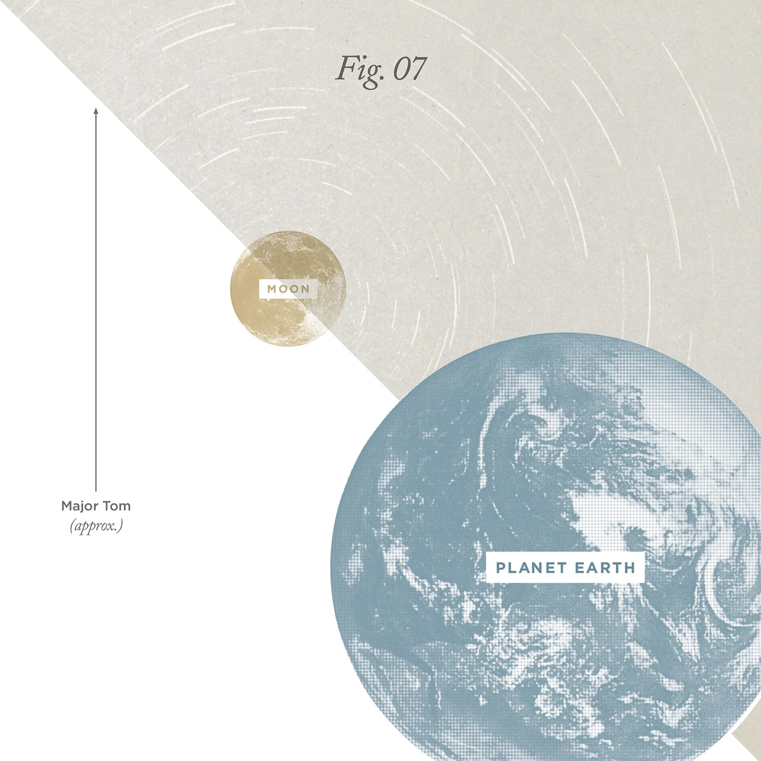
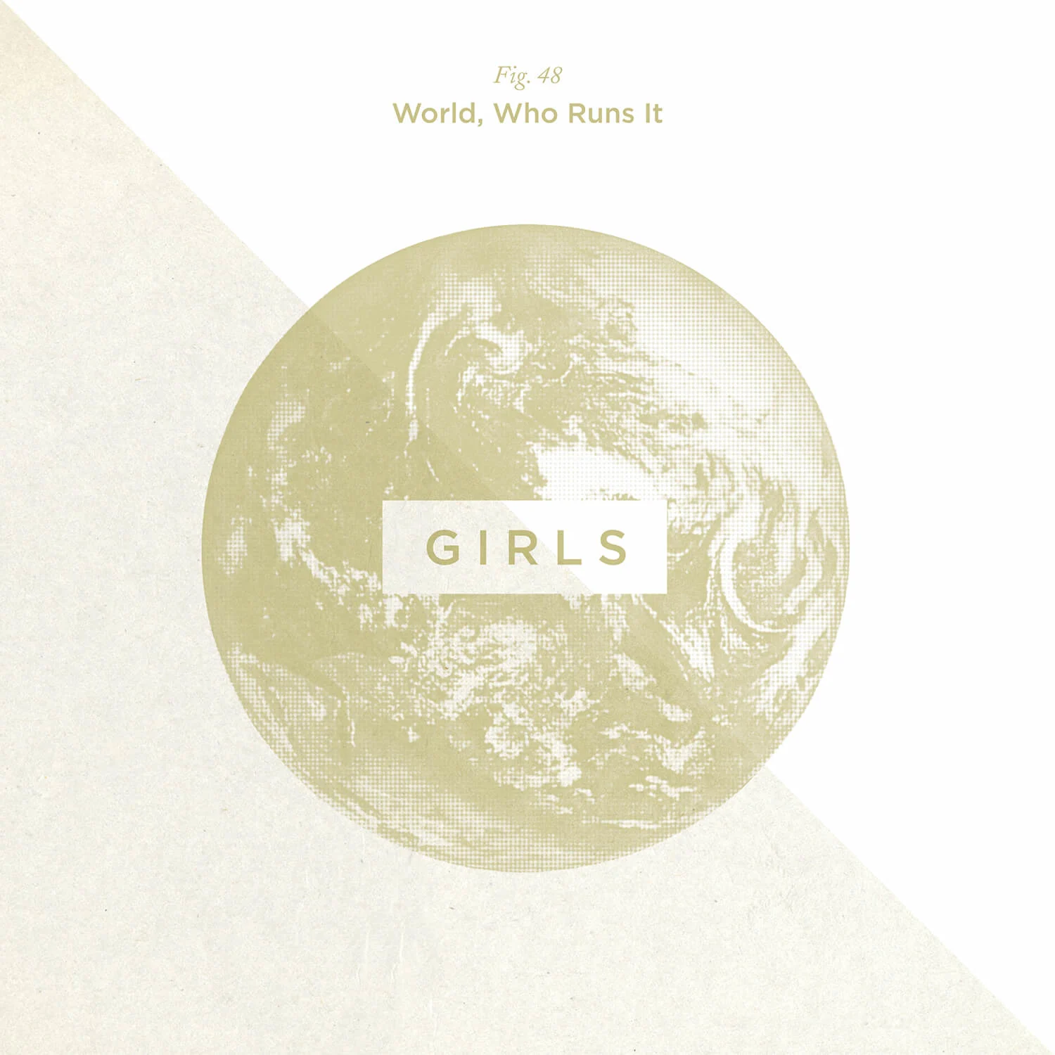
When HarperCollins decided to publish the project as an art book called Pop Chart, the work really began. Katrina created fifty more images for the book using lyrics from songs that would be more recognizable or classic than some of her more obscure choices. While working on the book, she invited her close friends over to give her feedback and guess the songs while drinking beer in her living room.
Making the series was instrumental in learning about her own creative process. “In the past I worried that rules would be constricting when it came to a personal project, because who needs more rules?!” she says.
“But I discovered it was the opposite. I learned that if I have some creative parameters and something of a loose plan, I can sit down for even just 20 minutes in a day and feel like I actually made something. I wasn’t getting lost scrolling through inspiration, or finding the right color, I was just sitting down and getting to work.”
Music keeps her company throughout her day and soundtracks her activities. When she’s not strumming her little baritone ukulele there’s always something playing in the background, from soul to pop to classical. The one constant in the music she listens to is that it’s always changing.
When Katrina needs to summon a good mood, Nina Simone’s Feeling Good is the remedy. If she’s writing, songs with lyrics have got to be put on pause. “Lyrics completely distract me,” she says. “I’ll find myself staring out the window or looking up words to songs on the internet when I should be working.”
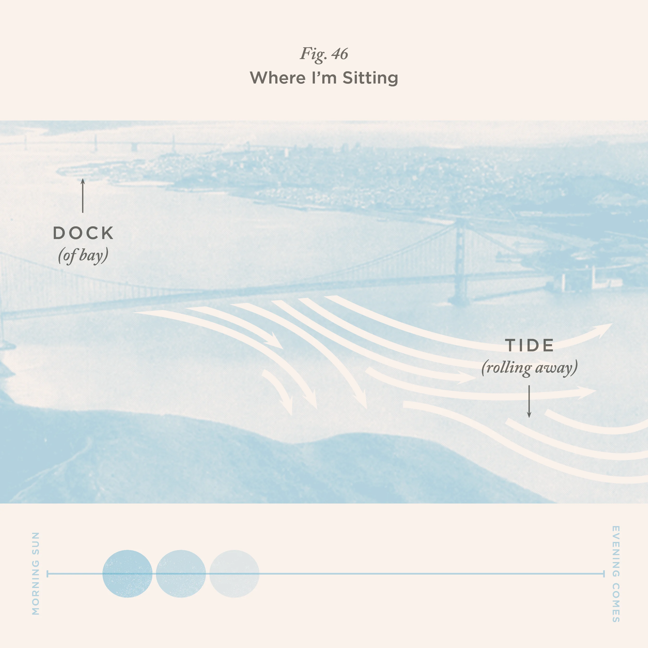
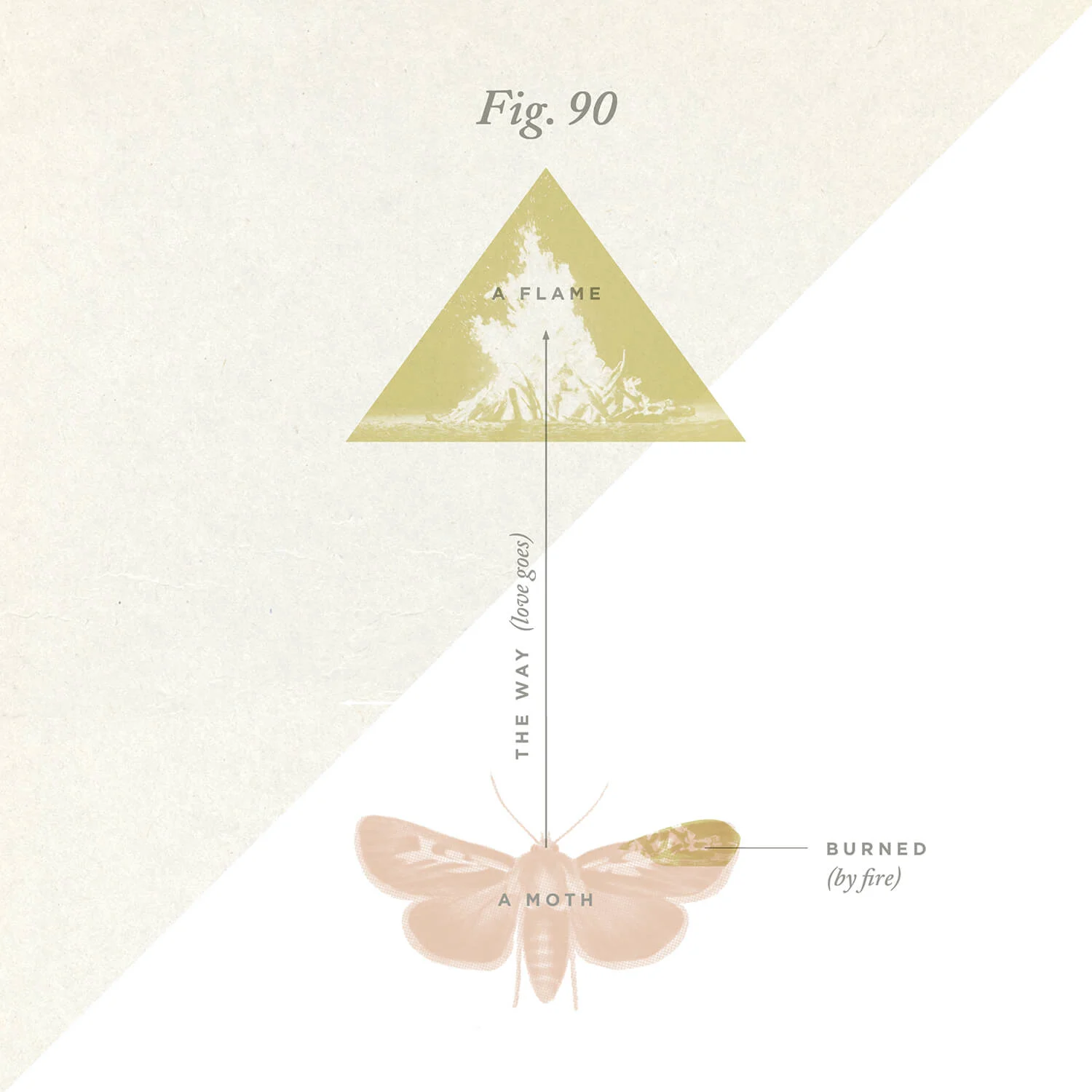
Her eclectic taste is reflected in the songs she chose for the project, from Justin Timberlake’s Rock Your Body to the protest song Strange Fruit by Billie Holiday — which she chose to include as a personal response to the white nationalist rally in Charlottesville in August 2017.
“To me, Strange Fruit is a stark and chilling reminder of the terrorism of white supremacy in the U.S. both historically and in the present day,” she says. “‘Blood on the leaves and blood at the root,’ is a physical and visceral image that reminds me we are all entangled in the roots of a systemic violence against black bodies. Whether we benefit from the system or are oppressed by it, white supremacy exists and runs deeply into our daily lives.”
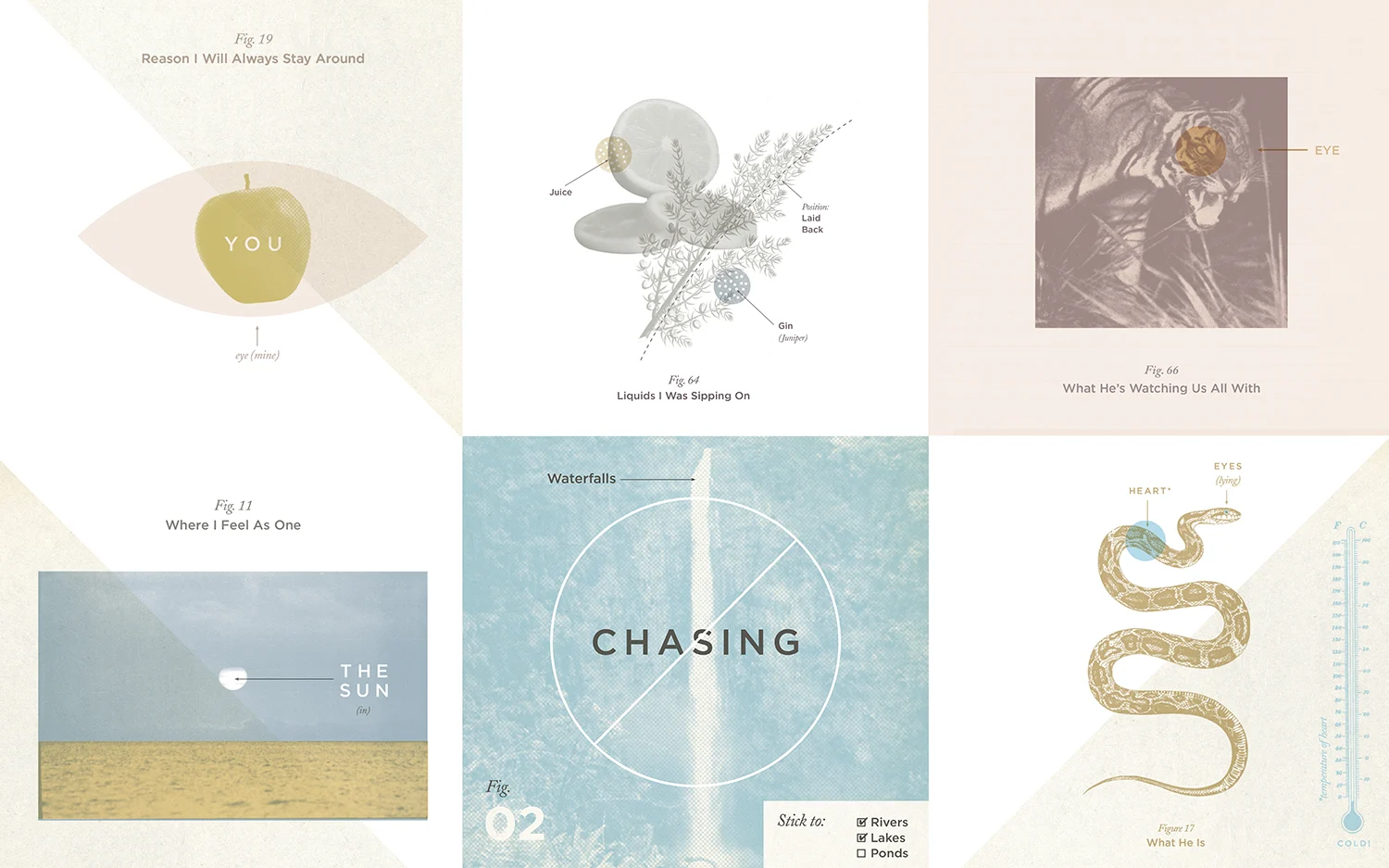
The most popular image from the series is T.L.C.’s Waterfalls. “It’s been really interesting to see how people much younger than I am still appreciate it and know all of the words to that song,” Katrina says. “Music can endure like that.”
One of her favorite stages of the process was mining songs for lyrics that could fit the brief. “I’d sit there and listen with all of my attention while reading the liner notes carefully, following tangents and random ideas. I can still get lost in that for hours,” she says.
Once the project took off, friends would send her entire spreadsheets of song suggestions. She thinks the work resonates with people because it has multiple access points: they could connect with the words of the song, enjoy the image for what it is, or get intrigued by working out the visual riddle.
Her mom’s favorite image for instance is from American rapper Warren G’s Regulate. “I’m quite sure that she isn’t familiar with his catalogue,” she says, “but she loves the visual design and the idea of ‘if I had wings I would fly.’”
