On Jasu Hu’s first trip to New York, she went to MoMa, where she saw Mark Rothko’s colorful abstract paintings. Seeing them in real life made a big impact on her. “I was really impressed. I stood there for a whole day and I kept telling myself: ‘Stop crying! Stop crying!’

“It’s all very abstract and nothing happens, but there’s already so much information in colors. Maybe it was something personal, but I was really touched by that painting. I realized I wanted my viewers to feel in a similar way. I’d like them to connect with my work like that.” And so back from her trip, she set out to amaze and awe people just like Rothko’s pieces had done for her.
Interestingly, when Jasu was still living in China and studying, she wasn’t even aware editorial illustrator was a job. Little did she know, in three years time she’d be one; working from New York, and taking commissions from The New York Times, The New Yorker and The Washington Post.
Jasu is the perfect fit for editorial work, as she’s a master in telling a whole story through a single image. Each time she finds the right metaphors to translate the idea of the article at hand – her drawings show a fine balance between abstract and literal visualization.
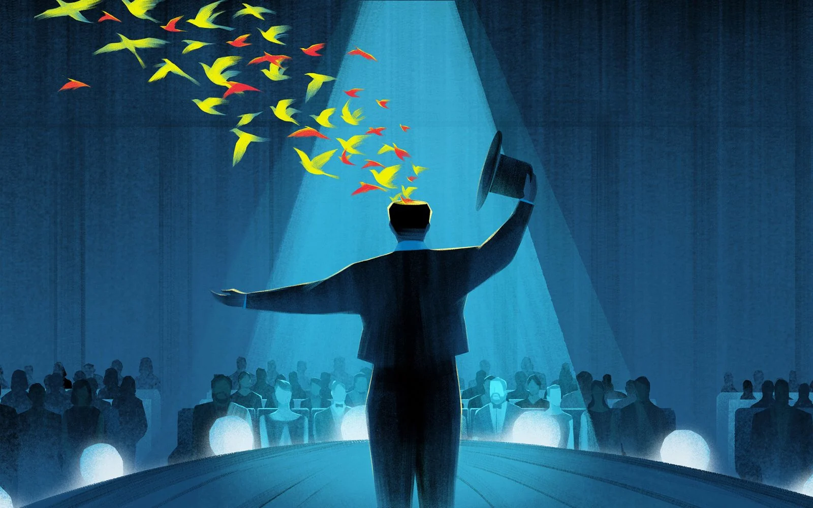
For example, there’s a man presenting a colorful flock of birds flying out of his head, made for a book review about a former magician. The author of the book shared tricks of the trade that could be used by everyone in everyday life. “Because the writer used to be a real magician, I thought it might be cool draw him as one, opening his mind and showing his unique thoughts to an audience.”
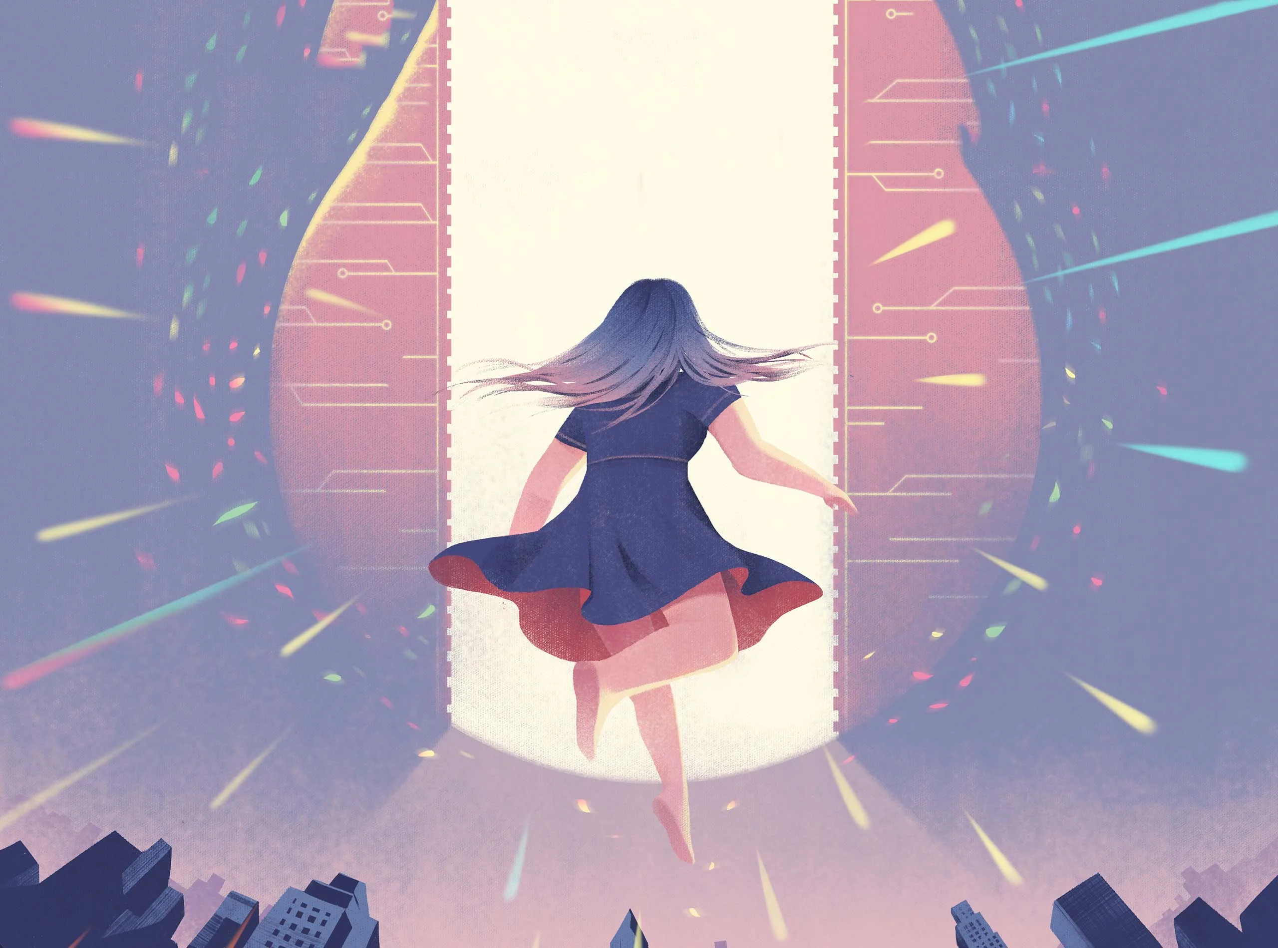
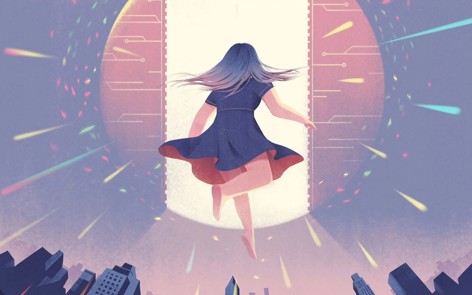
The young girl in purple who leaps forward into a futuristic-looking machine, was commissioned by Planadvisor magazine. “The article was about retirement funds, and I thought how investing in them was like predicting the future. It reminded me of going into a time machine, so I drew something sci-fi and a little magical.”
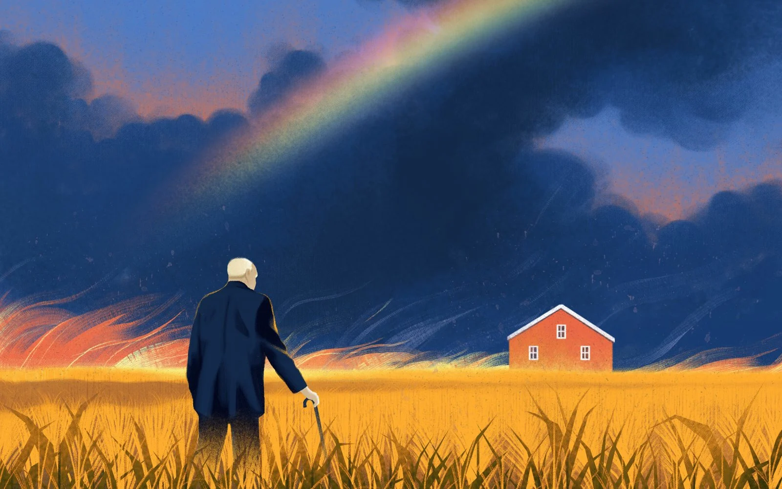
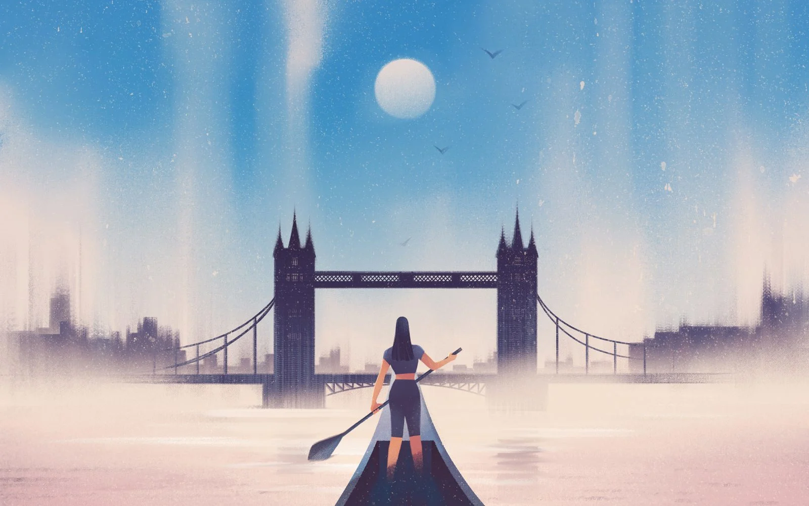
The artist often draws people facing backwards, or in profile. She hopes this allows readers to relate to the piece better. “If you can’t see people’s faces it’s more about the situation, or the context. With a little bit of fantasy, you, or someone you know, could be the guy in the theater watching the gay couple, or the black man standing in front of the museum,” she explains.
Like Rothko, colors play a vital part in Jasu’s work. With different gradients and hues she makes each illustration come to life. “I like it, especially for really big areas, as you’ve probably seen by now,” she laughs. “Color can really bring emotion into a piece.”