
As part of a new series, WeTransfer teamed up with US-based indie game platform Kill Screen to explore the design stories behind some popular games. Here we explore the weird and wonderful world of and how its signature look and feel evolved.
Samuel Boucher has been seeing faces of late.
“They call it pareidolia, when you think you see faces in ordinary objects,” explains. “It’s not that I walk around looking for them, but I’m always finding a face on a wall, staircase, or a coat hanger.”
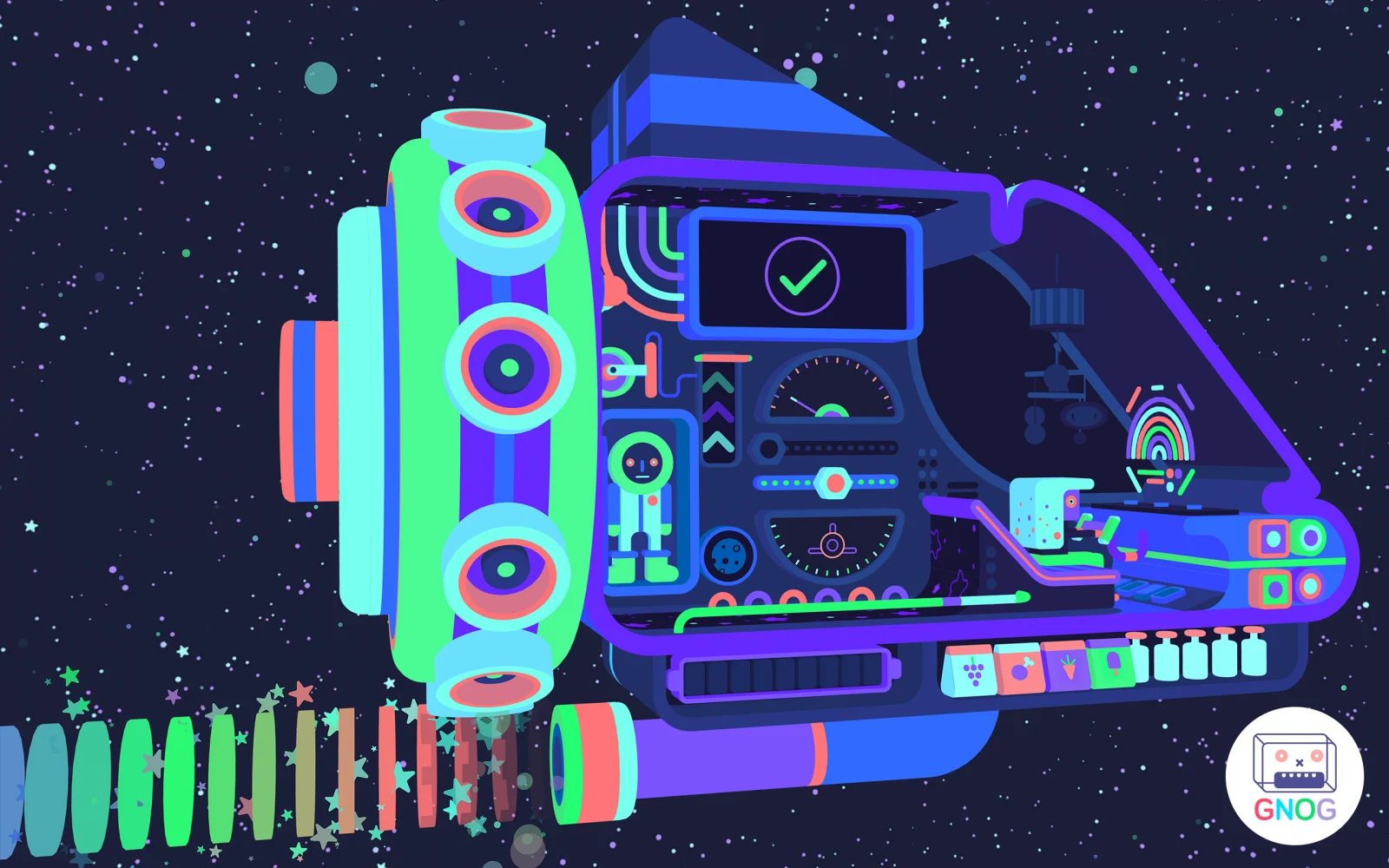
There is an explanation for this, of course. As the art and design lead on Gnog, Sam has spent the past three years breathing life into the game’s vibrant, playful levels, which just so happen to be faces. The game, released on PlayStation 4, iOS, and PC in May, tasks players with solving a series of charmingly face-shaped puzzles. Therefore, Sam has been paying close attention to how to design the perfect face.
“We have a giant wall at the studio with about 50 or 60 very primitive sketches of ideas for faces. Some worked. Some didn’t. But ultimately, the designs that made it into the game were the ones that told a story. We used the faces that we could build a pleasing little storyline into,” Sam says.

His favorite face for example, has a candy shop inside of it. As the player goes about cranking the gumball machine’s handle, or tapping secret codes into the squares of a chocolate bar, the story of the candy shop twists into shape. Sugar-hungry children hungry fill the aisles. The shop is renovated. Life is great.
If it’s not already obvious, these are no ordinary faces. Most of them are delightfully strange, combining Sam’s aesthetic with the nonsense logic of fairy tales. “I wanted to make different themes collide,” he said. “The first level is a big frog head. But inside the head, it’s a bedroom. It’s cool because it juxtaposes the idea of a bedroom with the nature that surrounds the bedroom outside the window.”
A good face, like the frog’s, or the submarine face that has a little man diving for treasure inside, is not only whimsical, but fun to play with.
“With Gnog, the visuals aren’t only this beautiful thing that solely exist to be beautiful. It was really important for the artwork to function as part of the game. Every single piece of the design needed to do something and be relevant, because we didn’t have a lot of space to work with – only the front of the back of the face. Every part of the design had to be interactive,” he said.
With a minimal style like mine, people will notice it right away if something is off

One of the biggest challenges for Sam, who was working on his first game, was learning to wrap his trademark artistic style around an interactive space.
“At the beginning of the project, I was throwing as many ideas as possible into one image. But when designing visuals for a game, having too much detail confuses the player. Also, with the software I was using, I couldn’t do weird tentacle shapes, or blobby things. I couldn’t go too crazy.”
In short, he had to simplify. “But simplicity is very hard. With a minimal style like mine, that’s very square and symmetrical, people will notice it right away if something is off.”
These constraints proved difficult, but brought about Gnog’s bright, joyful faces. In the end, Sam’s style proved a perfect fit. “I’ve always drawn faces. I’m fascinated by them. When I was younger, I always drew characters with small bodies and big faces. Maybe it’s because of my lack of skills at drawing poses. Eh, screw the body, I’ll just draw a face!”


