

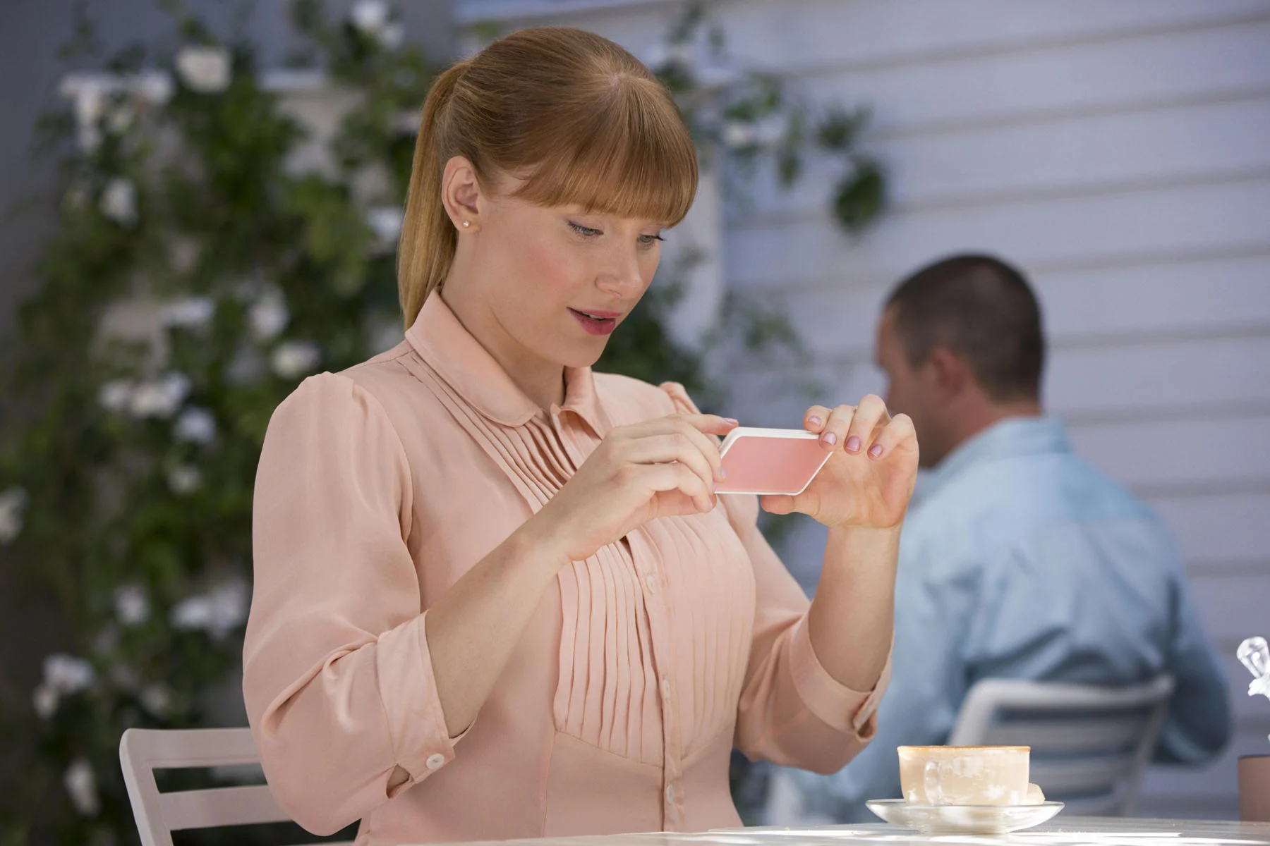
Joaquin Phoenix as Theodore in the romantic drama “HER”, directed by Spike Jonze, a Warner Bros. Pictures release. Image courtesy of Alamy.
Powered by a new wave of designers working in the realm of Fantasy UI, imaginary interfaces for fake apps keep popping up in every genre of film and TV. How do they operate as part of the plot and what do they say about our own technological habits? Writer Kyle MacNeill pinged five pioneers to find out more.
Fifteen years ago, Apple’s The App Store was officially opened with a tagline to boot: “There’s an App For That”. It checked out. Within just a year of opening up shop, its digital shelves were stacked with over 100,000 software packages. Form and function were far less important than fun; who cared about poring over a spreadsheet on an Excel port when your phone could suddenly pour a pint, turn into a harmonica or answer whether it’s light or dark outside?
As hyperactive developers applied themselves to making a quick buck, designers were getting to grips with mastering new approaches to User Interface (UI) and User Experience (UX). Of course, apps weren’t entirely new; they’d been envisaged by Steve Jobs exactly fifty years ago at the 1983 International Design Conference and mobile games stem from 1994, when a form of “Tetris” was pre-installed on the Hagenuk MT-2000 phone. Equally, UI has in some way been around since computers first booted-up and UX was coined in 1993 by Apple’s Donald Norman to describe the increasing interactivity of software.
For the first time, though, apps had become mainstream and designed for small screens, integrated into our everyday experience. Since, as the age-old adage goes, art imitates life; film and TV set in the present had to represent characters using apps on their phones for the very first time. What, though, if in your narrative setting—in either a future or a fictional universe—there wasn’t an app for that just yet?
Enter FUI – known variably as Fantasy, Fictional or Fake UI—imagined interfaces used in the world of entertainment. “It’s basically user interfaces designed for fiction, examples of this can be seen in anything from films, video games, to concept cars and future vision projects,” Jono Yuen, author of “FUI: How to Design User Interfaces for Film and Games,” says.
Over the last fifteen years, FUI has skyrocketed, continually upgraded. Its development has been generated by two drivers: new technology to represent and new technology to help with the representation. “There’s been a huge increase in TV and film,” Yuen says. “I think some of it is awareness, people have gotten used to technology being part of our lives and understand it better. Also the introduction of more mainstream examples of FUI has made it easier for viewers to reference and appreciate its effectiveness as a communication device.”
UI, now, isn’t just controlled by you and I. It uses us, too, tracking us, tracing us, tricking us.
Now, it’s become an entire (increasingly less niche) niche of the industry. “A lot of FUI design specialists come from a background in motion graphics and VFX but I’ve met designers from all walks of life,” Yuen explains. “Particularly in the beginning when there wasn’t enough demand to warrant specialists, the work was often given to people in adjacent fields. This niche area of design has evolved substantially now though, to a point where designers have started their careers dedicated to the space,” he continues.
But what’s the aim of FUI? In some cases, it’s simply to make phones seem real or narrative settings function as a whole. Rather than foreground the tech, it’s often used in the background, sometimes designed specifically for the film or show due to copyright reasons. Finder-Spyder, for example, is a bogus Google featured in countless major films.
Often, though, it’s in place to picture possible futures, used in Sci-Fi flicks and dystopian dramas to tap into our fears around AI and Big Tech or to imagine utopian solutions. “A lot of it is about imagining interfaces for situations that don’t exist yet, so the appeal is that they often showcase innovative and imaginative solutions that stand apart from everyday life,” Yuen explains.
On top of that, FUI has entered the writers’ room, contributing to the narratives of our favorite shows and movies in increasingly major ways. This app-first approach is apt; our lives are now hardwired to the apps we use, making us less of a main character than we once were. Anyone that uses Health for iPhone already literally eats, breathes and sleeps apps; but they can also help us make money, find love, learn languages, have children and organize our own death. Our DNA now lies digitally behind our fingerprints.
UI, now, isn’t just controlled by you and I. It uses us, too, tracking us, tracing us, tricking us. UX, meanwhile, is so ingrained in our universal experience that changing it can bug us out. Just look at the recent reaction to X and Elon Musk’s decision to clip the wings of the beloved blue bird.
If a lot of FUI has it right, we’ll never again be—in the original sense—left to our own devices; our devices will own us. For now, though, sit back and immerse yourself in the fictional interfaces of five futuristic shows and films—“Black Mirror”, “Her”, “Extrapolations”, “Ted Lasso” and “Red Rose”—hearing the creative process from the—thankfully for now, human—designers.
1.0: Black Mirror
Charlie Brooker’s dystopian anthology series has become so central to our vision of the future, its title is now shorthand for it: It’s like something out of “Black Mirror”. First commissioned by Channel 4 in 2011 and later bought by Netflix in 2015, the show’s twisted episodes imagine what’s imminent, feeding off fears surrounding surveillance culture, data leaks, altered consciousness and artificial intelligence, sometimes venturing into parallel, supernatural universes.
The key to the show’s art direction was making the tech feel possible. “The future may not be so fantastical,” says Joel Collins, series designer for “Black Mirror” and director of creative studio Painting Practice. “And so if we want to connect to the audience let’s keep our visual feet on the ground. People are so keenly aware of tech that it always needed to stay plausible,” he adds. Much of the time, the tech is domestic, personal and portable. It had to feel like the phone you’d have five years from now.
FUI was vital to realizing these new realities, but was a means, not an end. “FUI is a bit of magic at the heart of visual storytelling. If we’ve done our jobs right, the viewer is pulled deep into the story, fed clues or key plot points without any distraction or any question that this UI belongs in this world and to this story,” says Erica McEwan, the graphics art director. Gemma Kingsley, the motion graphics art director for many of the show’s episodes, agrees. “Fantasy UI should be a tool in guiding the viewer to the story, it should not be the story in my opinion. It’s one of many tools on a film or TV show that brings things to life without being too overwhelming and out of the realm of belief,” she says.
This believability is what makes the show as unheimlich as it is unhinged. But while the FUI is for most parts seamless, there are turning points where it breaks, glitches or bugs out. Here, we’re left with the literal Black Mirror of blank screens and shattered displays, drawing attention to our own experiences of apps crashing and phones dying. Suddenly, we are confronted with the unreality of the world we were moments before immersed in, staring not at a user interface, but into the face of the user: ourselves.
1.1 “Nosedive” (S3, E1)
Lacie, living in a society where status is determined by rating every single social interaction on an app, has her sights set on a higher score thanks to an invite to a lavish wedding. Nothing, though, goes to plan and she spirals towards becoming a social outcast, liberated by a new freedom to act out. Shot in pastel pink, its palatable ending and softer palette proved a turning point in the show’s canon.
Erica McEwan: The pastel aesthetic most definitely came to us from the production design (Joel Collins and co-designer James Foster) and director Joe Wright. Despite how drastically novel the color palette may have seemed at first for the show, the essence of the “Black Mirror” aesthetic is there in spades. The UI design of the Nosedive social media and ratings were no exception—their success heavily relied on reminding us of our own social media, even if they were on a pink device!
Charlie was always shining a light on what was around the corner, and I feel he nailed the timing of the beige influencer trend in this story for sure. In a world where we were all starting to be rated as users of Uber, the Rate Me app was beautifully horrific! It made it all feel very real, even with its tongue-in-cheek objective.
Joel Collins: When the story came in from Mike Schure and Rashioda Jones it was set in LA and has a sense of reality in it. I was keen to elevate this one episode as I worried it may feel too close to reality, the opposite of our normal way of thinking. I pursued a tone like “The Truman Show” and a world that had an almost plastic way of living, or at least for those with high enough ratings and money. When Lacie reaches her lowest ebb you almost reach a reality we understand.
The colors were part of the controlled palette. The idea was to numb down the world and make it smiley and happy and worthy of five stars. The tech needed to be soft, matte and not glossy. We created what we felt Apple may have done in this instance, tech and apps that worked to elevate this society. We also worked on the uprating and downrating sounds while creating an actual in-phone app, testing it locally in shops near Twickenham Studios. Pretending to buy a coffee and give five stars for service was both funny and very dark!
1.2 “Fifteen Million Merits” (S1, E2)
Set in a world where the majority of society cycles on exercise bikes to generate income, living in box rooms wallpapered by multi-purpose screens, Bing meets Abi and persuades her to enter a talent show. Offered by the head judge to join the pornography stream instead, Bing is forced to watch and becomes determined to fight the system.
Gemma Kingsley: From what I can remember this was a very tricky one, not in terms of design, but the technical side on set was a mammoth task to undertake. It involved inputting the graphics the night before and then on the morning of the shoot running through it with the actors to show them what they needed to do with the graphics; there was a lot of choreography involved, it looked great but it was a very difficult job. The gameshow vibe was all down to Charlie and his ideas of what it should be.
McEwan: It was all about a constant dopamine hit; more points equals more “power ups”. Games within a game within a life that functions like a game. Charlie is a video games guru, so there was no shortage of direction on how everything needed to work, interface and functionality wise. He was very vocal about that. The gamification of the whole world, especially the points system was crucial to the plot and the point he was making with this story.
With a relatively low budget, there was no chance of doing this episode in post-production. So Joel and Dan built the entire set out of screens. A prehistoric volume stage you might call it! This meant meticulously planning on screen playback for every set, every environment and every part of the UI within an inch of its life. With almost no physical graphics to manage on this episode, I hopped over (literally) to Painting Practice to join Gemma, Graeme and the animation team in rolling out hundreds of sequences we needed to play live on set.
Once we got on set, the compressed television schedule was super tricky; there was little to no time for rehearsing the cues with Daniel (Kaluuya, the lead actor) or the playback team. I remember bleary-eyed 6am starts where Gemma and I were dialing in the day’s animations with the technicians only moments before we were turning over. It was so, so tight!
1.3 “White Christmas” (S2, E4)
Matt and Joe share three stories in a cabin on Christmas Day. One follows a digital clone, known as a “cookie” of a wealthy woman called Greta, whose consciousness is trapped in an ovular electronic device. She lives out her days in a minimal, white room with a single control panel, acting as a virtual assistant.
McEwan: The cookie story in the portmanteaus followed a very aspirational and utopian smart home aesthetic. Elegant in both form and function—everything in her (main character Greta’s) home was “smart”. Seamless automation to everyday tasks. This design direction led the way for all the FUI. Everything from the interface on her coffee machine, to her calendar and of course the control desk in the white room, was seamlessly integrating the graphic language into the physical space. The idea was to follow the cues from the set and prop designs for all the interface design choices—typography, shape, the monochromatic palette.
Kingsley: I think here it was supposed to be mechanical and robotic as the character is essentially acting like a robot. I think Joel designed the set to have the look for this reason. Along with Charlie they developed the clinical feel that made the graphics a little more simple to create. I think it was all supposed to be smart home tech but the charter was not supposed to have anything that could distract her from her miserable duties day-to-day. The monotony of it is apparent in the lack of distractions from her job role. This played into the design for the UI.
1.4 “Entire History of You” (S1, E3)
Humans are now able to replay their memories in their mind’s eye thanks to the Willow Grain implant, which also records every single second of their experience; you can scroll through it and press play at any time. At one point, this is featured as a holographic app in a taxi.
Kingsley: I helped create the Taxi UI graphic interface. I wanted that to look clean and futuristic, but again without being too far-fetched. That's why the design wasn’t too complicated, I kept with the look being similar across the episodes as Charlie wanted; nothing too far-fetched but we liked the idea of it being holographic to create the future look. I had a couple of emails about where we got that technology from actually! I had to break the news to them that it was all done in post-production and not actually real. It was good to know it looked so real.
2.0: Her
A bittersweet romance set in 2055, “Her” (2013) sees futuristic love through rose-tinted smart glasses. This vision, though, soon reveals a thorniness and wilts. Focused on the sensitive Theodore Twombly, who ghostwrites letters and cards for emotionally illiterate clients, it sees him purchase an operating system voiced by a virtual assistant, Samantha.
Falling in love with her, he navigates societal stigma and sex surrogacy, enamored by her magnetic enigma but also made uneasy by her infinite intelligence. Briefly losing her after an app update, he discovers that she is speaking to thousands of other users and has fallen in love with several hundred, before she reveals that the system’s AIs are all leaving for a parallel universe. Theodore, still lost in adoration, heads onto his apartment rooftop, finally untethered from his screen.
Rendered with a tenderness, its dreamlike, wistful aesthetic has already become iconic. For Geoff McFetdrige, the film’s graphic designer, though, the plan was to create a UI without icons. “I have not done any apps or interface, but I have done a lot of work around icons. The visual vocabulary that I have developed purposefully lends itself to explaining complex thinking through simple imagery,” he says. “With “Her” I knew I had to create work that was post-icon. There should be no pointing and clicking.”
While the apps didn’t have to be functional, the fact that they had to feel like they were made the project equally challenging.
While the apps didn’t have to be functional, the fact that they had to feel like they were made the project equally challenging. “The task was overwhelming. Even though nothing I created for the film had to actually work, I still had the sense that I was trying to do something that entire teams of experts struggled to do,” he says. Shaped by a vision that using UI should be like clay on a potter’s wheel—something that forms a shape over time that’s molded by our own use—McFetridge prototyped designs using clay, wood and cut paper. “I felt that I had to think through the first sketches of the interface without using current digital tools,” he says.
Uniquely, “Her” pictures the future in a positive way. “The main direction I was given (by director Spike Jonze) was that the future is nice,” he explains. “This was a pretty useful direction as “nice” futures are incredibly uncommon in science fiction. Dystopias and some Utopias are seen, but the “just nice” future was hard to see,” he says, wanting to avoid the “overly busy walls of transparent data and gibberish” often represented.
The hardware is equally clean. Inspired by the costume designer KK Barrett bringing in cigarette holders and compact makeup, he created the small, pocket-mirror-like device used by Theodore throughout. Neither a prop or interface designer, he feels his outsider status helped. “As a designer I knew how to create images for the purpose of clarity,” he says. “As an artist I knew how to create a tangle of unexpected and abstract visuals that could appear alien and unexpected. I was always aware of how “wired” the audience for the work I would do was: we are all users.”

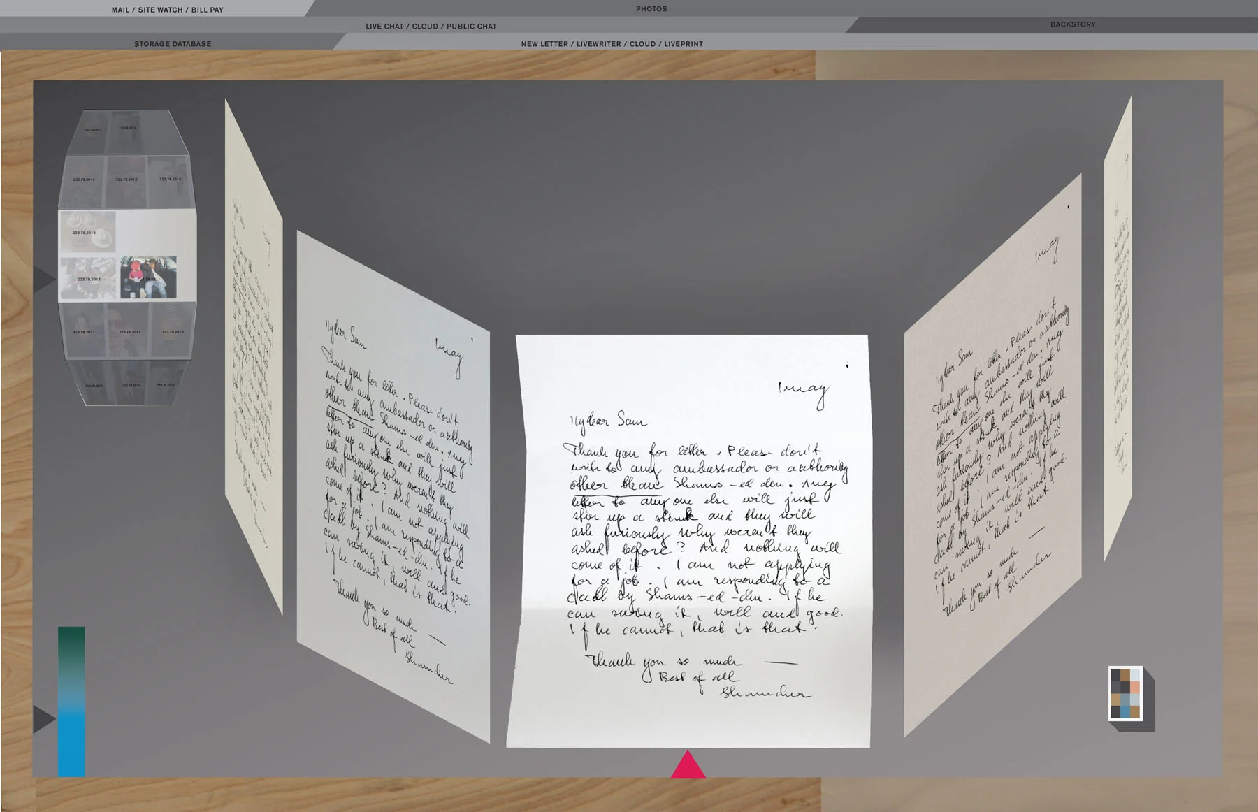
2.1 Beautiful handwritten letters
Geoff McFetdrige: We worked on many many versions of this scene. The use of handwritten letters in the near future proposes that we have gone full circle many times from analog to digital in our communication. The most important thing was to keep the viewer from being confused, and to be engaged in what was going on. Simple tropes like a “carousel” of photos and handwritten letters read out loud very quickly gets a lot out of the way for the viewer to start to put together what sort of future this is going to be. The film starts to announce that this is not a flying car future. As for the interfaces, the screen shows how color, texture, and spatial depth combine.
“This is very close to the final letter-writing screens. The final solution was very simple. It employs my eye for color and icons that are both believable but confounding. The main purpose was to keep the scene in the film simple but to have some light sci-fi depth.”—Geoff McFetridge
2.2 The LA Subway map
McFetdrige: This element could have been treated as an afterthought but we saw it, just like every detail, something that could add to the film. In the end it gets mentioned a lot. Partially because a still of my artwork was put out on the internet. Everybody knows that one of the problems with Los Angeles is the traffic and the need to drive to get anywhere. So, if the future in “Her” is “nice” then this had to change. The map is my dream of a Los Angeles connected by a super efficient public transport system. The train goes everywhere, including unexpected places (that I love); First Point Malibu for surfing, the Angeles forest for camping and skiing and to Gorman for dirt-biking.
“I think through drawing and writing. So everything you ever see from me was at some point a small sketch or notation. In these images I see sketches for logos and icons that I eventually made as 3D paper models. I was trying to create work that fast-forwarded me through decades of interface design and technological evolution. I have total faith in drawing as a tool to do that. It is truly a powerful technology, capable of magic on walls of caves and for creating notations for concepts that are beyond language.”—Geoff McFetridge
2.3.1 Samantha’s UI: Sorting through files
McFetdrige: I definitely can relate to an overload of digital (and analog) clutter and the dream that someone out there could take care of it for me. Theodore’s life is not without our familiar stresses and stresses. The future is nice, not a utopia. This scene was our version of a flying car in past sci-fi. I think there was a part of me and every viewer that feels a bit of “wouldn’t that be rad” when they watch it.
“A sketch for when a disorganized desktop appears. This was an early exploration of using paper models and graphics to make an asteroid field-like space. A sort of stressful version of an interface based on using 3D space for productivity.”—Geoff McFetridge
2.3.2 Samantha’s UI: Operating System Not Found
McFetdrige: I think we all know that combination of relief and despair when our phone runs out of battery or we take a trip into the mountains or some place where there is no cell service. So, we have something to compare this scene to. For Theo and the story this is devastating, it is a type of loss that is more like a break-up. Something most of us also understand. A connection is made that is unexpected and I think we feel that deeply, we feel our own wiring and it is powerful.
2.3.3 Samantha’s UI: The logo
McFetdrige: An aspect of my work is, familiar, with a twist, or cliches you have never seen before. The logo for the UI is an infinity symbol but with three loops. It is both funny and philosophical. The third loop could be “this one goes to 11” or a graphic to represent the unseen, the interconnectedness, God, the dimension outside of our understanding. A loop that proposes that even our current understanding of infinity is…finite. (Strangely, 10 years later, it is also very much like the new Meta logo.)
3.0 Extrapolations
An anthology for the anthropocene, “Extrapolations” weaves together a range of climate-centric stories that are progressively set further in the future. Starting in 2037 with society on the brink of political chaos due to global warming, its next seven episodes span over thirty years, looking at new technologies that connect animals and humans, the rise of eco-terrorrism and our adaptation to a hotter planet. A vast range of interfaces are used throughout, from data displays to video games to whale noise translation software.
“FUI should both suspend disbelief and show a possible future…if the viewer begins to question a UI, this pulls them out of the show,” says Cody Healey-Conelly, motion graphics designer for “Extrapolations”. To achieve this, the team employed a consultant. “For the near-future setting of “Extrapolations” we had a number of meetings during pre-production with a “futurist” from Apple who helped advise the creative team,” Douglas Huszti, supervising art director, explains.
To create a sense of time passing, the technology evolves over each episode. “The tech along with the UI was conceived over advancing over time; for instance, phones become wearable and wired into the user’s body,” Huszti says. Apps also become more intuitive; “We got rid of a lot of menus and instead tried to think of ways software could be used with gestures, eye movements, speech or thoughts,” Healey-Conelly explains. “The idea that anything can be a monitor was put forth early. Also, that as time progressed, tech would be less noticeable,” adds Huszti.
To create a sense of time passing, the technology evolves over each episode.
Part of the challenge was replicating our real world’s cyclical design trends. “We talked a lot about retrofuturism and how the pendulum swings back and forth every few years, with each subsequent version of technology responding to the tech that went before it,” Healey-Conelly says. This is, in its own way, an act of extrapolation; using past events to imagine future outcomes. So, of course, is the modeling of climate data that drives the show.
“Extrapolations” doesn’t just use past UI to create FUI, but also draws on the context of the present, ever-shifting in its narrative, to inform its design. Apps are a product of their environment and that includes the actual environment too; as our lives become further entangled with the effects of the climate crisis, our screens will increasingly reflect this, switching store credit for carbon credit or weather forecasts for alerts on whether it’s safe to go outside. Even texts have a context of production.
3.1 Speaking to whales
Cody Healey-Conelly: The whale listening station UI was extremely dense with sliders, buttons, and selections jammed into the interface. I wanted to convey to the viewer how complex an app would need to be to translate whale sounds into human speech and vice versa. As we are never really shown explicitly how the apps work, I felt like making the UIs dense was a way to quickly portray how complicated the technology was, without getting into the nitty gritty of showing exactly how it functioned. It was super important, though, not to cut corners.
“This was a challenging graphic to make as Phil Mesina (production designer) wanted something that could functionally translate whale sounds to human speech. The graphic was built with a UI at the top right that implies this process can be done in multiple languages as well as at slower and faster speeds. The top right has a drop down menu: the listener can select what human voice they want to read out the whale’s speech. In the case of “Extrapolations” that is the character’s mother, played by Meryl Streep.”—Cody Healey-Conelly
3.2 The use of holograms
Douglas Huszti: I am pretty sure that holograms will become a reality at some point, and I think our “futurist” consultant said as much. It is funny how “retro” they can feel now, given things like “Star Wars” from the 1970s.
Healey-Conelly: I don't think it's a retrofuturist idea, I think we just haven’t hit on the right technology to make a convincing hologram a reality yet. For instance, Microsoft’s HoloLens has already started working with video calls as holograms and I believe it was CNN that had hologram hosts for the presidential election in 2020. I think given how ubiquitous video chat is now, it only makes sense that there will be more versions in the future that bring video chat closer to the experience of speaking with someone in real life. I think currently the technology hasn’t been achieved to do holograms in a way that feels comfortable for people to use. At the moment, you need to use AR or VR to have an experience that is somewhat convincing and doesn’t cost thousands of dollars. I think once we start seeing tech that can generate holograms at a price point that is realistic for most consumers, the tech will catch on.
“This was designed to function as an entry pad to the underwater whale listening station in Episode 2. There are no buttons or UI to the graphic as the idea was that the biometric readers were advanced enough to allow access based on fingerprint input alone.”—Cody Healey-Conelly
3.3 The future of our planet
Huszti: Climate change disasters have only recently become a little too real for us all, and having art directed the series, I have become acutely aware of them. Before a few weeks ago, I really didn’t know what the air quality index meant to me and my loved ones, but given Canada’s wildfires, that has definitely changed. The flood in Miami in Episode 3, too, also hits a little too close to home. Episode 5 features the idea that the Indian daytime temperatures are too high and people have moved to a nocturnal schedule. This doesn’t seem terribly far-fetched.
“As far as I know, this graphic did not make the cut. It was made to be used in the White House situation room in Episode 4. This graphic represents a map of aerial threats across the globe—in this case, the drones that are going to spray sulfates into the atmosphere. For the most part, the graphic was supposed to sell the idea of the sulfates being dispersed globally, which is represented by the white dots spreading across the globe map. For the most part, the rest of the graphic just shows vague aviation data, altitude of the drones and local positioning.”—Cody Healey-Conelly
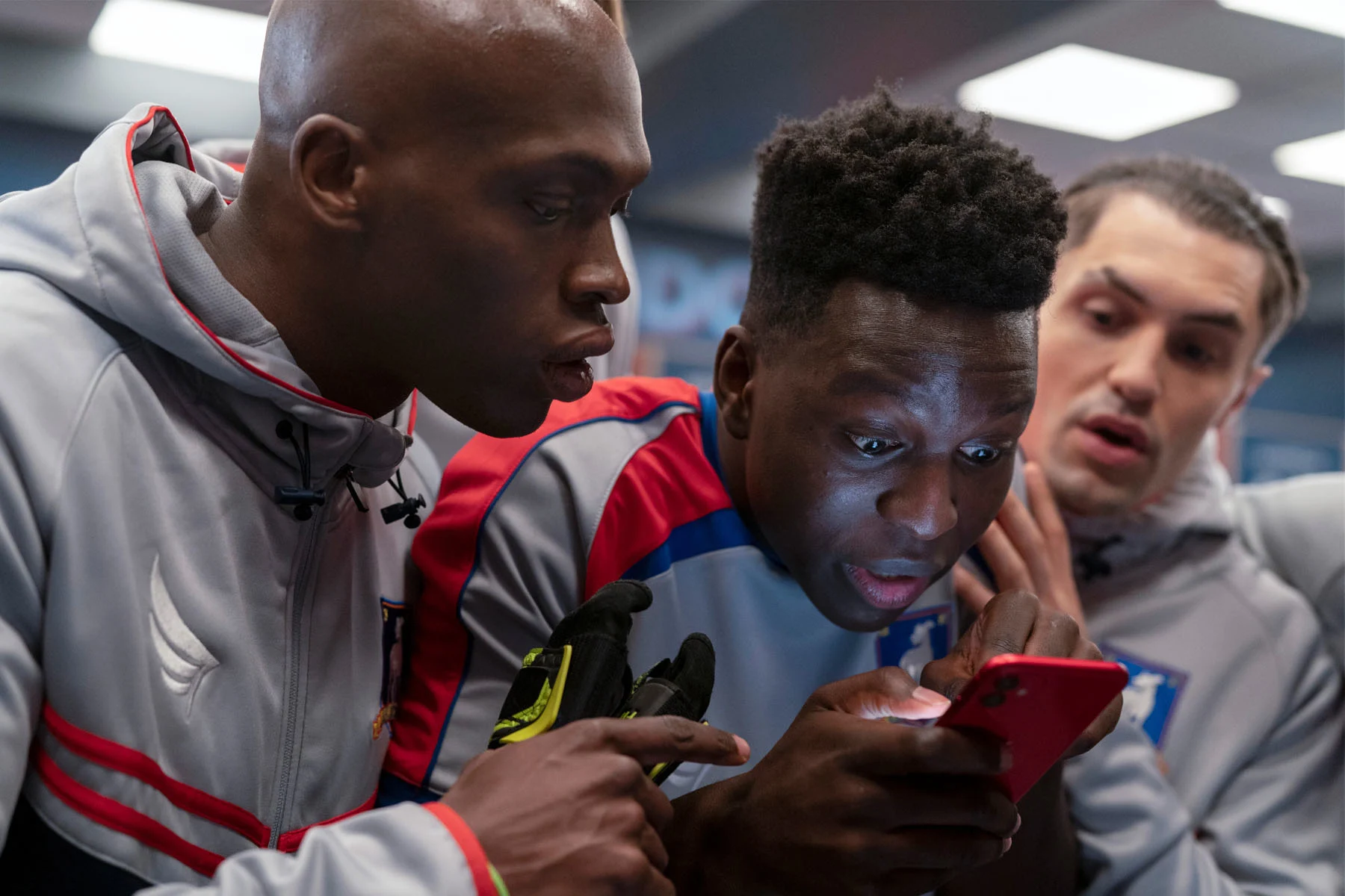
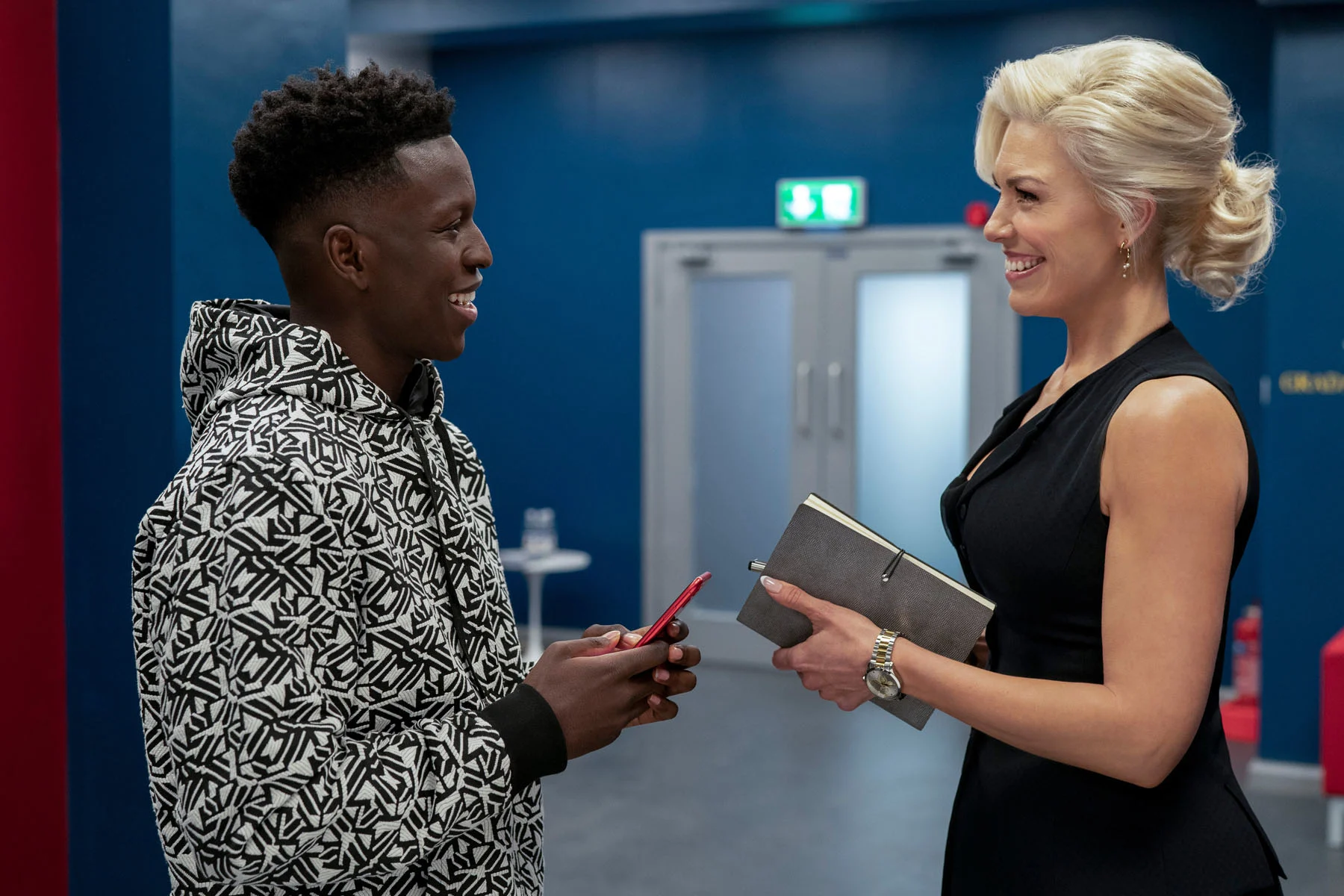
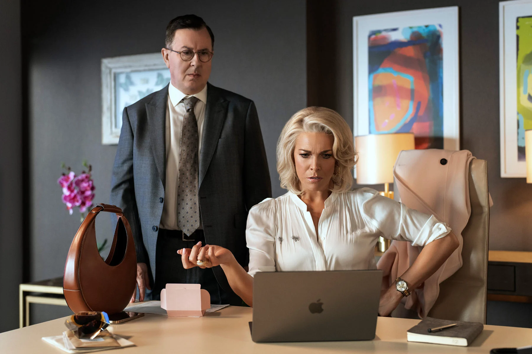
4.0 Ted Lasso
Based on a character created by Jason Sudeikis for NBC’s ads for the Premier League, comedy-drama “Ted Lasso” follows an NFL coach appointed by football team AFC Richmond as their new manager. Originally recruited by Rebecca, the owner of the club, to get back at her jaded ex and AFC fan, Lasso turns out to win over the players. Drama, though, is rife, forcing Lasso to tackle tabloid journalists, sex scandals and revenge plots.
On its playing surface, “Ted Lasso” has nothing to do with technology. Devices, though, abound; the show is filled with pinging iPhones and iPad screens, partly due to it being produced for Apple TV+, proving too much for some critics. The designers, though, were careful to not foreground the UI. “We tend to treat the apps or UI tech merely as drivers…for phones, apps and computers they tend to be relaying information, exposition or underscoring a period or time of the production,” says Paul Cripps, production designer. “My job was to keep the world real and believable and this was true of all the technology. We really got people believing in them,” he continues.
We tend to treat the apps or UI tech merely as drivers…for phones, apps and computers they tend to be relaying information, exposition or underscoring a period or time of the production.
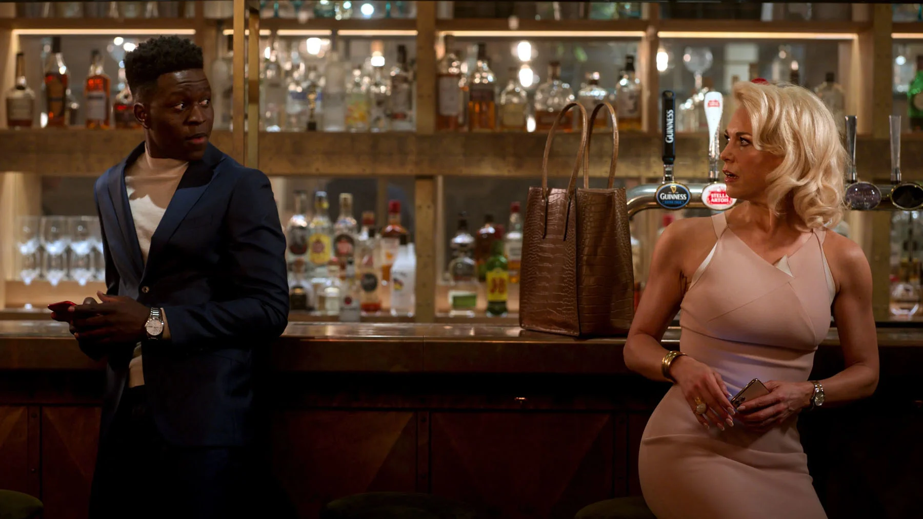
While most of the “Ted Lasso” tech is intended to feel real, even anodyne, one app is foregrounded: Bantr. A fictional text-based dating app, it proves central to the story; its anonymous messaging and lack of imagery allows Rebecca to unintentionally start a relationship with one of her players. As part of the show’s promotion, it was turned into a real release with the help of dating app Bumble; Bantr Live became an in-app game which allowed users to chat for three minutes without imagery every night that the show was aired.
While the show’s design team wasn’t involved, they were excited to see their designs in action. “It’s really interesting where your designs will crop up next,” Cripps says. “I’m glad to see people are buying into the idea of emphasizing personality over looks when it comes to selecting someone you’d want to spend time with,” Luiza Pissurno, a graphic designer on the show, adds. In this sense, Fantasy UI isn’t dystopian but hopeful, providing a blue-sky blueprint for an actual app.
4.1 Bantr
Paul Cripps: The idea for Bantr was really invented as a plot device to allow the relationship between Rebecca Welton the club owner and Sam Obisanya her player to develop and flourish without them knowing who each other really was. Hence the app had no photos; I guess it’s a little like dating via Twitter.
The app allowed the will-they, won’t-they thought processes of Rebecca and Sam to be slightly played with, as the “writing” animation of the little clouds allowed people to think they were about to get a message but then didn’t. This is an experience we have probably all had through WhatsApp with the “typing” message and Jason was quite keen to have this animation as an element of the app. I think we looked at the visual look and elements of various message and dating apps including WhatsApp and Tinder and went through a number of different colourways for the text screens.
We wanted it to be easily understandable for the viewer and the text needed to be visually clear to read off a phone or device on screen when relating messages. The app also became useful as the way to replace the disgraced DubaiAir Airline company as AFC Richmond’s main shirt sponsor and then the brand took off on a life of its own.
Luiza Pissurno: It was always supposed to be a dating app with no photos, as it is an important part of the storyline. I believe the aim was to highlight personality as more important than looks because it lasts a lifetime. To create a design based on this premise, I researched what dating apps look like today and what webchats looked like 20 years ago, when users just had a nickname and no photos. I downloaded some of these apps to gain the UI perspective and inform a design that is original, yet looks real. If anyone watching the show believed, even for a second, that Bantr was a real app, then my job is done.
4.2 Twitter
Pissurno: Nate relies on Twitter for self-affirmation as a football manager. He seems to always be in a competition with Ted, and this has been created by Rupert. As per the interface, every show has its own rules. On “Ted Lasso” we were allowed to see the real Twitter interface because it had an agreement with our production company. I created the Twitter pages and some of the memes but before we shot each scene, Twitter had to approve the graphic to make sure we were being respectful of its brand.
4.3 Apple
Cripps: Apple are rightly very protective of their tech in the series and they wanted to make sure anything we use is being interacted with correctly function-wise. We often put phone, tablet and TV screens in later in post-production and Apple are very insistent on the swiping and keying of phones being correct. They don’t want their products used in an inconsistent or unreal way which is totally understandable.
Pissurno: I believe the scriptwriters show Apple interfaces when relevant for the story, and that ends up being proportional to how much screen time we get in real life. I created the screen graphics (including websites, spreadsheets, and search pages) that we see on the show's phones, computers and iPads, and sent them to Apple for approval. It was very similar to the Twitter process.
4.4 The notchless iPhone
Cripps: An accidental, slight change of an iPhone in post-production (it appeared notchless, something that’s never been released) got a lot of the internet overthinking but I think was just a case of overzealous smoothing of a graphic element. At least that’s my reading of it. We weren’t accidentally heralding a new iPhone!
5.0 Red Rose
Tapping into our fears surrounding phone addiction, data privacy and social media challenges, “Red Rose” is a bildungsroman built on our endless roaming. Released as a batch of episodes on BBC iPlayer in 2022, it follows a group of phone-obsessed school-leavers as they navigate teenage romance, angst and grief.
Coming across an app called Red Rose, group leader Roch becomes addicted to it, increasingly manipulated by the tasks it gives her. Beginning to humiliate her and isolate her from her friends, the show becomes a UI-dunnit, following the group’s attempts to track down the developers, free themselves of their own devices and discover its origins.
It’s the first example of an entire show framed around (and named after) an app, making FUI its focus. “We think that anything to do with UI, fantasy or otherwise, really depends on the world in which it exists. We wanted Red Rose to feel as realistic as possible,” says co-director Michael Clarkson.
Addiction to technology is real. The design is an integral part of how long we’re willing to play with whatever it is that’s on our phones.
The key to making it addictive for both the characters and the viewer was creating what developers call stickiness. “It has aspirational qualities that would entice the user—teenagers, namely—to continue to interact with it in order for Red Rose to fulfill its dark purpose,” he says. To make it a viable app, Clarkson and the team consulted digital media expert John Bond. “It was to make sure we weren’t just fabricating technology. Conversations with him were actually rather terrifying as he explained how the made-up plot we wanted to generate for “Red Rose” can actually be achieved in the real world.”
Although much of the plot unfolds on the characters’ screens, apps other than Red Rose are left to blur into the background. “The director’s suggestion for the general design of phone screens was for an anodyne appearance,” Chris Barber, the graphic designer, wrote for his portfolio. “I created interfaces that were analogous, anonymous and familiar across different platforms.” Although a dating app called Krush plays a part in the narrative, it’s Red Rose that outgrows its status as an app, taking control of the group’s lives.
Perhaps the show’s most innovative detail, a mix of elements similar to Apple and Android with the aim of creating user though, is its use of different screensavers, social feeds and accessories; Ashley, for example, has Princess Di case to represent her obsession, while Roch’s case features a scrapbook insert and Wren’s is plastered in stickers. Aside from signposting which character is being focused on and symbolizing their personalities, it’s a reminder that while we can physically customize our phones, their inner workings—and apps running in the background—aren’t apparent or controlled by us.
5.1 Typefaces
Chris Barber: The director requested that the Red Rose app should appear on Rochelle’s phone outside of the usual UI parameters, i.e. as a contoured shape in the profile photo section, on the home screen and with its own unique color on pop-up notifications. As Red Rose begins its relationship with Rochelle under the guise of being her missing maternal presence, I chose a familiar, soft and friendly typeface of Adelle Sans. As the real intentions of the app were revealed—a dark web community—I changed the typeface to DIN, namely a slightly harder, more engineered, mechanical typeface designed for directing and controlling people in mass wayfinding systems.
5.2 Krush
Barber: Antony is hiding his sexuality from his friends and is secretly using Krush, a gay dating app, on his android phone with the script describing an “orange glow.” The script writer’s main reference for the cover design of Antony’s fantasy novel was “The Eye Of The World” by Robert Jordan from the Wheel of Time series.
Michael Clarkson: The orange glow is a nod to Grindr. We played with the idea of location tracking with this to make a moment take place within the story.
5.3 The glitchy TV
Barber: At Becky Fox’s house party the guests are having fun using a Go-Pro camera to stream themselves on a TV screen. The stream is interrupted by Red Rose with CCTV footage of Rochelle queuing at a food bank. There was a requirement for an odd glitch effect in addition to the usual security data overlay and noisy low resolution feel to be added to footage provided by the camera dept.
5.4 The user or the used?
Clarkson: Yes to all this. Addiction to technology is real. The design is an integral part of how long we’re willing to play with whatever it is that’s on our phones. Gone are the days of early internet and terribly designed websites. Visual aesthetics are key to selling whatever it is we want people to buy. It’s the same in the real world. As we said in the show—the user is the integral player in defining if reality has been lost. Education around mental health and how we use our phones is going to be essential so that we’re not the ones being used by it.