The creative process can be thought of as a series of decisions. But often, when the final project is out in the world, it's easy to forget those formative forks-in-the-road which shaped everything.
So we asked London-based design studio Sennep to share eight key moments which defined its mini-golf-meets-typography game, Alphaputt.
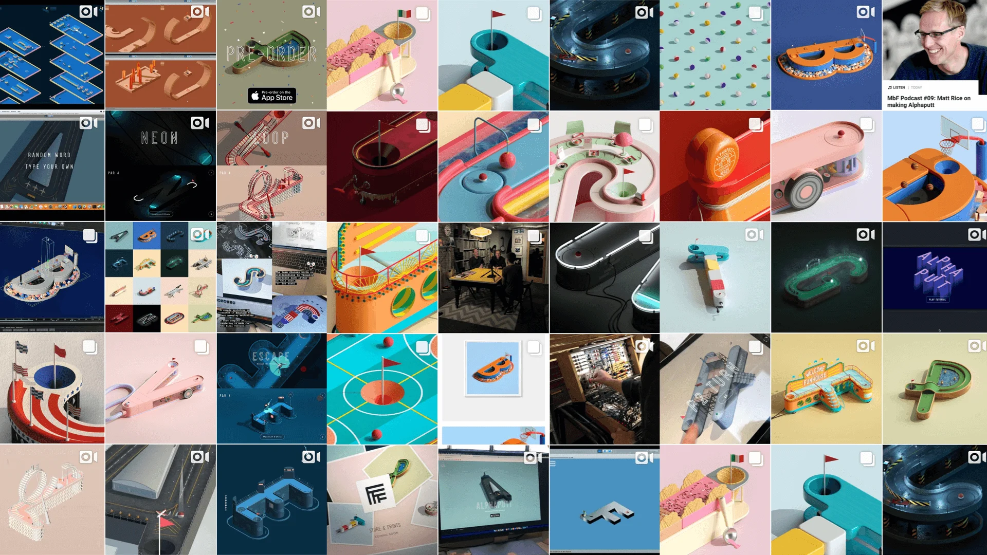
The studio's second game after the hugely popular OLO, Alphaputt is one of those brilliant ideas that sounds bizarre on paper. Players can "putt their way through the alphabet" in themed letter-based holes which include prison break-outs, UFOs and a chill-out garden.
It's a good way to learn about typography and it promises to be both beautiful and addictive as hell. Here are the key decisions that brought Alphaputt to life...
Decision #1
One personal project a year
The crucial first decision goes all the way back to 2003 when we started the company. From day one, we pledged to work on at least one personal project a year. This founding principle has lead to some of our more memorable work and ultimately lead to our most ambitious passion project to date – Alphaputt.
Decision #2
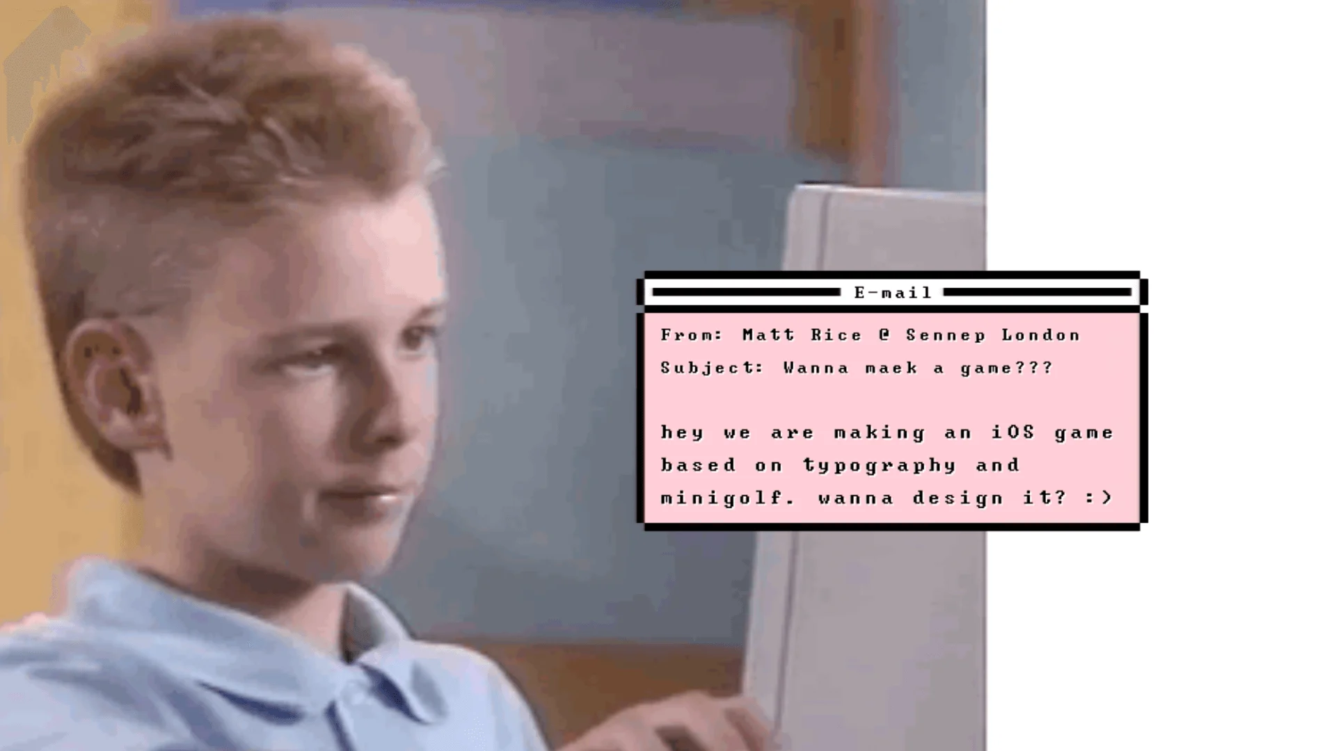
A failed pitch and the decision to go it alone
In 2015, off the back of the success of our first game OLO, we received an enticing but unrealistic brief to create a popular mobile game. After a short research sprint and brainstorm in the local pub, we came up with the concept of a stacked mini-golf game, nine holes on top of each other, with a snakes and ladders twist.
We were pretty happy with the idea, but our potential client eventually rejected it. A year later, we came back to the concept and decided to try and develop it ourselves.

Decision #3
Prototyping the concept (twice)
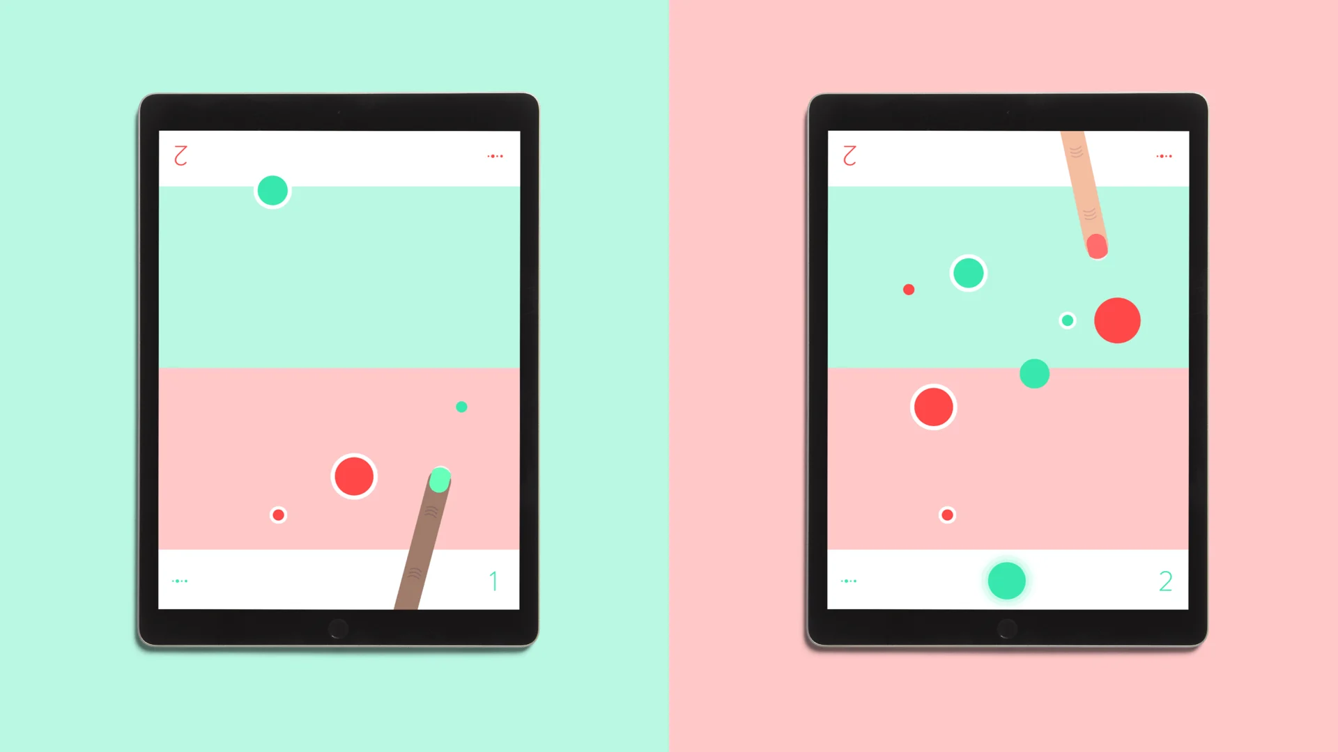
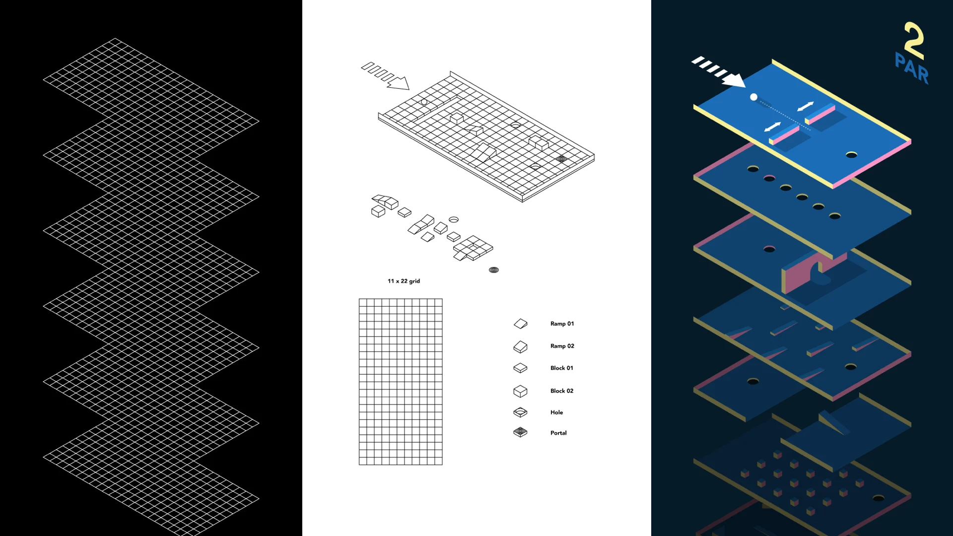
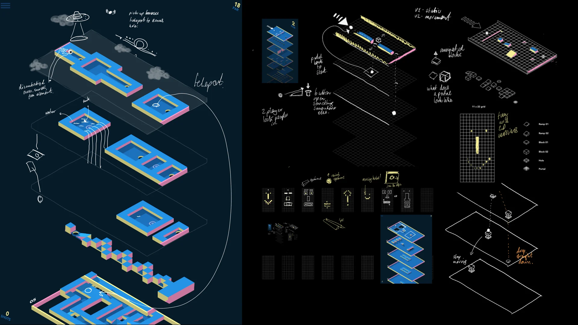
Before deciding to go into production, we decided to test the concept. Creating a game can be a costly venture, and we needed to be confident it was going to be fun to play. We began prototyping the idea in Unity 3D to see if the gameplay was as engaging as we imagined. In short, it wasn’t!
The prototype turned out to be more frustrating than joyful and the concept didn't work well with multiple players. We put the project on hold and another year passed before we came back to it for one last shot.
In August 2017, a team of two graduates joined us from Winchester University’s Games program to explore the concept during a three-month internship.
Decision #4
Changing and simplifying the idea
One month into this new investigation we still hadn’t hit on a concept or on gameplay we were excited about. Only the mini-golf mechanic remained.
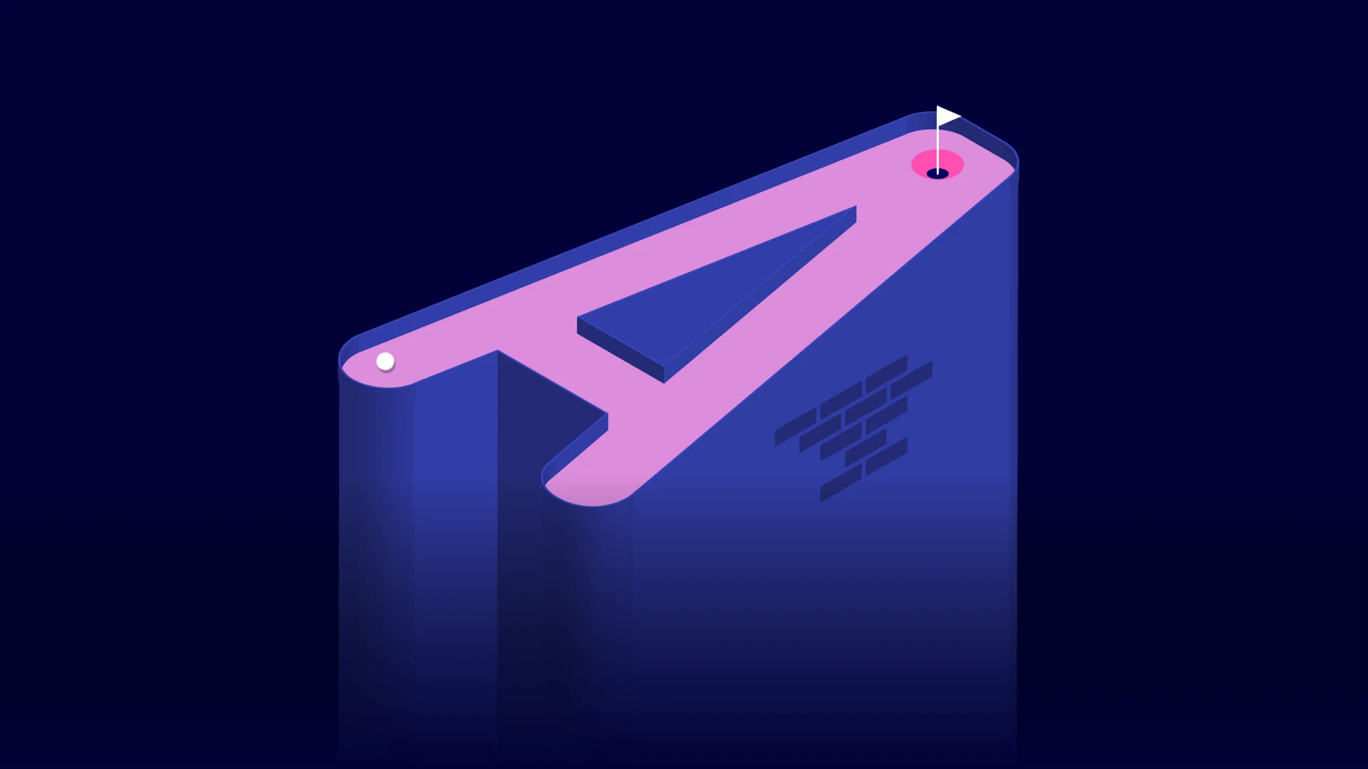
We needed to make the idea tighter to allow us to progress to the next stage. With a bit of fresh air and change of scenery, a new concept was eventually formed during a five-hour ferry trip to a Greek island – alphabetical mini-golf.
From there, everything fell into place. The 26 letters gave us a focus. We now had constraints to be creative within, and the shape of each letterform helped us narrow down ideas for both themes and gameplay more easily. As a bonus, rearranging the letters into words, in theory, gave us as many different courses as words in the English language. Finally, Alphaputt was born!
Decision #5
Funding the project and building the team
Once we’d decided Alphaputt was worth pursuing, we knew it would require some significant investment to get it to the level of polish we wanted.
We discussed Kickstarter as an option and considered looking for a publisher to fund the development. We didn’t want to compromise or be beholden to anyone though, so we decided to go it alone. We agreed on a sensible budget and put together a lean team to work on it.
We didn’t want to compromise or be beholden to anyone though, so we decided to go it alone.
That team consisted of one full-time Unity developer, a part-time creative lead/designer, a technical director, a project manager and three supporting pugs, Pauli, Titan and Chel (known affectionately as the #Alphapugs).
Once concepts for the majority of the holes were designed and tested internally, we decided to grow the team using external expertise for the final push. We turned to trusted collaborators, all experts in their fields, to help give the game the all-around polish we believed it deserved. This decision turned out to be key, as everyone brought a lot to the final product.
Decision #6
The choice of typeface
One of the critical decisions we had to make regarding design was what typeface to use. As a typographic game, this choice was central to how the final game would look but also how it would play.
Out of convenience, in the initial prototypes we used Bfont, the default font in 3D software Blender.
We also tried Avenir and it quickly became clear the choice of letterform would dictate what concept we came up with for the gameplay. For example, the Avenir “g” was perfect for the theme of gravity (in this concept the ball is dragged by gravity around the circular letterform towards the hole). However, using a more condensed font, the idea didn't work at all.
It quickly became clear the choice of letterform would dictate what concept we came up with for the gameplay.
We tested a few options. Most options were condensed fonts as they’re long and thin, and perfect for putting. For consistency, we liked the idea of using one typeface for both the holes and the UI (user interface). In the end, BWord designed by Matt Willey (graphic designer and art director of The New York Times Magazine) was the clear winner.
It was perfect to build a mini-golf course around. The rounded forms are great to putt the ball around at speed and helped with the gameplay on many of the holes.
As a condensed headline font, it also worked well for interim messaging as well as the scorecard and general user interface. We use both weights – regular for the UI and bold for the 3D mini-worlds.

Decision #7
Designing a theme for each letter
In hindsight, a crucial turning point in the project was the decision to style each letter to illustrate its theme. When we first started exploring the look of the game with 3D designer Jonathan Lindgren, we treated everything with the same color palette and style. It looked good, but we felt it was a bit limiting and too stylized to engage with a broader audience than just our design peers.
This approach of creating individual mini-worlds added significantly to the timeline regarding design, development and sound design but was ultimately worth it.
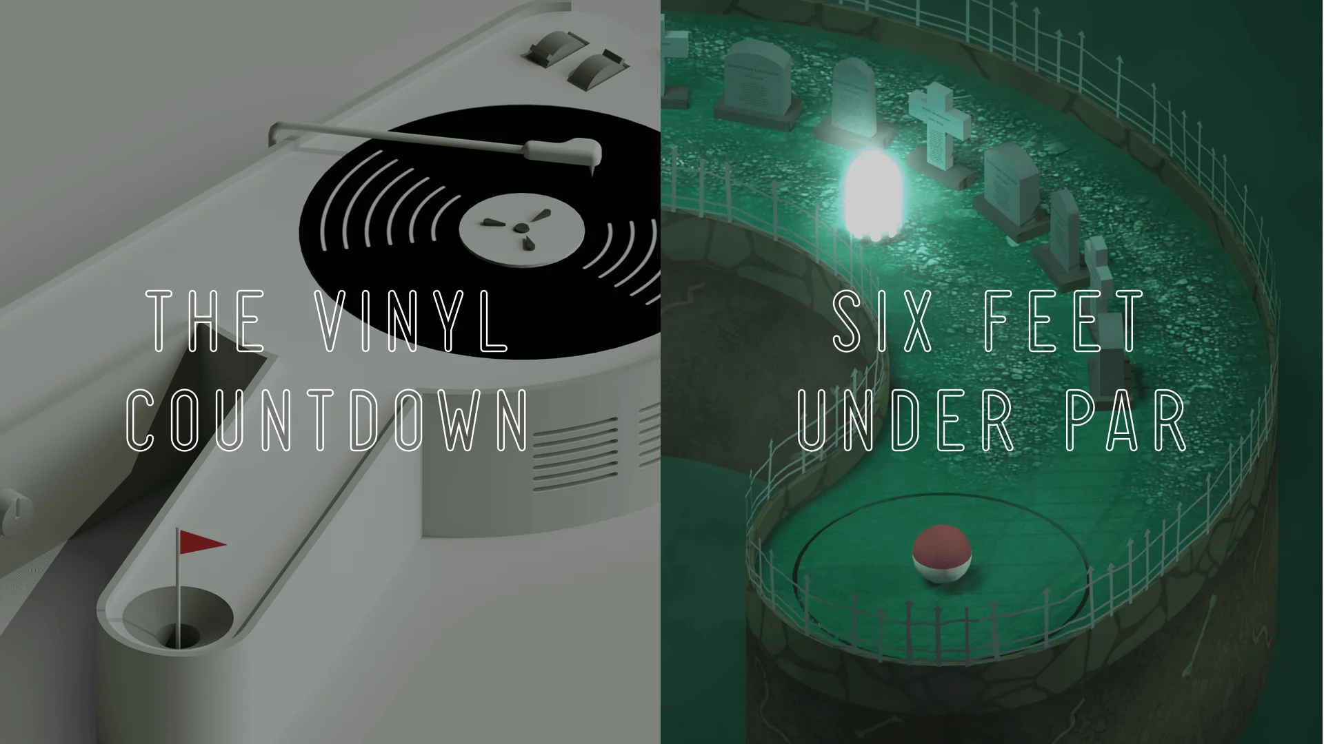
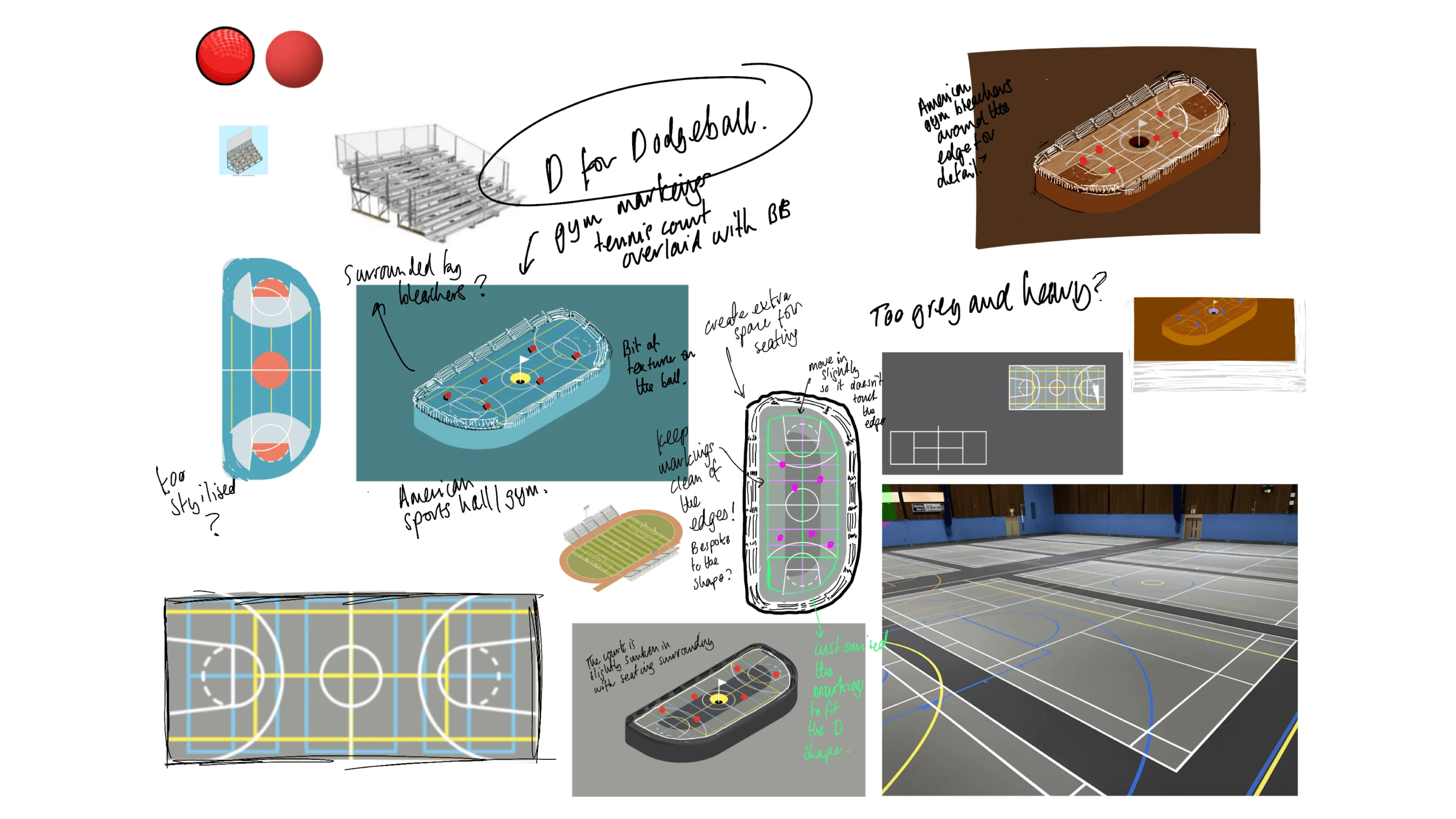
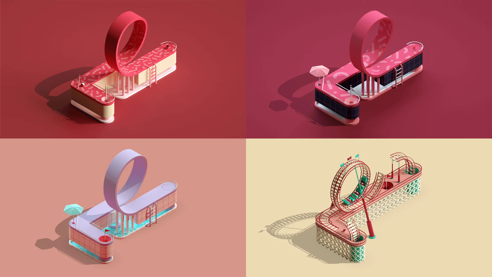
This allowed each hole to have a distinct personality and made each one more relatable and engaging. Take the letter L design. Initially, it was created as “L” for Loop and designed with a graphic pattern applied to it. Later, we developed it to have a look inspired by a Miami pool party before finally giving it a theme park design with “Scream if you wanna go faster” music, the rickety track sounds effects and screams of joy from the riders.
Decision #8
Openly sharing the process on social
This project has been a labor of love and a big learning curve for everyone involved. From the very first design in back in 2015, we decided to share the progress on social media, finding it helped to keep us motivated and accountable.
We were also able to grow a supportive and very engaged audience on Instagram over the past eight months — their feedback was very motivating when the light at the end of the tunnel sometimes seemed very distant.