
It's easy to overlook the power of fonts as creative tools. That's where Sarah Hyndman – the intriguing designer, typographer and storyteller – comes in.

Sarah’s goal is to make typography accessible to a broader audience, beyond designers. “Right now, it is a bit like the wine industry 20 or 30 years ago,” she says. “It’s wrapped up in this mystique that only experts should really talk about it. It’s got this specialist language and terminology.
“I’m trying to break some of the stigmas around typography being intellectually too serious, and I want to show it’s actually loads of fun.”
Sarah does this in many ways; she founded Type Tasting, a design and research studio through with she conducts all kind of experiments online and offline; type safaris for example, and font-based dating games.
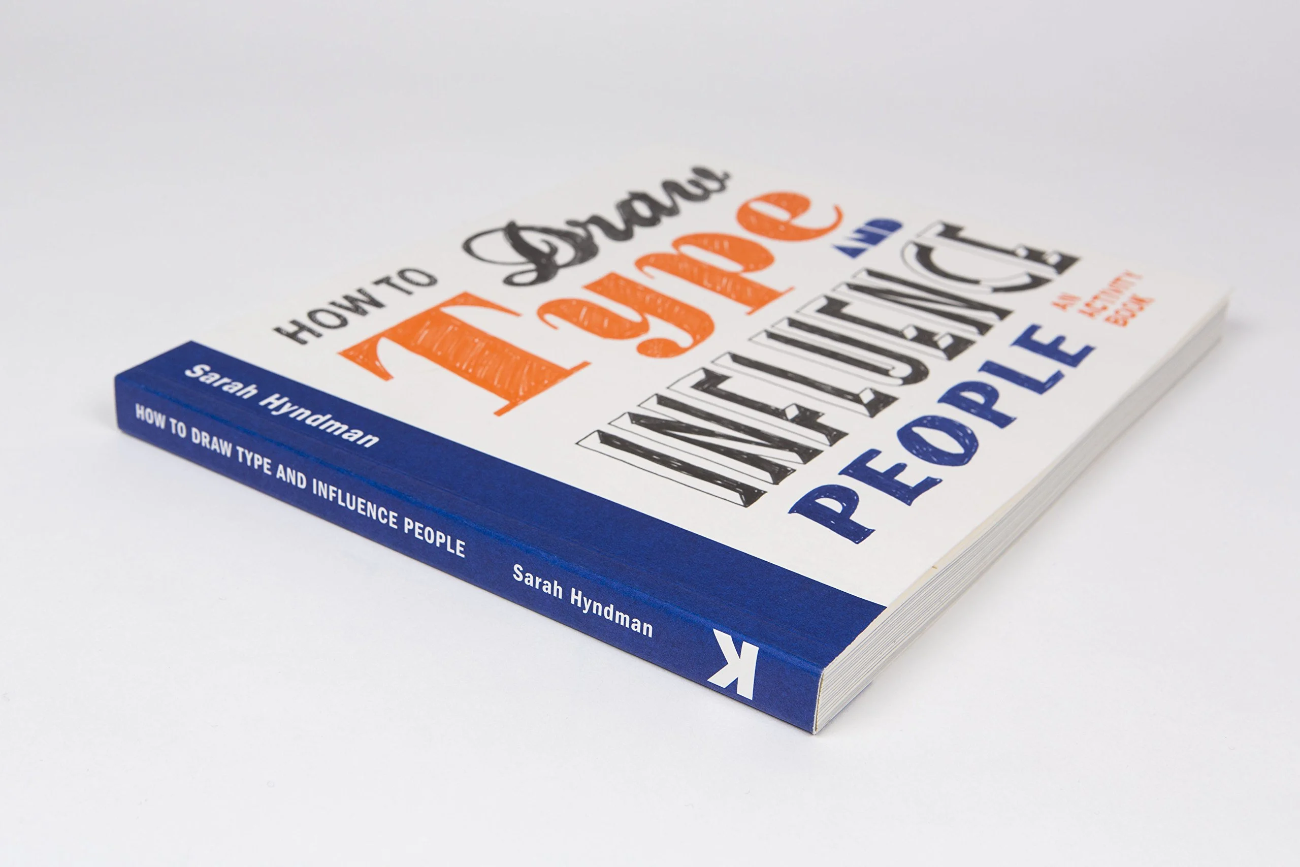
Alongside that she has published a book – Why Fonts Matter and now her newest title, How To Draw Type and Influence People, will soon hit the stores.
Sarah argues that type has great influence on our lives. It is all around us. Try to keep track of all the type you see for a while. It’s impossible. From the letters on your toothpaste tube and the scrawled name on your takeaway coffee cup, to the display board for your train home, we are bombarded with type every minute of the day.

Yet, perhaps because it is so present, we don’t notice it as being part of our lives. Rather, it acts on our subconscious.
“Learning type is a really complex process,” Sarah explains. “When you sit and teach a kid to read, it is frustrating seeing how laborious it is. You need to build new connections in your brain as it’s taking visual information, turning that into language,” she explains.
“But then once you’ve done this, it’s a bit like learning to drive, or learning to walk – your brain has now worked out it can give it to the subconscious to deal with, where it is going to take less energy.
“When your subconscious is doing the reading, it means that it’s also analyzing the typefaces, so your subconscious is the one that assumes something is expensive or really sweet. You don’t have to process that consciously, because your subconscious has already been taught a code of references,” she continues.
So, according to Sarah, “Every single one of us is already an expert in typography as a type consumer. All of these codes of references only work because you and I have been learning to recognize them all of our lives.”

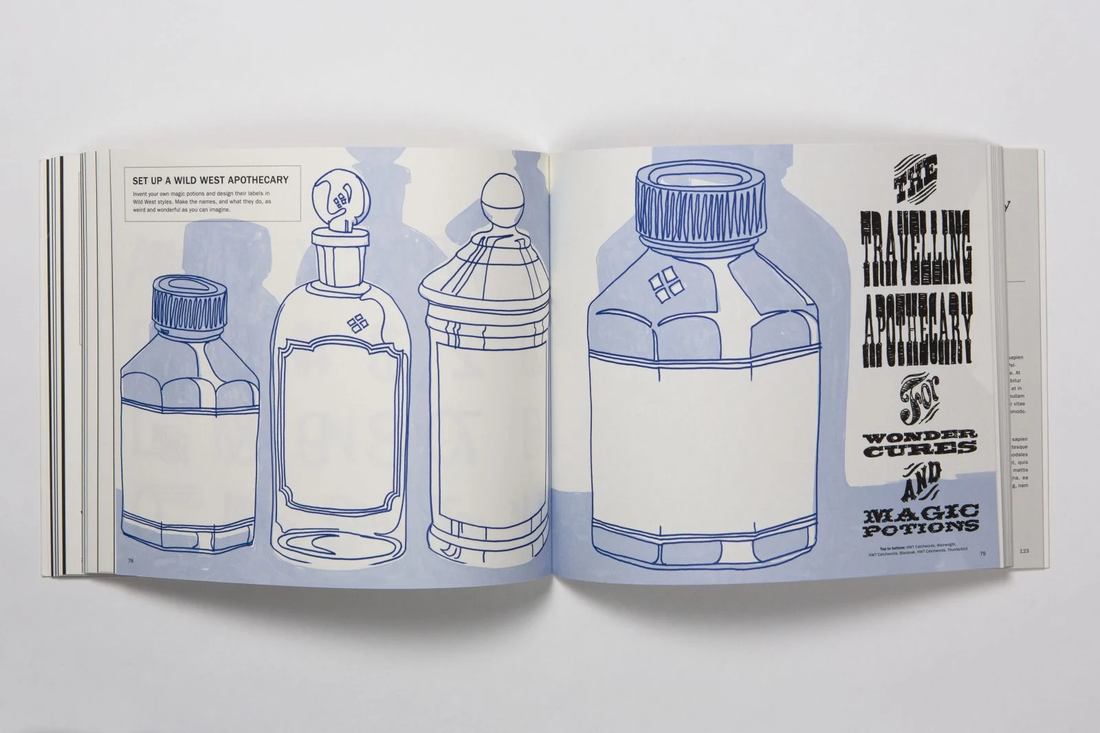
In her new book, Sarah takes the reader step-by-step through how different styles of lettering can tell a different story. She lets you design your own fragrance bottle, talks about how to depict a sweet or sour taste and shows you how to put across a powerful message. She demonstrates that by designing letters in different ways, you can communicate any story you want.
This does not mean type is all powerful. “We have proved that you can’t fool people,” Sarah says.
“We have very specific parameters in which we can influence, and beyond that we simply can’t. Design is not that clever.”
For instance, you can have a delicious looking chocolate bar wrapper, but when the quality of the bar itself doesn’t live up to the expectation of the packaging, the experience is a huge disappointment.
On the other hand, when the food does live up to the expectation, the taste sensation is enhanced and elevated – you enjoy the flavours even more.
Type, Sarah explains, is more about nudging people in the right direction – choosing healthier snacks over junk food for example – by using the tools she has as a designer.
She believes a book is the perfect medium to help designers as well as non-designers dive deep into the world of typography. “It’s a love letter to how fun type is,” she says. “I wanted it very much to have this low entry level without dumbing it down. It still takes you on a journey of discovery, but it doesn’t expect you to be an intellectual.”
Moreover, it forces people to pull their attention away from the screen and follow a more hands-on approach. “When you design a typeface on a computer, you already have to be a bit of an expert; you’re using the technology. Once anybody goes to their computer, that’s the moment you stop thinking so creatively and jump straight to a final solution, whereas when you are just doodling, it doesn’t feel too precious. It invites you to just play; there is no right or wrong.
“You’ll find that a lot of the time, it’s the accidents and the things that go wrong that end up being the best ideas. If you just start with, ‘I just want to do another version of Futura’, you will just do another version of Futura. Whereas if you start exploring how geometric typefaces come about, you’ll find a lot of the discoveries you make along the way will end up being the uniqueness of that new solution.
“I want this to be a book that absorbs and captures. There could be so many ideas in there that might just trigger things to become themes, that you might want to go and investigate and do a big project on.”
And so, go on, pull away from the screen, grab that pencil and let Sarah show you the power of type.