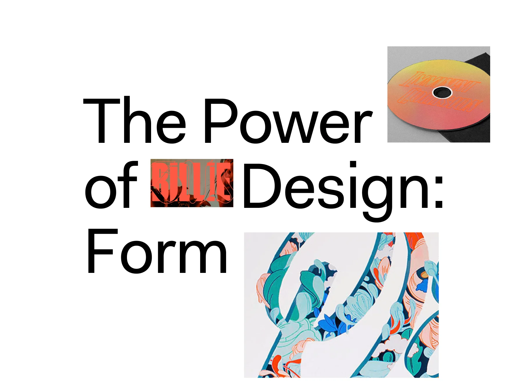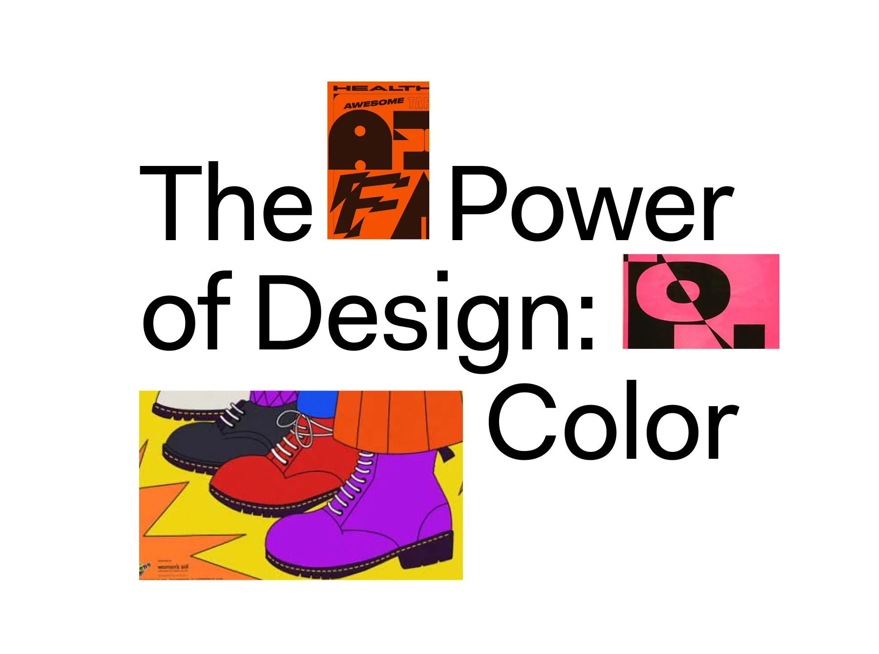
IN PAID PARTNERSHIP WITH 99DESIGNS BY VISTAPRINT

Whether we realize it or not, we are exposed to typography every single day, and the typographic design used by any given brand has the power to change how we feel about it. We may have never even had an interaction with a brand, yet its identity has the power to affect our perception of who it is and what it stands for. This is something that designer Caterina Bianchini knows all too well, and in her career has designed typefaces for the likes of Apple Music, Selfridges and The Barbican. In the first episode of our new design-focused three-part series, The Power of Design, we dive further into the ways that typography can make or break a brand, and Caterina tells design writer Madeleine Morley why, when designing type, you need to find its essence.
Typefaces surround us and influence us in profound ways as we go about our daily lives, yet few take notice of their intricacies and special power. The decorative tails of the serifs that line our newspaper feel authoritative and help guide our reading; the no-nonsense, generously spaced sans on motorway signs take care to make sure we’re heading in the right direction; the swirling cursive on a chocolate bar ensures we grab the right snack at the corner shop. Whether we notice them or not, we associate typefaces with different contexts, time periods and emotions – and we bring those associations with us when we look at a brand’s logotype or choice of fonts for an ad campaign.
“When designing with type, you need to understand its essence, how it’s been historically perceived, its rules and associations,” says designer Caterina Bianchini, the founder of London-based creative consultancy and branding studio Nari. “Once you understand category conventions, it’s then that you can push and pull at them to create really compelling work that gets people thinking.”
As the famous mid-century graphic designer Paul Rand once said, “you must first know the rules and then break them in an intelligent way.” This ethos has guided Caterina throughout her career working on heavily typographic solutions for the likes of Boiler Room, Apple Music, Reebok, Selfridges, The Barbican, Somerset House and more.
A notion of “the right wrongs” guides her studio’s practice, which seeks to bend and flex the studied rules of typography in order to surface unexpected and playful solutions. “One thing that I always try to create is a sense of energy, a sense of personality and character,” says Caterina. “Even though it’s being made through the computer, I still want a design to have a human feel. That’s what type can help with: It’s the easiest, quickest way to convey a brand’s personality.” At its best, when you see a successful logotype on the street, “it’s almost like you’re meeting a person,” says Caterina, “you can tell so much about them instantly.”
For Tristan Le Breton, the Creative Director of 99designs by Vistaprint, the global creative platform connecting clients with graphic designers all over the world, typefaces are an essential tool that creatives can use to capture brand spirit. “Typefaces often evoke an emotional response in people,” he says, “Stranger Things, for example, did an amazing job with its typeface: It immediately triggered memories in me. They nailed that 80s sci-fi nostalgia with a mysterious, adventurous typeface that had a bit of a horror edge to it.” A typeface can express a certain mood or a certain feeling, immediately creating a reaction in people that a word couldn’t on its own. “We were recently working for a food brand and we designed this really chubby, delicious looking typeface for its logo,” says Caterina, “it just looks so full and content.”
With their ability to convey a mood so quickly, typefaces are especially integral to a brand identity. “Using particular typography styles and getting that right is really important in understanding what your brand is about,” says 99designs’ Tristan. “It’s the main thing you see,” says Caterina, “so it really needs to encapsulate the core essence of the company and its values.”

A logotype can communicate the overall concept of an identity swiftly – one wonky letter might transmit a sense of playfulness to the viewer, or a thin, elaborate font might communicate an atmosphere of luxury. “The logotype is like the face,” continues Caterina, summarizing this relationship. But it also goes beyond merely the logotype: “There’s also the secondary type for instance, used for copy and the like, and that’s almost like the conversation that you have with a person. It’s how they speak, it’s their dialog and tone.”
Following Caterina’s understanding, typefaces can come together to form a kind of person, someone with an attitude and a way of speaking and conversing. But since people don’t all follow the same rules, expectations and style guidelines (think of how subtle quirks in clothing and make-up conveys personality), bending the rules of how typefaces should be used can be crucial to creating individuality and character.
Recently, for example, Caterina worked on the identity system for HOME – a gallery space in London founded by photographer Ronan Mckenzie that supports BIPOC artists – and created an elongated, elegant serif logotype to capture the project’s essence. The type has been drawn with an understanding that thin, elegant serifs are widely associated with sleek and sophisticated editorial design, but it also melds together the serifs of the “M” and “E”, joining them in a way that breaks from the standard rules of typography. That join, though, is a crucial metaphor for the core value of the gallery: It’s a space for community and togetherness.
“Honoring the rules and having a deeper understanding of the history of type is vital,” says Caterina, “but so is playing with those rules, and juxtaposing and contrasting them, to really push the concept of your design and bring it to the fore.” As the saying goes, it’s not just what you say, but how you say it.


WePresent and 99designs by Vistaprint partnered to create a three-part documentary series on the power of design, focused on type, color and form to inspire design lovers around the world. 99designs by Vistaprint understands that memorable design sets brands apart from the competition to showcase what makes them unique. To illustrate the transformative power of design, they empowered 99 small businesses around the world with a refreshed brand identity. To see these stories of design revival, visit 99designs.com/99daysofdesign.