Growing up in Mumbai, Kimya Gandhi’s life was enveloped by the teeming, potent visual landscape of the city. Her memories of hand-painted theater posters, street signages and hand-lettered sign boards that hung outside local shops now filter into her work as a type designer. She tells writer Ritupriya Basu about the inspirations behind her striking, power packed Devanagari typefaces, how spotlighting the rich heritage of Indian typography is vital to her practice and why there has never been a better time to be an Indic type designer.
In many ways, for type designer Kimya Gandhi, Mumbai was where it all began. Amidst all the tchotchkes that filled her typical Maharashtrian home, there were bookshelves brimming with the latest Marathi releases, and cookbooks that her mother adored. The evocative covers of these books left a lasting impression on Gandhi’s mind, as did “Kalnirnay,” a calendar almanac that marked out auspicious dates, festivals and holidays. The rich visual dialects of Mumbai chiseled Gandhi’s interests in the beauty and balance of letterforms even further, from the hand-lettered sign boards across the city, to the hand-painted posters that hung outside theaters.
Gandhi went on to study at multiple universities across India, Germany and the UK, before moving to Berlin, and joining Mota Italic Type Foundry as a partner in 2014, where she works with her husband Rob Keller. Today, Gandhi’s work captures a vivid celebration of her roots, and especially her interest in Devanagari. “During my masters program, a very dear professor conducted a course on Indian thoughts and traditions, and opened up my mind to design in Asia,” says Gandhi. “Our course was otherwise primarily based on the Latin script, and we studied Western design principles and histories. Of course, knowledge of the Latin script is imperative to working in design in current times, but the lack of Indic scripts and context in the design syllabus was jarring. The more I learnt about Indian scripts, the more I was interested. I read and write in Devanagari, and because I was most familiar with the script, I started designing in it.”
Devanagari is one of the most widely used writing systems in the Indian subcontinent, used for the representation of well over a hundred languages including Hindi, Marathi, Nepali, and Sanskrit, to name a few. Gandhi’s work in Devanagari is at once deeply personal, and yet universal in its appeal—it draws notes from visual cues familiar to anyone from the subcontinent, and yet she presents these letters in forms that are entirely fresh and unexpected. Her typefaces flirt with form and legibility, and almost always draw the mind back to Gandhi's first point of inspiration—India and its streetscapes.
“I’ve always been inspired by hand-lettered signs, painted by anonymous artists, all over the country,” says Gandhi. “I like the idea that these artists’ design decisions stemmed from a place of originality, and were not based on any classical principles taught in design schools—this makes for such a refreshing, unique display of form that I haven’t seen in contemporary type design.”
In a sense, Gandhi’s work, and its rising popularity, is also emblematic of a larger, softer shift in the Indian type industry—after decades of working with dated technologies, the arrival of different softwares has made the development of Indic typefaces more accessible than ever before. “This has enabled a new wave of designers who are no longer tied down by the shortcomings of technology,” says Gandhi. “It is a great time to design Indic typefaces!”
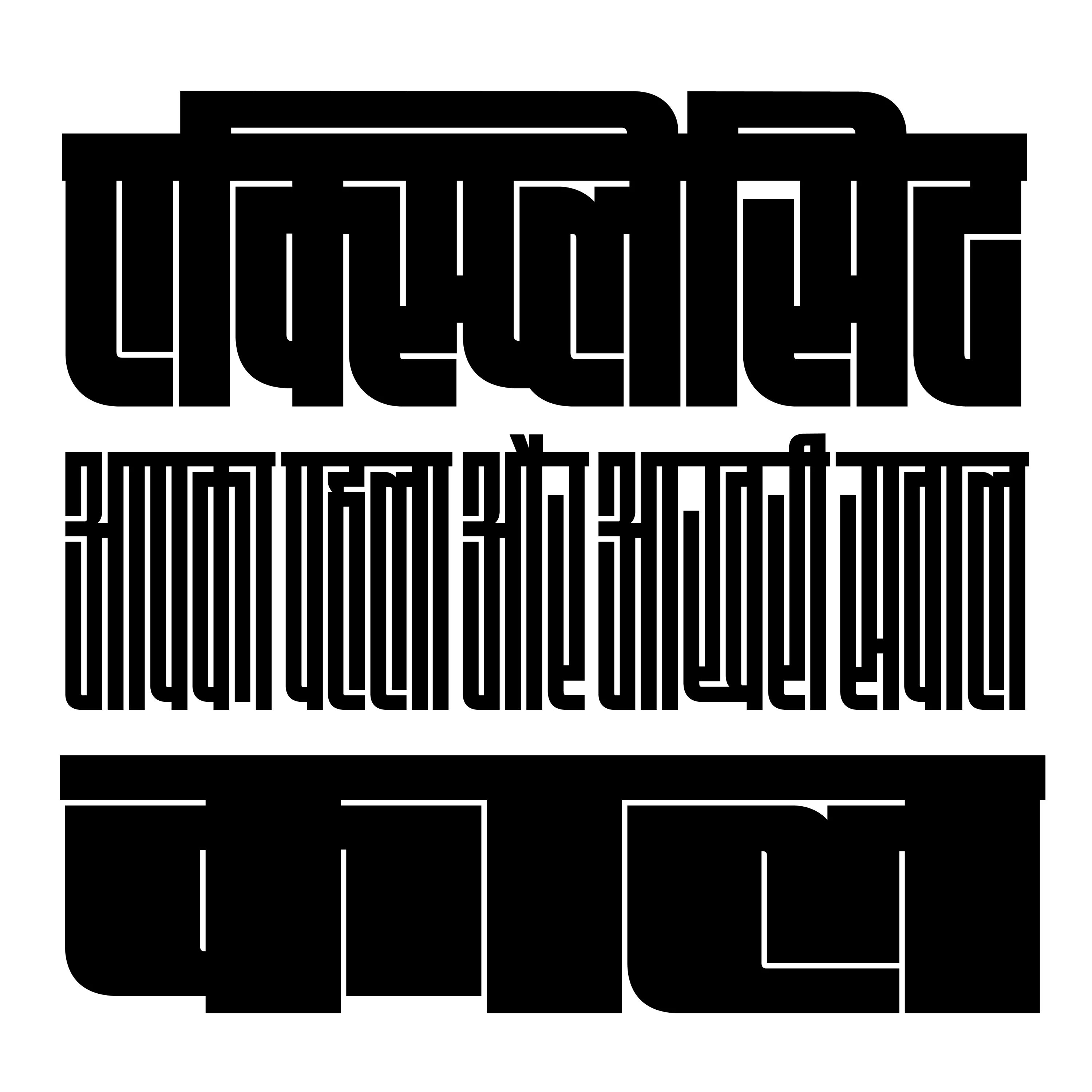
Maku
To create Maku, Gandhi returned to her natural handwriting as the foundation. “The project allowed me to explore Devanagari typeface design and what can be done with the script on a whole new level,” says Gandhi. “It is quite common for handwritten fonts in Latin to have several alternate characters, but this wasn’t done with Devanagari fonts yet. While working on Maku, I decided to draw alternates that randomly appear when typing, lending a more handwritten feel to the text.”
The drawing of Maku was painstaking, as Gandhi recalls. “I hand drew all the characters with the alternates. The character set of the final typeface is around 3300 glyphs, but I had to draw several more versions of the characters to be able to select these 3300!” she says. “The feature code to generate these random alternates was also fairly complex because it had to work with the several different Devanagari marks and characters. It got quite challenging so I had to work together with Georg Seifert and Rainer Scheichelbauer of Glyphs app to help me figure out the code in the end.”
Gandhi included a family of fun characters, emojis and icons inspired by Indian festivals, and added some stylistic features like swash characters, that were never seen before in Devanagari characters, but were very prevalent in the country’s hand-painted signs. “Understanding the context of my typefaces, and giving designers tools to showcase our vibrant culture has since always been a prerequisite when I design new typefaces,” says Gandhi.
Fit Devanagari

In a blog post Gandhi wrote to launch Fit Devanagari on Mota Italic Type Foundry’s website, a GIF of a ‘क’ expands and contracts dramatically—it begins at a whisper-thin width, and expands to reach a dare-you-to-look-away, Herculean form, almost filling up the screen. This is Gandhi’s variable typeface, Fit Devanagari, designed as a companion to David Jonathan Ross’s Fit family. “There are different typefaces—some that are designed to be extremely legible and solve a particular problem, but Fit is nothing of the sort. Fit is a playground for exploring type as image. The bold forms and the extreme masters are just a testament to what is possible with variable font technology,” says Gandhi.

“Before committing to the project, I spent some time figuring out if Fit’s style can even be extended to Devanagari. I didn’t want to force ‘Latinize’ the forms just for the sake of it. It is important for me that the nuances of the script are retained even while experimenting with the forms. The masters of Fit range from an extremely thin to an almost explosive width, and these proportions have never been seen in Devanagari! The legibility of some of the complex conjunct letters (where two letters are joined together) was hence a challenging undertaking in all these wide ranges of widths! Cracking some of these almost felt like solving a puzzle, sometimes frustrating, but mostly fun.”
The typeface, which was designed to surprise, and yet stay true to the essence of Devanagari letterforms, stretches the possibilities of vernacular typography with maximum impact.

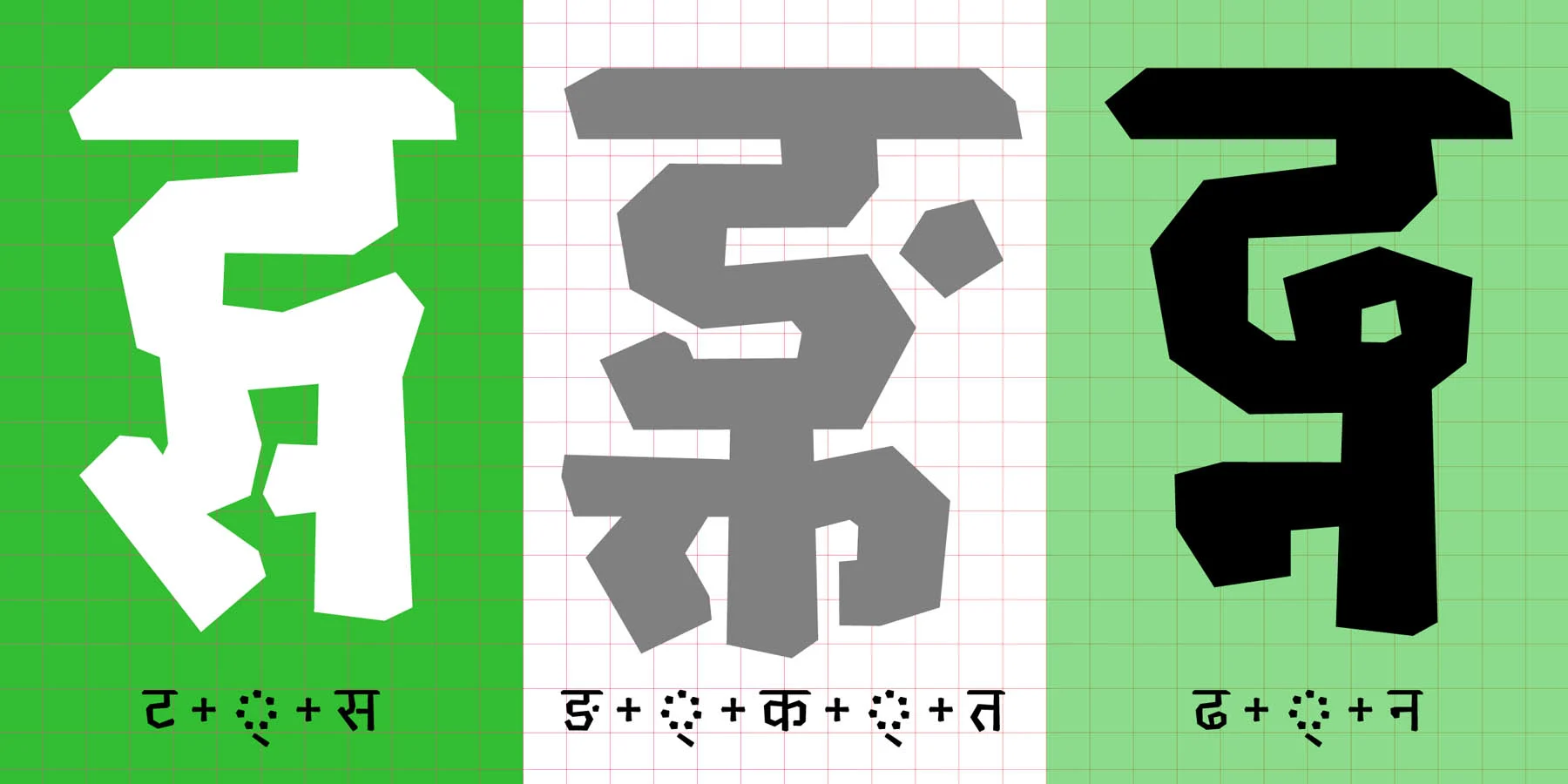
Chikki

For anyone who has eaten Chikki, a traditional Indian brittle made from nuts and jaggery, Gandhi’s eponymous typeface is sure to evoke strong memories. The playful typeface began as a series of sketches made during a type conference, and evolved into a radical, no-curve design. The letterforms, which are made of sharp strokes that almost ‘crack’ and turn at points, make for an impactful display typeface, available in a range of weights.
“I usually begin drawing the Light and Black weights for the Devanagari simultaneously. When drawing Devanagari, it is important to make decisions about stroke contrast in extreme weights at the start of a design because some characters can get really dark. I start with a few simple shapes and some complex conjuncts to figure out proportions early on. It is also useful to draw letters with different characteristics—angles, loops, knots, connections, etc.” Chikki—which is available in Devanagari, Gurmukhi and Latin—creates a play of contrasts. “The idea was to use harsh seeming corners and still create a fun and friendly design!” The typeface has also led to other experiments, such as this WIP typeface, where each letter has six layers, which creates a 3D bevel effect.
“With Chikki, I was looking for a name that reflected the “crispness” of the typeface,” says Gandhi. “One random evening, I thought of Chikki, the hard, crunchy Indian sweet that when you bite into, makes these sharp edges that remind me of the nibbled-off corners of the typeface. And just like that, it fell in place!”