

Haruki Murakami is one of the most famous writers working today, but also one of the most mysterious, rarely giving interviews about his work. Suzanne Dean, the creative director at Penguin’s VINTAGE, is tasked with designing each book cover for his impressive oeuvre.
Aimée McLaughlin spoke to her about creating a visual style that’s both circular and surprising, hinting at elements from Murakami’s multi-layered stories.
If you’ve ever read a Haruki Murakami book, you’ll know that venturing into any of his fictional worlds comes with an inevitable sense of mystery. The Japanese author - who has been writing fiction since the late 1970s - creates multilayered stories that often oscillate between different realities, whether that’s by taking the wrong emergency exit off a highway in 1Q84 or climbing to the bottom of a mysterious, empty well in The Wind-Up Bird Chronicle.
He’d never been perfectly book covered
The classic Murakami style is something Suzanne Dean has been familiar with for a number of years in her role as Creative Director at VINTAGE, where she directs the author’s book covers (among many, many more).
Suzanne actually worked on some of Murakami’s books a decade earlier while in her first job at VINTAGE (before Random House merged with Penguin).
Back then, she decided on photography-based covers, which she explains were the result of a fairly commercial brief from the editorial team with little creative freedom. “Looking back I think they were pretty awful and they weren't right, he’d never been perfectly book covered.”
Thankfully, Suzanne got a second stab at the books in 2012, when she was asked to give Murakami’s existing catalogue a more cohesive look. That’s when she came up with the concept of the symbolic circle, which has been a recurring feature of Murakami’s book covers ever since.


The idea for the circle device came to Suzanne surprisingly easy, functioning as a simple visual metaphor that could easily be adapted to convey different ideas for different books. It was only later on when looking into Japanese and Taiwanese graphics that she realized circles regularly appear on packaging and printed materials in both countries, including on books. “It's just an aesthetic that I've picked up on subliminally,” she says.
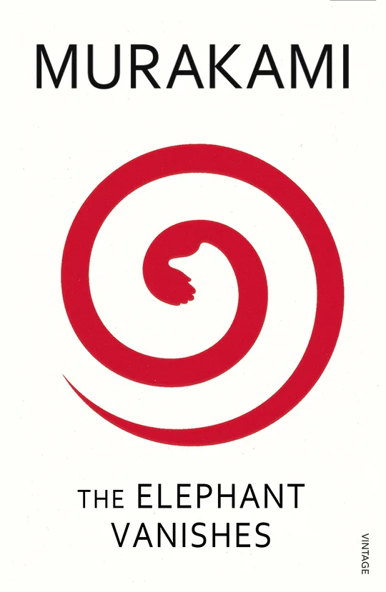
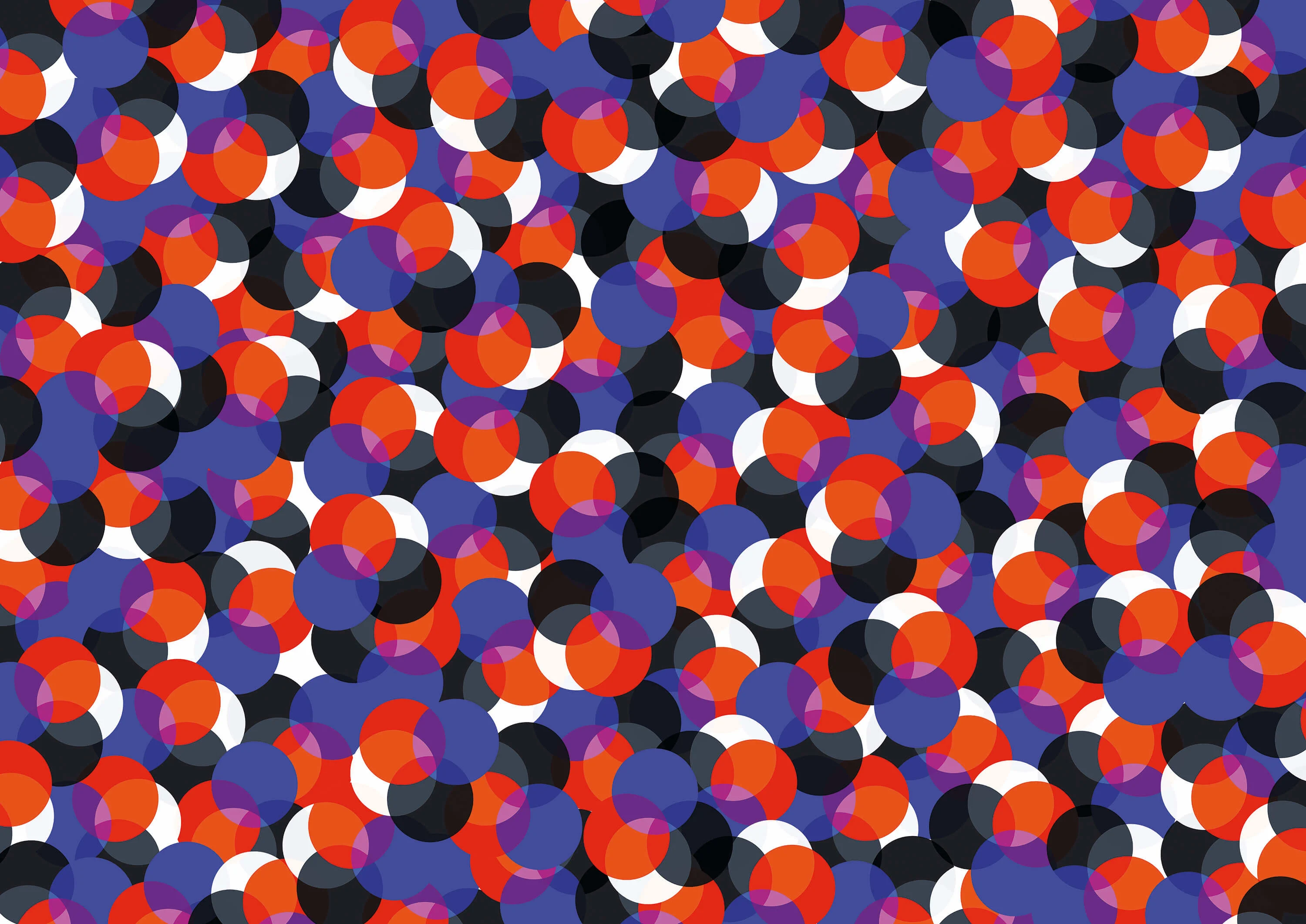
Suzanne decided on Israeli illustrator Noma Bar - well known for his clever use of negative space - to give the existing 15 titles a new lease of life. She gave him a strict grid to use with precise dimensions and a uniform color palette of red, white and black.
The result is a series of covers that not only look beautiful as a set, but also have hidden meanings within them, like the obscured image of a trunk in The Elephant Vanishes or Norwegian Wood’s tree trunks that double up as the legs of the story’s three central characters - Watanabe and the two very different women he encounters.

“It’s Noma’s playfulness, and the fact there’s an image within the first image and maybe you take a little bit of time to see it, which works with Murakami's playfulness,” Suzanne says.
The simple-yet-effective circle concept is now a well-established feature of Murakami’s books. “It was like developing a brand; we brought out book after book and had this whole look with the circles,” Suzanne says. “Then once the brand becomes well recognized you can start to play with it, which is the point I've got to now.”
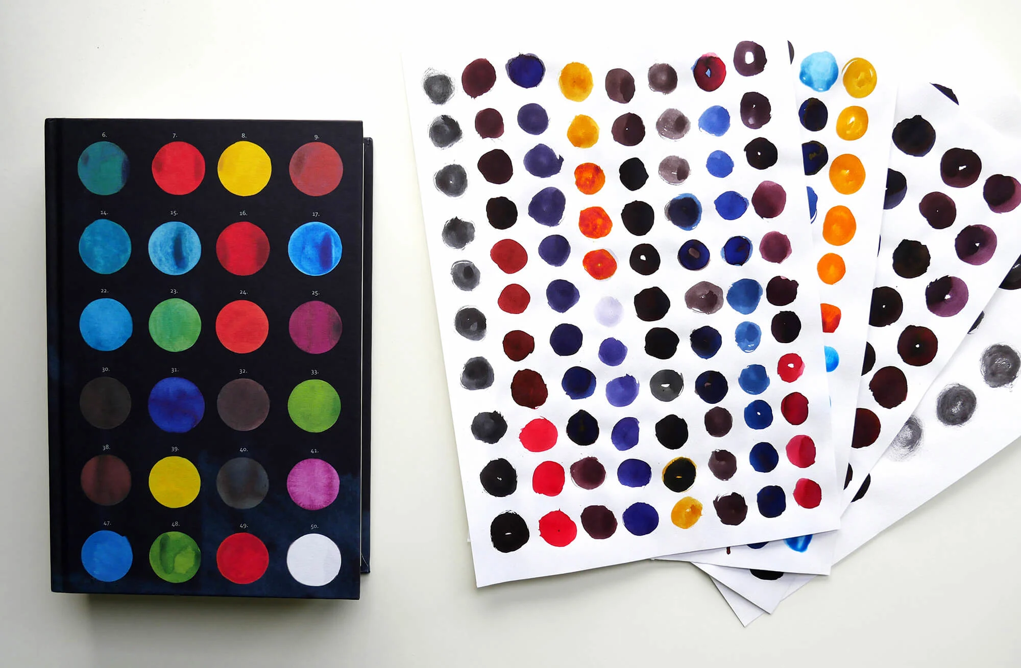
The first time Suzanne moved away from Noma’s distinctive look was with Murakami’s 2014 book Colorless Tsukuru Tazaki. She used different colored circles based on the characters’ names: Mr Red, Mr Blue, Miss White, Miss Black, as well as a “colorless” one to represent the main character Tsukuru. “The idea for that was so instant, it was one of those things where I almost couldn't see anything else,” she says.

While the idea may have come to her quickly, she wasn’t going to make things too easy for herself. For the first edition of the book she decided to incorporate circle-shaped stickers that the reader could peel off and paste as they wished, inspired by her young son’s obsession with sticker books at the time.
“I think some people bought one copy so they could keep it pristine and another that they could play around with.”
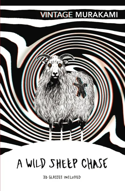
This collectibility factor became a big consideration for her next designs. For example, she’s gone the extra mile with other Murakami titles like Wild Sheep Chase, which has a menacing looking sheep illustrated by David Foldvari, and includes a pair of 3D glasses with red and blue lenses similar to the ones used in cinemas.
“It came from an idea of B-movie titles. I thought we could stick the glasses inside the book, and they were very successful,” she says. “The trick with those covers is that it has to work in 2D and 3D, so it needs to look great on the table but also have something extra.”
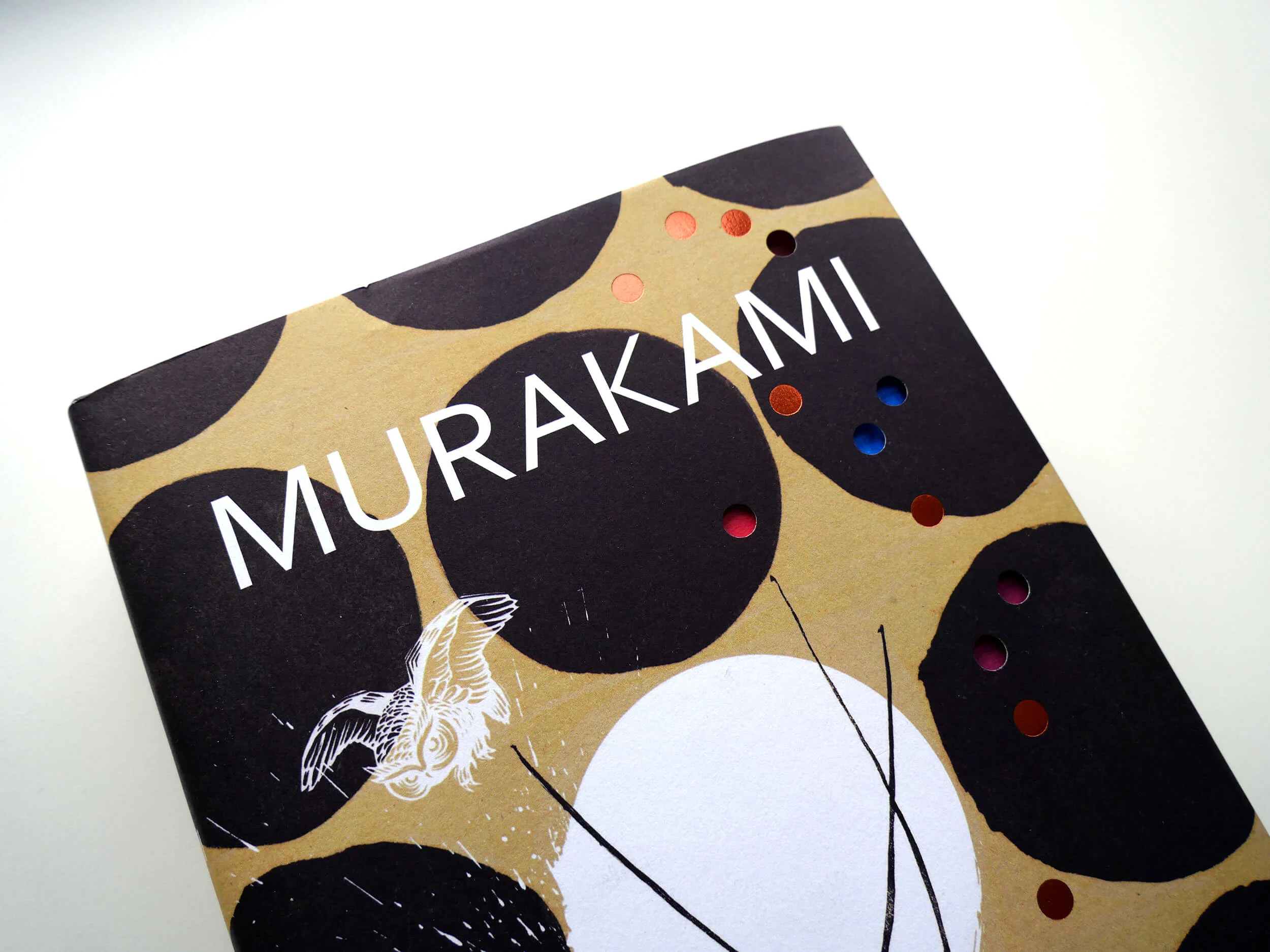
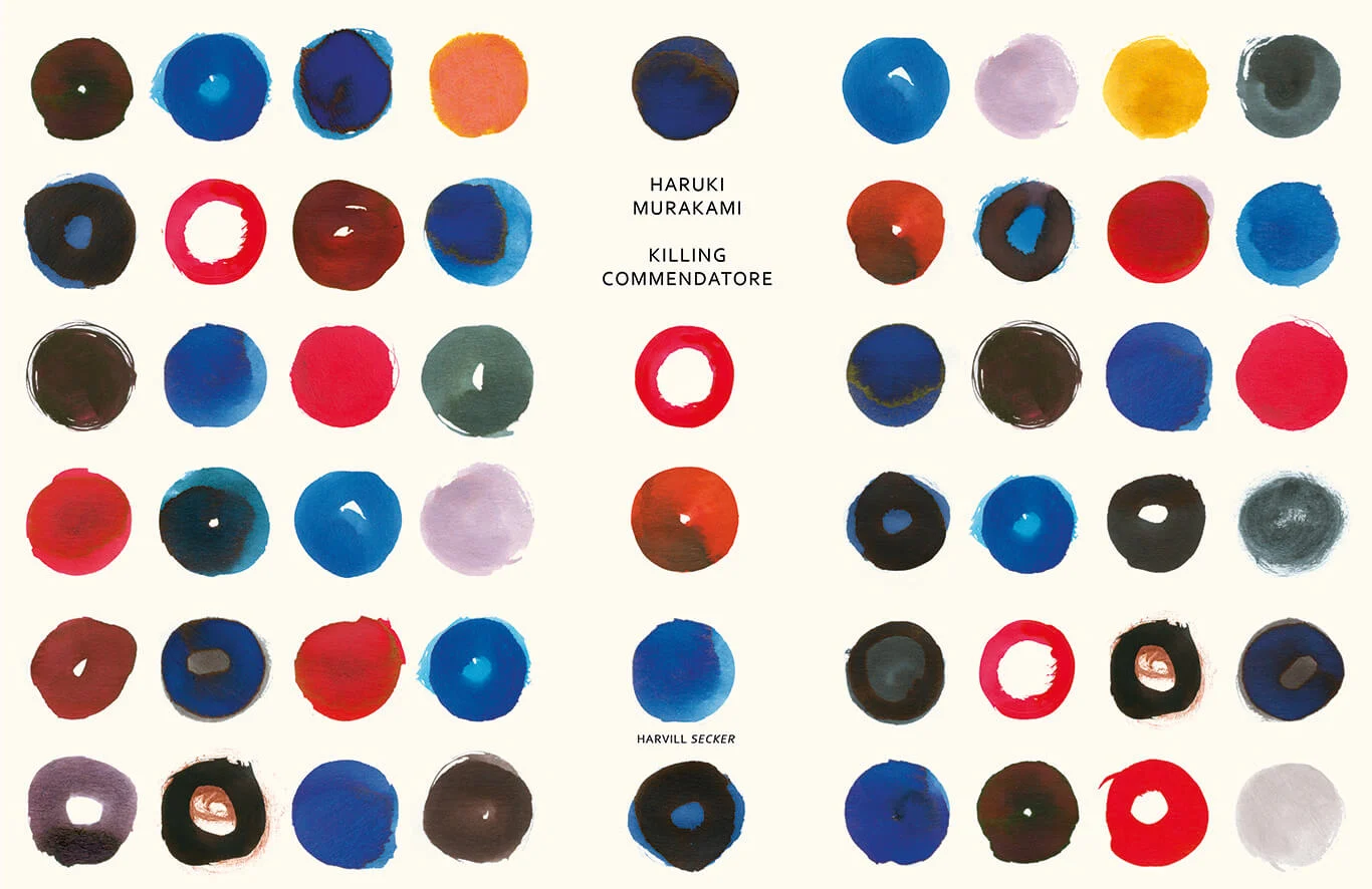
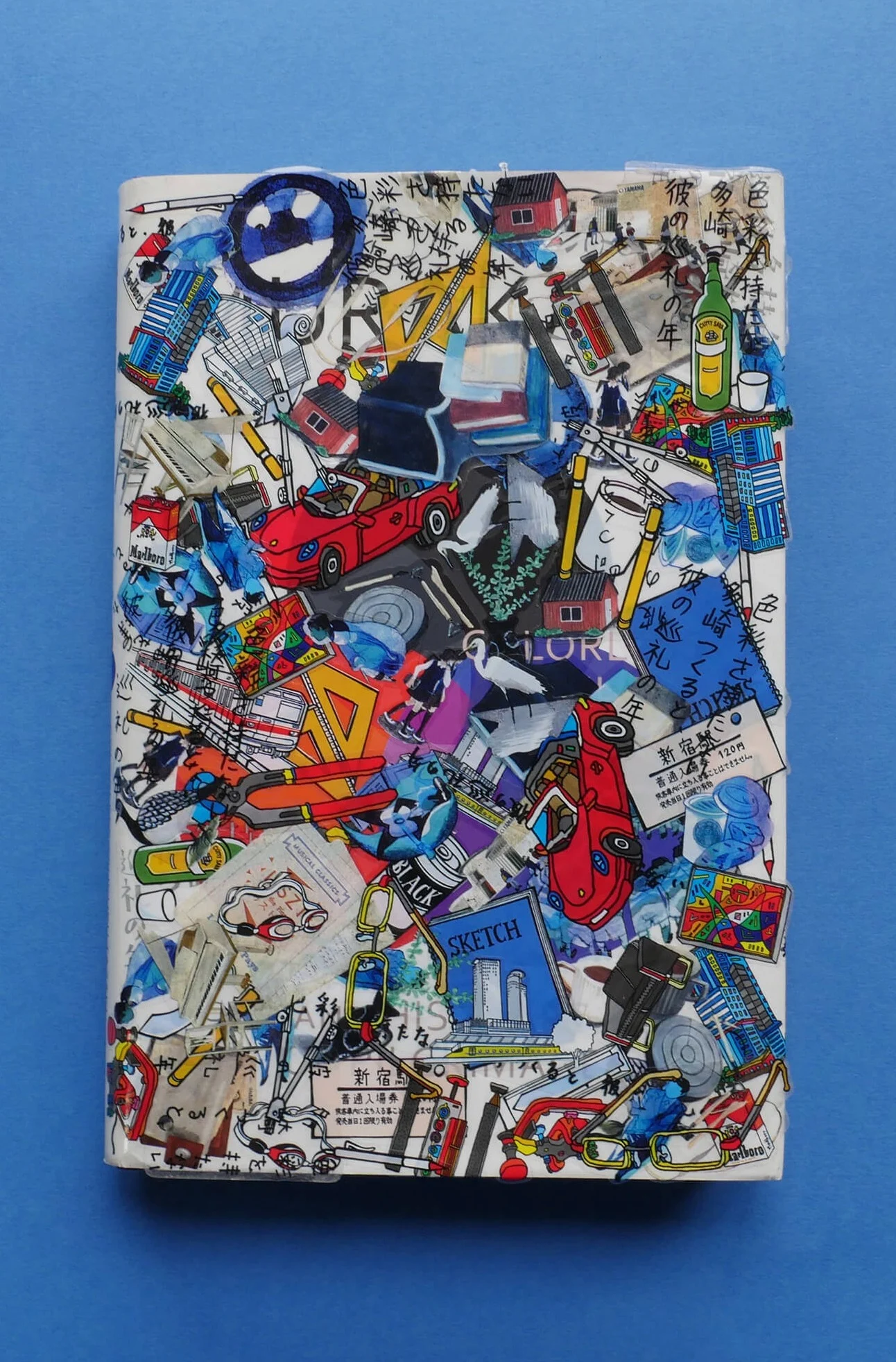
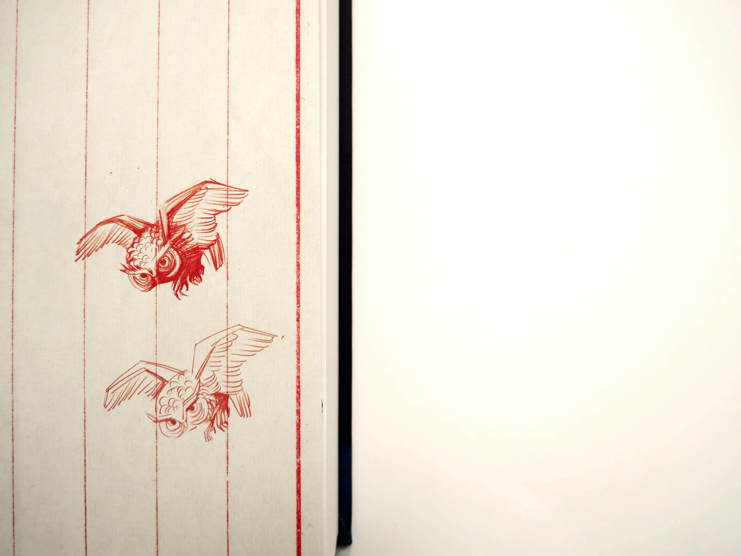
The designer’s latest work for Murakami’s upcoming book Killing Commendatore is no exception. It tells the story of a 30-something portrait painter in Tokyo who is abandoned by his wife and finds himself holed up in the mountain home of a famous Japanese painter.
Since the book’s focus is on the main character’s profession as an artist, the special edition comes complete with a wooden artist’s box wrapped in tissue paper, a Japanese paint brush and some inks.
Brought to life over the course of ten weeks earlier this year (Suzanne works on up to 30 other titles at any one time), the design for Killing Commendatore started out the same way as any of her other books - sitting alone with the text. “I always try to read the book before designing a cover. I think I'm going to miss something if I don't read it all,” she says.
In Killing Commendatore’s case though, the book was still being translated from Japanese to English so Suzanne had to make do with a two-page synopsis, which she covered in notes and scribbles to help her draw out the essence of the text.
After immersing herself in the world of a book, Suzanne gives herself anything between one day and a couple of weeks to experiment with ideas. “I tend to work by collecting bits and pieces and playing around; I think play is really important for designers,” she says.
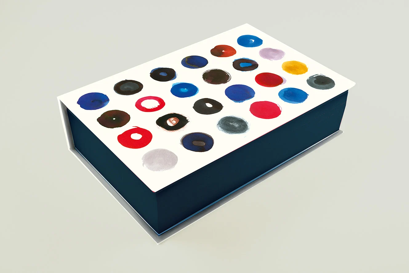
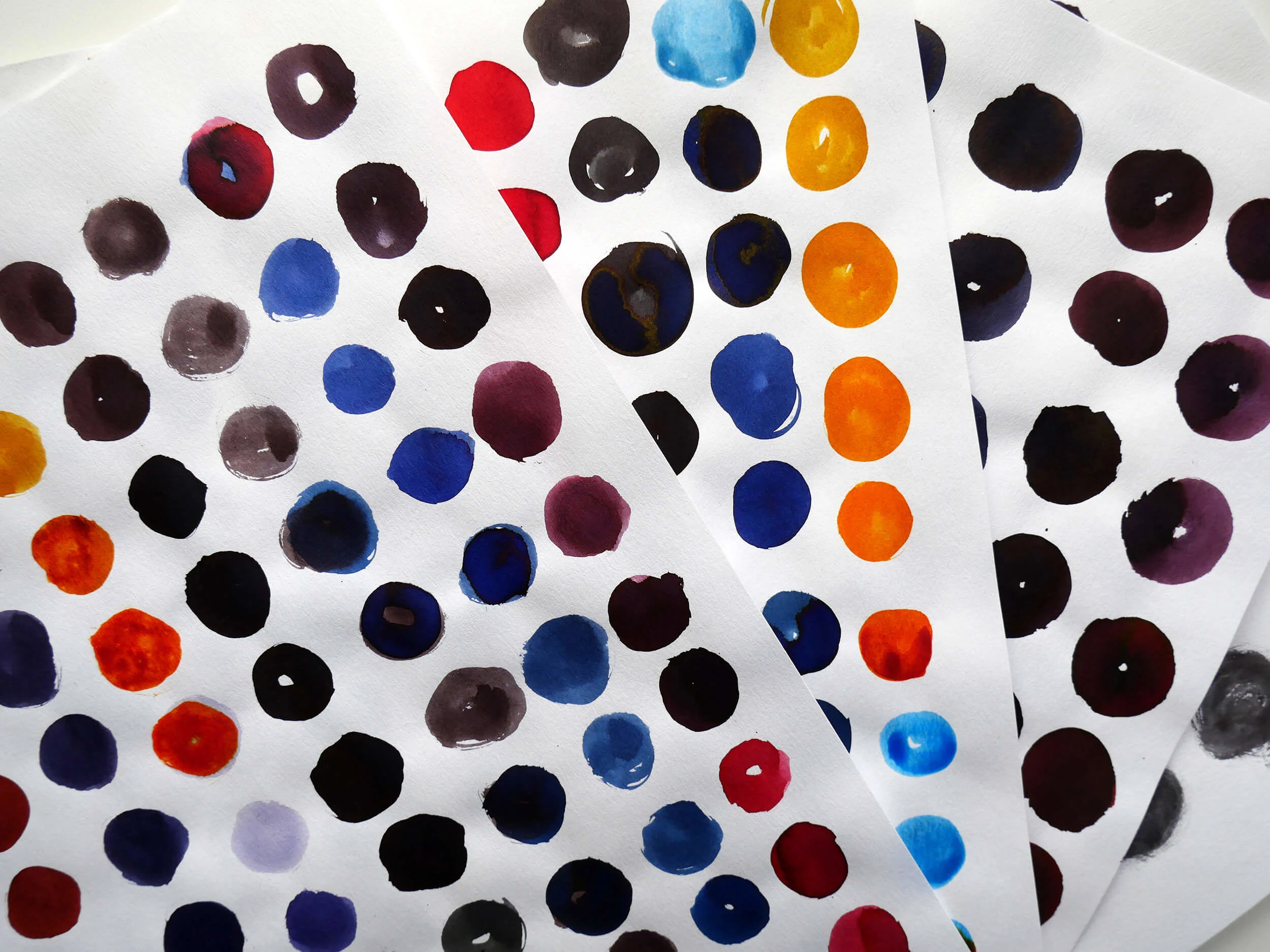
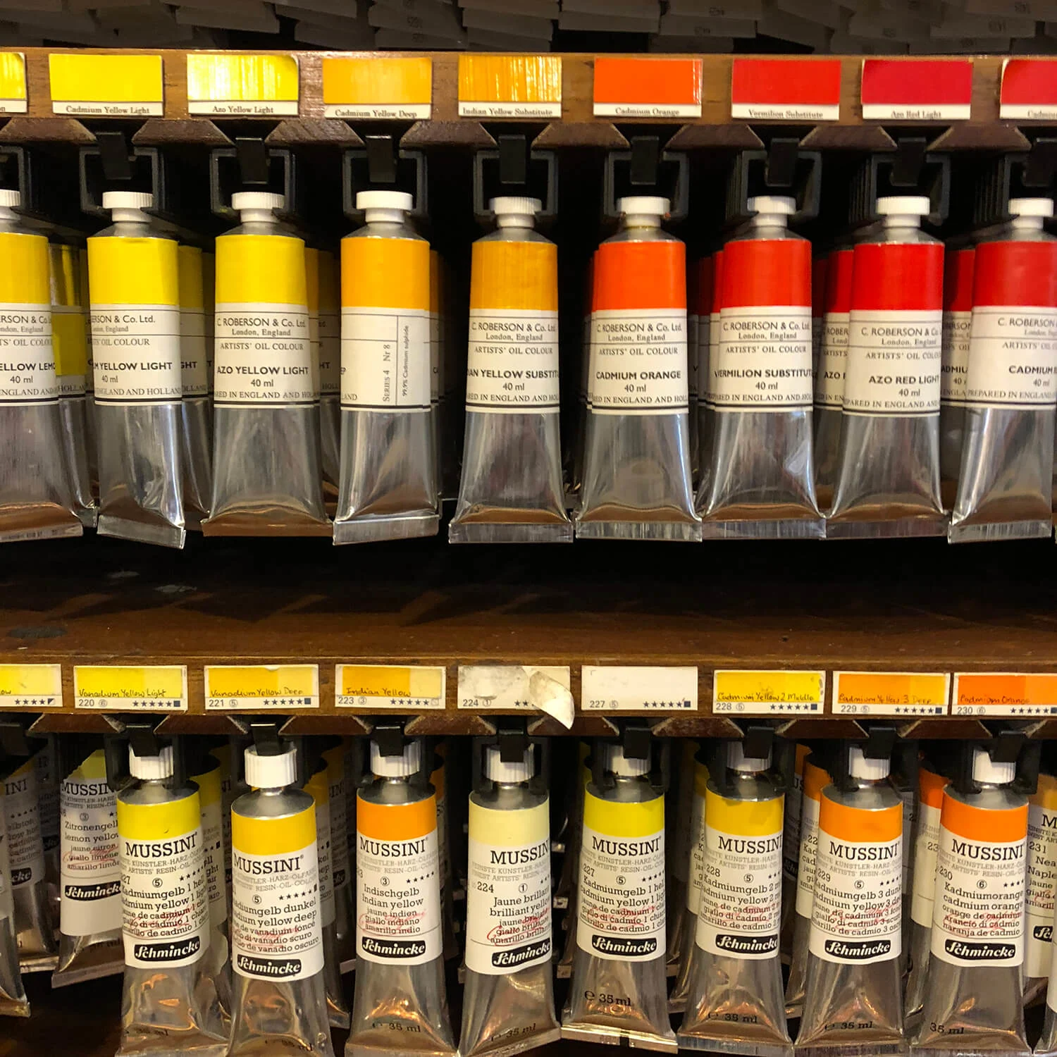
For Killing Commendatore this phase mainly consisted of her spending her weekends painting circles on countless sheets of paper using Japanese palettes.

This painted circle would go on to form one of the various different circular motifs seen on the cover. In true Murakami fashion, the text has a number of references to holes leading to different realities, including one particularly Alice and Wonderland-esque moment where the main character is forced to squeeze through a tiny hole - symbolized by a series of small die-cut holes on the cover.
Through the die-cuts you get a glimpse of the Japanese paint palette Suzanne has faithfully recreated underneath, complete with circular splodges of different colored paints.
Another circle device is the white moon (with more paint splashes as another nod to the artist) in the middle of the cover, since an important part of the story takes place at nighttime.
Examined in isolation, none of the other features on the cover would mean much to the reader unless they’ve already finished the book. Instead, they make subtle allusions to its narrative.
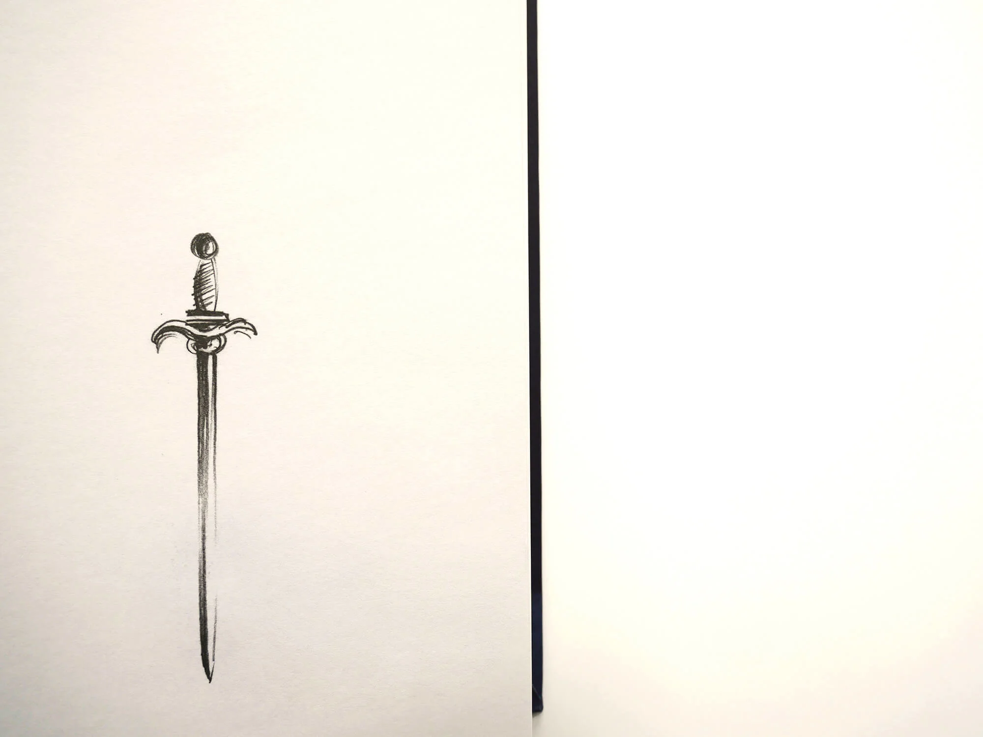
The brown paper cover mimics the aesthetic of the package in which an important painting is wrapped, a twig taken from a real-life Japanese painting references the novel's setting and the sketch of the owl relates to the bird the main character shares a house with, made by artist Vladimir Zimokov.
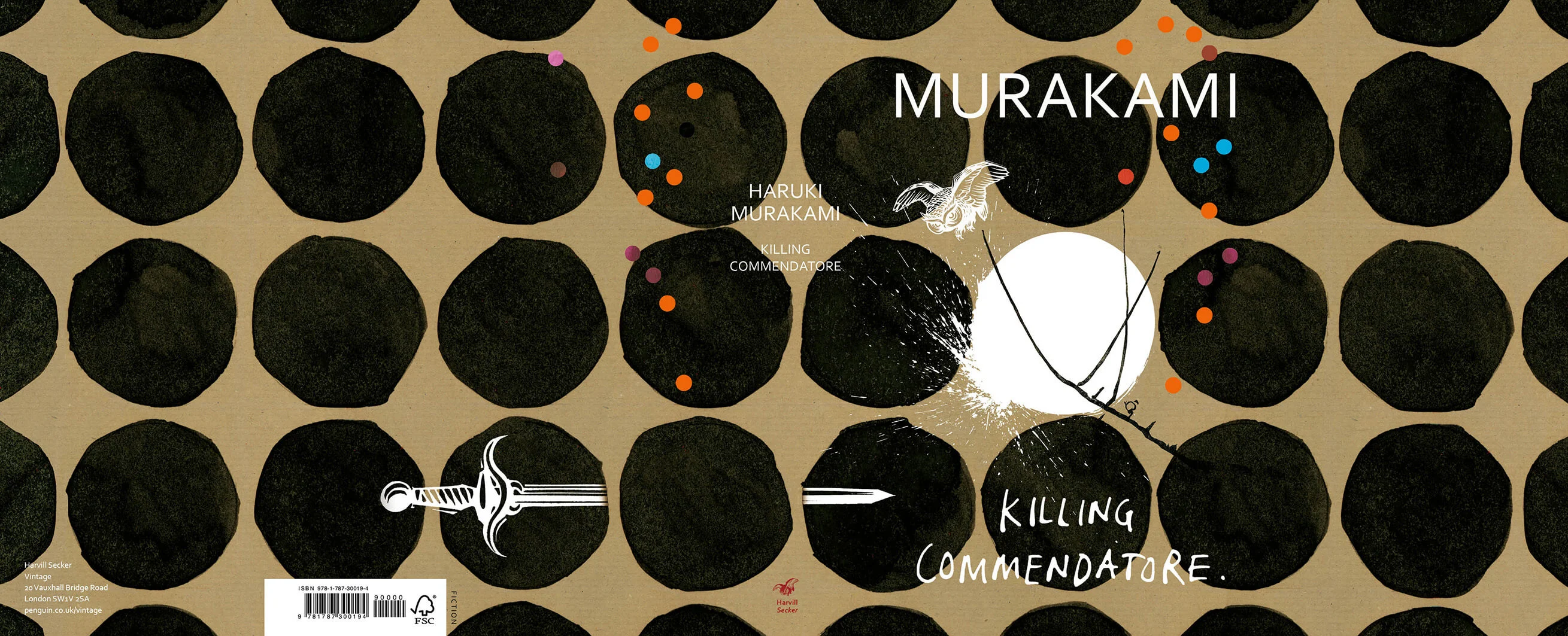
The only things that didn’t make it to the final version was an illustration of the commendatore himself. Instead Suzanne asked Vladimir to allude to the figure with a sword that pierces the book, with the tip going through the front cover.
Like all her other covers for Murakami, the final design for Killing Commendatore had to go through the man himself. Known for being incredibly private, the way Suzanne works with him is not your typical designer-author relationship.
“If the author is in the UK I might sit next to them and show them a range of visuals, but I work in a very different way with Murakami because he is halfway across the world and that scenario doesn't apply,” she says.
Instead, any feedback comes via his agent and over email. In most instances though, there isn’t much need for back and forth, Suzanne adds. Killing Commendatore was approved by the author with no changes whatsoever.
Once Killing Commendatore has spent a decent length of time as a front list hardback and paperback, the plan is for it to be slotted into Noma’s familiar format with the rest of Murakami’s catalogue. It’s a nice cyclical touch, and a way of giving the books another life after they are published.
“Noma’s work felt fresh at the time and I think it still holds ten years on, because it's such a simple idea that looks fantastic on the page. It's very rare that a cover from ten years ago will stand up now, it's only iconic ones that last.”