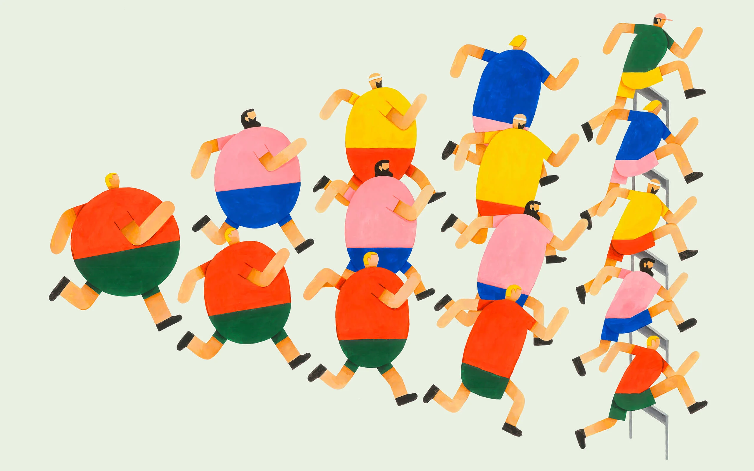
Mostly for his parents' benefit, Latvian illustrator Roberts Rūrāns would say as a kid he wanted to grow up to be a “bone doctor.” Though he's not qualified to heal a broken arm now, the subjects he paints have a particular physicality to them, as their limbs bend and stretch across the page. “I love the playfulness that can be expressed through the human body,” he says.
Roberts’ style is characterized by getting the most information across within the simplest of lines and shapes. The people in his artworks have faces without eyes, eyebrows or noses; only their mouths give away what they’re feeling.
“My style simplifies all forms and leaves out all the details that are not necessary for the concept to be readable,” he says. “A mouth is the bare minimum for a face to express emotions.”
Every artwork communicates a quick-witted concept that prompts a smile. “I acknowledge my illustrations seem to imply that this world isn’t such a bad place after all,” Roberts says. The colors he uses add to this happy glow, using an effective mix of primaries and pastels.

His cheerful and original sense of humor results in pieces like his poster for a garden concert where a party of worms get hot and heavy in the hollow of a tree to the steady beats of a hungry DJ Woodpecker hammering away at the bark with his beak.
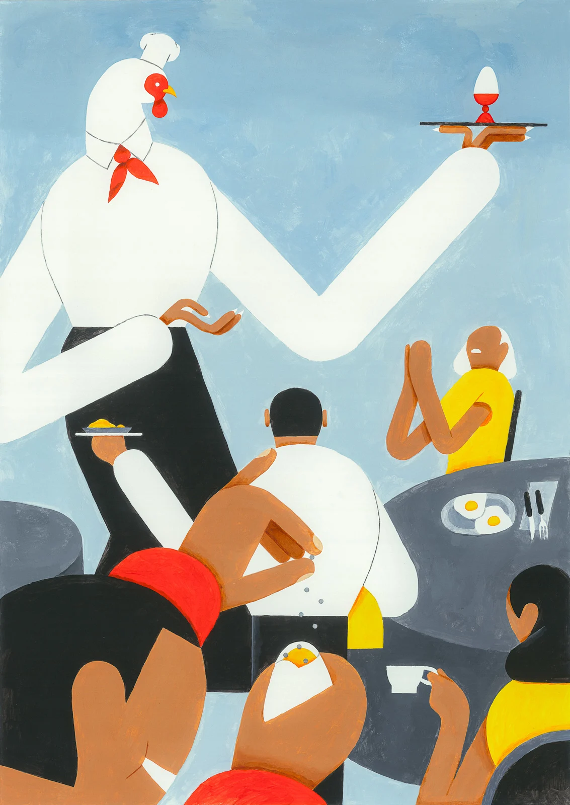
In another image, to advertise a breakfast special at a local cafe in Riga where Roberts lives, a chef hen presents the dish of the day: a boiled egg. “I’m not really sure where my sense of humor comes from, guts maybe?” he says.
“I think a good sense of humor is a desirable characteristic for anyone and can be especially useful for an illustrator. Good humor is a cousin of wit, which I think is an essential part of a good illustration.”


I had this inner voice inside me questioning my choice not to have a specific style of my own.
Animation is a useful tool for expressing Roberts’ concepts and he collaborates with animator Eduards Balodis to make them. For a piece about sharing knowledge an old man’s long white beard breaks into pieces, they then float away becoming speech bubbles as he shares his wisdom with a young girl.
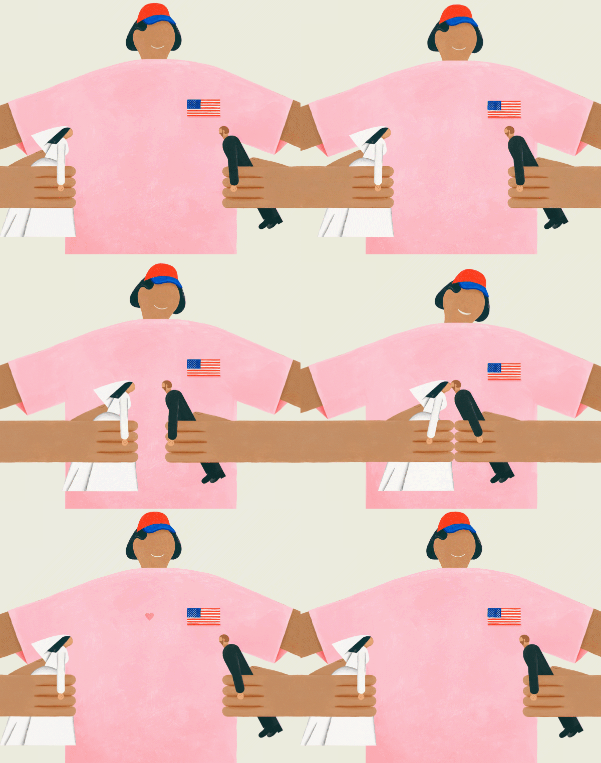
In another - an editorial animation for Vogue about American royalists - a superfan in an American flag T-shirt plays nicely with a figurine of Prince Harry making him kiss the doll version of his bride Meghan Markle.
It’s essential for Roberts that his ideas translate quickly and he’ll test them out on his studio mates by showing them his drafts. “I’m a freelancer parasitizing on the goodwill of my designer friends who have a studio,” he says. “If they don’t have that 'aha' with a smile on their face, I go to my desk slightly disappointed to continue my search for a visual solution.”
In fact, Roberts has come up with a formula for making work that’s interesting yet easy to understand. He considers it to be the bedrock of creativity.
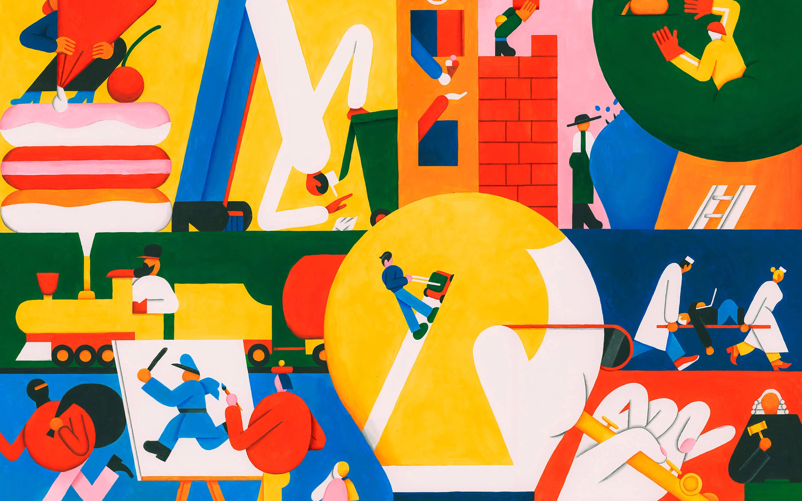
“For me, it’s trying to balance the well-known with a surprise. 3/4 of the piece is easy to understand but the remaining 1/4 is left for the 'aha'. If the ratio is changed the illustration can become either too boring or too complicated to hold attention,” he says.
Latvian newspaper cartoonists were Roberts’ earliest creative influence. As a kid he’d wait for the postman in the morning just so he could take a look at the latest cartoon strips. He counts cartoons, street art and graphic design as the three major influences on his personal style which, surprisingly, he’s only been using for about a year and a half.
Good humor is a cousin of wit, which I think is an essential part of a good illustration.
A few years back Roberts co-founded a design studio called Overpriced. His role as the in-house illustrator meant that he needed to be versatile in many illustration styles, ready for anything a client might require.
“That worked pretty well for a design studio,” he says, “but for some reason I had this inner voice inside me questioning my choice not to have a specific style of my own.”
These doubts coincided with a bad financial patch for the company. He resigned from the partnership and became a freelancer. At the time he’d just finished a project using an underdeveloped version of the style he has now: textural with stylized forms.
“I made a choice to stick with it,” he says. “This choice came partly intuitively and partly rationally, as I felt in my gut it was right and understood that I’d found something unique to stand out with.”
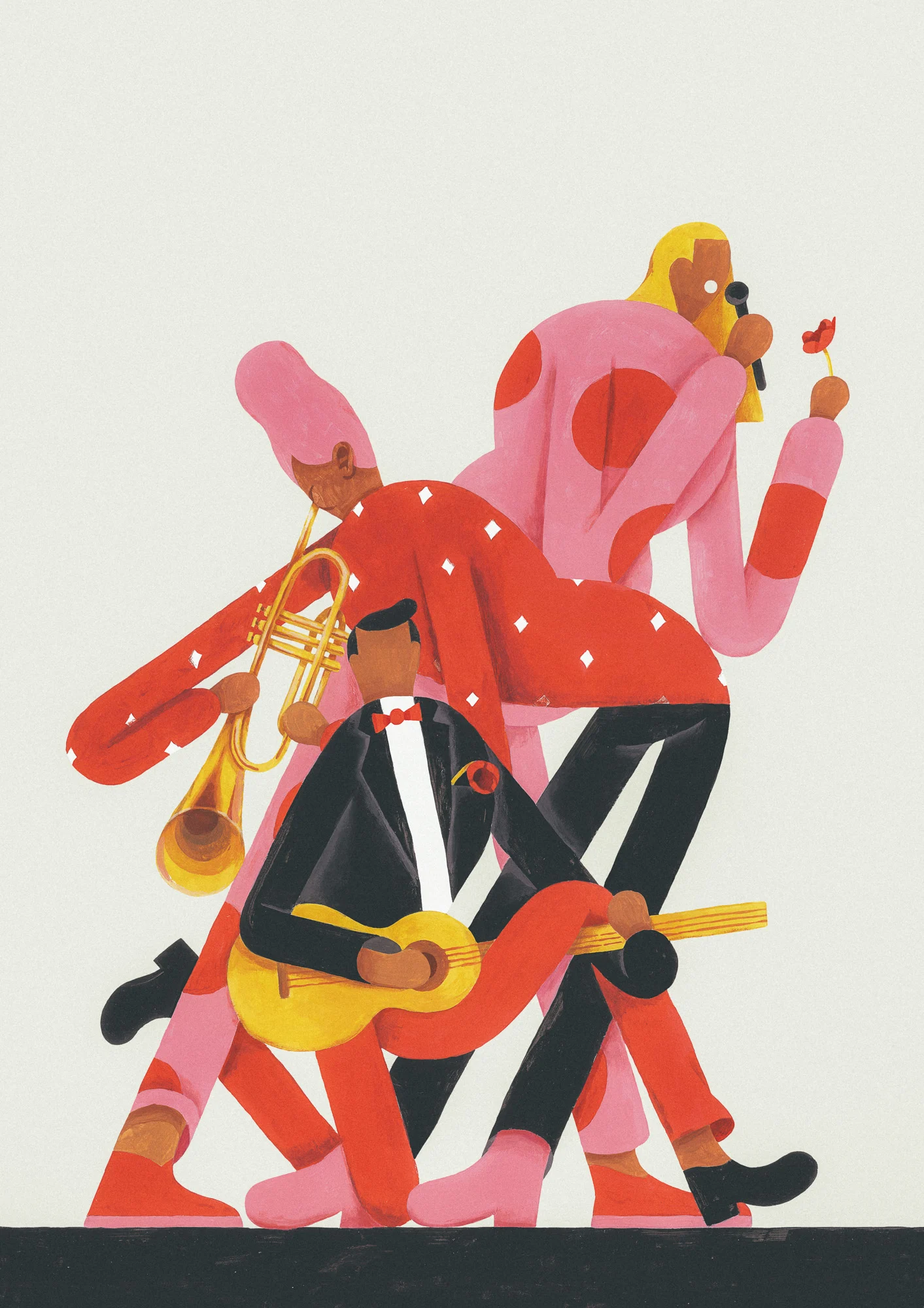
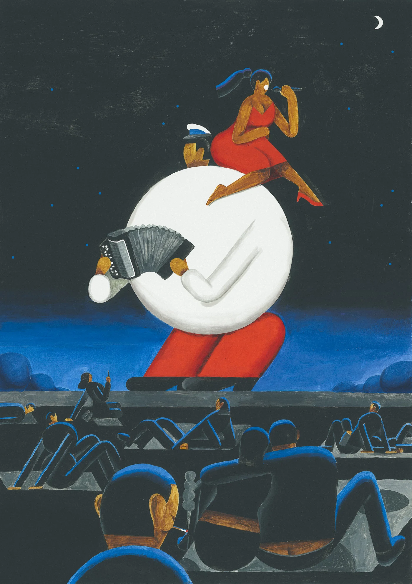
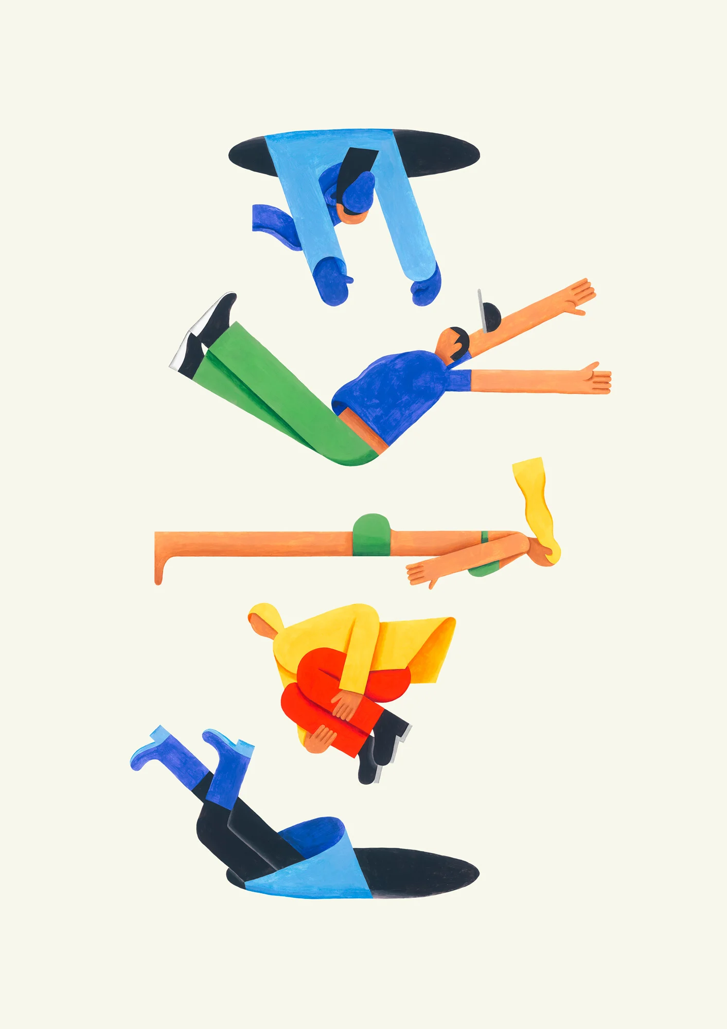
Sticking to one style has turned out to be an excellent strategy and Roberts has become sought after for his unique look. “It’s so nice to have clients coming to you because they’d like to have a bit of your personality infused in their project or idea,” he says.
“Every commission comes like a compliment if you look at it that way. Plus, having a personal style saves a lot of time on making visual decisions. It’s like speaking in your native language. You know your dictionary so you can get to the point quickly and do it beautifully.”
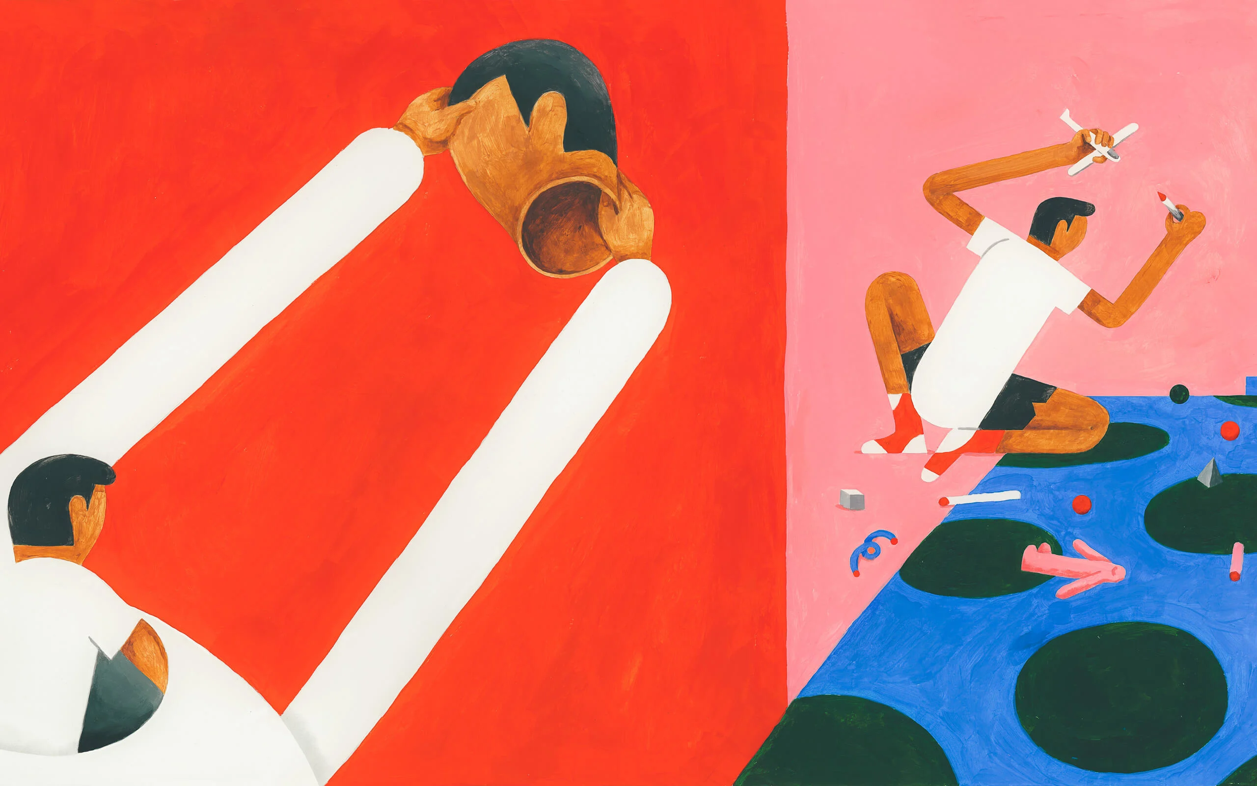
Roberts’ freelance career is taking off at an exciting time for visual arts in Latvia with the Art Academy of Latvia now offering a course on illustration for the first time. “Local companies are starting to appreciate the value it can bring to their businesses,” Roberts says, “and many talented new artists have emerged to make their mark on the world.”
The scene is benefiting from strong independent publishers of comics, illustration books and children’s books. “It’s all serving for the emergence of a visually intelligent next generation,” Roberts says. “So I’d say the best times are yet to come for illustration in this country!”
Words by Alix-Rose Cowie.
