We know of the design legends who created some of history’s most iconic record sleeves, but who’s doing it nowadays? Turns out it’s Grammy award-winning art direction duo Perron-Roettinger, who together are responsible for some of the best album artwork and campaigns in recent memory. Here Willo and Brian take writer Owen Myers through the process of creating five of their most memorable and boundary-breaking album covers.
An album’s art used to be one unchanging image. Now, it morphs. Albums compete to win attention on streaming services and, when they have it, interactive visual elements make it harder to click away. Spotify’s Canvas feature, for instance, lets artists pair their music with vertical short form videos: click on Solange’s Binz from her 2019 song-suite When I Get Home, and you’ll see her flexing in a bionic cowboy outfit; tap Watermelon Sugar to see Harry Styles bury his face in sticky fruit. The streaming service calls it “album artwork, for the streaming age.” If Nevermind came out today, the baby’s feet would be paddling.
“The idea of an album cover has slowly been diluted,” says Brian Roettinger, one half of the relentlessly creative design duo Perron-Roettinger, in a March conversation from their airy office in LA. “I’m not very nostalgic,” counters Willo Perron, his partner. “I think that we're on the verge of it being all animated,” he says. “Your storytelling and your iconography is no longer trying to hit this single image. I'm surprised that we're still slinging static, square images at this juncture.”
Willo and Brian’s album art – created for Miley Cyrus, St. Vincent, Miguel, Childish Gambino, and at least a dozen more – is an expertly-curated clash of visual influences. As art directors the duo are often the first port of call for a musician to bring a record’s themes to life; Willo and Brian work with them to hammer out a concept, and then commission a team – photographer, typeface designer, illustrator, stylist, et al – to make that vision a reality. Frequently the pair’s choices reflect their subcultural leanings; they hit up an S&M photographer for St Vincent’s Masseduction and, with German art photographer Daniel Sannwald, created a spectral orgy for Miguel’s WILDHEART . If their peers trade in blockbusters, Willo and Brian make midnight movies. (The cult classics always have more staying power.)
The duo’s imaginative merge of visual styles would probably give a purist art historian a heart attack. And so much the better: album art often feels stagnant, and their work is a refreshing shot of adrenaline. In conversation they’re passionate, and not afraid to get weird. Forget Peter Saville – Willo and Brian they are as likely to reference PeeWee’s Playhouse as the political punk band Crass, or Kandinsky’s color theory as truck stop bumper stickers. The duo come across as straight-talking punks who have graduated from drinking 40s at basement shows but still like the Vans and love the music. Their record covers can be beautiful, but their best work also gets a kick out of skewering and subverting the glossy conventions that you might expect of music’s biggest names. “She looks so great here with dirty fingernails,” Brian says, producing a box set of Florence + the Machine’s How Big, How Blue, How Beautiful . “These were from a test shoot that turned out better than the actual shoot.”
Brian is a longtime champion of art at the fringes and, in the late ‘90s, founded Hand Held Heart, an indie label that put out early releases from Liars, Chromatics, and Pretty Girls Make Graves. After a stint at the Southern California Institute of Architecture, he was at a friend’s backyard BBQ when he met Willo, who had creative directed Kanye West’s 2008-9 Glow in the Dark tour. A few years later, the pair officially collaborated for the first time on Jay Z’s 2013 album Magna Carta Holy Grail, which fused Classical aesthetics with DIY punk and included a secret LP hidden inside the record’s cardboard sleeve. It won a Grammy for Best Recording Package. This February they announced Perron-Roettinger, a merger of their two businesses. “‘Merger’ sounds so corporate,” Brian says with an eye-roll. “Next is our initial public offering,” adds Willo drily.
“I feel like it's okay for records to be mainstream,” says Willo, who has also creative directed tours and performances for Rihanna, Frank Ocean, and Lady Gaga. “But they have to have some value system attached to them, or some identity, or belong to some cultural movement. Cranking out art for radio records, feels like everything fabric is against.”
Over the span of an hour, Willo and Brian candidly talk through the process of creating five of their most memorable and boundary-breaking album covers. Read on to discover the stories in previously-unheard detail.
MAGNA CARTA HOLY GRAIL (2012)
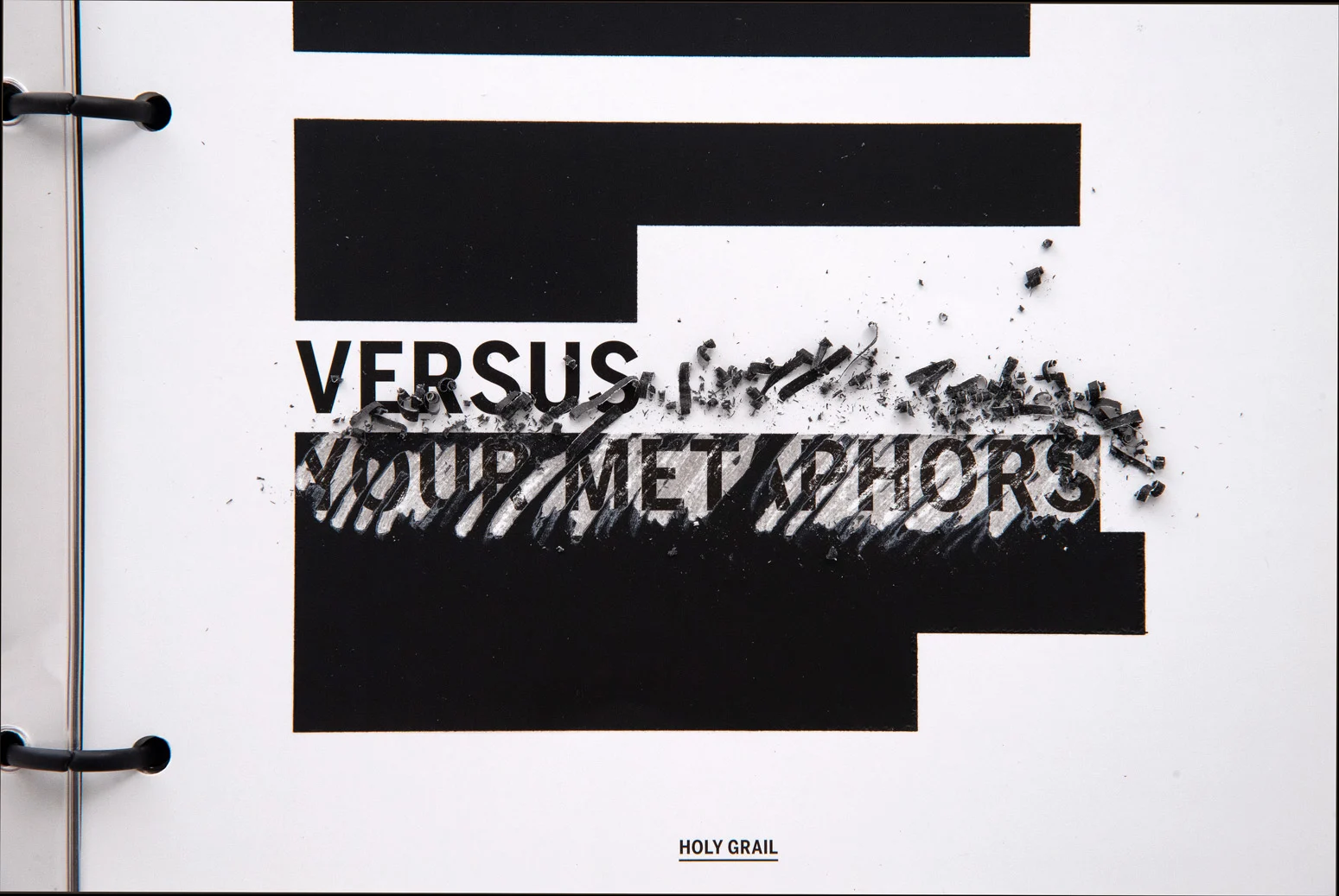
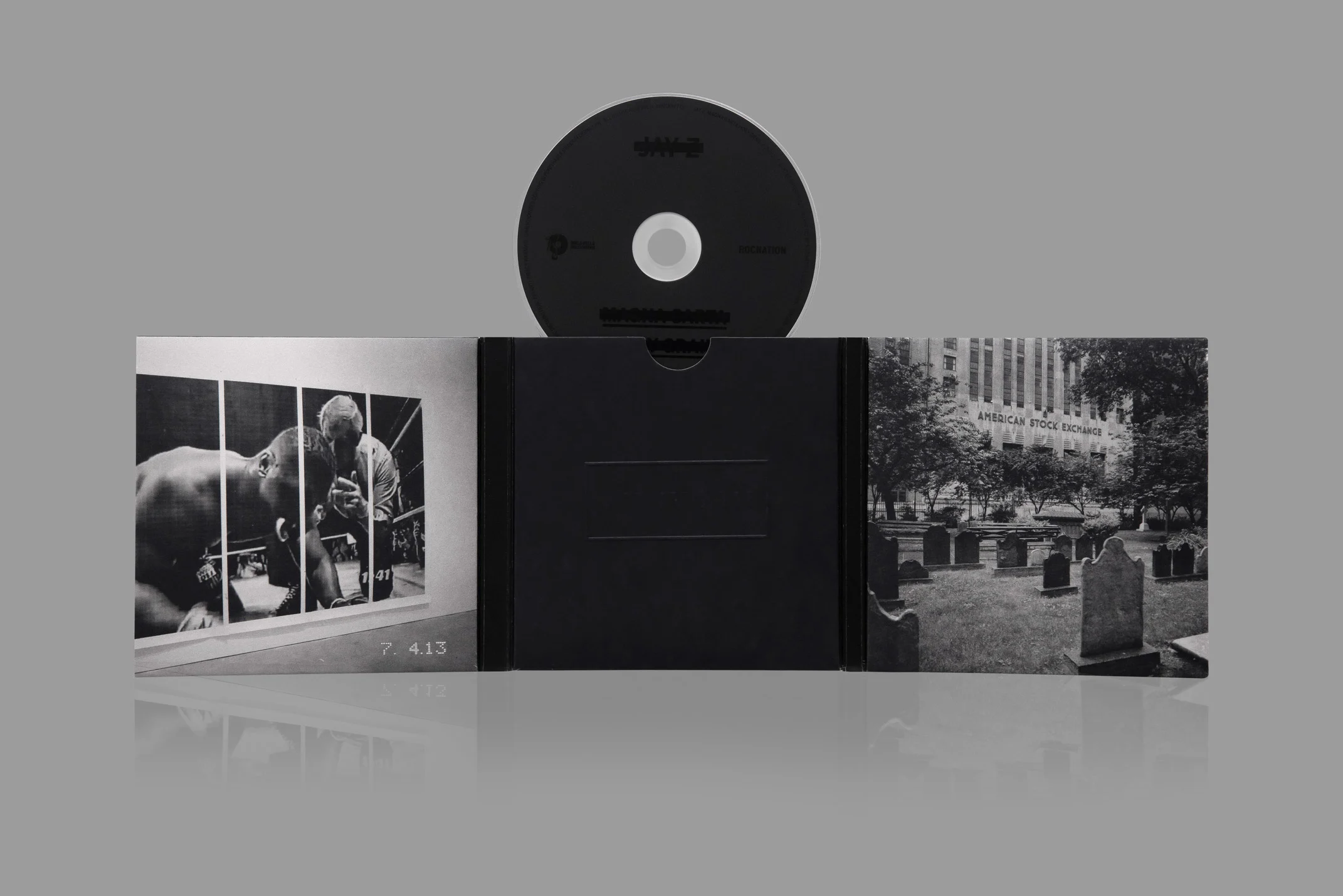
Willo’s introduction to Brian’s work was his 3D accordioning packaging for Liars’ tightly-wound 2010 album Sisterworld. “I was like, ‘whoever this mad person is, I’m gonna fuck with ,” says Willo. They paired oddball instincts with a prankster’s creativity on Jay-Z’s Magna Carta Holy Grail, with a deluxe vinyl edition which tests the limits of the medium as well as the expectations of listeners. Some booklet pages were unopenable and others were printed with text that was only readable by erasing scratch-off-style opaque panels. A flexi-disc of Jay Z’s steely, previously-unreleased Open Letter was sealed-tight inside the back cover. “It's essentially redacting information,” says Brian. “It's hiding your record inside of a sleeve that you've got to destroy to get .”
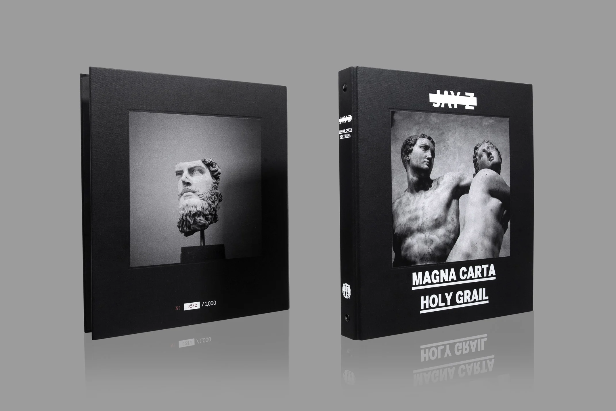
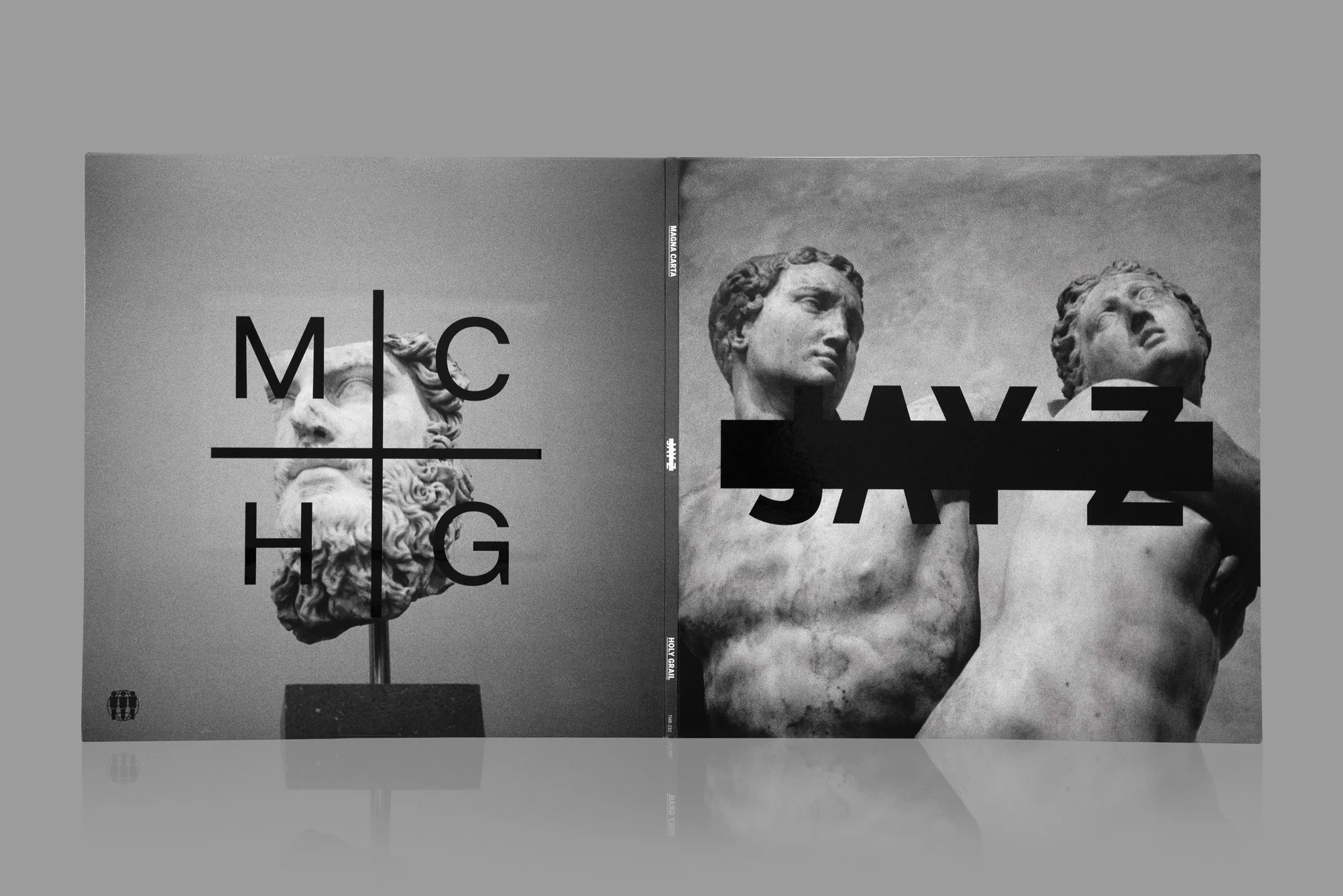
“It's doing a big mainstream record in a DIY or hardcore way,” says Willo. “A lot of these are kind of stolen photos,” he adds, gesturing to the Magna Carta Holy Grail cover. The grainy classical sculpture is Alpheus and Arethusa by Renaissance artist Battista di Domenico Lorenzi, snapped by Ari Marcopoulos during a jaunt around NYC’s Met Museum with Willo and Brian. They’d sold Ari to Jay-Z off the back of the photographer’s archive featuring hip-hop icons like Rakim and Fab 5 Freddy. Ari’s grainy reportage breaks from the stylised portraits of Jay-Z’s previous albums, as well as the gilded Watch The Throne art, which in comparison looks like something from Tutenkhamun’s tomb. “There was like this certain new opulence that was in the air,” says Willo. “I wanted to embrace that, but without the shininess of it.”
How were they able to get away with it all? “I don’t know!” says Willo, smiling. “Jay didn't really know who Ari was but he’s super easy, and a real patron to artists. why he's been able to be an elder to Rihanna as much as Kanye as much as me.”
NO AGE, AN OBJECT (2013)
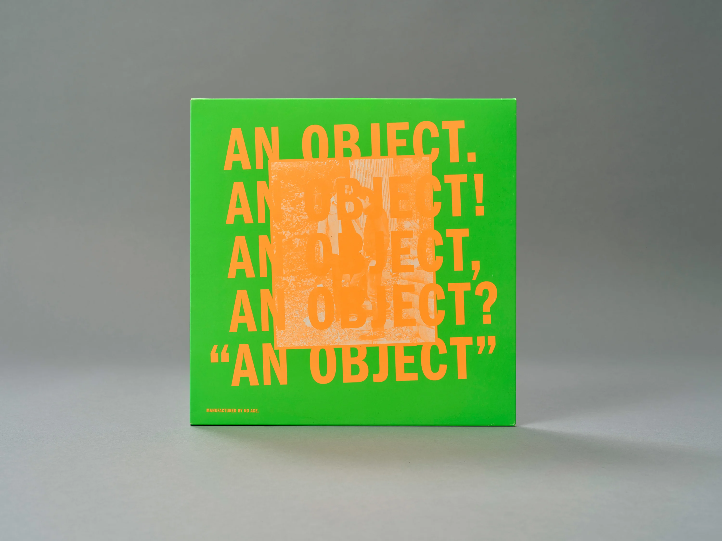
Los Angeles punks No Age are, in Brian’s words, “never going to be a band that has a picture of their face on the album cover. It always has to be some other narrative that's not about them.”

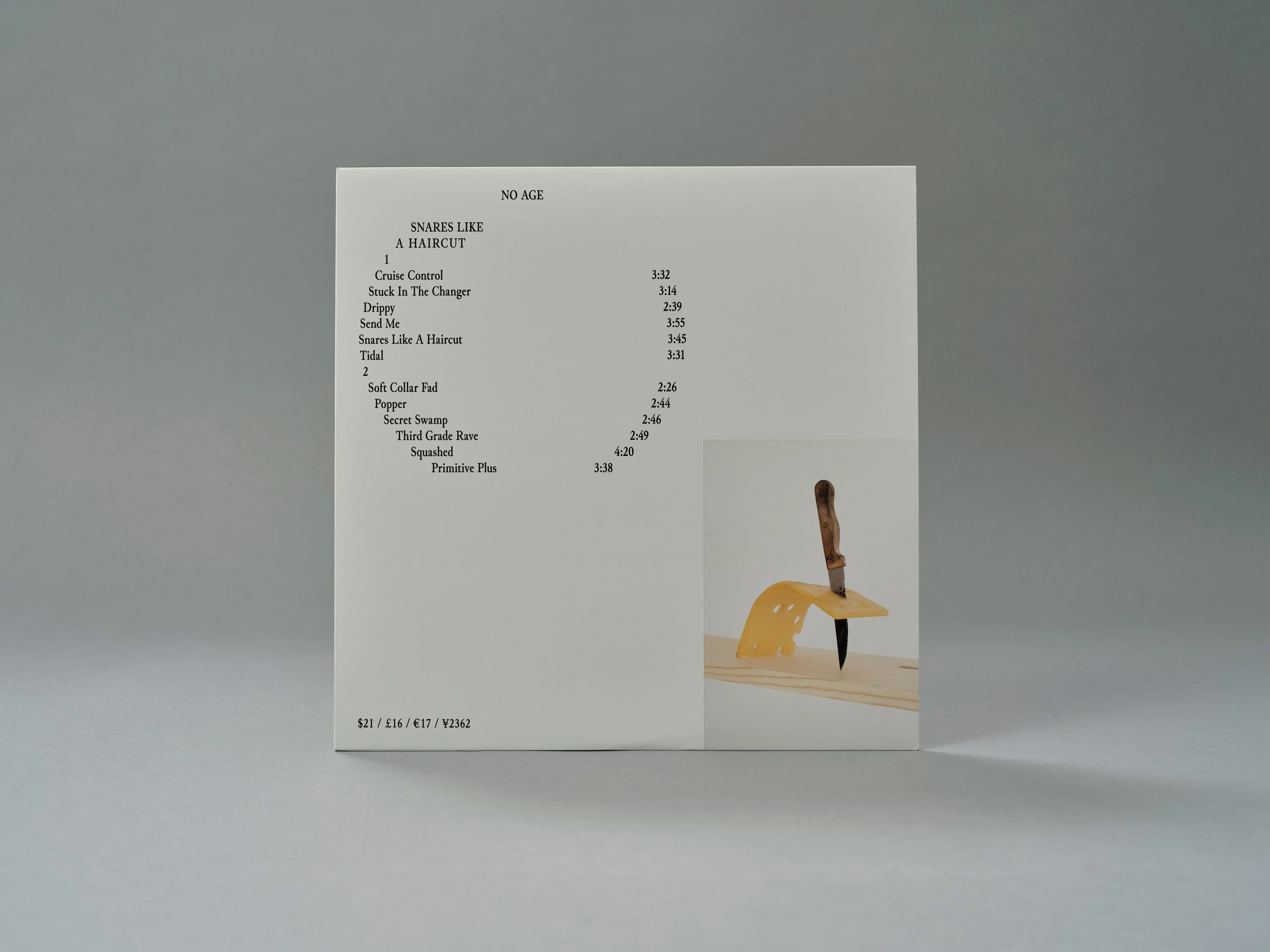
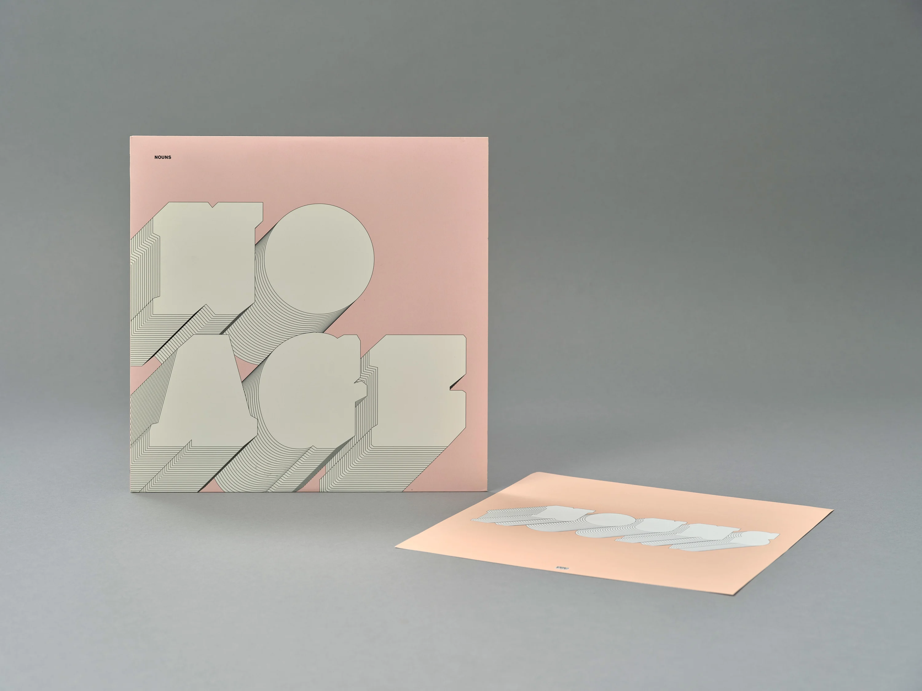
The duo’s third album An Object was a neon blast of Magritte-esque surrealism that poked fun of the album as a consumable product. “They were battling the idea of whether they even wanted to make a record,” says Brian, who grew up with the band’s vocalist Dean Allen Spunt in LA and has worked on every No Age album from 2008’s Nouns to last year’s Goons Be Gone. “Being a two-piece band, I’m always the third of the decision making,” he says of his working relationship with Willo. “We battled with the idea of what a record is; we started calling it an ‘object.’ That became the concept behind the album,” he says. The album was printed by Brian and No Age, DIY style, with a barcode in neon orange that is unscannable. “It’s an old punk, Crass thing,” Roettinger says, grinning. “The barcode is The Man.”
KESHA, THE HIGH ROAD (2020)
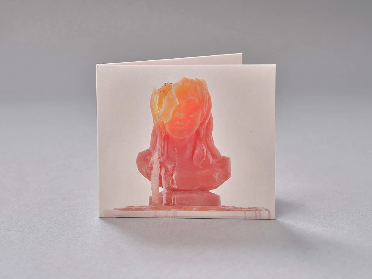
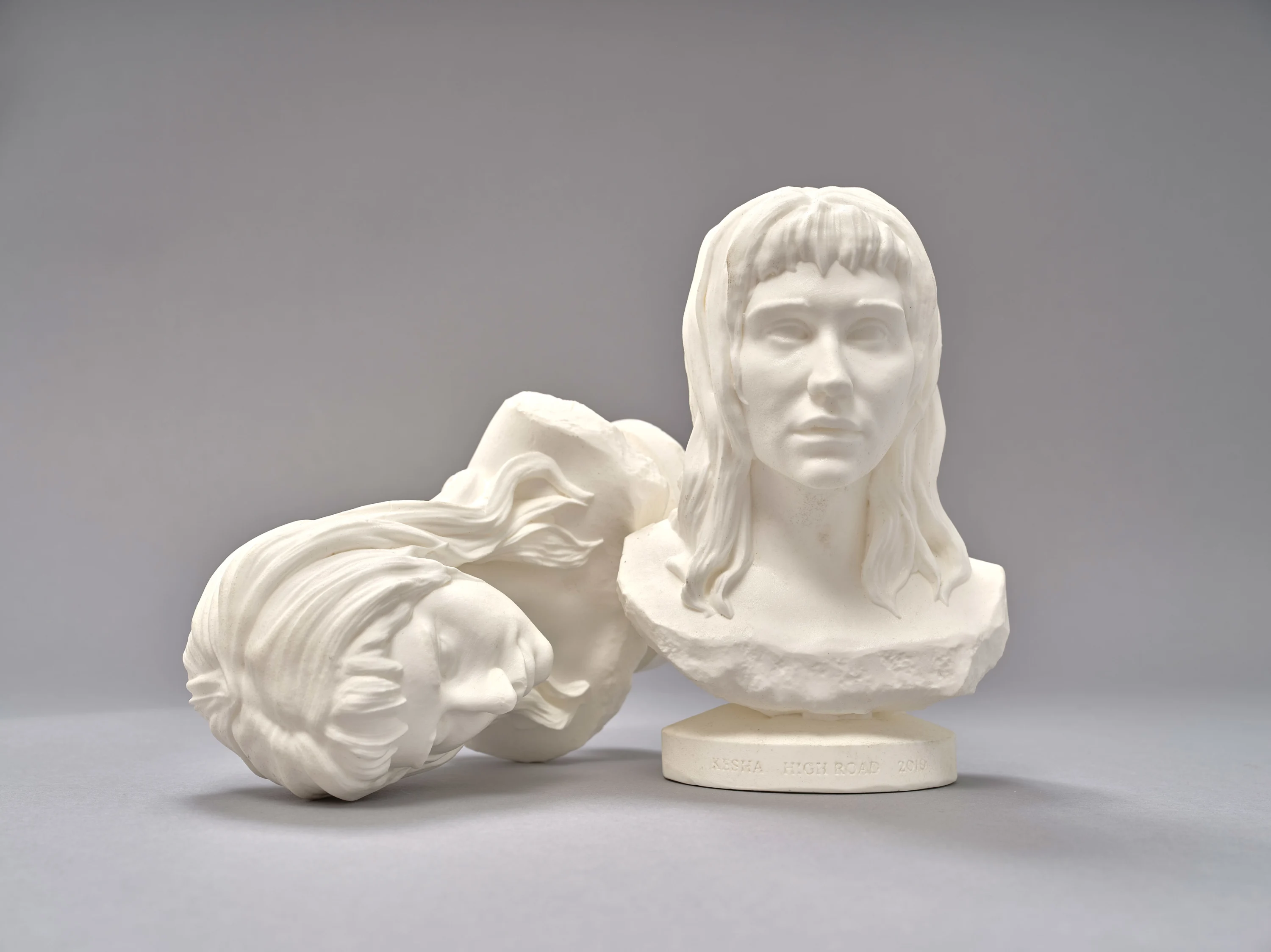
Kesha dug deep for 2017’s Rainbow, but with her follow-up The High Road she was ready to let loose with an album that paired her previous record’s powerful declarations of autonomy with a refreshed wit (“don’t circumcise my circumstance,” she quips at one point). Kesha “wanted to shed this identity that she people think she has,” says Brian who, with Willo, has become the pop artist’s defacto creative team in the past few years. He describes the work they did on her identity as “sort of a rebirth.”
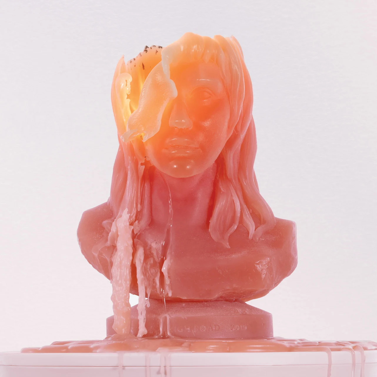
Kesha’s face and upper torso were scanned for the album cover, and then Perron-Roettinger’s in-house 3D team created a negative imprint into which pastel pink wax could be poured. The Kesha Kandle was born. “It's like a bust, which you associate with permanence,” Roettinger says. “And then it into a candle, which is impermanent.” Several foot-high versions of the candles were made, and scaled-down versions were sold as merch. Kesha’s a dream collaborator, Brian adds. “She really wants to push things – too far sometimes. She needs to be pulled back, which I think is a good thing.” The High Road was released as Kesha’s legal battle with Dr. Luke entered its sixth year, context which seems apt. On the album cover she is slowly being eroded, but she glows from within.
