Like any crush, a creative crush tends to follow a set pattern. The lightning bolt of infatuation. A period of watching and yearning. And, if you’re lucky, everyone lives happily ever after.
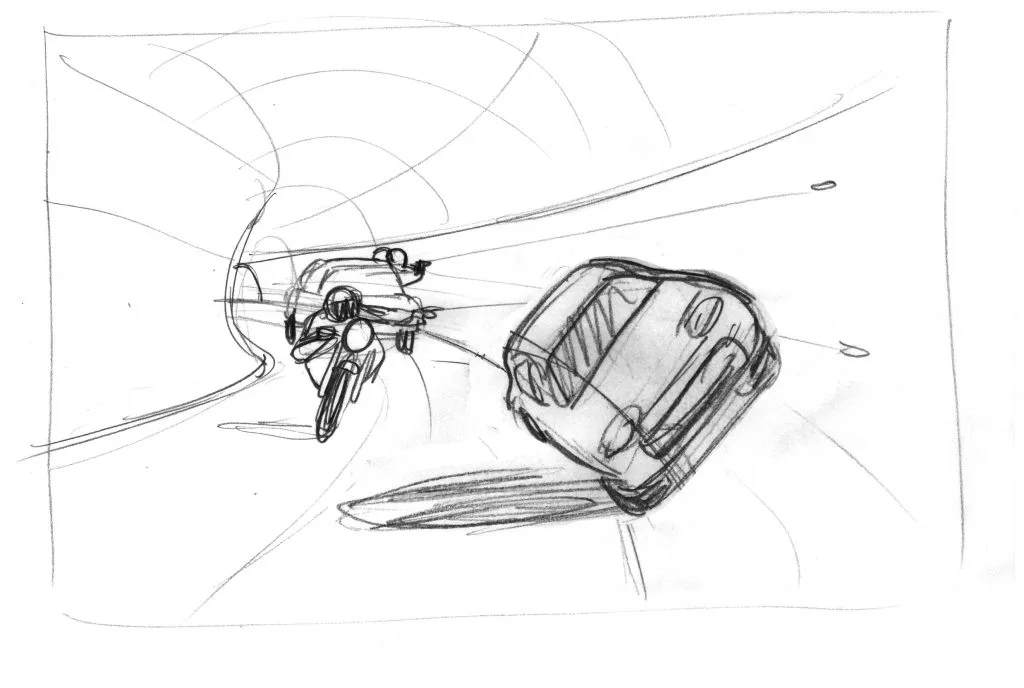
My crush on illustrator Klaus Kremmerz started with this New Yorker article about the film Baby Driver. I was sort-of-interested in the piece, but I fell hard and fast for Klaus’ felt-tip illustration that accompanied it – the energy, the texture, the composition.
So I set about finding out more about him, and found that apart from a simple site stuffed with his brilliant work, information was very scarce. This was both maddening and somehow charming.
When I emailed him, Klaus admitted this strong-silent type act was deliberate. “I want to keep my private life well separated from my professional life,” he explained. “I just talk about my work and not about myself – I let my work speak for me.”
I just talk about my work and not about myself – I let my work speak for me
Here’s what I could tease out of him – he grew up in Hamburg, Germany, and studied illustration at the city’s University of Applied Sciences. His mum was an oil painter, self-taught, working mainly on still-lifes. Klaus says growing up in such a creative household led him to follow his own career as an image-maker.
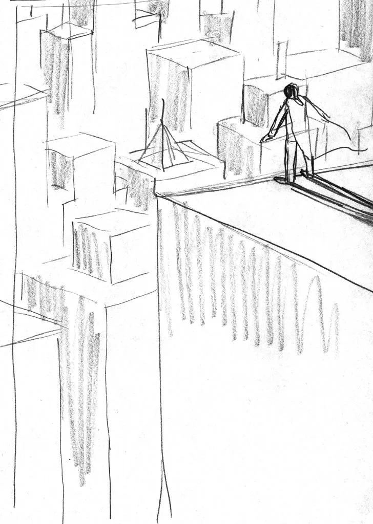
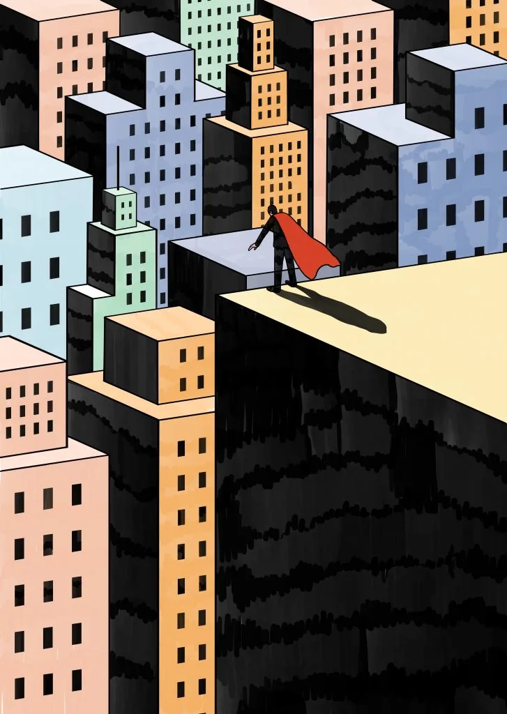
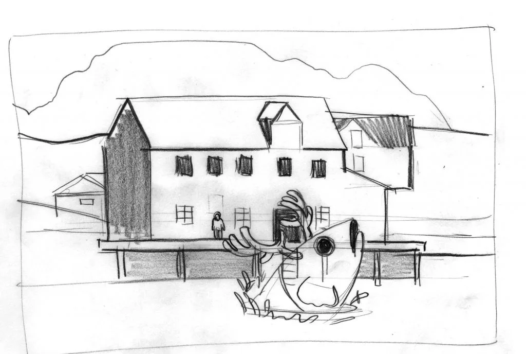
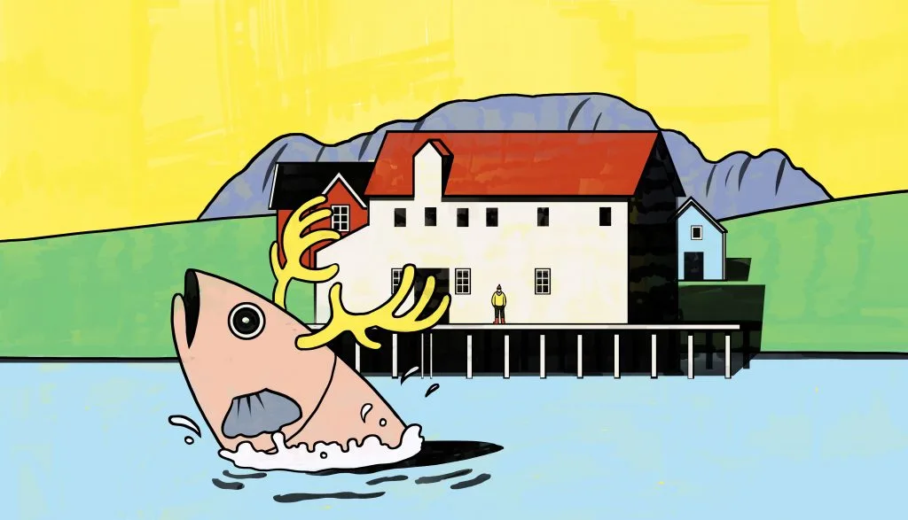
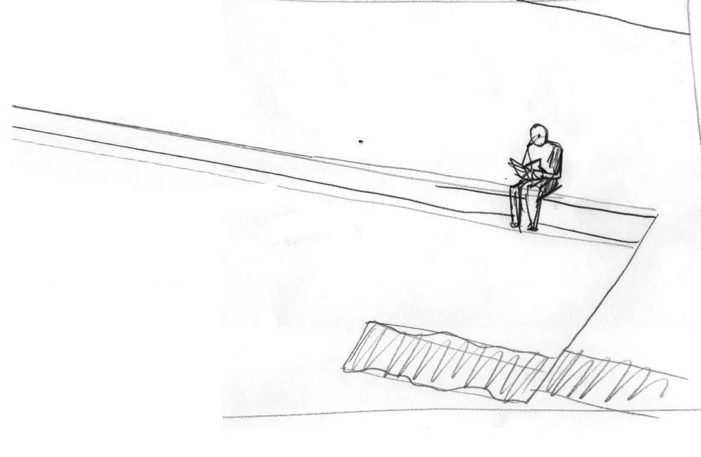
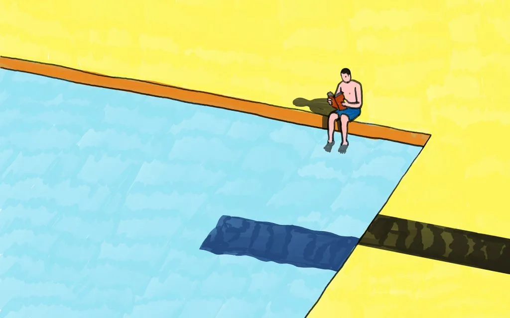
And, er, that’s it. So let’s focus on the work. The fantastic work-in-progress sketches Klaus sent us show off his drawing skills and the technical prowess which underpins his pictures. He has a nice line in weird – the horned fish in the lake for example – but that’s not his default position. The lone man sat by the swimming pool demonstrates that Klaus is equally skilled with simple, quiet scenes too.
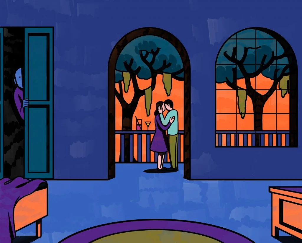
The use of felt-tip adds not only physical texture but also a sense of nostalgia to work – looking at the work it feels like we can smell our childhoods again.
“When I discovered the work of Wesley Willis, I started to use felt-tip pen as well,” he says. “It’s a primordial media, probably the first thing a child uses to make a mark on a piece of white paper. I do love this connection.”
The choice of material helps make his work feel like nothing else around at the moment, and it’s no surprise that clients like The New York Times, Monocle and Zeit Magazin are queuing up to commission him. He also produced a beautiful illustration of the New York City Public Library’s archivist for the last ever print edition of The Village Voice.
But the use of felt-tips is not just a USP for clients. It’s integral to the way he sees his creative practice.
“Felt-tips do not let you be over-elaborate. You need to find a quick solution, to avoid color spreading out of control on the paper.”
“It’s a fresh media rich with potential. Every time I start a new work, it feels like driving without the safety belt. I don’t know if the image is finished till is finished.”