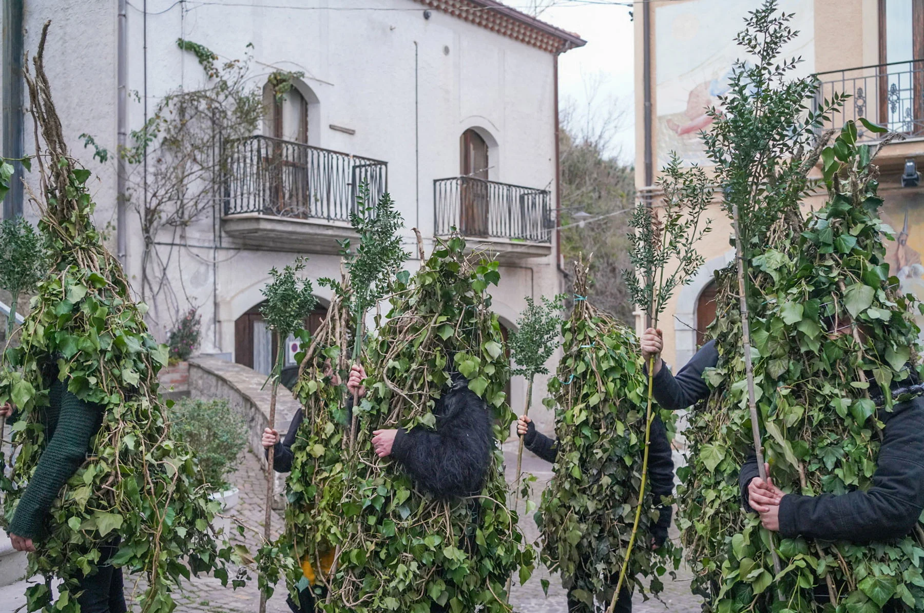
Is it possible to paint a full picture of a 120-year-old football club in one single image? Javier Arrés is the man to ask. He’s tried to do just that while working on cover images for five issues of These Football Times, an independent magazine that tells the stories behind a different club in each issue. He tells Alex Kahl about the research that goes into his detailed illustrated cityscapes, and how he goes about deciding what defines each club.
“I’ve been a fan of football since I was a child. I’m passionate about its history, its stadiums,” says illustrator Javier Arrés, who used to play as a goalkeeper as a child in the city of Granada. So it was the perfect news when These Football Times, an independent magazine that digs deep into a different club in each issue, asked him to design some of their cover images.
So far, he’s made illustrations depicting some of the most historic clubs in the history of the game, from the gargantuan Real Madrid to the famed Buenos Aires side River Plate. He brings as many signature aspects of the club as he can into his works, from legendary players to iconic footballing moments. He also zooms in on the cities the clubs represent, including well-known landmarks and local facts in each piece. “Football teams are almost always linked to a city, a neighborhood, a monument, a stadium,” he says. “In this sport, the city is more important than almost everything else. Architecture is such a big part of it, and a city’s heritage can tell us a lot about a club’s identity.”
Of course, Javier can’t include everything in one illustration, and there will always be some fans who aren’t happy about the omission of a particular player. “I feel a little bit of pressure in that way, but it’s what makes the project interesting,” he says. “I keep myself informed. I check every date, every shirt, every player. I want to know every idiosyncrasy of a club before I start work.”
The committed fans of these clubs might bring some pressure, but it’s also what makes the work so special to Javier. “Working with something people care so much about is an honor,” he says. “And it’s very special to be able to bring my work to fans around the world.”
The Leeds United Factory

“For Leeds I had to do some really extensive research, because I wasn’t that familiar with the club. I read their history and that of the city, and I went on Google Maps, which is something I do when I don’t know the club’s city so well. I walk through its most emblematic streets, and I look for tourist guides or blogs that talk a little about the most well-known places and cultural details of the city.
After that research, I knew my piece had to involve an industrial element, because the city has such a rich working history. I decided that everything was going to happen inside a factory, with the famous shield from the club’s crest being assembled right there inside. I also wanted to include two architectural elements of the city, its two bridges over the Aire river, which are beautiful. I was inspired by the Leeds market’s amazing metal coffered ceiling, which I also included. I choose aspects of the city, its history and that of the club and merge them all together.
Most of the players I chose to include played for their most legendary side of the 1960s and 70s. I also included their current manager Marcelo Bielsa, and Mark Viduka, one of their more recent stars.
The cup that’s shown is that of the Football League First Division, which Leeds have won three times. They last won it in 1992, the season before the league was renamed as the Premier League, a competition they have since never won. Those are details that you have to take into account, and why it’s so important that I do my research, because the fans of the club aren’t going to forgive even the smallest mistake."
The River Plate Machine
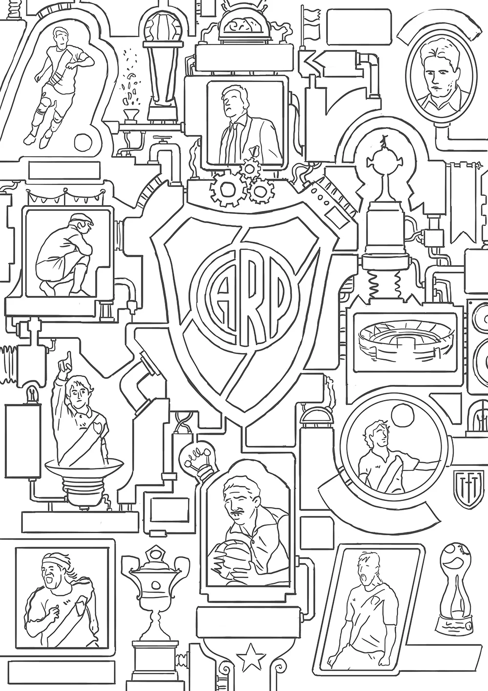

“When it came to making a cover for River Plate, it was clear we couldn’t refer to Buenos Aires too much, because it’s also the home of their greatest rivals, Boca Juniors. I decided to create a machine that would capture how well the club has been playing in recent years under the guidance of their manager Marcelo Gallardo. River Plate is a machine with an incredible history that works wonderfully and builds connections between its legends of the past and its stars of the present to succeed.
For each of these covers, I have to choose which elements or players of the club need to be the main protagonists. After my research, it was clear that the famous shield had to be the main character. After that, I could include legends like Labruna and Gallardo. I also had to include the iconic Copa Libertadores trophy.
I decided to include their stadium in the work, the Estadio Monumental Antonio Vespucio Liberti, which is also the biggest stadium in Argentina.
I like to put little hidden easter eggs into each piece, like the chicken – a reference to the nickname ‘chickens’ given to River Plate by the rival fans of Boca Juniors – and the machine firing bits of paper around – a nod to the Argentine tradition of throwing confetti onto the pitch and decorating the stands.”
The Machine of Real Madrid

“For Real Madrid, the main issue was deciding which players to leave out. They’ve had so many legendary players but there isn’t room for everyone. I know their history so well, and I knew that Di Stéfano was safe. The European Cup undoubtedly had to be a focal point, as they’ve won it more times than any other team. I even had to leave Sergio Ramos out, and people have often asked me why. I felt Santiago Bernabéu – the president of the club for 35 years from 1943 to 1978 – was far more important to include. It was impossible to make a global tribute to Real Madrid and not include him. He was responsible for rebuilding the club after it was decimated by the Spanish Civil War, and their iconic stadium was named after him.
I wanted to depict the players in a way the fans would recognize immediately; some great iconic moments from their career there. You can see Zinedine Zidane as he struck his famous volley in the Champions League final, and Raul commanding silence after scoring a goal at the Camp Nou.
You can see La Cibeles, a monument in the city of Madrid where its fans celebrate their titles, and for the club’s crest I made my own version that merges different shields from the club’s history. I linked all the elements together in a monumental factory, a building that’s absolutely packed with titles and hits.”


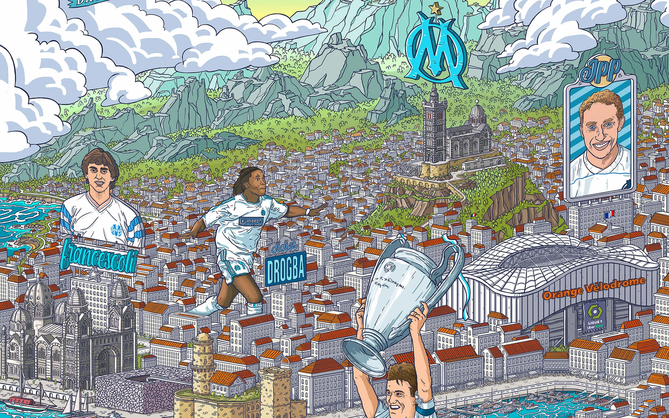
The O.M City

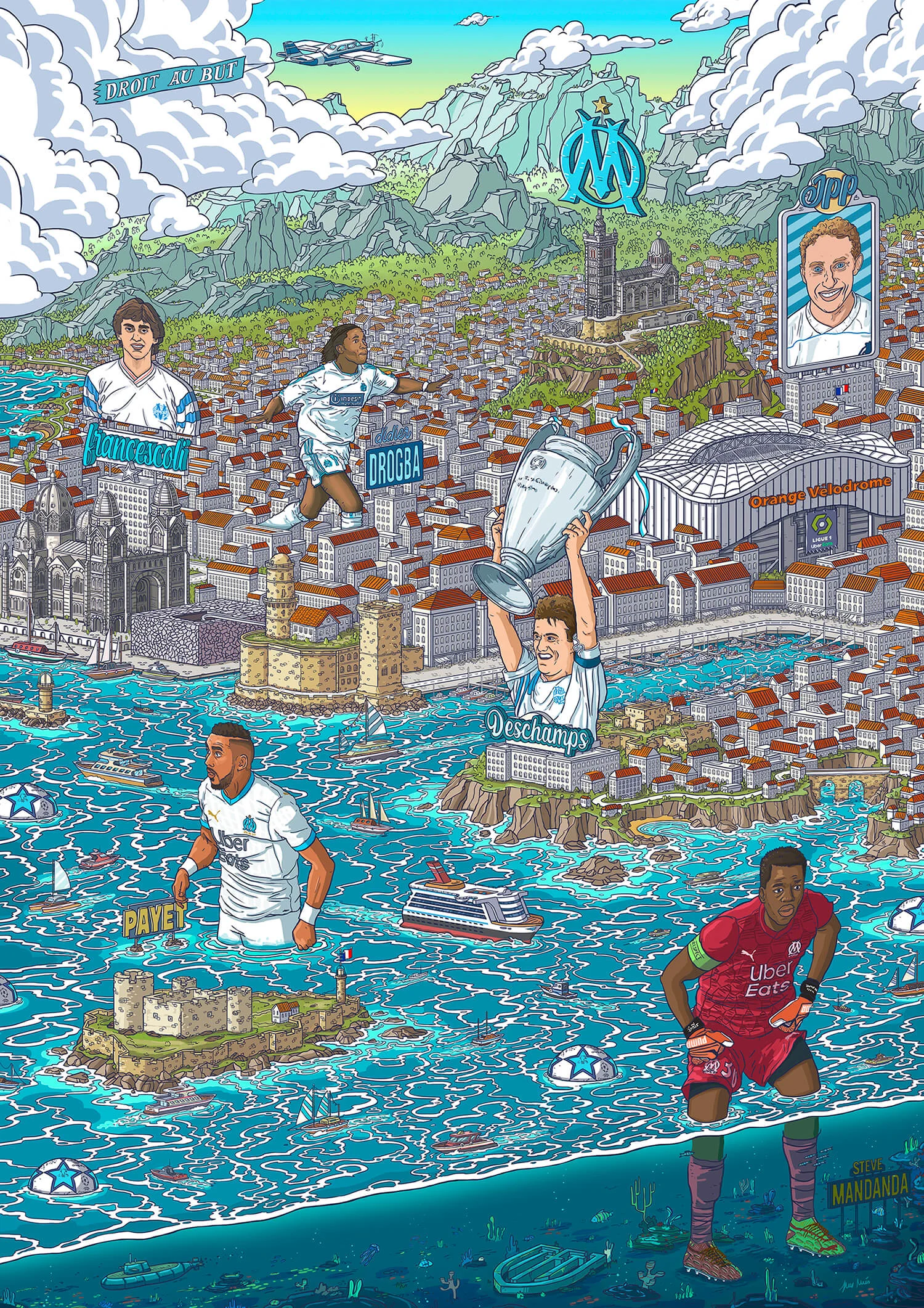
“For the Olympique de Marseille illustration, I knew from the very beginning that the city would be the focus; it’s a city I visited years ago, which helped me recreate it. I wanted to capture the spirit of the French blue coast, so images of boats and ships filled my head. There are so many emblematic parts of the city, from the port with its cathedral and modern museum to Notre-Dame de la Garde and the Château d'If, which was the setting for The Count of Monte Cristo. Football isn’t like some other sports, where a club can change locations or be given a new name. Clubs are intrinsically linked to the cities they were born in, and in football the place is often just as important as any legendary player.
One of the most important moments in the history of Olympique de Marseille was in 1993 when their captain Didier Deschamps lifted their only European Cup, so that moment had to be at the entrance to the port, like the Colossus of Rhodes. The great hero of the city welcoming you as you enter; there was something mythological about that and I wanted to include it.
I continued to play with this idea of ancient civilizations, and I portrayed all the players as if they were giants or local gods who patrol the city and defend it.”
The PSV Football Industry

“The famous club from Eindhoven was originally founded in 1913 by the company Philips, as a team for their employees to play in. Philips is known worldwide for its light bulbs, and I loved that because it meant my work had to be covered with bulbs, cables and electronics.
As usual, I walked through the city of Eindhoven on Google Maps, and decided to focus on the stadium. I spent hours online taking screenshots around it, and drew it again and again to make it as accurate as possible.
The good thing about a city only having one big club, as in the case of Eindhoven and Marseille, is that you can use lots of landmarks from the city. I added two monuments: the Evoluon and the Admirant Entrance Building.
My research showed me that the club’s peak came in 1988, when they won the treble. I also liked some of the club’s old logos and wanted to include them. Once I’ve decided what to include, all of my focus shifts to achieving the perfect balance between all those elements.”
