
Designer Tré Seals talks to Cedar Pasori about creating Vocal Type, a type foundry with fonts by creatives of color that highlights important historical moments.
Growing up on a farm in southern Maryland, just 20 miles from Washington, D.C., Tré Seals spent his days drawing. His parents worked for themselves, in manufacturing, while providing Tré with an education in the arts. “I always knew that I was going to be making things for the rest of my life,” remembers Tré. “I just didn't know what.”
Tré, now 26, figured it out sooner than most. On his way to becoming a successful graphic designer, he founded Vocal Type in 2016 — a type foundry by creatives of color. After growing disheartened by the statistical lack of diversity in design, he decided to become part of the solution.
The time it took Tré to create Vocal Type was invaluable, and at times, serendipitous. He didn’t always know how he’d create a first-of-its-kind type foundry, or where it would fit into his career, but he had strong roots and proof of overcoming extreme hardship. At four years old, he was diagnosed with a brain tumor and credits drawing with the emotional side of his recovery. In elementary school, he perfected his cursive writing. In high school, he sold graffiti-style notecards to classmates and began lettering tattoos. “During my last year of high school, I decided that I wanted to make my own font one day,” recalls Tré. “I didn't know any of the technology back then, but I hoped that one day, I'd be able to make and sell fonts to people.”
Even then, it wasn’t obvious to Tré that type would become the focus of his career. In college, at Stevenson University in Baltimore, he made branding his specialty and thought he’d go into agency work. During his senior year, Tré experimented with vector illustrations of letters and released them online for free. Thirty thousand downloads later, he was even further drawn to the expression and reach of type.
“My love for branding stems from my interest in fashion and blogs,” says Tré. “I remember spending hours reading Highsnobiety and Hypebeast. I collected clothing tags and keychains as a kid. To this day, whenever I craft an identity, if the story and concept is perfect, but the logo doesn’t look good on a T-shirt, I won’t show it to the client.”

It was an industry dominated by a singular perspective - white male.
After turning down numerous job offers — including one with Pepsi in NYC — and landing at a staffing agency, Tré went independent in 2016 and was unexpectedly in-demand for real estate company logos. “These companies wanted logos that looked like a logo I had already designed for a real estate start-up,” remembers Tré. “I would do research for city-centric logos, and they all felt and looked the same. I didn't see any essence of the culture or identity of the city.”
This led Tré to look up statistics about diversity in design. Various sources gave him a general idea — that around 3 to 3.5% of all practicing designers in America are Black, and ±85% are White. “I started thinking that I had chosen the wrong career,” remembers Tré. “It was an industry dominated by a singular perspective, white male, and because of that, everything looked the same. So I started thinking, how can I add diversity to the design industry?”


Though the realization was ultimately crushing, Tré found more fuel to continue; almost simultaneously, he picked up a PRINT magazine essay by the African-American graphic designer, Dr. Cheryl D. Holmes-Miller, titled, “Black Designers: Still Missing in Action.” The piece, a follow-up to her 1987 essay about the same subject, was a clear call to action for the next generation of black designers: to claim their place in the industry.
“I reached out to Dr. Cheryl D. Holmes-Miller and told her my idea,” recalls Tré, who heard back from her quickly before they Skyped. “She said, ‘You better do it before somebody else does,’ and that's basically when Vocal Type got started.”
A central question in Holmes-Miller’s original essay is that of “what’s missing in the design profession as a result of so little input from the largest of all American minority groups,” she writes. According to Tré, that “missing” element is straightforward. “It's representation,” he says. “When I was in college, I'd never been taught about Gail Anderson, Bobby Martin, or Maurice Cherry,” Tré adds. “I wasn’t raised to talk about religion, race, or politics with people. So talking about diversity is something that was originally hard for me.”

Since I was really little, I always wanted to have some sort of legacy.
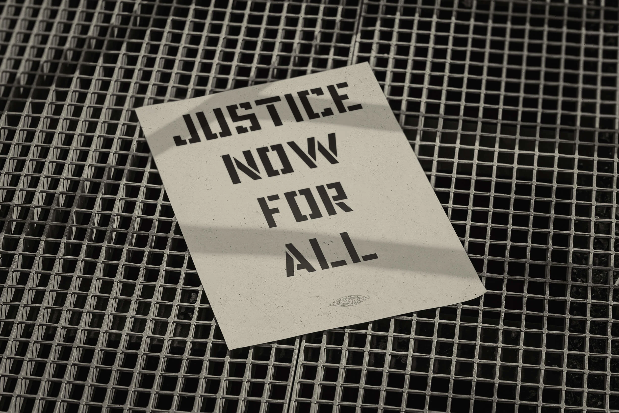
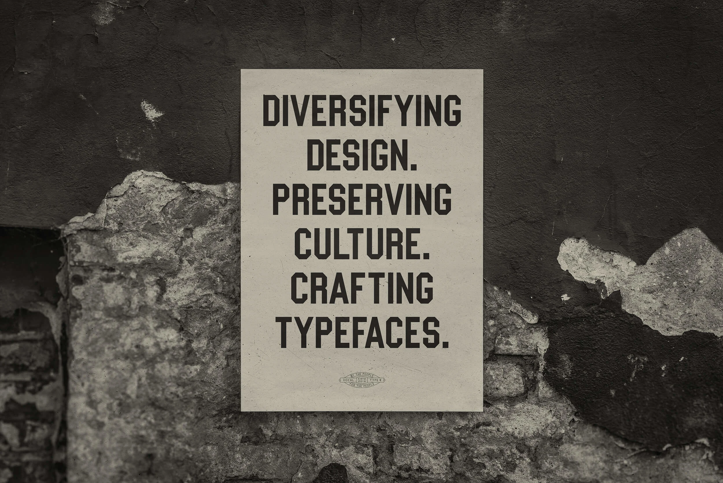
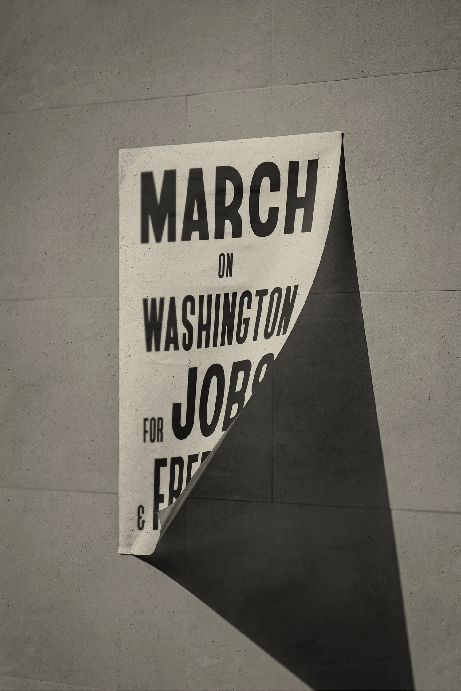
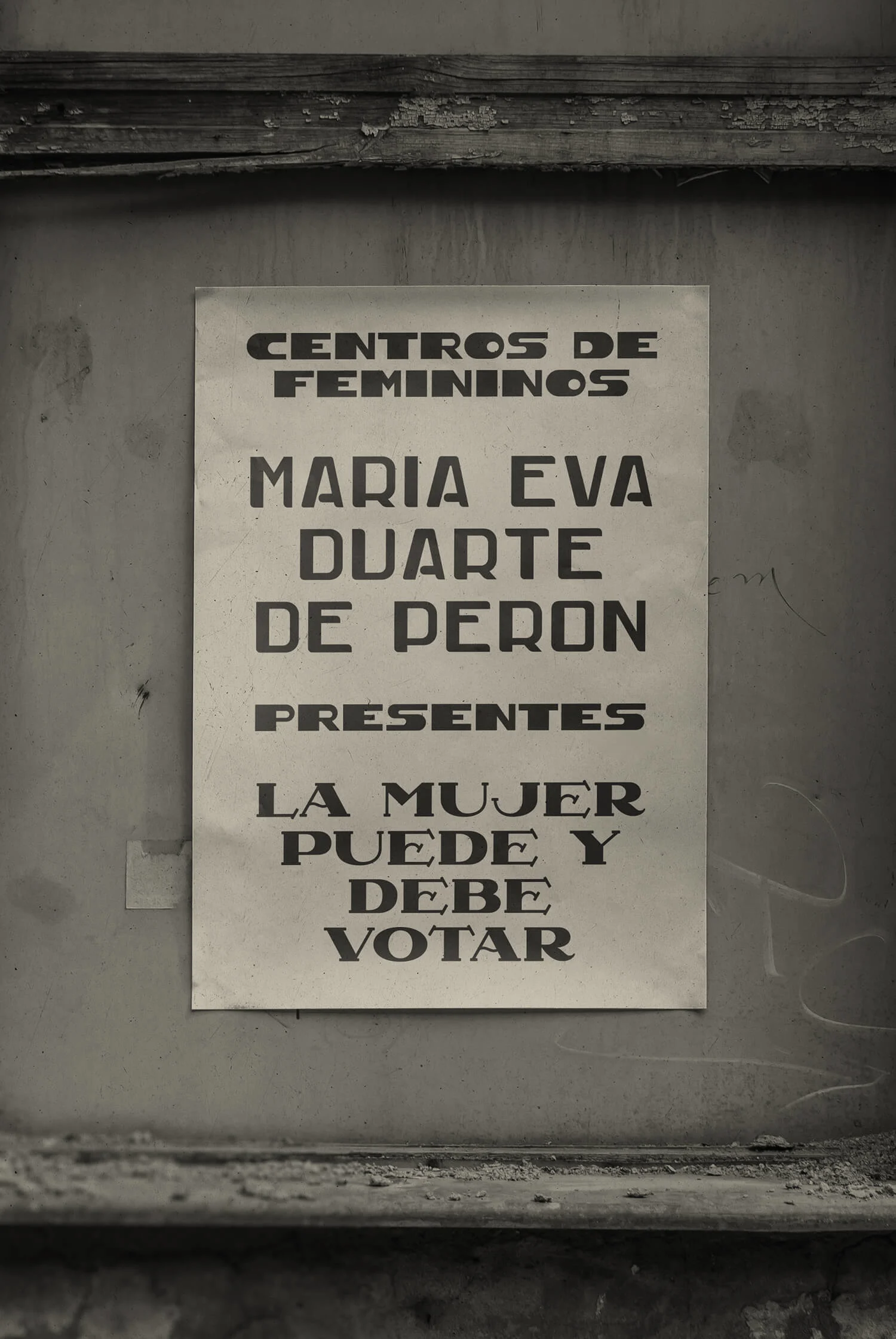
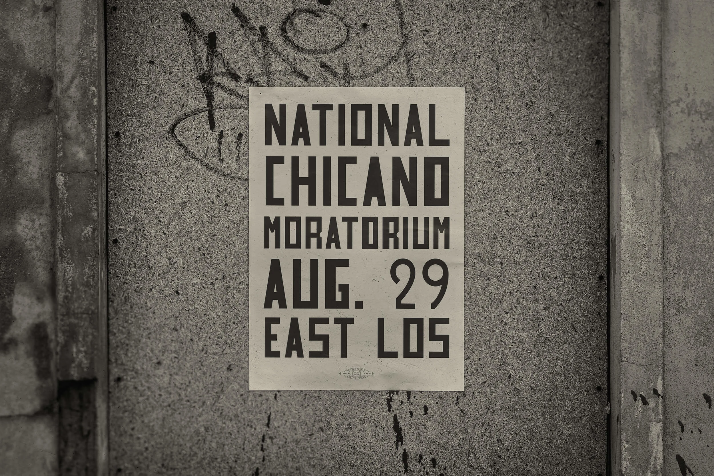
Representation, combined with history, became the foundational tenets of Vocal Type. “I wanted to introduce the history of different minority cultures into the designs of these fonts through citations,” explains Tré, who has designed all of the fonts currently on Vocal Type. There are fonts inspired by (and vessels for) the stories of the Civil Rights Movement, the global women’s suffrage movement, the Stonewall riots, and the National Chicano Moratorium march. Notable licensees include the Chicago Design Museum, AIGA D.C., and the Renegade Theater Company, among others.
By the time Tré was getting ready to release his fonts initially, he consulted a list of nearly 100 type foundries that he compiled in college. Using collages and showing work on Instagram’s “36 Days of Type” seemed like better ways to market and maintain ownership of his work. “I thought about selling my fonts through online distributors,” says Tré. “I decided to put in the hard work and do everything myself, instead of giving 30-50% of my earnings to a company that wouldn’t market my fonts.”
Tré is now working on adding typefaces made by other minority creatives to Vocal Type, a project that makes up 50% of his workload and is augmented by client commissions. He does most of the promotion through Instagram, Pinterest, and media interviews. Idols like Gail Anderson and Maurice Cherry have licensed fonts and continually offer support. From the start, Tré’s parents have been crucially supportive, including with a complementary project: the renovation of the family stable into Tré’s art studio.
“The farm that I live on, where the studio is, was built by my great, great, great grandparents, back in 1911,” says Tré, whose father called up a contractor as soon as he heard the idea. “Up until 2015, we had horses living there,” he says. “My actual workspace is where we kept all the hay.”

Tré’s decision to live and work on his family’s land was partially inspired by the book, The Alchemist, by Paulo Coelho. In it, the young protagonist is in search of a personal treasure and endures various trials and tribulations to get it. “He finds out that, the whole time, the treasure was at home — where he was originally from — in a place that he went to all the time,” describes Tré. “I realized that I wouldn't be inspired seeing things that everybody sees, in every other city, when I get so much inspiration from where I already am.”
Tré has documented the stable renovation on his Instagram, and it’s taken over three years to complete. He hopes to finish it this year and provide public access. “Since I was really little, I always wanted to have some sort of legacy,” says Tré. “There were many times when I thought about giving up, because Vocal Type was taking up so much time, and I wasn't getting a lot of sales. People have sent me ‘thank you’ letters and recommendations, and those have kept me going. I want Vocal Type to not only be my legacy, but to help other creators be remembered, too.”