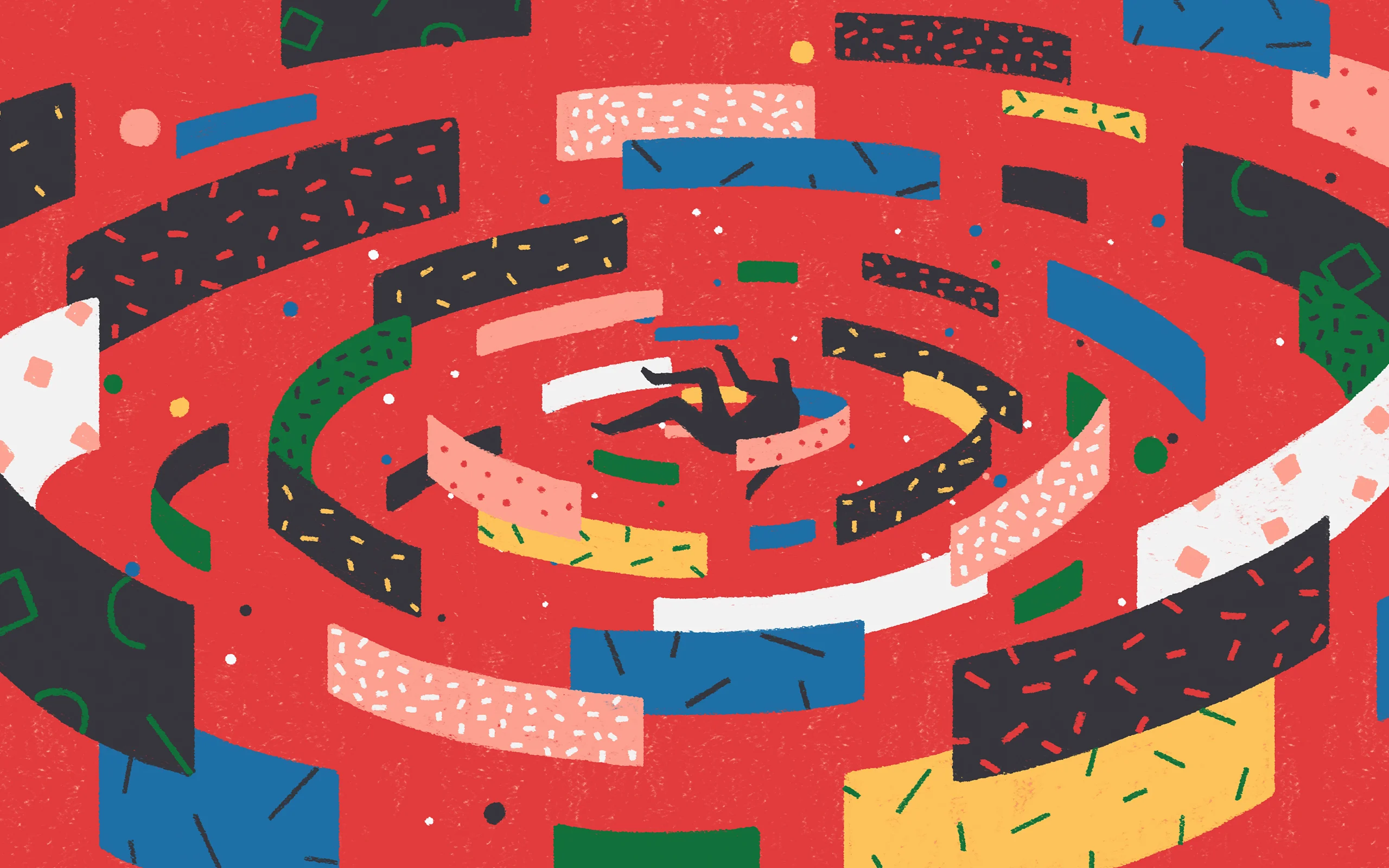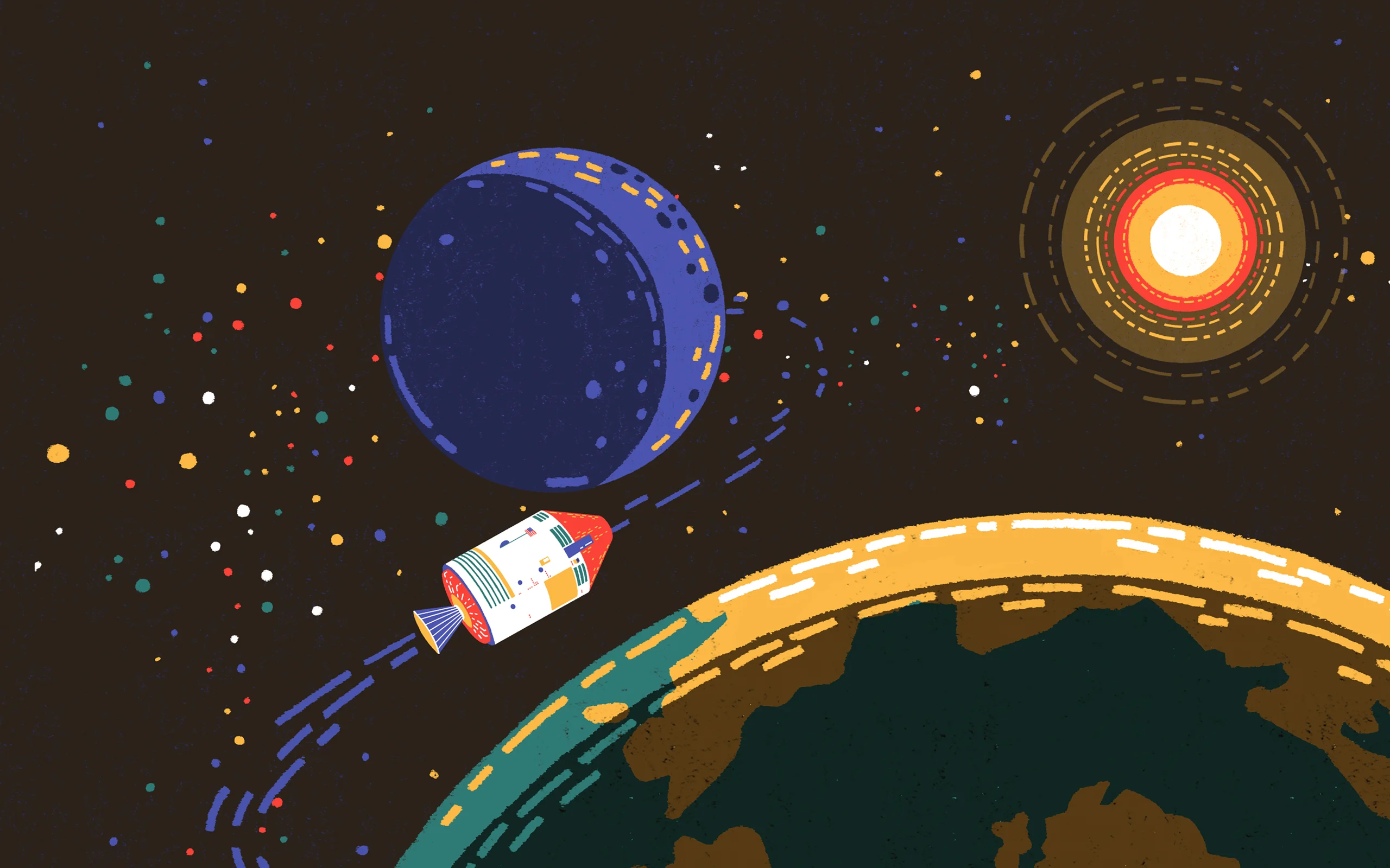

From illustrating rocket ships bursting through space to couples wining and dining, whatever topic Yukai Du depicts, it’s immediately recognizable as her work. But, for the now celebrated animator and illustrator, it wasn’t straightforward figuring out this style that now seems to come so easily to her.
Whereas most illustrators start with drawing and later move on to experiment with moving image, Yukai’s approach was the other way around. She studied animation, which mainly involved making other people’s work move, and then started creating her own visuals. “During my studies I illustrated a lot in my free time,” she explains. “It took a while before I felt comfortable animating my own work, but animating itself has always felt really natural to me.”

Yukai’s pieces have a distinct style. She’s not afraid to use vibrant colors and adds thousands of tiny stripes and dots to her images, giving them beautiful texture. The characters she illustrates, with their big bodies, tiny heads and hands, are easy to recognize too.
Little wonder then that Yukai has been commissioned by the likes of TED Education, The New York Times and The Guardian, nor that she has won some of the most prestigious awards around, including the Adobe Design Achievement, D&AD New Blood, and the World Illustration Awards. You might also know her from Dear People of Europe, a collaboration between 28 artists, which urged people to get out and vote.

A key part of her creative progression came when Yukai moved from China to the UK. It forced her to see things from a different perspective. This is where the curious shapes of her characters come from, for example. “People in Europe are much taller than me,” she says. “I don’t really know how it happened, I just started to draw people with a really small head and a really big body.”
Another key moment was her graduation project at London’s Central Saint Martins, an animation called Way Out, in which she really found her visual tone of voice.
“Before that project I didn’t have my own way of expression. I kept doing style frames over and over again, for five or six months. I tried so many different things; line drawings, sketches, different color palettes and different brushes. But I didn’t feel happy with any of those,” she says.
Then, working on a piece for Nobrow magazine, she experimented with what later became her signature approach – dots and stripes. “In that project, I found the style I liked. I brought it back for Way Out, and thought, that’s me! That’s what I want!”

From that moment on Yukai kept finetuning. “The first two years were difficult for me, because my full-time job took a lot of time. After work, I would get dinner, turn on my computer and start working again! It was intense.”
But lately, things have been better. Yukai built up her portfolio, bringing in more and more clients. This has given her the confidence, and the freedom to develop her work even further.
She refines things that make her work better, and sometimes revisits old habits. “When I graduated I used a lot of dark colors, but I never thought this would work for commercial purposes. It’s why I started using a lot of bright colors,” she says.
“This worked well, but when I made the TED Education piece last year, I went back to dark colors to reflect the sky. People reacted very enthusiastically, and now I get commissioned to illustrate planets and Milky Ways. It’s funny how things can come back around.”


