Desync — The team who created Foregone’s first-person-shooter computer game
The team who created Foregone’s first-person-shooter computer game
WeTransfer teamed up with US-based indie game platform Kill Screen to explore the design stories behind some popular games. Here we explore first-person-shooter Desync and how its signature look and feel evolved.
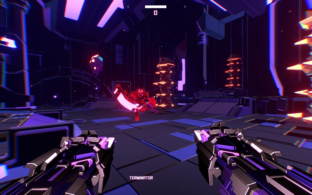
At first blush, Desync shares more in common with an after-hours dance party at Moogfest than your stereotypical grizzled, muddy action game. While most games of its ilk like Quake and Unreal Tournament strive for photographic quality, Desync goes in the opposite direction.
“We felt from the start that Desync would be polarizing, so the art style naturally fell into that wavelength,” said Sean Gabriel, the lead designer at Foregone.
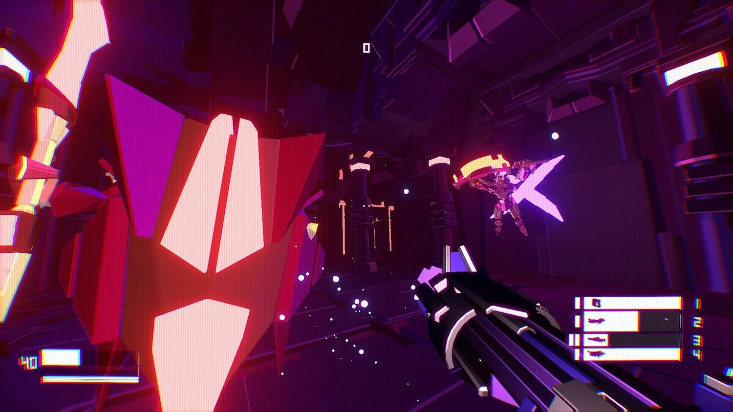
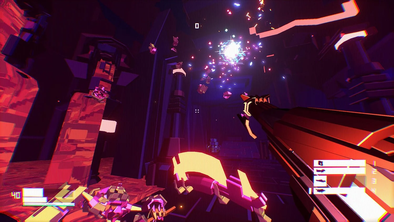
Much like the game’s alien arsenal, Desync’s entire visual design is eye-catchingly vibrant. This isn’t an accident. Over a three year development cycle, the game’s aesthetic was tweaked and iterated upon many times. But the end result is worth it – by breaking from the conventions of video game graphic design, the team crafted one of the most radiant titles in recent memory.
The art direction makes a great first impression, with intense showdowns set inside a glowing dance floor of an arena. Like so many games, the object is to destroy everything that moves, but here the attacks explode into sparkly pixie dust particles. As for the bad guys, they are somewhat reminiscent of Tron’s computer warriors.
This was a matter of necessity. Since the team only had a single artist, realistic graphics were impractical. Life-like game environments require a tremendous amount of money and manpower. Bungie, for instance, employed a whopping 159 artists to bring the hit game Destiny’s sci-fi world to life with realism.
“Getting bogged down with realism wasn't going to be an option,” Sean says.
Instead, the team needed to simplify. From the very beginning, they gravitated towards an aesthetic of lurid purples and electric indigos that pop from the pitch-black background.

“Initially, I was throwing around vague and unhelpful ideas like abstract; low-poly; digital; no robots,” he says.
It took a while for the team to settle on a direction. In various pre-alpha versions, Desync featured knights in armor, corridors and distant mountain ranges. Eventually they would strip out any reference to reality.
“With Desync, we wanted to avoid creating objects that resembled anything from the real world,” Francesco Calvi, the game’s artist explains.
This step was important. By removing anything that was remotely identifiable, the team didn’t have to worry about creating realistic depictions. They could solely focus on making the Desync world as unique as possible. Instead of the usual elevator, swarming cubes and hexagons swirl around the main character.
Often I was scratching my head trying to figure out how to make obscure object number 746 look good

Yet working within such strict limitations proved challenging for the small team, who are all young men in their 20s making their first game. Francesco, a self-taught graphic artist, had to fight off the urge to keep adding more detail to the abstraction. Also, influences were at a premium. He couldn’t look to nature or real life for inspiration, since the team’s mantra was to avoid any reference to the real world, although he occasionally cheated and peeked at anime.
“Often I was scratching my head trying to figure out how to make obscure object number 746 look good,” he said.
A lot of time was spent locating the sweet spot between too complex and too simplistic a design. Yet Francesco’s discipline was ultimately of great import to the game’s glowing reception (no pun intended). Without the element of simplicity, the dazzling imagery would seem self-indulgent, serving as a distraction to players who got lost in the noisy design.
By reducing the meticulous detail to simply shapes and polygons, Foregone was able to rethink decades worth of visual design. All it took was a little effort and a whole lot of neon to make the game shine.


