
To survive in a digital age, the print medium has to adapt and surprise. In India, The Irregular Times is sharing a love and passion for art and presentation in its newspaper pages. Writer Madeleine Morley speaks to its team about the community ethos behind their vision and the design elements that make their paper so unique.
What can a newspaper do that another medium can’t? Let’s put the question another way. Why create a newspaper in today’s digital day and age? It’s a question that has been asked in the creative world for over a decade now, with many lauding the physical materiality of print over the fleetingness of online experiences. But what has also become clear in recent years is that printed matter can offer readers an important gift—that of serendipity. This gift is a potentially liberating one in a time in which what we read and see is increasingly dictated by profit-driven algorithms and filter bubbles.
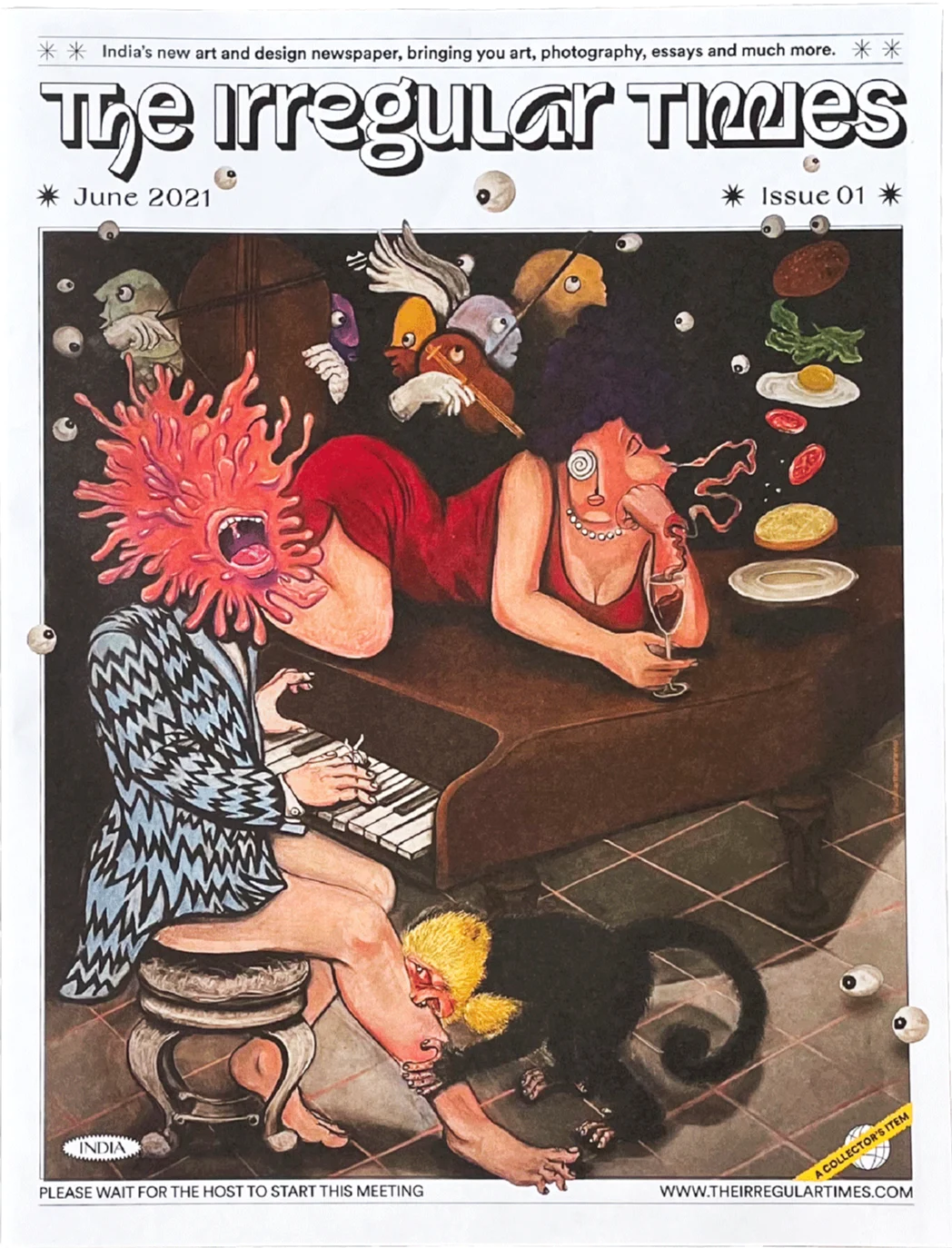
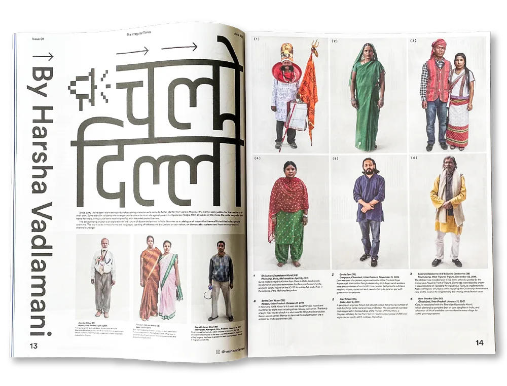
In 2021, the first issue of The Irregular Times came out in India, a response to endless zoom calls and the digital fatigue caused by the Covid-19 pandemic. Two years on and it just won a prestigious Type Directors Club award and released its fourth issue, themed “Tongue Tied.” The publication bills itself as “India’s First Art & Design Tabloid” and features the work of South Asian creatives from around the world. No two spreads follow the same design logic, becoming a celebration of personal expression and the individual voice of an artist. “We wanted to do something for independent artists and people who don’t have access to fancy art fairs or galleries in general,” says its co-founder and designer Anant Ahuja.
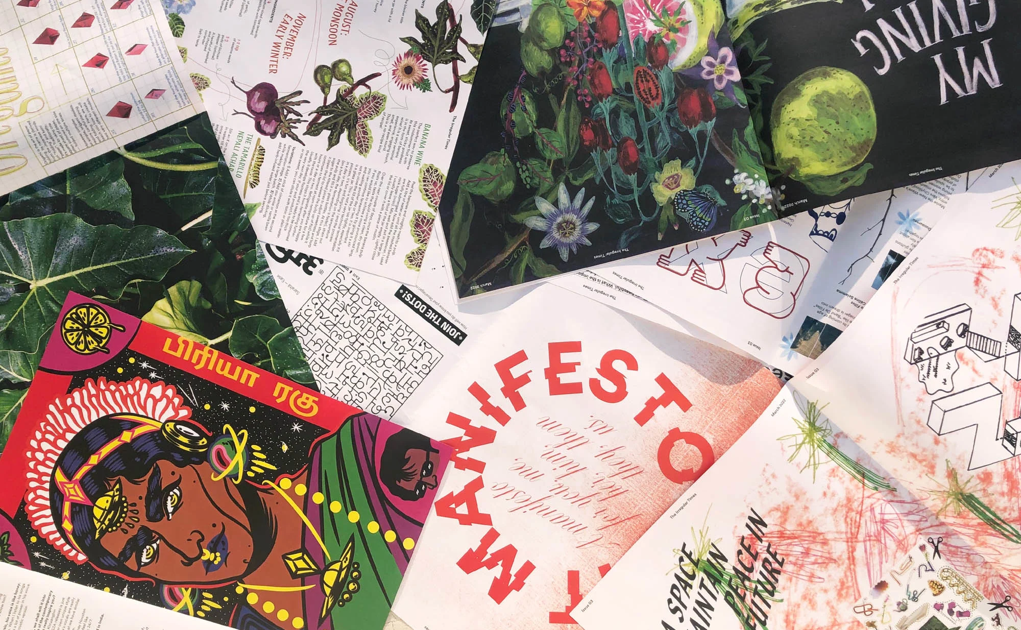
When you’ve finished one story and turn the page, you enter into another world entirely through maximalist colors, forms, and typographic treatments.
At the time, Ahuja and the rest of the collective behind The Irregular Alliance out of New Delhi had been curating an art show called The Anti-Art Fair. The idea behind the fair was that it would take place at the same time as large, moneyed expos.
“We wanted to bring the crowd that would go see high art to the art that was being made by artists who didn’t have access to those spaces,” says Irregular Alliance member and features editor Vasudhaa Narayanan. In the pages of The Irregular Times, the emphasis is similarly to “collaborate with different writers and artists who come from backgrounds that are often not accepted within art spaces.”

During the pandemic, it became clear that a printed newspaper could bring art to people at a time when events were canceled and socializing was largely digital. After four issues, the power of print to reach beyond an open-access art fair has become even more apparent. “To distribute The Irregular Times, we literally reached out to friends, people who have gyms, people who have restaurants, people who have cafes,” says Ahuja, who also emphasizes that the newspaper has been self-funded with rupees “from our own pockets.” “We went to local magazine stores in the DDA Market, a community market that apartment areas often have around them,” he continues. It’s in these spaces that the team hopes that people without easy access to art will stumble across the publication. Which brings us back to the question of what a newspaper can do that other mediums can’t as effectively: serendipitous encounters.
“I come from a background where art wasn’t a thing around me,” says Ahuja. “Only when I studied design did I start to understand what art and design meant. And it was very liberating to realize we could build something that could find its way to people like me.”

While each edition of The Irregular Times looks and feels vibrantly different, there are a few consistent elements issue to issue. A segment called ‘In the Studio’ presents an in-depth interview with an artist about their practice. ‘Womxn Making Strides’ features a womxn artist, writer or creative doing something unique in their field (the first issue spotlights a pole dancer). ‘Adults Anonymous’ is a coloring page, for which the team commissions an illustrator to create a sexually explicit drawing. It “exposes the audience to sexuality and normalizes it a little bit,” says Narayanan. “The idea throughout the newspaper is to challenge tropes in an interesting way through form.” And the editorial focus is always on the margins, on the people and ideas that lie beyond the mainstream. In most issues, a recipe from a chef in a part of India not often spotlighted by the media also tries to bring lesser-known food to light.
“We want to find the narratives of those outside traditional art spaces, because it’s really important to address them in some shape or form,” continues Narayanan. In the latest issue, an interview with art critic and perfumer Bharti Lalwani is one such narrative; her perfumes are inspired by 17th and 18th Century Mughal and Rajput garden paintings, many of which have been stolen, bought-up, and accumulated by Western collections. “Her form of critique is to address the way the white world hoards all these paintings and does not give access to them to the Global South,” says Narayanan.

Challenging the mainstream often means putting extra work into uncovering the unknown, and deliberately taking the road less traveled.
Challenging the mainstream often means rejecting the easiest editorial approach. It means putting extra work into uncovering the unknown, and deliberately taking the road less traveled. For issue four, Narayanan and her editorial team were initially following a lead to work with a collector with a vast archive of different publications that once existed across India. But the material is no longer in India—it’s now part of the University of Chicago Collection. “So if we would have done that story, we would have been dependent on people collecting these resources outside of the country. We’d be trying to collaborate with them to talk about our own history,” says Narayanan.
“This is something we can challenge. In situations like this, we ask ourselves, how can we ask someone who is South Asian, who has research and background in South Asia, to provide a new perspective on a historical topic?” Instead of profiling the North American archive, the new issue features a stand-out essay by Bengaluru-based Karthik Malli on the history of metal typefaces in colonial Bombay, which explores, among other things, metal type’s entanglements with caste-based labor practices.
“That’s how we try to find our own research in the process of commissioning, and evaluate who is the best person to write something,” says Narayanan. This care filters into collaborations with interviewees, too: the publication is largely English language based, but for interviews with those who don’t come from English-speaking backgrounds, interviews are always translated to make sure the profiled can read, and see, their own voice in their mother tongue. This thoughtfulness then also filters into the publication’s design and particularly the differing title treatments crowning every spread.
We challenge the normative ways of printing: You have to turn the newspaper left and right and upside down to interact with it.
“Most of the pieces we put together are so well researched and for such a long time,” says Ahuja. “We want the titles to emphasize that and have their own weight.” Each column has its own design language, too. And when you’ve finished one story and turn the page, you enter into another world entirely through maximalist colors, forms, and typographic treatments. “The idea behind that is like what we tried to do with the art fair. We’re not hanging paintings on white walls. We’re creating an immersive experience,” says Ahuja, remembering launching the first issue back in 2021, and papering an entire staircase with pages from the newspaper.
Which brings us one last time to the question of the power of a newspaper in our digital times.
“We want people to cut out the art, frame it, make zines with it, create with it,” says Narayanan, describing how readers have made whole new artworks with The Irregular Times’s spreads in the past; winding, towering, paper-y sculptures and new publications in their own right. “We challenge the normative ways of printing: You have to turn the newspaper left and right and upside down to interact with it,” she says. All of this takes away the “preciousness” of a printed work, and turns the design into something functional, accessible, playful, physical, and unique. By engaging with form, that might inspire a reader to create their own new form.