
New York-based Venezuelan artist James Rönkkö began looking into analog design processes after he started to feel uneasy about his screen time a few years back. By combining digital methods with paper folds, sun spots, heat transfers, physical typesetting and low-res scans, he’s created his own hybrid approach, and the results are uniquely his own. He tells Alix-Rose Cowie about his obsession with evidence of human touch in design, and his constant pursuit of new ways of making.
James Rönkkö lived two lives as a teenager: one with his friends in Venezuela where he grew up, and one in a global online community of coming-of-age kids making electronic music and releasing it on SoundCloud. Design came by chance when these friends needed flyers, gig posters or album art. Knowing a bit of Photoshop, he began making “weird cover art” and found it came more naturally to him than the music had.


Born in 1999, Rönkkö has always known computers, spending countless hours online where everything is designed to a grid and all the text is aligned. A few years back, as an adult working in New York City, he started feeling uneasy about all the time he was spending in front of a screen. He began researching pre-digital design processes like physical typesetting, heat transfers and screenprinting. “I started to experiment with doing things in real life out of curiosity about how things worked in the past,” he says.
Looking at older graphic design, he’s compelled to figure out how it was made and then try it himself. He’s moved by evidence of human touch, like an unintentional paper fold in a scan of an old poster online. “That paper fold feels really good there because it’s real,” he says. “It’s not there to be aesthetically cool. As you follow that feeling deeper and deeper you end up the asshole ironing images onto pieces of paper,” he jokes. “I’m just in search of that real life feeling.”


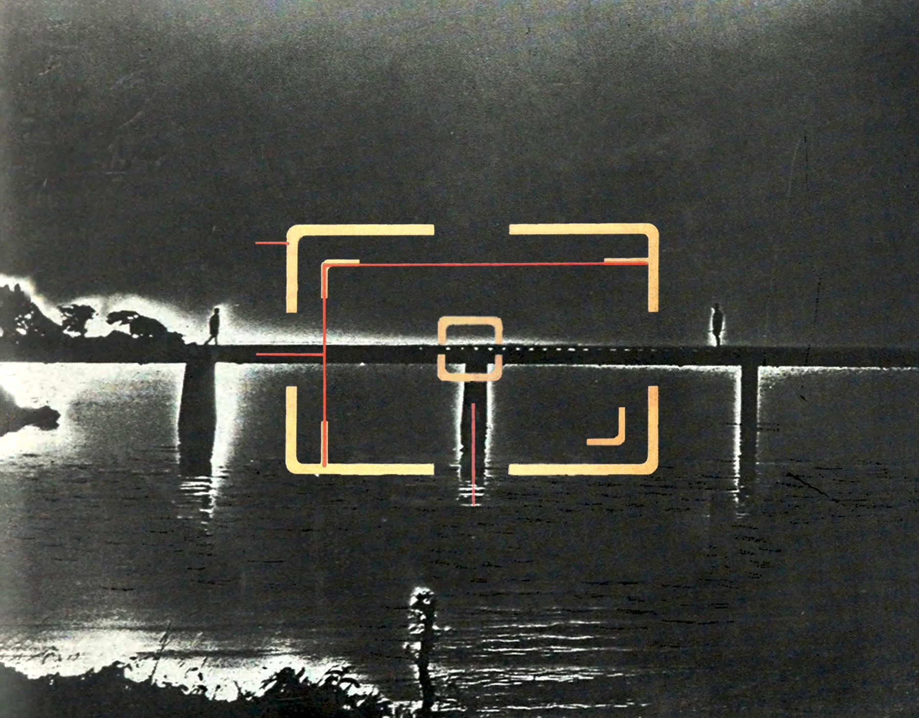
Blending old and new technologies, Rönkkö has created his own process of hybrid analog-digital image-making. The results are lo-fi, textural, imperfect compilations of found images and his own photography or mark-making. Examples of his process include taking a screenshot, printing it out, transferring it onto textured or distressed paper with a hot iron, and then scanning it back into old software like Photoshop CS1 to tweak; or projecting an image onto paper and taking a photo of the projection with his phone. He keeps paper outside to get warped by sunlight or gather dust to create different effects, and he scans images at 75dpi to get a soft, blurry look.
“I have a loose idea, and I try to express it through little blips of images,” Rönkkö says. These might be his own film photos or drawings or things he finds in old nature photography magazines; a decal on a car he biked past and turned back to snap; pixel art inspired by a pattern in a crochet book; or designs on a tattoo sheet he once saw in Venice Beach. “I’m always keeping an eye out for things I might like,” he says. “But I try to use things that feel like they have been lost in time, gone forever from the culture, like a phantom image. You could see the most beautiful painting, and it’s in the back of a matchbook for an old hotel, and that’s it, that’s its life.” He rescues and reworks the found images, giving them new context in his collages, or “graphic remixes”.


You could see the most beautiful painting, and it’s in the back of a matchbook for an old hotel, and that’s it, that’s its life.
Through Manuela Press, started with a friend, Rönkkö is motivated to find places other than the internet to share his ideas: handmade prints or self-published zines and books. “At some point, when every image that you see online, every video, every word that you read could potentially be fake, we’re all going to be sick of it,” he says. “And my hope is that people just log out.” Everything he’s made (even digitally) since 2019 exists as a physical copy. “Growing up, all I heard was ‘print is dead’. And it’s not really, it just needs to be rethought a little bit.”
One of Manuela Press’ aims is to experiment with printing techniques and formats to lure the phone-obsessed away from their screens. “It’s about making things more fun to look at and read,” he says. “How stimulating does a book have to be to make you put your phone away?” In order to create an engaging physical experience, they print on different tactile materials, playing with surprising compositions and setting text so that a reader has to follow it around the page. They’re still in the early days of having fun with this concept, which they’re playfully calling “Books II.”
A line in Rönkkö’s zine “Litework” reads “As the alarm button flashes relentlessly…” “That’s what it feels like to exist right now,” he says, and he hopes unfolding an idea in your hands could be the antidote.

A tour poster Rönkkö made recently for the musician Nick Hakim originated as a screengrab from the anime “Lain” by Yoshitoshi Abe. It references Ted Nelson, who invented the term “hypertext.” “Ted envisioned a world where every log made online was connected in a detailed network, allowing people to follow trails of related information across different digital expanses,” Rönkkö writes in the image description. “He believed that computers offered a way past the limitations of paper.”
Even so, Rönkkö makes the point that computer operating systems still use terms like “pages,” “documents” or “folders” to describe and organize files. “We still hold onto the physical concept of paper to anchor our digital experiences,” he says. Despite the constant march towards bigger and better technologies, people find comfort in keeping the old ways of doing things in sight—a belief that fuels Rönkkö in his search for new ways to give people something to hold.

