
Edith Young
In showrooms and living rooms, and on highways and runways, the message is clear: color is out. In our age of minimalism and monochrome, a neutral palette seems to have infiltrated all corners of design—but what does it all mean? Writer Neelam Tailor investigates the causes and consequences of our chromophobia.
Images and color research by Edith Young.
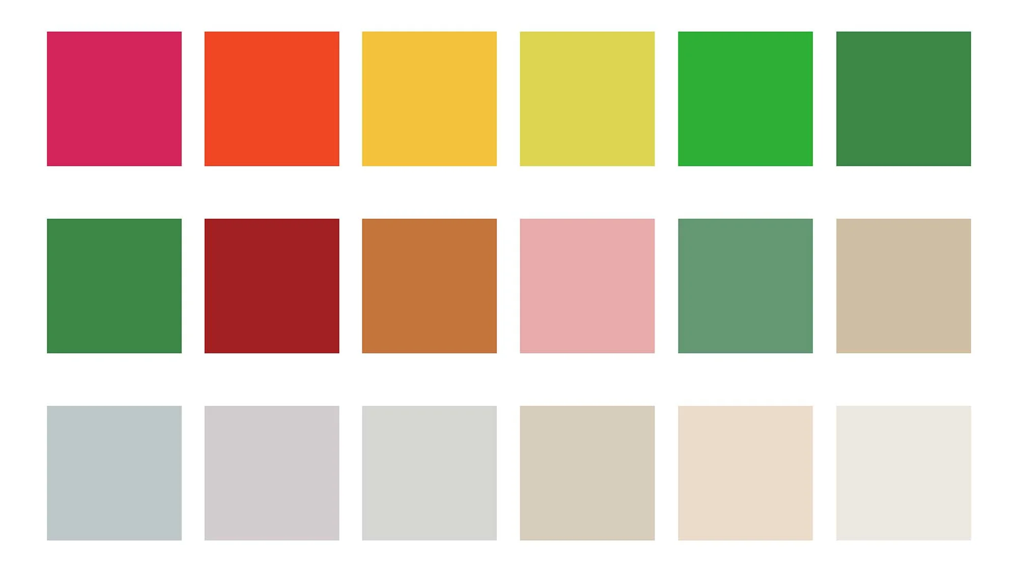
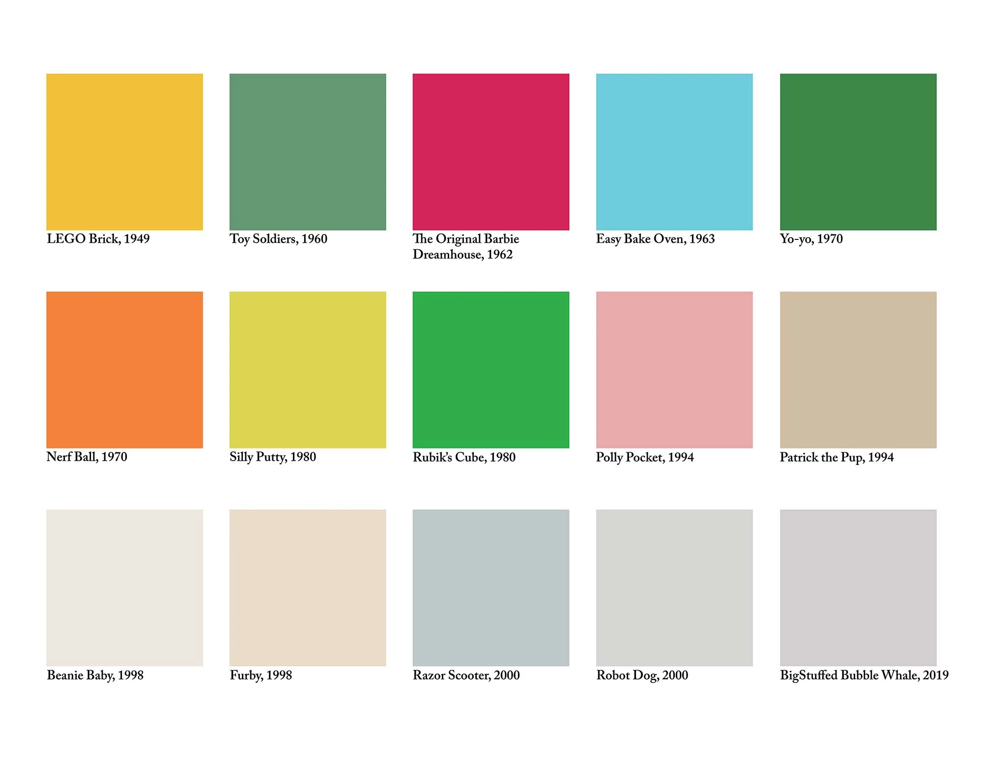
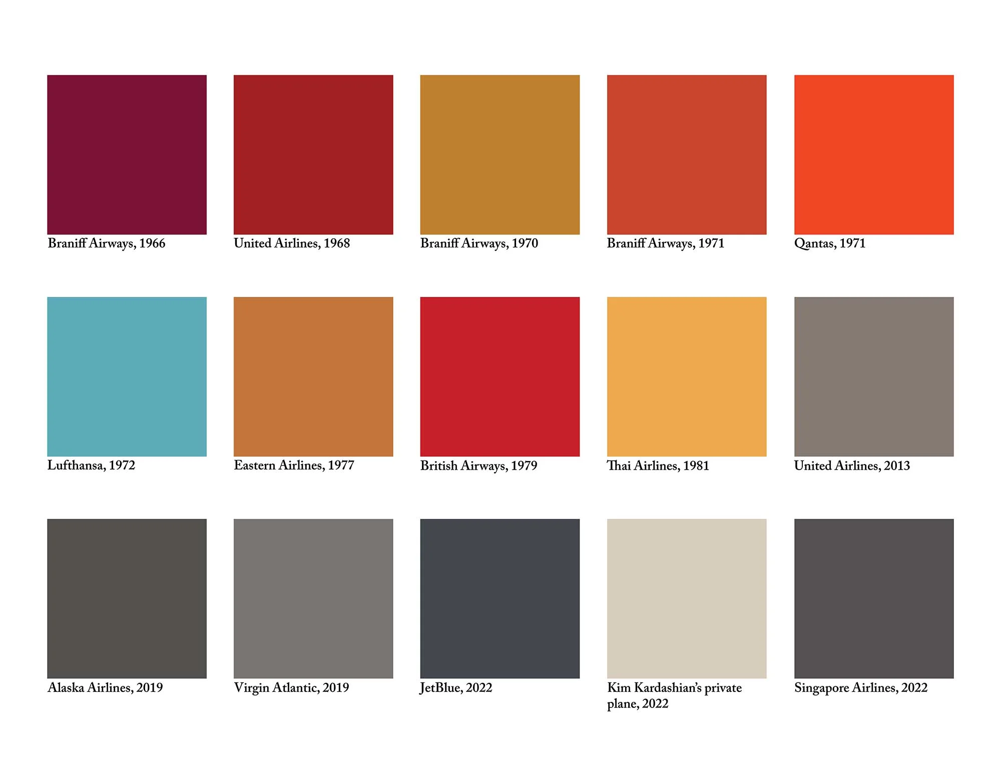
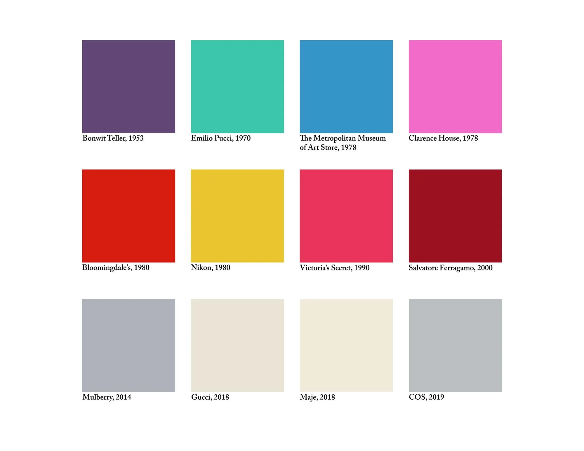
As I went for my daily evening scroll around TikTok, the algorithm took me to a corner of the app where everyone was talking about color. “Color is disappearing from the world,” creators announced, sharing a chart published by the Science Museum Group that looked like a vortex of gray swallowing up all things joyful and good. The graphic reflected a study for which researchers analyzed around 7,000 photographs of everyday objects from the museum’s collection, created between 1800 to 2020. “The rise in gray”—or decline in the variety of colors used between 1800 and about 1980—was the most notable trend the researchers noticed. And while the study is nowhere broad enough to make any sort of generalizations, there’s a reason it got such a huge reaction online.
Perhaps you’ve noticed it, too. On our roads, yellow cars are much fewer and further between, as the most popular new car colors in the UK haven’t strayed from gray, black, and white since 2000; and the most sought-after paint colors from paint brands Dulux and Farrow & Ball in 2020 were 50 shades of greige. Tie that to the rise of That Sad Beige Lady, who has gained nearly 200k followers on TikTok mocking the growing trend of beige clothes and toys for children. And remember when McDonald’s started trading in its red roofs and plastic yellow chairs for a wood-and-slate decor in 2006? Oh, and apparently birds native to Europe are on average less colorful now too, thanks to climate change.
But is color actually disappearing? According to anthropologist Dr. Nicole Truesdell, it really depends on where you look, because color is still thriving outside of the Western countries primarily represented in the Science Museum’s collection.
Riccardo Falcinelli, an Italian designer and author of “Chromorama,” a bible on the history of color, thinks the main reason for the West’s move towards the gray is for some silence from “visual noise”—the brightened barrage of marketing that fights for our attention through packaging, billboards, and screens. “A colorful world is no longer something new. It’s something commercial,” he says. “In the same way that we criticize consumerism, we criticize too many colors.” People, he adds, have a huge desire for “calmness” right now, particularly in cities.
This constant commercial assault isn’t what color represented back in the 1960s. Chemical dyes were first created in the mid 19th century, and by the mid 20th century, cheap chemical dyes were widespread, and colorful clothes were no longer more expensive than plain ones, Falcinelli told me. During this post-war period, color represented people’s progressive politics, Falcinelli explains. Think psychedelic floral wallpapers with bright red sofas and blue shag carpets. Loose clothing covered in swirling oranges, purples, and greens. Color was core to the counterculture movement, and how the hippies of the time showed their anti-establishment outlook, pushing back on the more constrained 1950s. The civil rights and women’s rights movements gained traction, bringing a level of freedom of expression. A more liberal mindset brought a liberal use of bright colors. The proliferation of drugs like LSD likely played into the psychedelic palette of the time, too.
As the 1970s brought in disillusionment and mass unemployment, particularly in the UK, you saw bright colors juxtaposed with black in punk aesthetics to signify anger and rebellion. “Color communicates only in a specific context. If that context changes, that color doesn’t mean what it used to mean,” Falcinelli says.
Color communicates only in a specific context. If that context changes, that color doesn’t mean what it used to mean.
Consider the color purple. Originally extracted from the mucus gland of a sea snail, it was once a sign of extreme wealth due to its rarity and cost. Blue, from indigo plants imported from India, and before that from Afghanistan’s semi-precious lapis lazuli stone, was similarly rare and expensive, and rich Westerners would wear it and collect colorful ornaments as trophies to signify their international access and proximity to power during colonization.
“I think something that’s important to hone down is that whiteness and power can express itself in different ways. And sometimes ornament is used as a way of expressing power and domination,” says Isa Segalovich, a lecturer in interior design history.
She continues: “The context that we are in right now, in the 2020s, is one of erasure. In the ’60s, ’70s, and ’80s, you saw more of a [corporate co-option] of culture and color, which were popular and [companies] could make money off of. You also saw a lot of Orientalism there as well—the co-option of something that looked ‘exotic’ or something that looked like it was from a ‘paradise place.’”
The relationship between colonization, whiteness, and capitalism has an important part to play in why this aesthetic of whites, beiges, and grays is popular in design right now, too. According to Truesdell, there is a “resurgence of people coming back to their ancestry” after centuries of colonization and forced assimilation. With this comes a return to color, pattern, and ornament from different cultures, folklores, and spiritual practices. As a response, the system of power that once consumed space through colonizing land is now using homogenous, minimalist design, and color to consume space in a more insidious way.
Speaking about gentrification in cities, Truesdell says: “What happens when new developments come in? Any inkling of that location having its own essence is removed in favor of this ‘Scandinavian’ style. But why does that design make sense in that location? Why do we privilege certain aesthetics over others?”
If you live in a city, you’ve probably seen this play out. The coffee shops and expensive yoga studios with exposed brick, white walls, naked light bulbs, and concrete floors replace kebab shops and corner stores, just as the area’s racialized residents are priced out by wealthy, often white, young professionals. This is how whiteness plays out through color and design, whether in Hackney, East London, or Brooklyn, New York.
Segalovich has looked specifically at how this minimalist and colorless design style shows up in coffee shops. On her TikTok, she shows images of the colorful coffee shops created by locals for their own community that are less common now, often replaced by coffee shops that function more as glorified co-working spaces. “All of this goes along with an obsession with streamlining: cutting the ‘unnecessary’ color and ornament for an aesthetic of optimization. There’s this idea that the most minimal thing will deliver the most benefits the quickest,” she says.
In “Chromophobia,” author David Batchelor contrasts color and whiteness in the context of West’s obsession with rationality. “You can never have color without emotion,” he writes. “Color is always seen as too much to do with pleasure and the senses.”
Color is always seen as too much to do with pleasure and the senses.
In the case of interiors, there’s also a move away from seeing a home as somewhere to settle, indulge, and make your own. Instead, homes are seen as transient investments. Painting your walls Elephant’s Breath—a Farrow & Ball favorite—or another shade of gray will make it more appealing to a wider range of people when it comes time to sell up, compared with bright green walls, for example. A study by Zillow found that choosing tones like white, gray, light blue, and navy could increase your home’s worth by nearly $5,000.
In packaging, we’ve seen a similar color drain for a completely different reason. In the wake of the climate crisis, sustainability (or the appearance of it) has become branding gold, and according to Falcinelli, “organic” is one of the most powerful words in marketing right now. With this comes a move away from obviously artificial colors in favor of neutral tones, and a preference for natural materials.
Consumers’ move towards sustainability is a major reason why McDonald’s underwent a major makeover in 2006, when red-and-yellow exteriors were swapped for brown wood and slate cladding, Falcinelli says. In 2009, the chain took things a step further, replacing the red background behind its golden arches with a dark green one to promote a more eco-friendly image in Europe. “If people want organic, McDonald’s doesn’t know how to compete because they don’t do that kind of thing. And so they do something more superficial: they change the color of the walls. They cannot change the sandwich,” Falcinelli explains.
It is not just a matter of style. We are living in a period of crisis, not a Technicolor period.
The more muted tones are also a reflection of the state of the world right now. On top of the climate emergency, the cost of living is incredibly high, politics across Europe are shifting to the right, and there is a war in Ukraine with a growing nuclear threat. “This is not a magenta period,” says Falcinelli. “If you go on Netflix, there’s a lot of black and dark colors on the posters. A lot of the series take place during the night or while it is raining. I think it is not just a matter of style. We are living in a period of crisis, not a Technicolor period. While if you looked at the Hollywood posters of the ’50s you had a lot of colors. It was a much more optimistic period postwar.”
So is the future greige? No—there will be color. Humans are made to experience it; our eyes can distinguish between about 10 million different shades. But the beige-ification of the West is worth examining—both for what it says about our current tastes, and what it says about the challenges of our present day.