
A few years ago, English football club Everton unveiled a new club badge. It was meant to be a modernised logo for a club which dates back to 1878, but the team’s fans were aghast. More than 22,000 of them signed an online petition to have it changed and Everton was forced to issue an apology so grovelling it almost sounded sarcastic – “we are sorry we spoiled so many weekends.” The following year, Everton worked with supporters to choose a new crest which was decided by an online poll.
The episode says something about sports fans’ relationships with their club badges. It’s one of the few areas where graphic design crosses into the mainstream and once wronged, the fans were quick to express their disgust at the design’s shortcomings.
It was that strength of feeling that designer James Kirkup wanted to tap into when he created The Football Club Index. Published this week, just ahead of the new Premier League season, the book documents the graphic heritage of all 48 football teams to have played in England’s top division.

“One of the many reasons I wanted to create the book was to reinstate the meaning that your club crest owns,” James explains. “Whoever you support, whatever your current standing, your crest isn't just a logo, it's a piece of storytelling that holds the history of your club since its birth. I never felt the relationship was broken, but it was certainly something that needed to be preserved."
Each club’s entry includes a full history of its old and current crests, with some strange and beautiful entries from down the decades.
“There's been some pretty nuts ones,” James says. “Some of my favorites seem to be the ones that fans of the clubs in questions hate. Like Swindon Towns epic graphic they should totally bring back to Newcastle's old NUFC typographic hug. And, Brighton's old Dolphins crest should never be forgotten, mainly for the happy jumping dolphin over the actual design.

A few years ago, English football club Everton unveiled a new club badge. It was meant to be a modernised logo for a club which dates back to 1878, but the team’s fans were aghast. More than 22,000 of them signed an online petition to have it changed and Everton was forced to issue an apology so grovelling it almost sounded sarcastic – “we are sorry we spoiled so many weekends.” The following year, Everton worked with supporters to choose a new crest which was decided by an online poll.
The episode says something about sports fans’ relationships with their club badges. It’s one of the few areas where graphic design crosses into the mainstream and once wronged, the fans were quick to express their disgust at the design’s shortcomings.
It was that strength of feeling that designer James Kirkup wanted to tap into when he created The Football Club Index. Published this week, just ahead of the new Premier League season, the book documents the graphic heritage of all 48 football teams to have played in England’s top division.
“One of the many reasons I wanted to create the book was to reinstate the meaning that your club crest owns,” James explains. “Whoever you support, whatever your current standing, your crest isn't just a logo, it's a piece of storytelling that holds the history of your club since its birth. I never felt the relationship was broken, but it was certainly something that needed to be preserved."
Each club’s entry includes a full history of its old and current crests, with some strange and beautiful entries from down the decades.
“There's been some pretty nuts ones,” James says. “Some of my favorites seem to be the ones that fans of the clubs in questions hate. Like Swindon Towns epic graphic they should totally bring back to Newcastle's old NUFC typographic hug. And, Brighton's old Dolphins crest should never be forgotten, mainly for the happy jumping dolphin over the actual design.
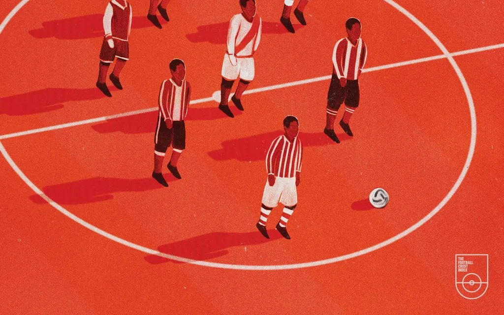
James and his team also commissioned original artwork from 48 designers, each a supporter of the club in question. “Initially, there was no intention to bring in designers – I had this mad idea that I'd create artwork for each club on my own and it'd be some holy grail of my own nonsense. As I started to lay out each spread, the idea of creating work for clubs I didn't support just felt stupid.
So the call went out, and 48 designers stepped up to create work for their own teams – each one an individual creative take on the universal absurdity of fandom.
And clearly many people were drawn to the idea. The project’s Kickstarter campaign smashed its target, raising three times more than the original goal. James puts that down to both the content of the book (which appealed to both football fans and design aficionados) and the “honesty” of the set-up.
“I attempted to make it look like I knew what I was doing, whilst it was pretty obvious I was just making it up as it grew. I think people were into that. Kickstarter is great for that, ‘I'll help them out’ moment but I think as soon as it becomes too polished and perfect you're a bit, ‘Nah you'll be ok mate’.”


