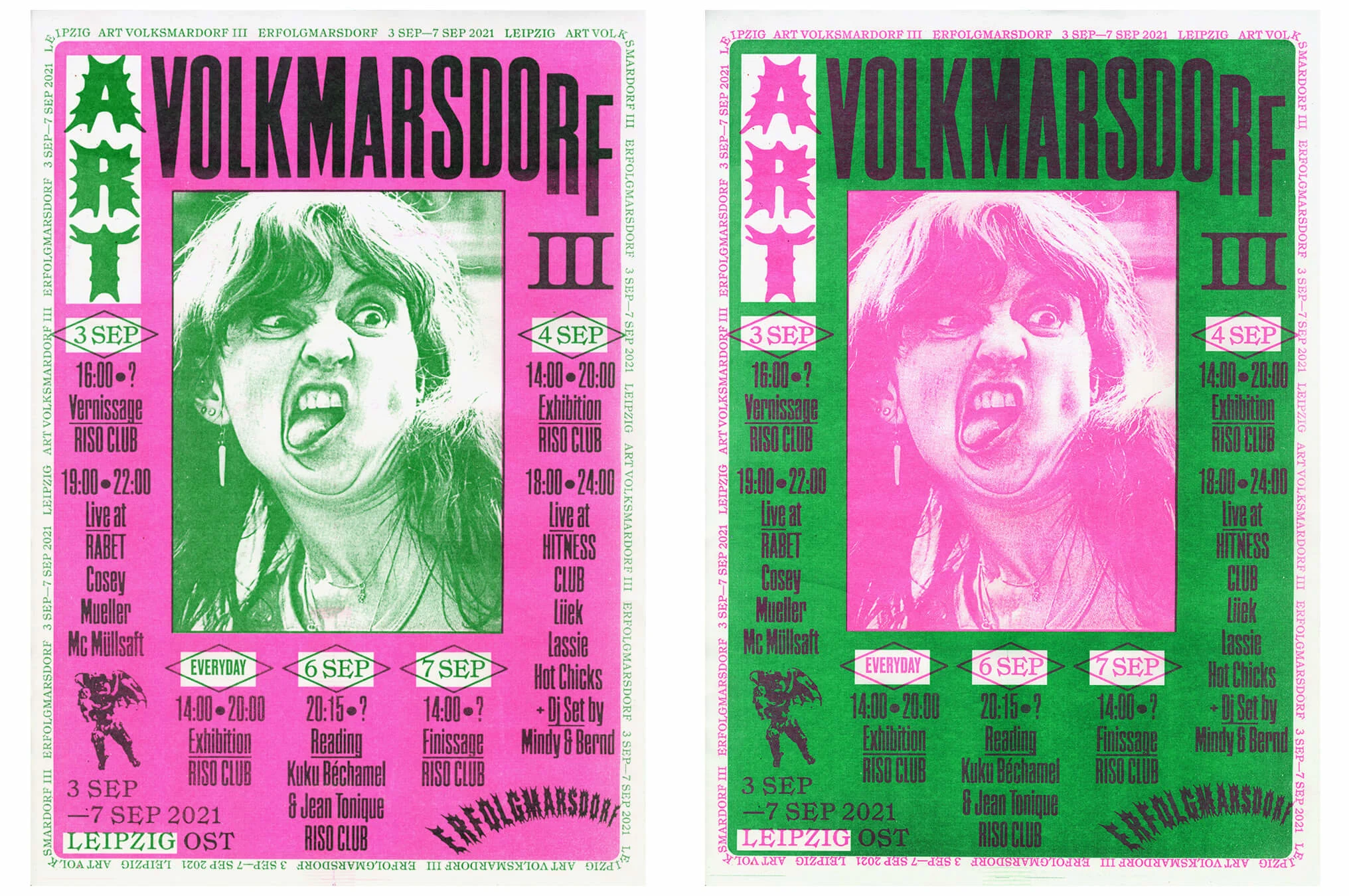
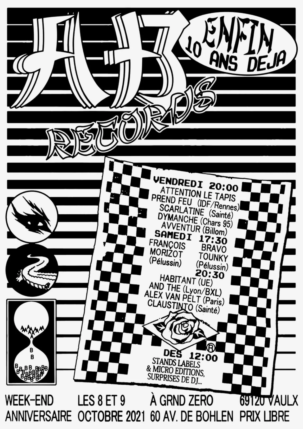
Since being drawn to an indie music event by a DIY advert tied to a lamppost, designer Félicité Landrivon has endeavored to design and print posters that will attract passers-by to the kinds of cultural events she’s passionate about attending herself. Each design stands out from the wall it’s pasted to – with busy, eye-catching compositions and bold lettering – an urgent call to action for people to come and experience something. Here, Madeleine Morley explores Félicité’s love affair with these posters, and the way she experiments with fonts, styles and printing techniques to assure her work continues to evolve and entice.
When she was 17 years old, Félicité Landrivon was walking down the streets of her home city of Lyon when something caught her eye: a black and white, xeroxed page of pale green A4 paper, wrapped around a glowing street lamp. A few minutes later, she saw it again, this time wheatpasted to a wall. When she turned up at the address scrawled across the flyer, she discovered a smokey bar with a sticky stage that hosted indie bands on the weekends. “It was the posters that brought me to the local music scene,” Félicité remembers over a decade later. “And then, it was the scene that brought me to making posters and to graphic design.”
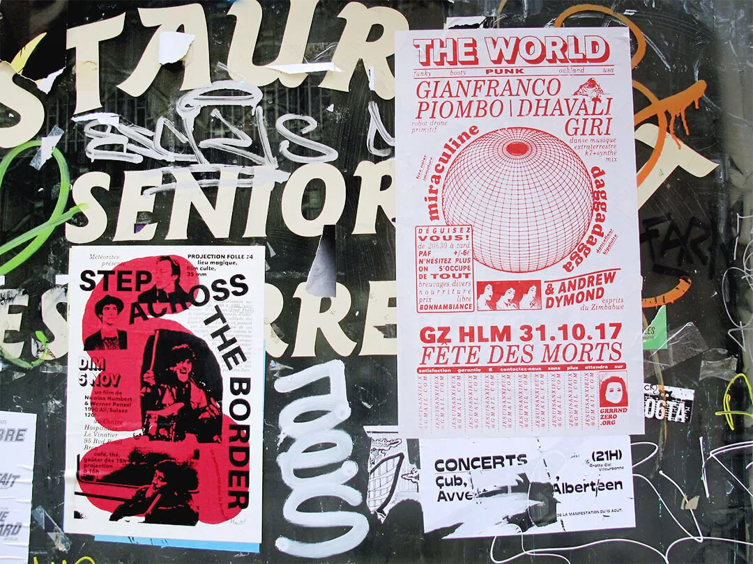
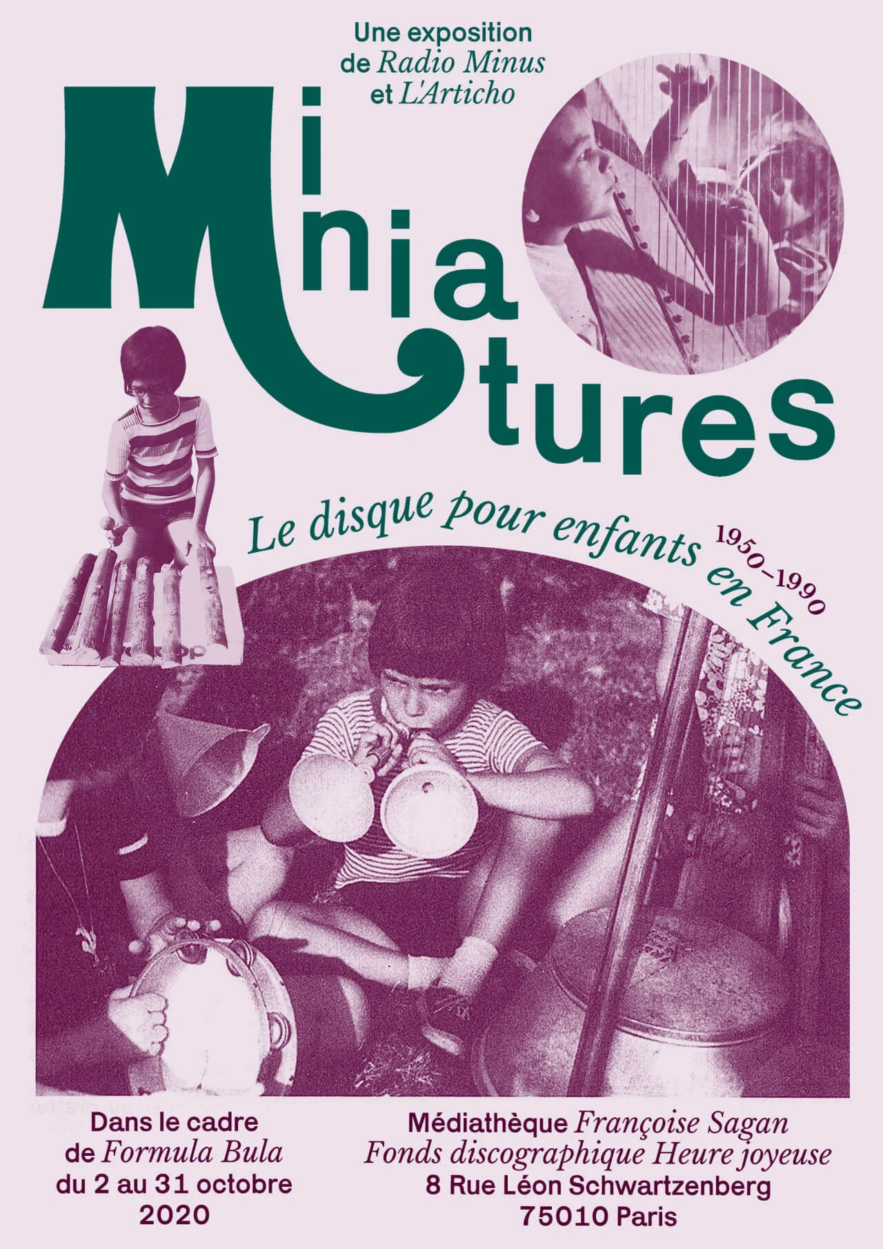
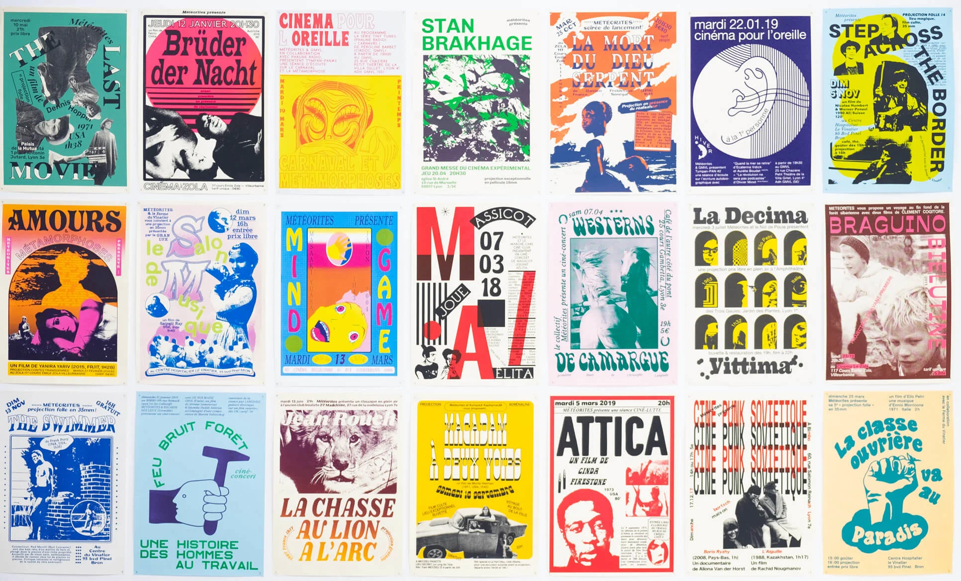
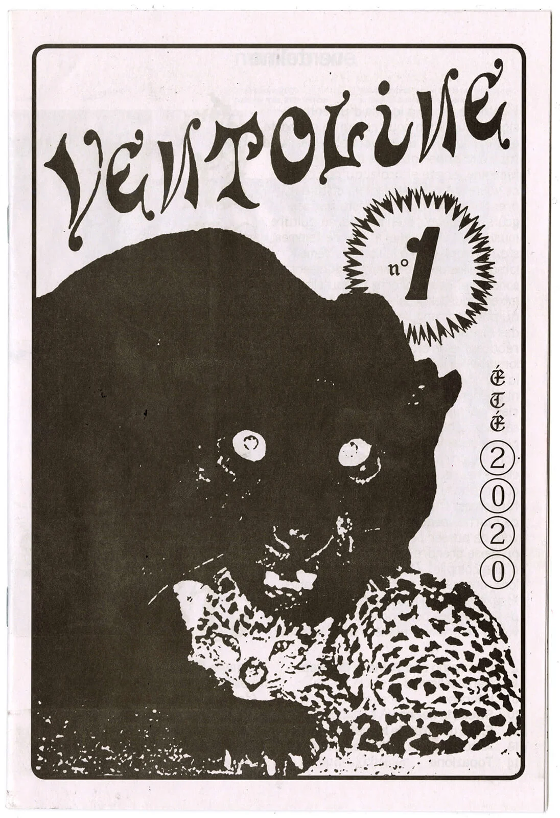
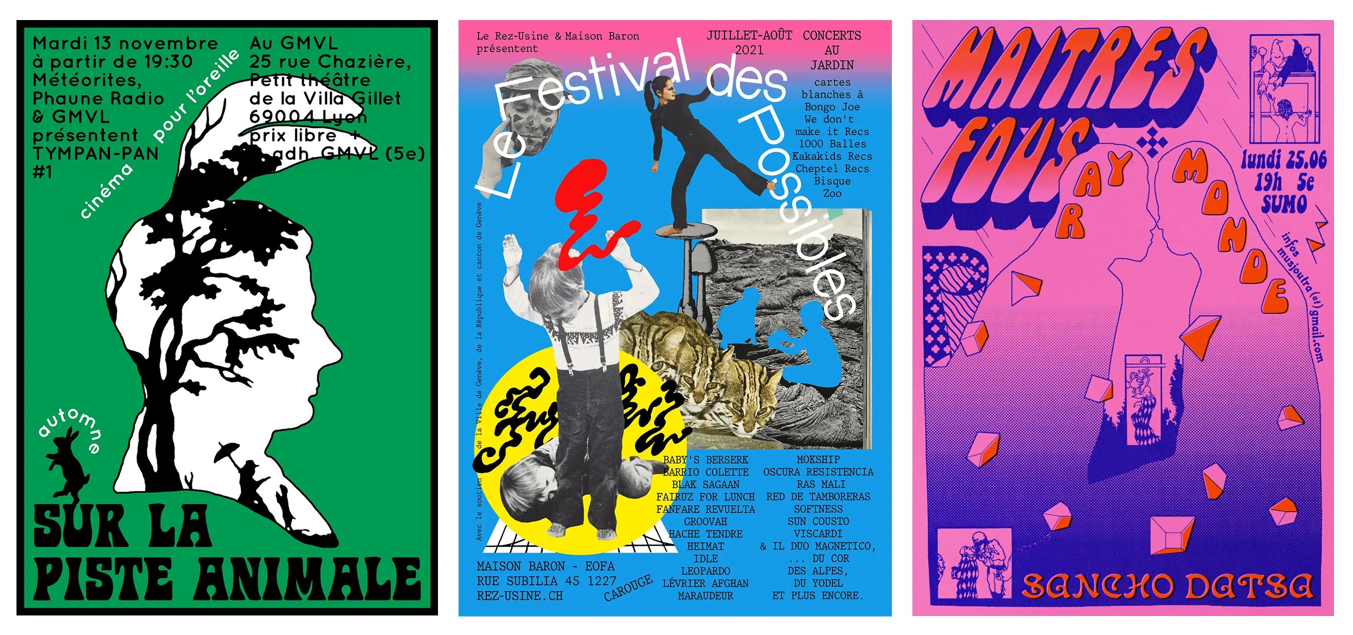
Fast forward to 2021, and Félicité now works as a freelance designer in Lyon, creating densely packed compositions – often featuring a combination of collage, ornate typography and cute, cartoonish animals – for musical and cultural events as well as non-profit organizations. Her path to professional design was by no means a linear one: In her late teens, Félicité began organizing her own gigs while pursuing a degree in the humanities, and it was then that she started making her own DIY posters to advertise shows. “It’s part of the open spirit of the scene. Anyone can do anything,” she says. A felt-tip pen, a local copy shop and a love of French and Belgian comic books were her first tools. Then, at the age of 21, Félicité went on to study graphic design in art school and honed her craft.
A close involvement with the cultural sphere that her work promotes still heavily influences the way Félicité thinks about designing. “I want to create things that aren’t only pretty and funny, but efficient as a communicating object,” she says, hoping her work will stand out on the street and inspire others to seek out its source just like the DIY flyers that first caught her attention. “If I wasn’t designing for something I care so much about, I wouldn’t be as picky and worried.”
It’s part of the open spirit of the scene. Anyone can do anything.
While Félicité also creates books and album art, the rectangular poster will always be the form closest to her heart because it’s so quick to compose, print and release into the world. She works primarily with the fast-paced printing techniques that have always been favored by punks, activists and anyone with an urgent message to spread: that means Risograph, screen-print and, of course, cheap Xerox. “With these, you can design a poster in the morning, print it in the afternoon, and start sticking in the evening,” says Félicité, noting the form’s obvious yet liberating distinction from a book or record, which often involves an industry and many players.
It’s these homespun making methods that allow Félicité to keep her fingers in all stages of a poster’s life, something she clings onto, resisting the more professionalized tendency of creating on a digital screen and then sending off the files via email to a client. “I like to have a physical relationship with my work: By printing it and then sticking it up on the street myself, I get to see its size, I get to figure out how it works from a distance and in its actual context.” In the streets of Lyon, she likes to see how it stands out amongst the other wheat-pasted designs vying for attention on the yellow brick walls.
If I wasn’t designing for something I care so much about, I wouldn’t be as picky and worried.
In many ways, Félicité began where most of us do when we’re involved in the arts – a teenager with a love of DIY, drawn to newness and the unknown, learning by doing. The difference is that Félicité never lost this ethos as she got older; she’s still like a teenager, cutting up and arranging things she loves with the commitment of a scrapbooker.
“I’m drawn to anything that’s vernacular, and I’m not interested in what’s happening in graphic design,” she emphasizes. Instead, it’s inside comic books, literature, movies and at flea markets that she finds the shapes and imagery that filter into her work. Lining her studio walls are goofy animal sculptures, colorful toys and patterned scarves. She looks at these objects, and through the stacks of old newspapers she keeps around her, and finds her own grids and forms by means of copying and imitating them.
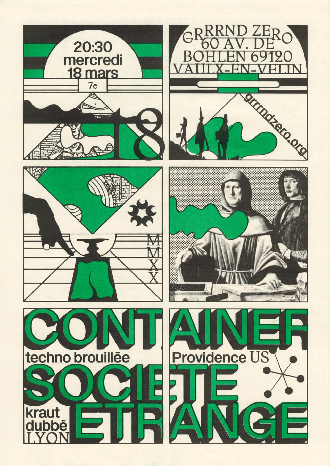
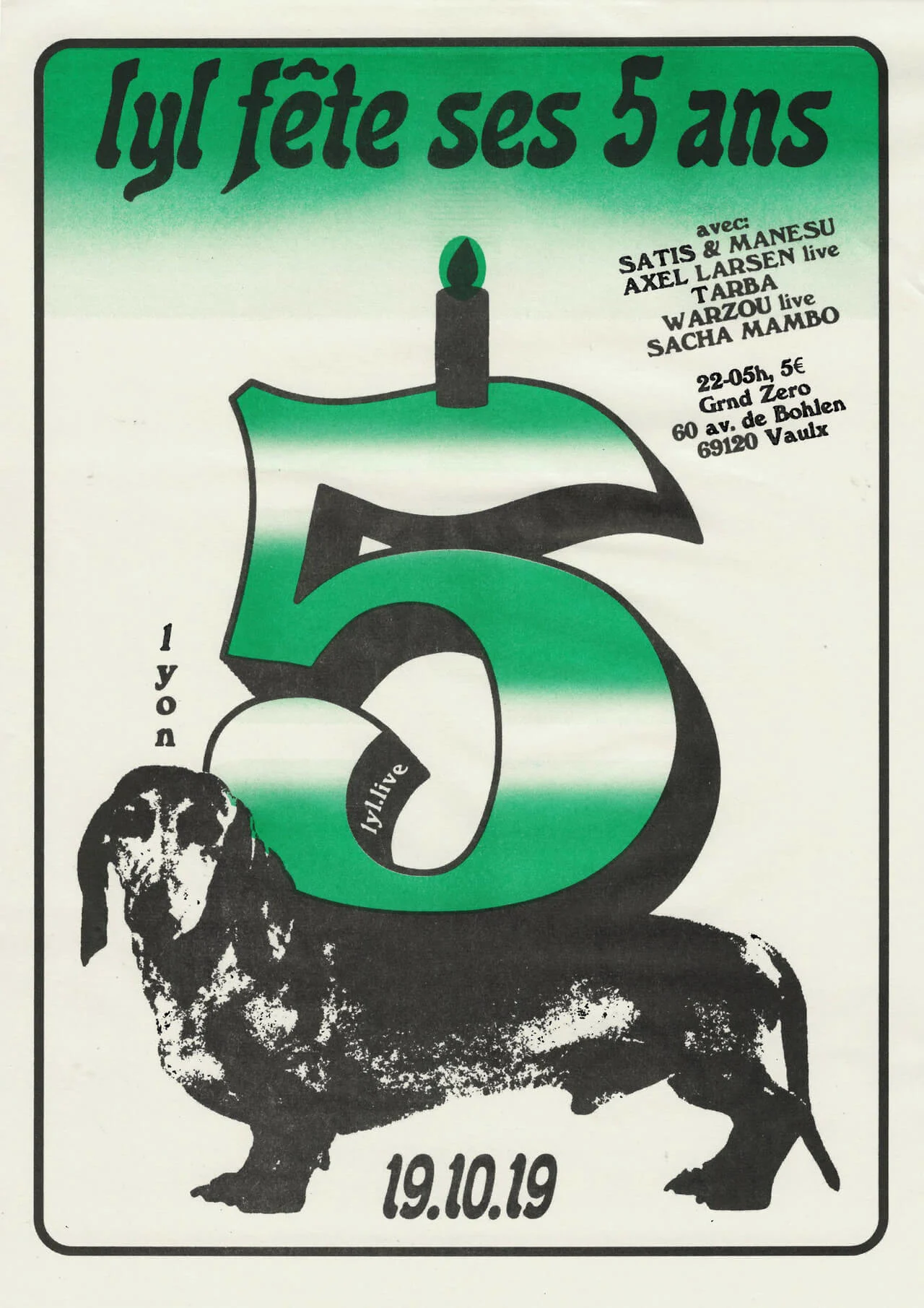
When designing a poster for a Lyon gig by electronic act Container, Félicité combined a comic’s grid with her own drawings and elements from medieval art books. The resulting green and black print beckons music fans to a night of dark, disorderly techno. To celebrate five years of Lyon’s independent web radio station Lyl, the designer took a retro number five and perched it on top of a found photograph of a sausage dog – because for Félicité, nothing says happy birthday better than a cute dog.
“I try not to use fonts that I see everywhere,” she says, intent on doing her own thing and not letting trends distract her from her own long-standing interests. For her distinctive typography, she often scans old type specimens to make new fonts from scratch, or hand-draws jazzy letters directly onto a page.
“The more I’m exposed to visual material, the more I get new ideas. If I just sit at my desk and have nothing around me, nothing will happen,” Félicité says. “Creation and ideas don’t just spring out of nowhere.” Sometimes, all you need to do is look up and catch a glimpse of something new—maybe something pasted on an unassuming street lamp—and everything could change.

