Farida Sedoc has been making art in various capacities for two decades. Her work has always been a response to political and social issues; all that’s changed are the mediums she uses to explore them. From printing her first controversial T-Shirt to the Black Lives Matter poster she recently designed for the Stedelijk Museum, she’s taken her time to find her creative feet, spreading the word about the causes close to her heart as she goes. She tells Alex Kahl about the stories behind some of her favorite projects.

When Farida Sedoc began to print T-Shirts with a friend, their first design had “Fuck the police” written across the front in Arabic. “Coming out of angry teenage years, we were just working with our intuition, and the T-Shirts were always subconsciously a reaction to what was going on around us,” she says.
“Amsterdam in the ‘80s was a pretty rough place,” Farida recalls. “Lots of drugs, sex and alcohol. But the main thing I remember were the protests.” Farida grew up in a turbulent decade for the city. Squatting was becoming prevalent as a form of protest against the shortage of housing in the city. The Dutch Squatters Movement (or Krakersrellen) gave rise to violent riots in the year of 1980. Watching these political and social issues unfold, Farida learned that her very existence in society had to be political. “We learned to always react to things,” she says.
Her T-Shirts would explore police brutality, Islamophobia, and even the controversial introduction of the Euro in 1999. “It was all about having a voice,” Farida says. After 10 years of printing T-Shirts, Farida’s practise had stopped growing, and was actually getting smaller.
She stopped screen printing on shirts, and started to do it on canvas, and for a decade has been creating work across multiple mediums. “My greatest disappointment was not being able to create this big streetwear brand,” she says. “But it was also a blessing. I felt I was being ignored in fashion. In retrospect, giving it up gave me time to think more about the work.” Up to that point, although Farida’s work had explored political and social themes, it had been very intuitive. “I started to hang out with friends who were artists, and noticed they were busy having conversations about content, instead of focusing on the product or the outcome,” she says. “I started to consider the meaning of my work more. Asking myself questions like ‘What is your work about?’, ‘what does my voice mean?’ and ‘what do I want to share with the world?’’”
These days, Farida works across different mediums, from graphic design to collage to textiles. She feels it doesn’t matter what she uses in her work, as long as she’s responding to the context and the content. “The subject matter was never random. I thought it was, but it wasn’t,” she says. “I can just have a proper conversation about it now. 20 years ago, I’d say I just screenprint stuff. Now I have the words to explain why I do it.”
Graduation project: Radical Cut up
“I consider myself self-taught, but two years ago I was invited to take part In Sandberg Instituut's masters program Radical Cut Up. A Masters based on the idea that nothing is original or authentic in the arts, where image, concept and context are all a collage.
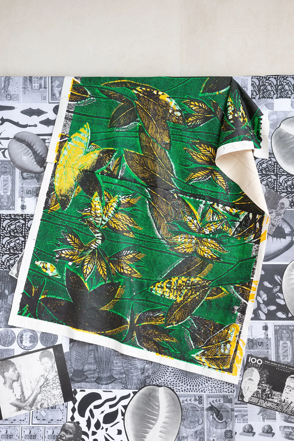
The director’s inspiration came from hip hop where sampling is the base of any beat. For the first time, I thrived in a school setting. Being 37 and starting a new course was strange, but I was given so much motivation. My graduation project combined screen printing with a study into the historic meaning of prints on textiles. They’re mostly worn on the body, but I wanted to make them abstract. So the focus is not on the body and the movement of the garment but the meaning of the message on the fabric and the stories they tell which bring communities together, open up dialogues and influence societies.”



Freetown
“I had an idea to create a world, a city, a space where women rule. I wanted to create a matriarchal city made out of fabric, large-scale patchworks combined with screen printing. I used traditional Caribbean madras fabric to make colorful backdrops, found images in books of existing women and screen printed buildings that represented a more masculine energy in the city. It's an ongoing project. They can be seen as individual works but brought together they form this neighbourhood.”


Stedelijk Museum: BLM
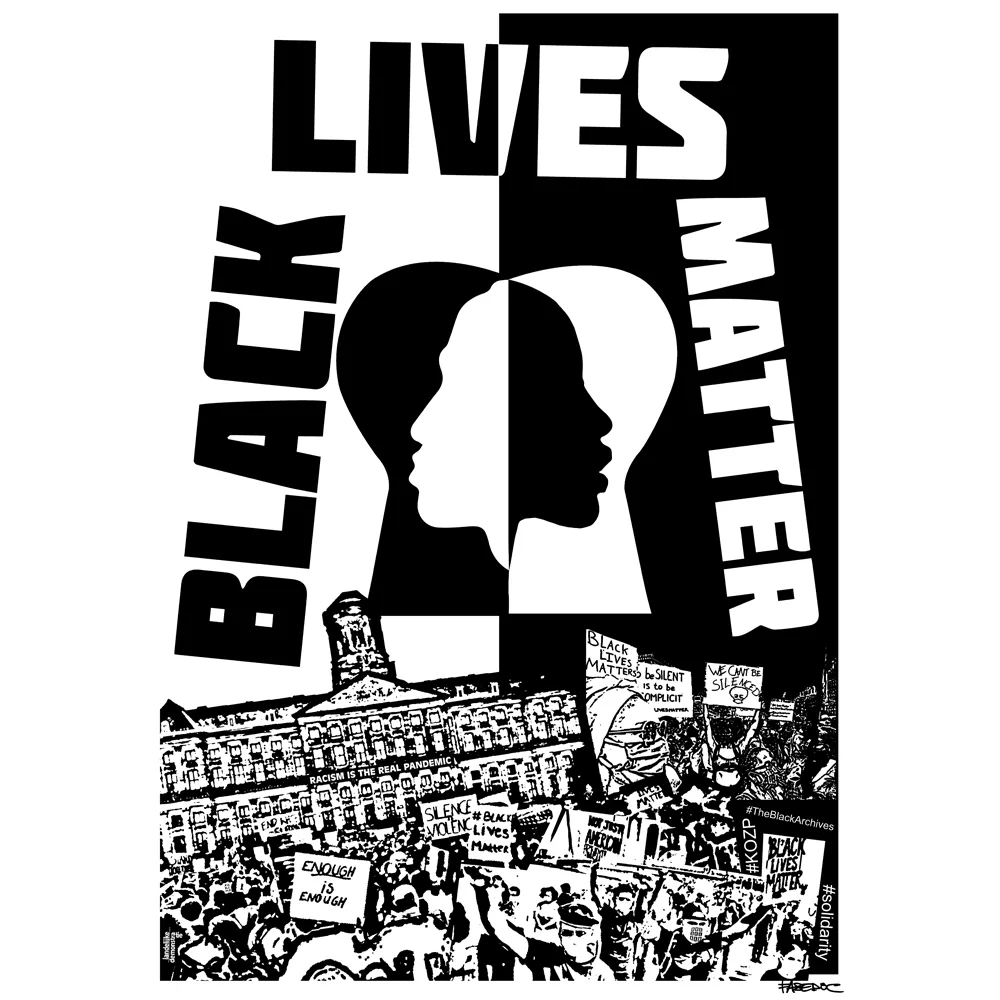
“The Stedelijk Museum asked me to design a poster for them to go along with their commitment to actively taking a stance against racism. It was a very intense period, only just coming out of lockdown here in Amsterdam and being confronted with this devastating reality. I used this energy to create the poster. We have a great legacy of graphic design and I'm constantly digging for the "good stuff," like a hip hop producer digs for samples for new beats. That forms the base for all of my work actually. If I feel I can add something visually to the message my collaborator wants to convey, I work very fast.”
The Van Abbe Museum: Trade Markings
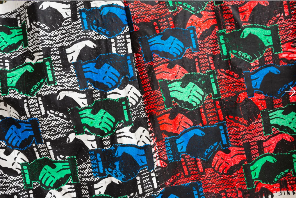
“Trade Markings was inspired by the centuries-old push and pull of trademarking and liquidity – the opacity of property and the transparency of exchange. I was invited to ‘re-design’ exhibition spaces, flipping the ‘neutrality’ of the ‘white cube’ on its head. Because this exhibition was in the south of the country I wanted to make a product that also told a story about the region. They have an extensive textile history so I created a few designs based on their method of designing. Both textile prints I made are heavily influenced by Indononesian batik fabrics and Dutch wax. A company that’s been based here for over 150 years produces these industrialized indonesian-influenced batix. I added text responding to the sentiment of the exhibition. We used them to upholster the seating throughout the exhibition and we also created "grass roots'' floor plans responding to the context. These texts would say ‘Sit down be humble,’ ‘C.R.E.A.M.,’ and ‘Seize the Time,’ inspired by Black music, literature, and activists.”


Het HEM
“We worked within the context of the idea that culture takes shape in communities. It develops through inspiration, interaction and the integration of new ideas. James Brown’s motto Cant Be Greedy, You Gotta Take Some and Leave Some weaves a common thread, which explores the nature of culture as something that is fluid and passed from one person to another. I created three large scale ‘protest’ posters, all black and white. Using different existing imagery but combining these with other images, to convey a new message and imagine a new future with the idea of giving people dignity, grace and hope which was often the original motivation of the creators who are in the works.”


