


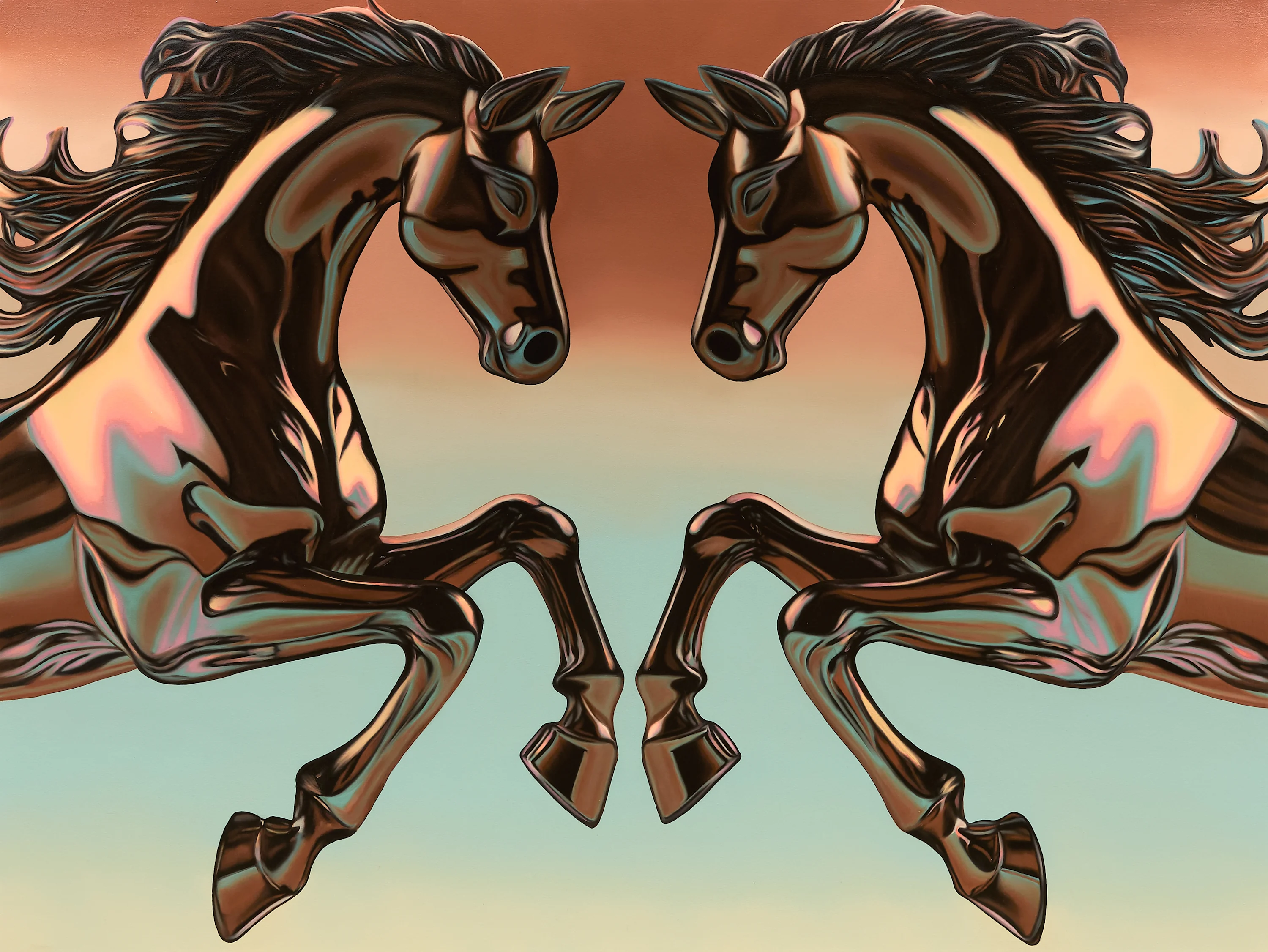
Douglas de Souza’s paintings shimmer with a seductive gloss: gleaming cars, lacquered helmets, swans, horses, and fragments of pop diva lyrics drift through a world of high shine and kitsch excess. Symbols often seen as masculine and feminine collide and intermingle—speed and horsepower softened by delicate swans and ornamental knickknacks. He tells Alix-Rose Cowie how the seductive shine of these objects masks a deeper fragility, mirroring the unstable performances of masculinity, femininity and selfhood.
São Paulo-based artist Douglas de Souza grew up in the south of Brazil on a staple diet of MTV, magazines, and telenovelas. As a teenager in the nineties and early 2000s, he’d create desktop wallpapers in his bedroom featuring his favorite pop stars. His computer skills led to a graphic design career in fashion, but feeling unfulfilled as an artist, he left fashion to study fine art. De Souza paints impossibly shiny images by manipulating oil pigments to present as smooth, glassy and luminous, like the screens he started making pictures on. He removes almost all evidence of brush strokes in a bid to relate classical painting to our current digital world. On the unfolding timeline of art history, he wants his work to pin him to the here and now.
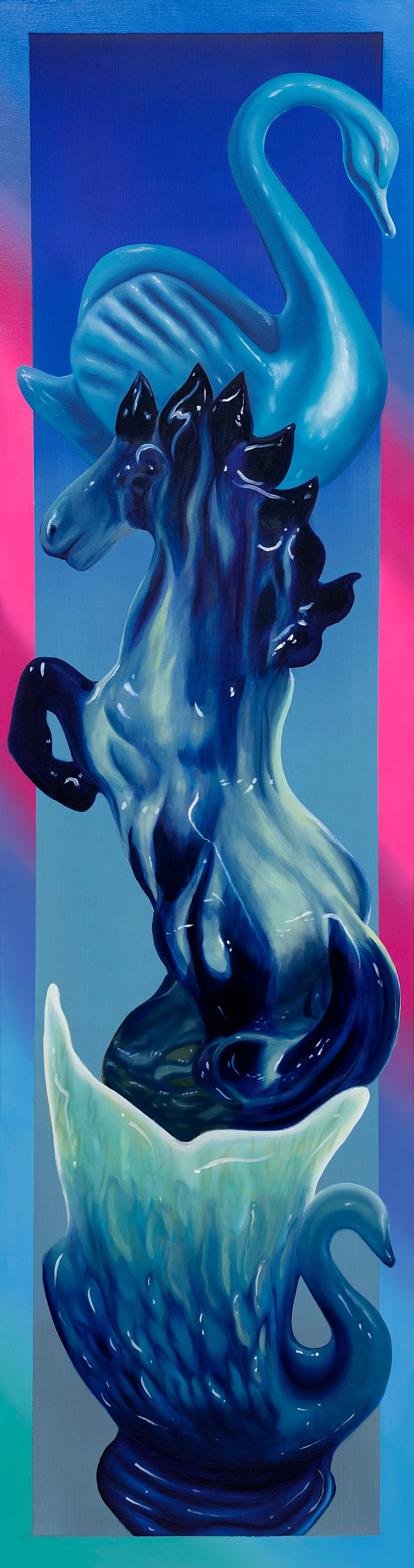

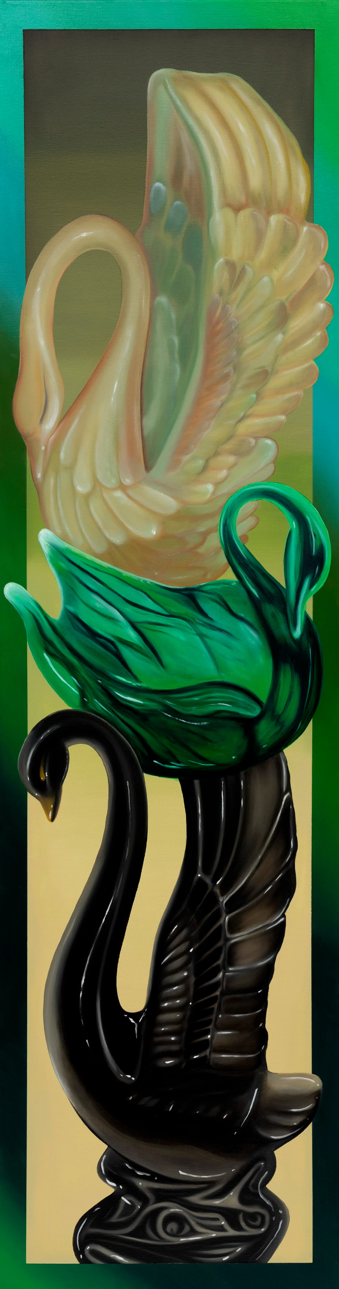
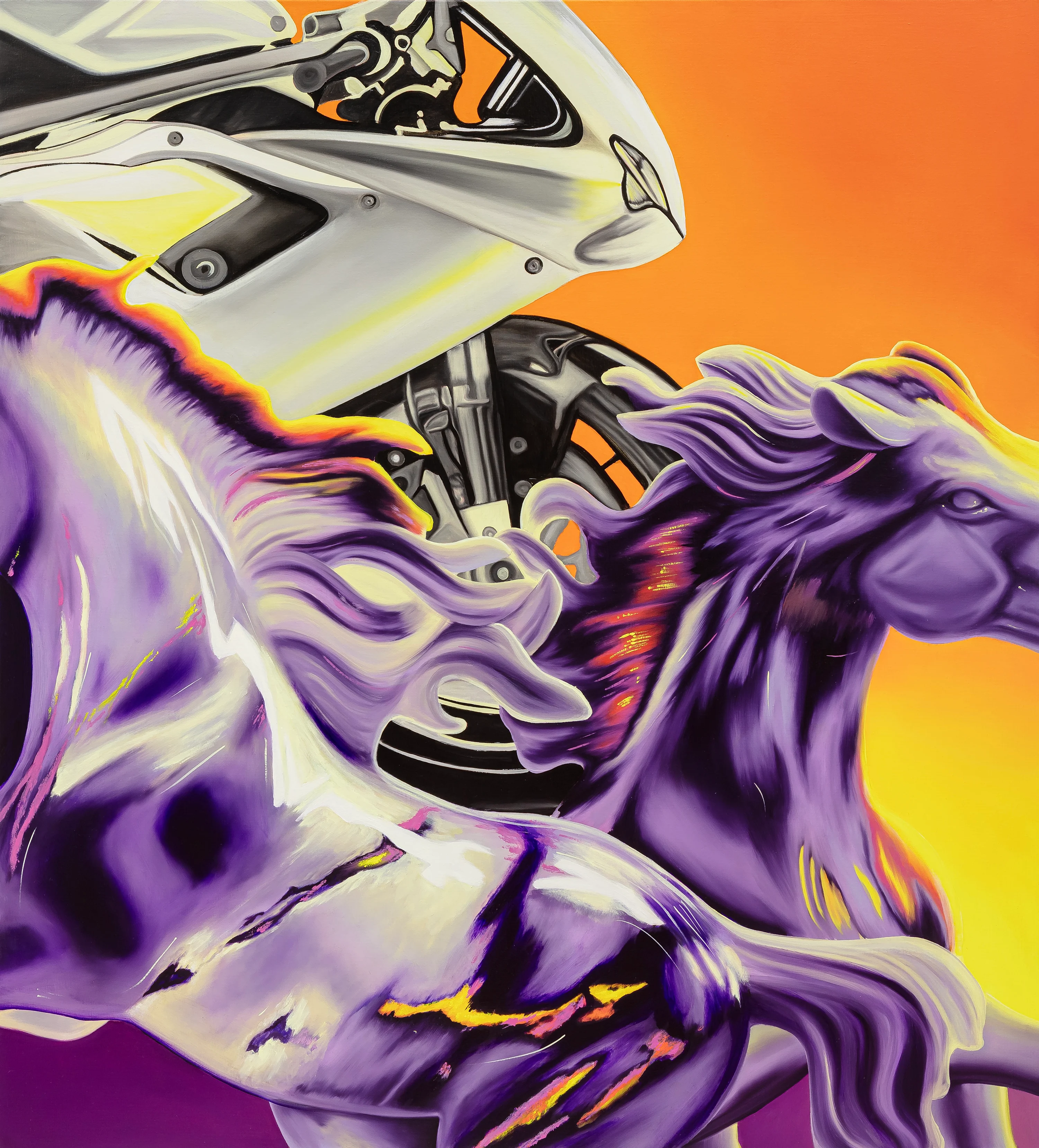
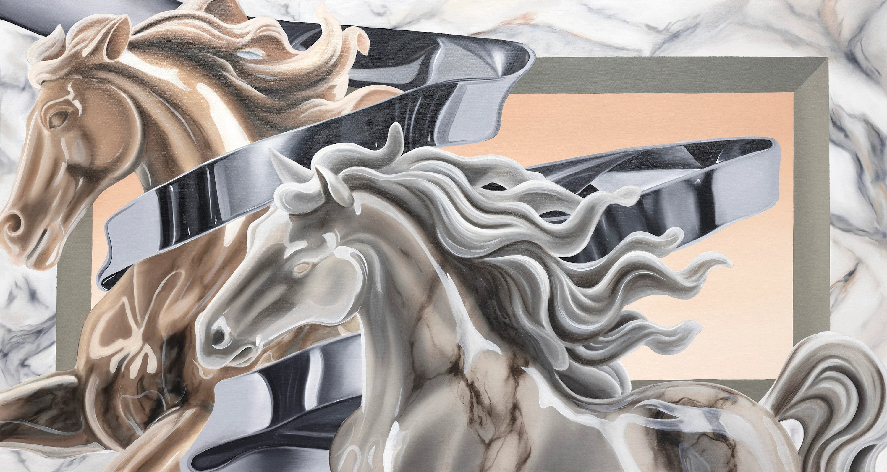
Through a visual language built on unapologetic pop gloss, airbrushed color, sentimentality and kitsch, de Souza hopes to translate his experience as a gay man by painting objects as metaphors for sexuality, identity and vulnerability. For his solo show “Men in Love,” he painted ornamental swans, stallions with flowing manes, high-powered muscle cars and leaping stags, challenging what reads as masculine or feminine and the very partitioning of the two, and asking what visual language “belongs” to him.
“I’m always looking for this kind of queer code of objects,” he says. “The swan is a figure that’s very sensual and feminine in a way, and at the same time it has this very long neck that’s a phallic symbol of masculinity. You can measure the horsepower of a car. So I was trying to find ways of seeing myself in these paintings: one way is more domestic and feminine, like through the knickknacks and shiny things, but with the cars and motorcycles—the speed, the violence of it belongs to me as well. As a man, I’m familiar with those things. But I always try to put this coat over it to make it more queer.”
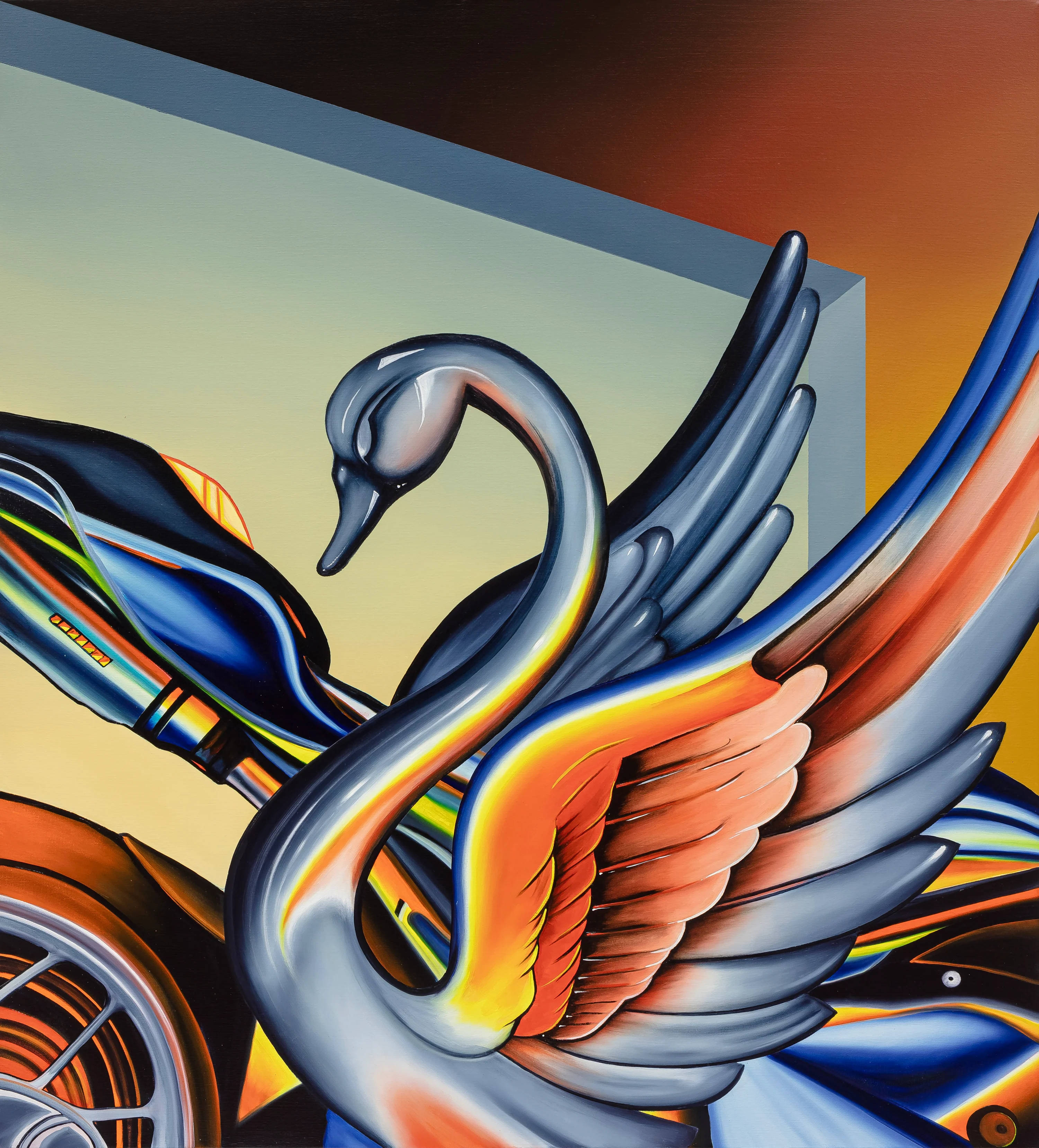
I’m always looking for this kind of queer code of objects.
The decorative swans are nostalgic objects from de Souza’s childhood. His mom and aunts have small crystal trinkets displayed in their homes that he was never allowed to touch. “Sometimes people regard kitsch in a derogatory way, seeing it as low-brow culture,” he says. “But for me, coming from the countryside, it’s the kind of thing we have around.” Choosing to render these common objects in oils, he’s putting them on a pedestal and changing their perceived value.

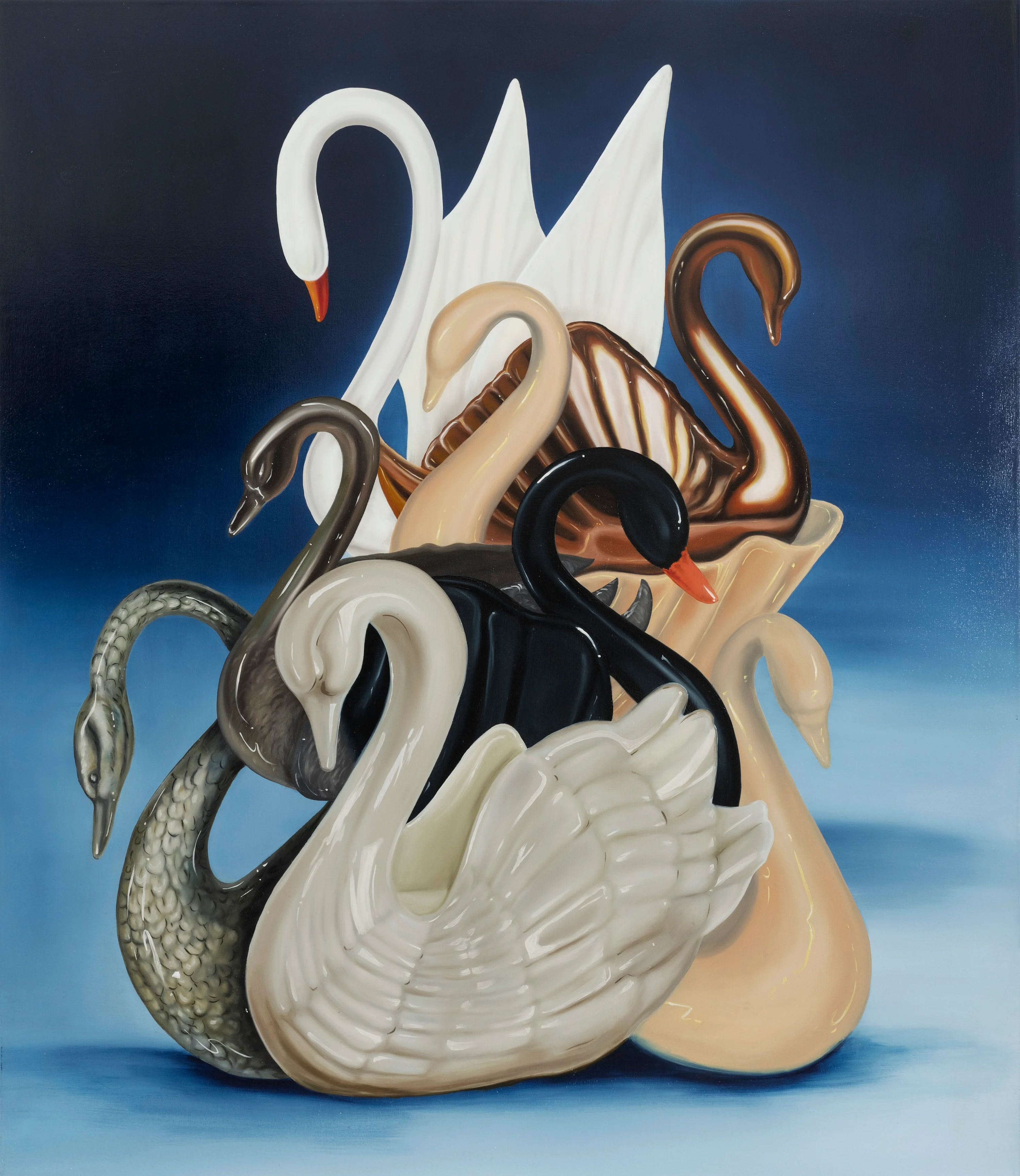
Polished surfaces are a very good metaphor for our experience as human beings… We can be fragile and present ourselves as hard.
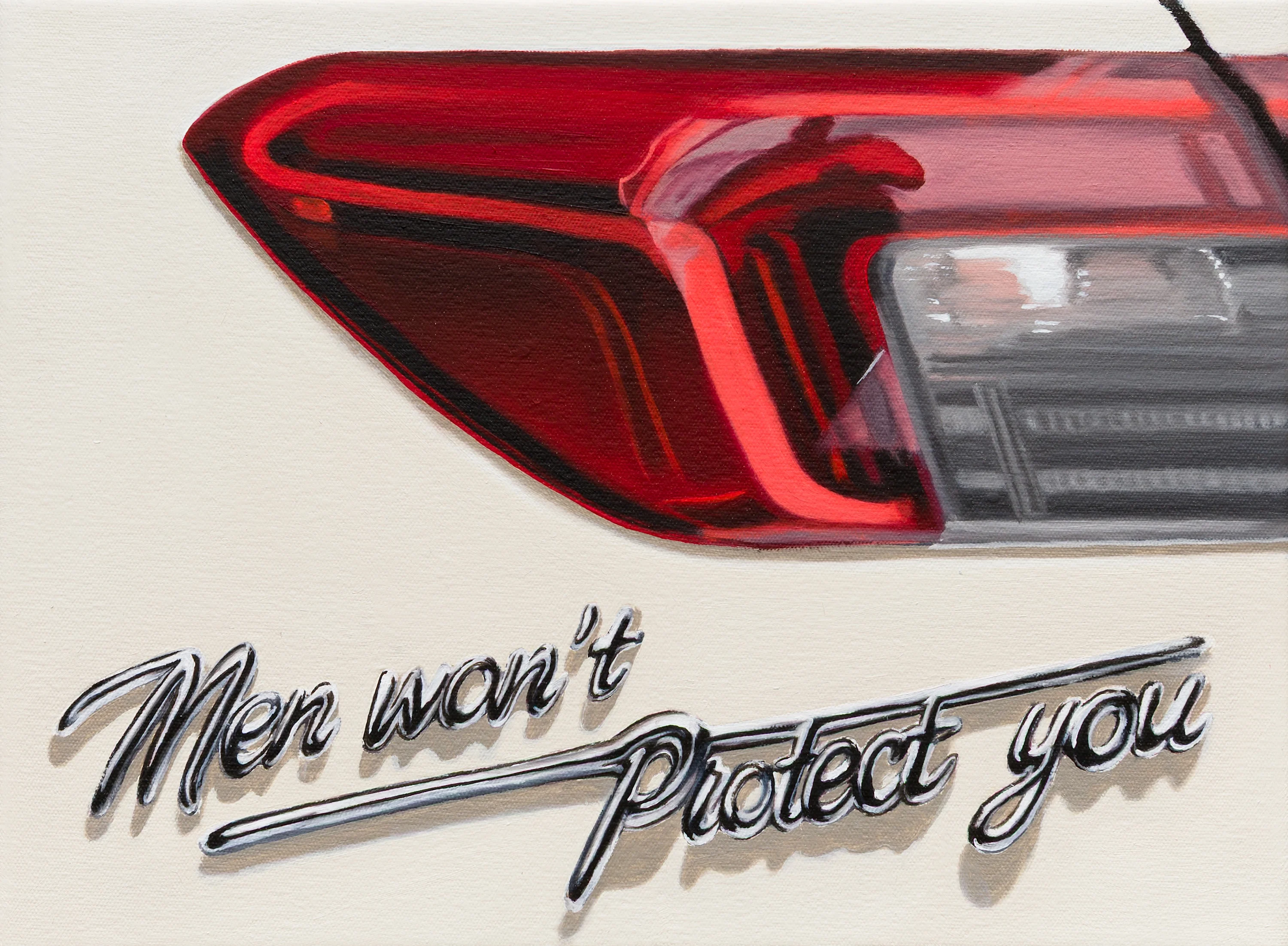
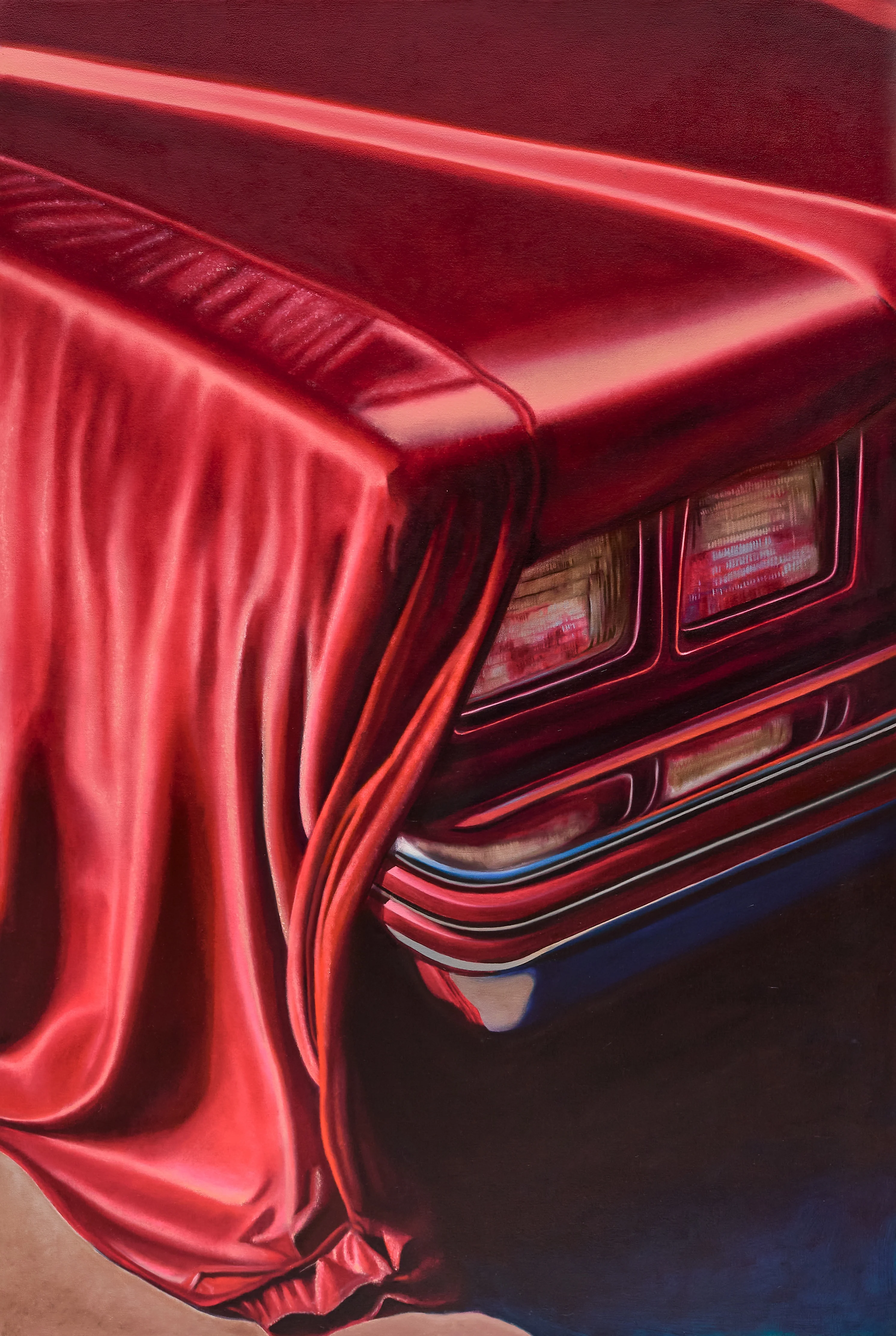
De Souza’s work is concerned with the facade of things; the pristine exteriors people present to protect themselves. But brittle things are the most easily broken. Though all the surfaces of the objects he paints seem unblemished and impermeable, a car’s glittery varnish can easily be scratched, porcelain chips, and glass shatters. “When I started painting, I was very drawn to polished surfaces, glass and sparkle, without knowing why. So I started to investigate these kinds of surfaces because they’re a very good metaphor for our experience as human beings or how we try to cover up our sexuality,” he says. “We can be fragile and present ourselves as hard.”
De Souza’s graphic design thinking informs his means of communication; he wants his metaphors and symbolism to be understood, and for people to connect directly with his messages. “Sometimes I feel like the fine arts especially can be a very closed way of communicating, very coded,” he says. “And for me, I like to give a hint of what I’m talking about, to have people get into the work.”

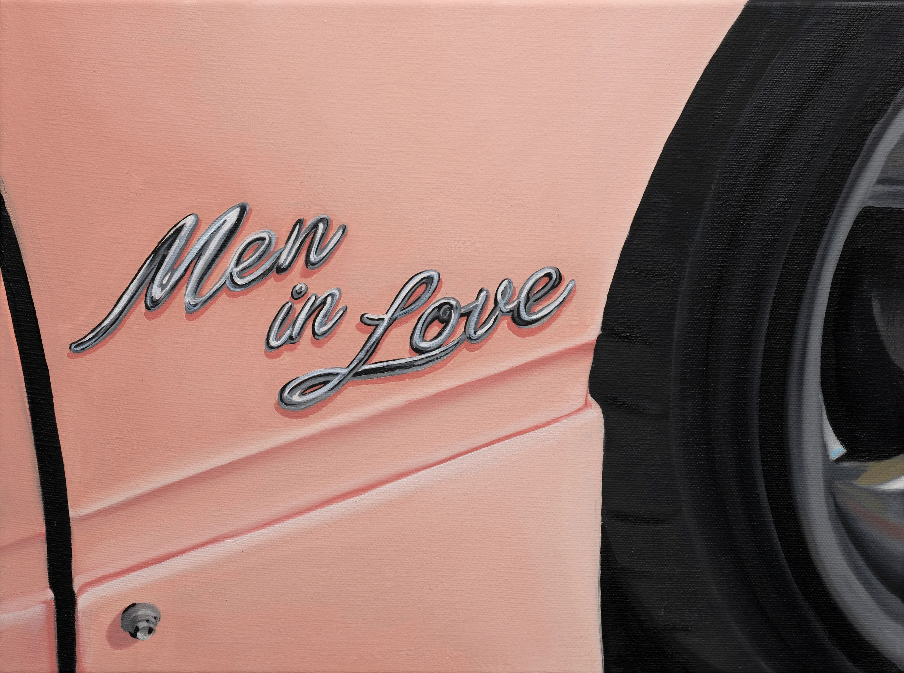
De Souza’s series “Music To Dance To” borrows from the hyper-sentimentality and emotional arrow to the heart of the pop songs that defined his teens and dancing in gay clubs as an adult. “I have this very close relationship to pop music,” he says. “It’s a different language to painting. When I listen to a band like Gossip, which I’ve really loved for a very long time, even though it’s a lesbian woman singing, the lyrics about love can relate so broadly, to men or women.” De Souza adopts this universal language as a way to relay his meaning to a broad audience, using lyrics or song titles as the titles of his artworks.
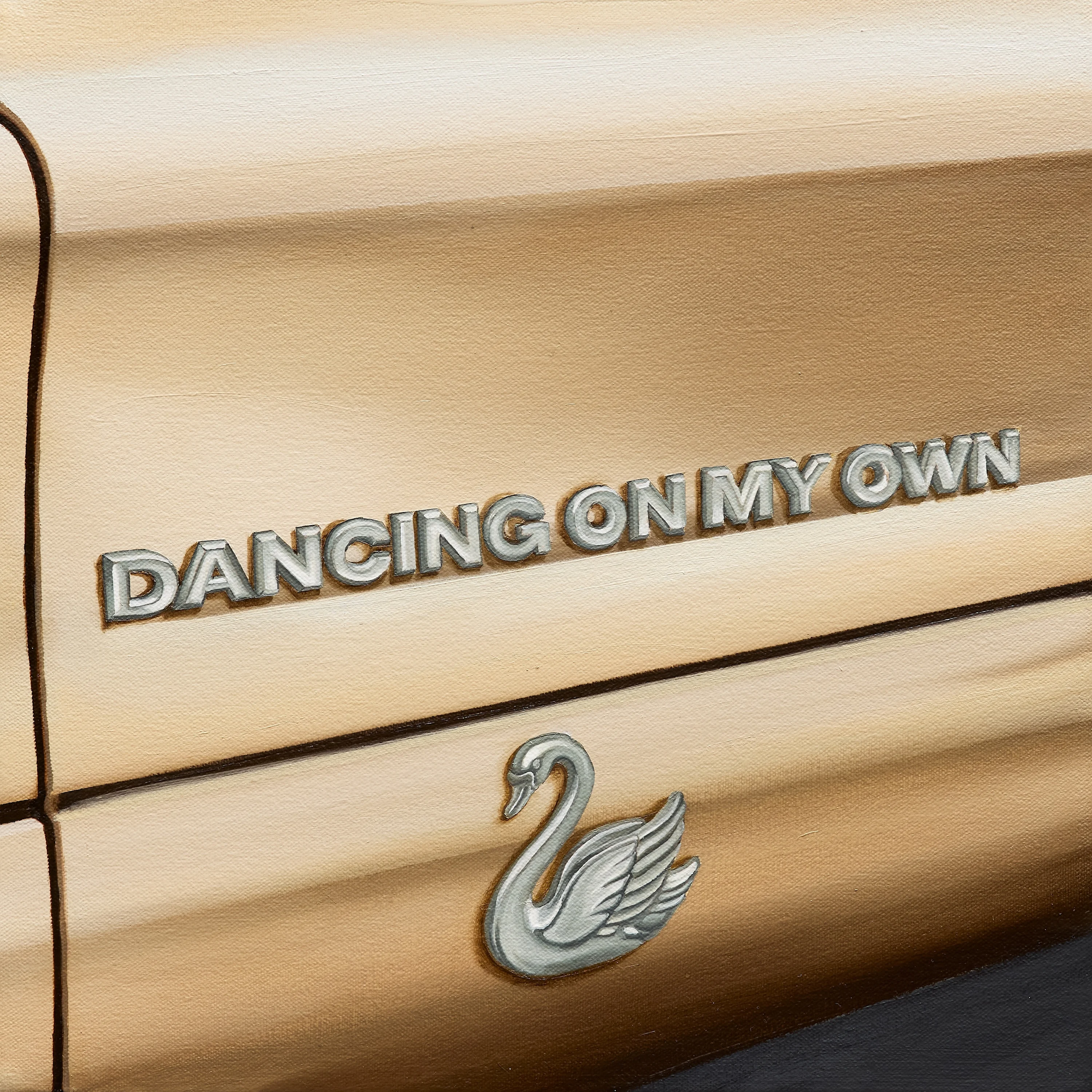

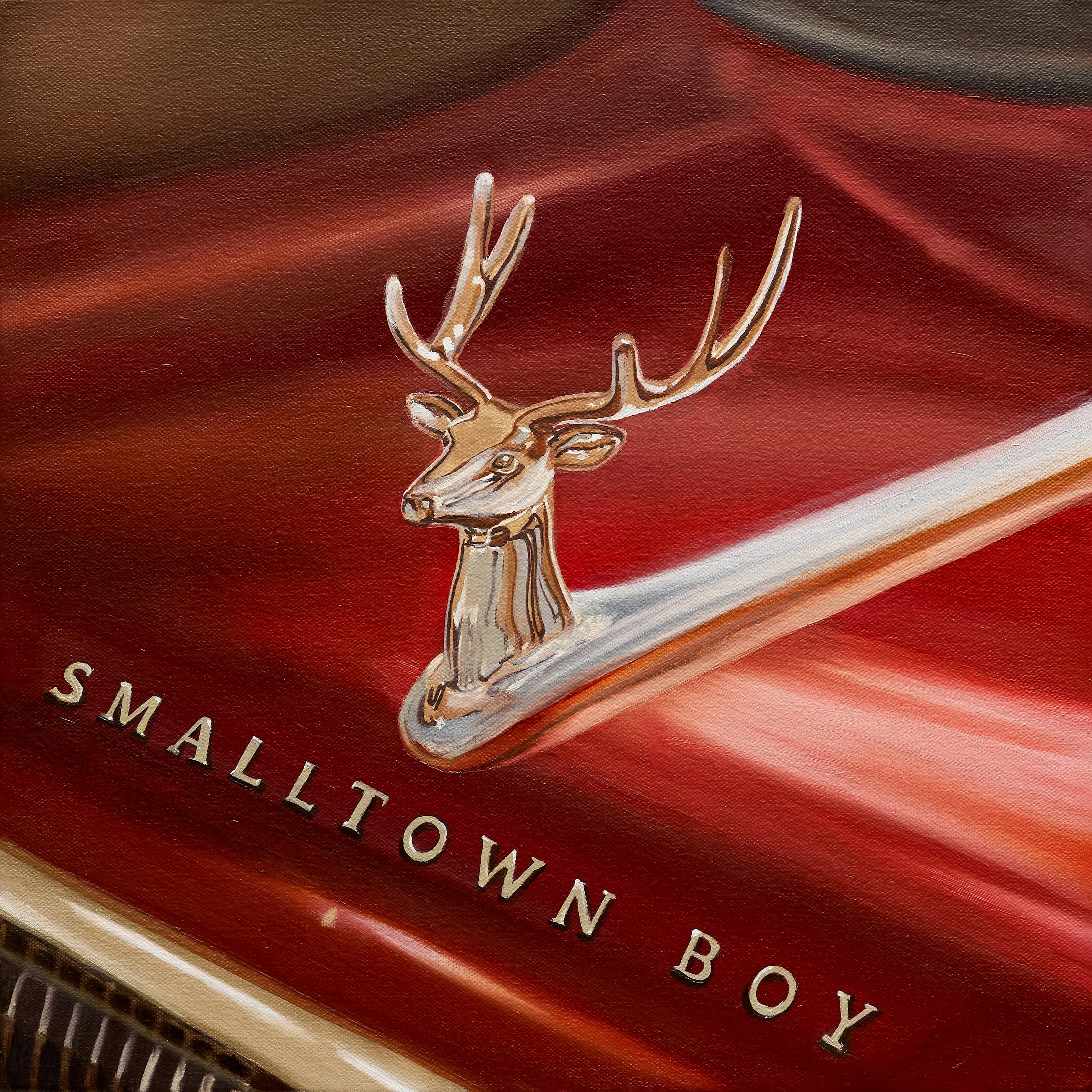
“Music To Dance To” is a series of 24 paintings presented together, each the exact size of an album cover. When installed for exhibition they display the rainbow colors of the Pride flag. He imagined each artwork as the cover art for a single, such as Robyn’s “Dancing On My Own.” “It’s funny,” he says, “this is the kind of thing I’d be making in my room as a teen. When you think about art history, there are a lot of different ways of making commentary about your time. I didn’t want to feel less in what I’m doing because it’s not political in a straightforward way. But for me, being who I am and doing this is already political in a way. Making these choices and saying, ‘This is important for the queer community, to praise our pop divas!’”