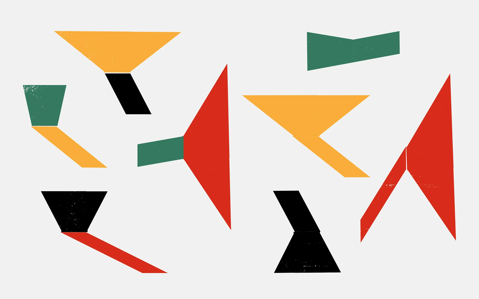
Brazil is a country renowned for its exuberant expression. Even the colors of its flag transport us to the lush greens of the Amazon rainforest, the changing blues of the Atlantic and the bright yellow rays of the sun.
Its music, its art, its architecture, its design, heck even its football team, embodies a rhythm and a spirit that feels spontaneous, joyful and self-assured.
“In terms of culture, Brazil tends to look very cheerful and vibrant,” says David Galasse, a Portuguese/Brazilian graphic designer based in São Paulo. “In fact we deal with our difficulties with joy. You would not want to go into a meme-making war with the Brazilians!”
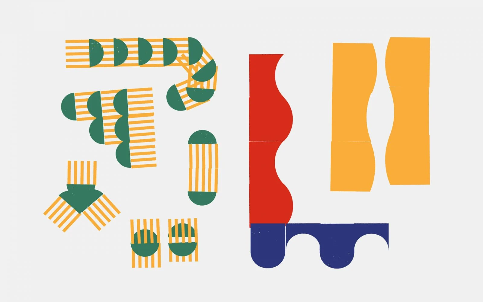
São Paulo he says is a “chaotic city” where “the cultural scene is very lively, from its center to the suburbs. Almost all the walls have graffiti, the night scene is incredible, and there are many artists popping up everywhere.”
It’s in this creative climate that David has been working as a graphic designer since 2000. He’s held positions at several leading advertising and design firms such as Ogilvy Brasil, Grafikonstruct and Ginga, and racked up an impressive client list that includes Coca-Cola, adidas and Nike. But these days, he’s focusing more on his personal work, “a response to the anguish that I feel as a graphic designer.”
I have always understood typography as a very powerful way of expressing ideas. I think it has been my solution to interpret the questions that are asked of me, since I have difficulties with figurative drawing and photography.
He’s referring to the process of creating work within the confines of a commercial project. “You have to deal with a brief, then you go carry out research, and then you actually begin to draw. But in the middle of the process, I began to give more importance to chance and to the accidents that are generated.”
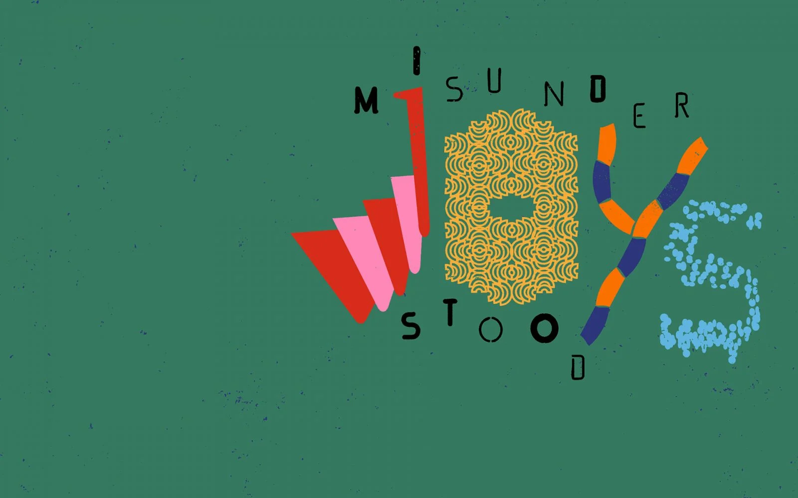
Take his drawings as an example. He regards these as experiments, where accidents are actually the goal. The archetypal Brazilian – colors yellow, green and blue – make their appearance but they are contrasted with a powerful red. The geometric shapes are juxtaposed with an unusual amount of white space; he’s playing with conventions and the result is fantastic.
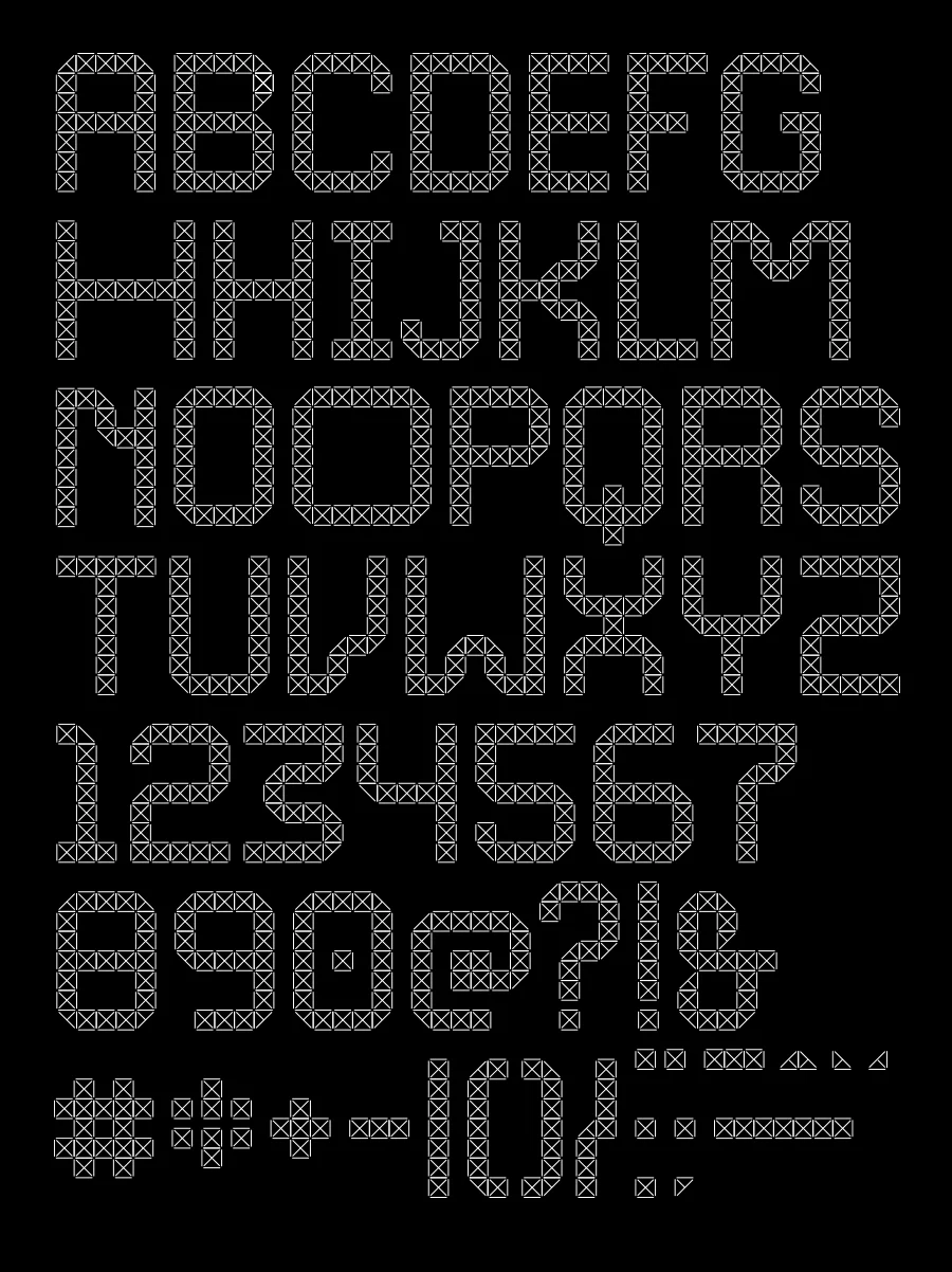
“These kinds of images are the result of a study I have been doing lately, in which I use fundamentals of design to generate abstract figures. What’s interesting is that these fragments have great potential for creating new fonts.”
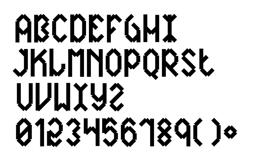
Much of David’s work is typography based. “I have always understood typography as a very powerful way of expressing ideas. I think it has been my solution to interpret the questions that are asked of me, since I have difficulties with figurative drawing and photography.”

In the imagery he created for WeTransfer, letters seem to dance in the image, free from convention. David is adept at probing this interesting intersection between art and design.
“I feel very attracted to young designers and artists who produce independent publications,” he says. “I believe that we are getting to a point in which there will be a fairer balance between cultural production, consumerism and brands. Art allows me to question what surrounds me.”
