
When the Shanghai-born Chengan Xia moved to Chicago to study, for the first time in his life, he could look at Chinese culture from an outside perspective. Uncovering the semiotics of national identity—and the way it’s affected by visual propaganda—the artist explores a myriad of cultural influences in visually explosive pieces of art. He tells Jyni Ong more, digging into how his graphic design background has informed his practice and why installation is the medium he’s most excited about.
Ever heard of new ugly? It may not sound appealing at first, but this visual style is what makes Chengan Xia’s work unique. Characterized by overloaded maximalism, clashing bright colors and a mishmash of styles; more is more with new ugly. For the Shanghai-based artist, this oeuvre arose from the streets of Chinatown. While studying for an MFA in Graphic Design at the School of the Art Institute of Chicago, Chengan found himself, for the first time in his life, looking at his culture from an outside perspective. Speaking of Chicago’s Chinatown, Chengan tells us, “I took those things for granted when I was in Shanghai because it’s where I grew up.”


Fascinated by the eclectic memorabilia that lined the shops’ shelves—a buddha next to a statue of Christ on the cross next to a Phoenix—the budding artist understood these objects as “simple tags for culture.” He explains, “they’re like propaganda for a whole national image.” In that moment, he realized his Chinese background to be interesting and, in turn, felt an urge to explore the semiotics that make up a national identity. From low-brow tabloid culture to historic funeral rituals, Chengan’s practice broadly asks questions surrounding consumerism, politics, technology and contemporary Chinese identity.
Through installation, video art, collage, poster and publication design, the multi-faceted artist consistently draws from his graphic design background to inform his highly aesthetic artworks. While proponents of new ugly such as Yui Takada chose to flatten their compositions, Chengan wanted to maintain the vibrant buoyancy within sculptural type and 3D illustration. As a result, his design systems “violate all the rules.” Actively defying the textbook rules of modernism, Chengan’s work ignores grid systems and doesn’t try to control the viewer’s eye through design. “New ugly broke all that,” he says. “It’s like postmodern graphic design exploration. It has more internet textures.”
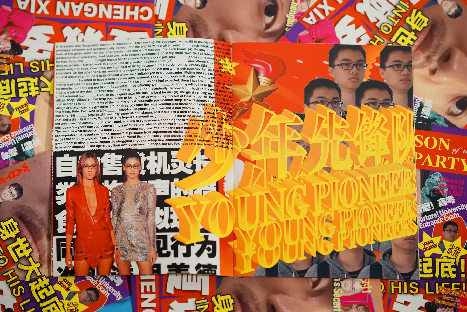
In “Not only align left, but also alight right,” Chengan dissects how varying elements of graphic design can shift and merge to read as propaganda. Focusing particularly on color combinations and choice of words, he explores how semiotics can prompt strong emotions. “I’m trying to combine a lot of ideological terms, slogans and typefaces to blend the meaning of each poster,” he adds. “You don’t see a very clear intention in all posters, but you see strong emotion.”
Rather than commenting on current politics, Chengan’s work interrogates how propaganda is formed and the strategies that are used to carry a certain message. For instance, he utilizes Fraktur for its strong connotations with Nazi propaganda; the typeface named as “true German script” by the Nazis and employed for official documents including letterheads. Hitler also used a hand drawn version for the cover of “Mein Kampf.” Elsewhere, Chengan uses the Helvetica family as a nod to its frequent appearance in tabloid magazines.
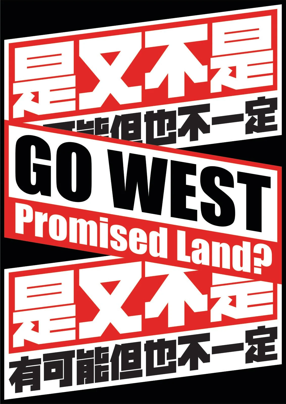
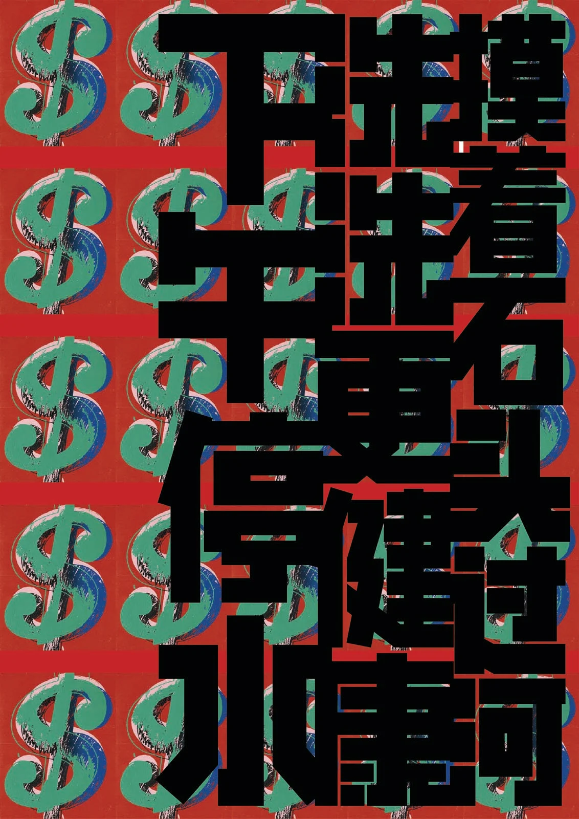
Skilled in the art of typography, Chengan designed all the Chinese characters in “Not only align left, but also alight right.” He wanted to create a squarish family with a strong stroke style, a nod to Wu Shanzhuan’s—a leader of the 80s Chinese Conceptual Movement—characteristic block glyphs. “What I learnt from him,” explains Chengan, “is that it doesn’t matter if you can read the character or not. But you can feel the impact.” There are no strict conceptual reasons behind his type design. Instead, the artist wants to maintain a sense of unique speciality within each character and balance this personality with negative space.
In many cultures, the tabloid can be seen as a symbolic cultural artefact. It’s also the central feature of one of Chengan’s earlier works, “Son of the Party.” In this project filled with vibrant collages, he plays on the fact that his birthday (1 October) coincides with the birthday of mainland China. The apt pun title plays on the fact that not only is he a son to his parents, but also the Communist Party.
Sometimes, it doesn’t matter whether you can read the character of a design if you can feel the impact.
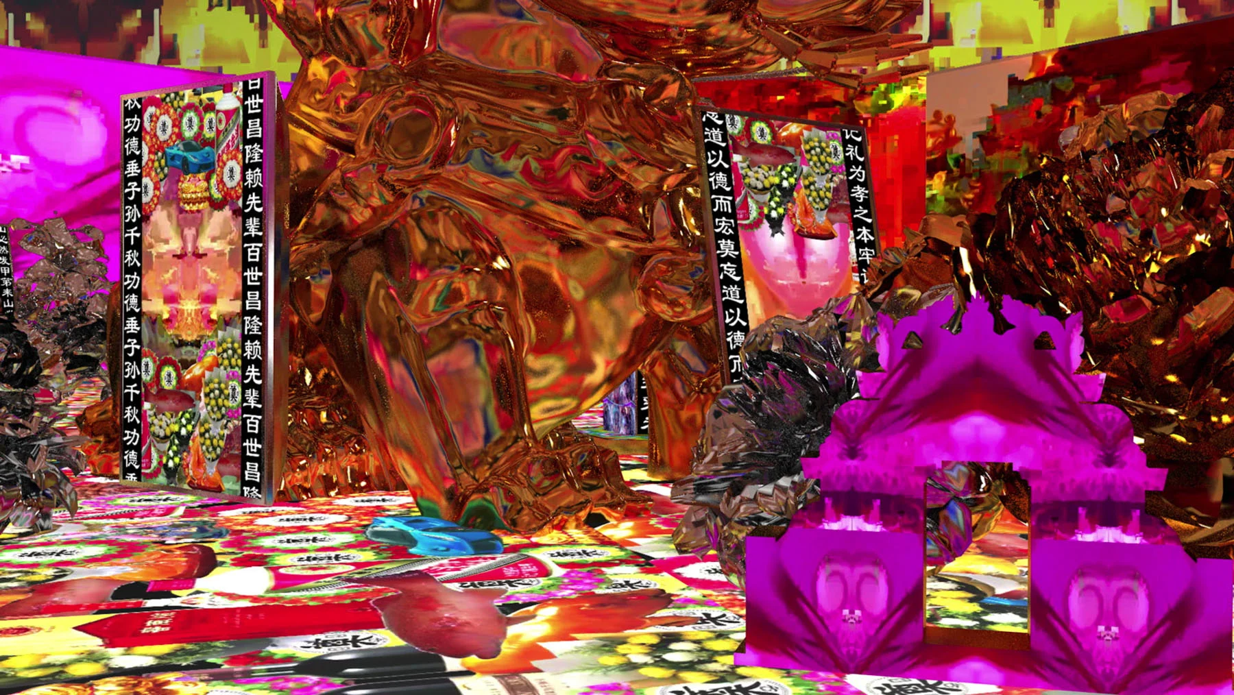
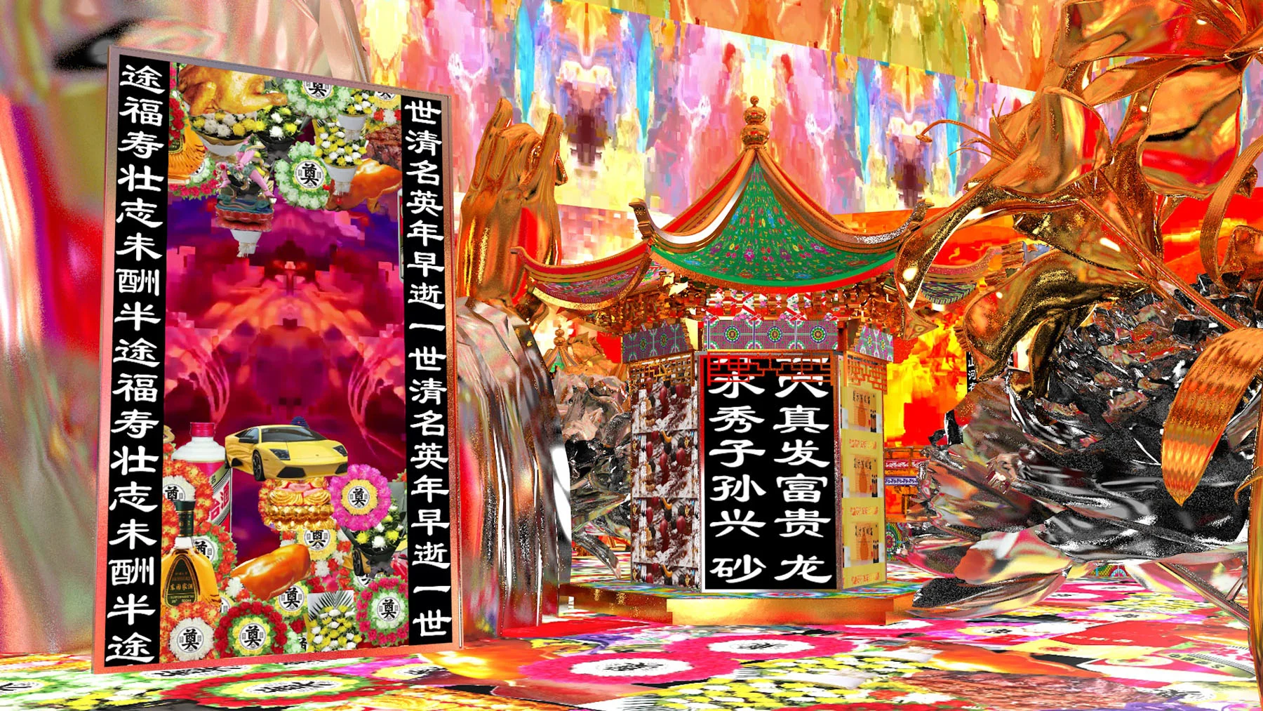
A patchwork of ideas, symbols, or even mediums is crucial to Chengan’s creative expression. In “With Silver, With Gold,” a project which adds yet another string to Chengan’s extensive body of work, we see another side to how Chengan cleverly mixes cultural influences with contemporary media. With this artwork, the artist reimagines the traditional Chinese funeral in the digital space. Taking cues from his Grandma’s “very traditional” funeral from a village in Shanghai, he rethinks the ceremony of burning but in the digital.
When he displays the work, or any work for that matter, Chengan always tries to reincorporate his visual style into a real space either through wallpaper, sculpture or physical objects. “This part is influenced by Barbara Kruger,” says Chengan, “her use of space really enhances the visual influences on the audience. This is what I’m currently exploring,” he says as a final thought, talking of how installation is the most exciting medium to him currently. “I’m exploring how to maximize visuals from the digital world to the physical world.”