
Caz Hildebrand knows food, but as a designer, not a chef. As the author of the massively popular The Geometry of Pasta, The Grammar of Spice, and her latest addition, An Anarchy of Chillies, Caz is as interested in the way food looks as how it tastes.
So we asked her to be a visual food critic for a day, judging the dishes at Cornerstone restaurant in London based on how they look, how they taste and the relationship between the two.
At Cornerstone, less is more. As a designer I often believe that less is more, but sometimes with food, abundance of color and variety are part of the joy. It’s not a design process to the same extent – you’re not necessarily a reductionist – but it can be beautiful to look at one perfect object on a plate. One beautiful crab on a plate, for instance, is an incredible thing. It’s good to meditate on it a little bit – it’s whether you are looking for eating, or looking for looking.
Sometimes things that are delicious-looking can be really, really horrible. It can be disturbing when the experience of tasting is not the same as the experience of seeing. We eat first with our eyes.
At Cornerstone, I was thinking not just about the food on the plate but also the plate itself, and then the table, the surface on which the plate sits. It’s all part of the experience, how you negotiate the food.
They made a lot of effort to think beyond the obvious. That’s an interesting quality in a restaurant.
Some of the dishes have a kind of intentional austerity about them, which is about trying not to have anything extraneous or superfluous on the dish.
Everything has to be perfect because there’s nowhere to hide. They might say there’s a kind of honesty about it, and there is. But it’s also exquisite when you receive a little work of art on your plate.
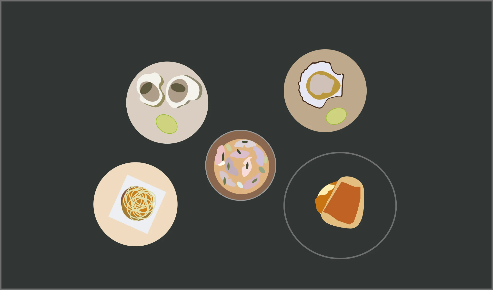
River Fal Native Oyster, Seaweed Hot Sauce

Design
7,7
Taste
10
An oyster is a beautiful thing if you like them, and if you don’t like them, they creep you out. They’re beautiful in color, very delicate. The chefs made a green spicy sauce, that’s even more like a color of a Northern European sea in the winter. And they added this crazy bit of lime that had this electric color from a completely different world. It was a symphony of sludge.
It tasted amazing because the sauce was based on seaweed and it had a sort of chilli kick. I wasn’t expecting to like that with an oyster, because a naked oyster is delicious on its own.
The dish tasted much more wonderful than it looked though. It is not beautiful to many people.
Mackerel Paté, Cider, Sea Purslane, Treacle Bread
Design
6,7
Taste
8
This was really an incredible dish. It looked very beautiful because it had such delicate colors. The pate was a very pale cream, then the little pink slices of fish had an amazing iridescence on the skin. Then a little bit of pale, lime green spring onion. And then it had the crispy leaves of purslane, which is a little wild sea vegetable.
They made this green color, I think it was some sort of oil, and a green apple cider jelly. It looked very beautiful. It sounded boring on the menu, but everything about it went together well, the look, and the taste, but then the jelly had a little hit of amazing sweet-sharpness.
The paté was incredibly smooth but you had the texture from the pieces of fish and onion there. It was a sublime dish, I thought it was amazing.
The dish looked very pretty; it was placed with a lot of care, but it still looked quite natural, not too contrived. Sometimes when you look at food, you wonder how many hands have passed through it before it arrives on the plate. This looked very delicate; it felt modern and surprising.
Handived Scallops, Coral Butter, Lime

Design 4,5
Taste 7
Oh the scallops! They looked terrible; a bit mucky. Kind of messy. The beauty of the shell is always the thing; those shells are very iconic. The scallop shell is such a symbol.
It was a nice dish, but it looked a bit unloved. You know that a lot of care has been taken in the process of cooking, it just didn’t quite deliver on that. It looked like they wiped it on the way out of the kitchen.
On the menu they said they made a butter with the scallop; when you see the words “Coral Butter” you immediately think of a beautiful color. It just looked like butter with some funny little grayish stuff in it, so it didn’t quite deliver on its description.
Potted Shrimp Crumpet, Kohlrabi, Gherkin, Parsley

Design
4
Taste
7
It promised a bit more than it delivered. It looked fun when it arrived on the plate, but it was strange because the shrimps were hidden underneath kohlrabi on top, but they also put large prawns as well. And that seemed so weird – the large prawns were just wrong there.
It just needed to be a bit simpler I think. They had slightly too many things on the plate. It looked a little bit like a lady with a funny hat and that was a slight indication that it might not be as good as it promised. It was interesting, rather than delicious.
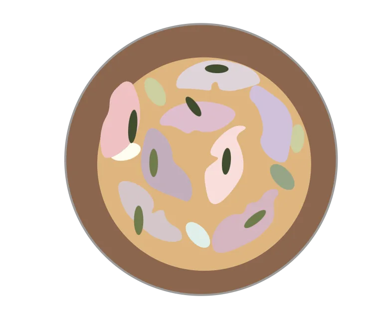
Roast Cornish Hake, Celeriac, Anchovy, Chilli

Design
6,75
Taste
6
The hake was served in a beautiful bowl, it had an interesting glaze. It looked very lovely. Again it was quite a minimal presentation, it was a rectangle on top of a circle. That’s maybe a constructivist style. If that was the intention, I don’t know.
I guess the sauce started to homogenize the white fish and the white celeriac. It lost something. Usually you have the piece of fish sitting on something else and the distinction is clear, but in this little bowl, it all fell together. The colors were compelling; not great but good. The fish was cooked perfectly.