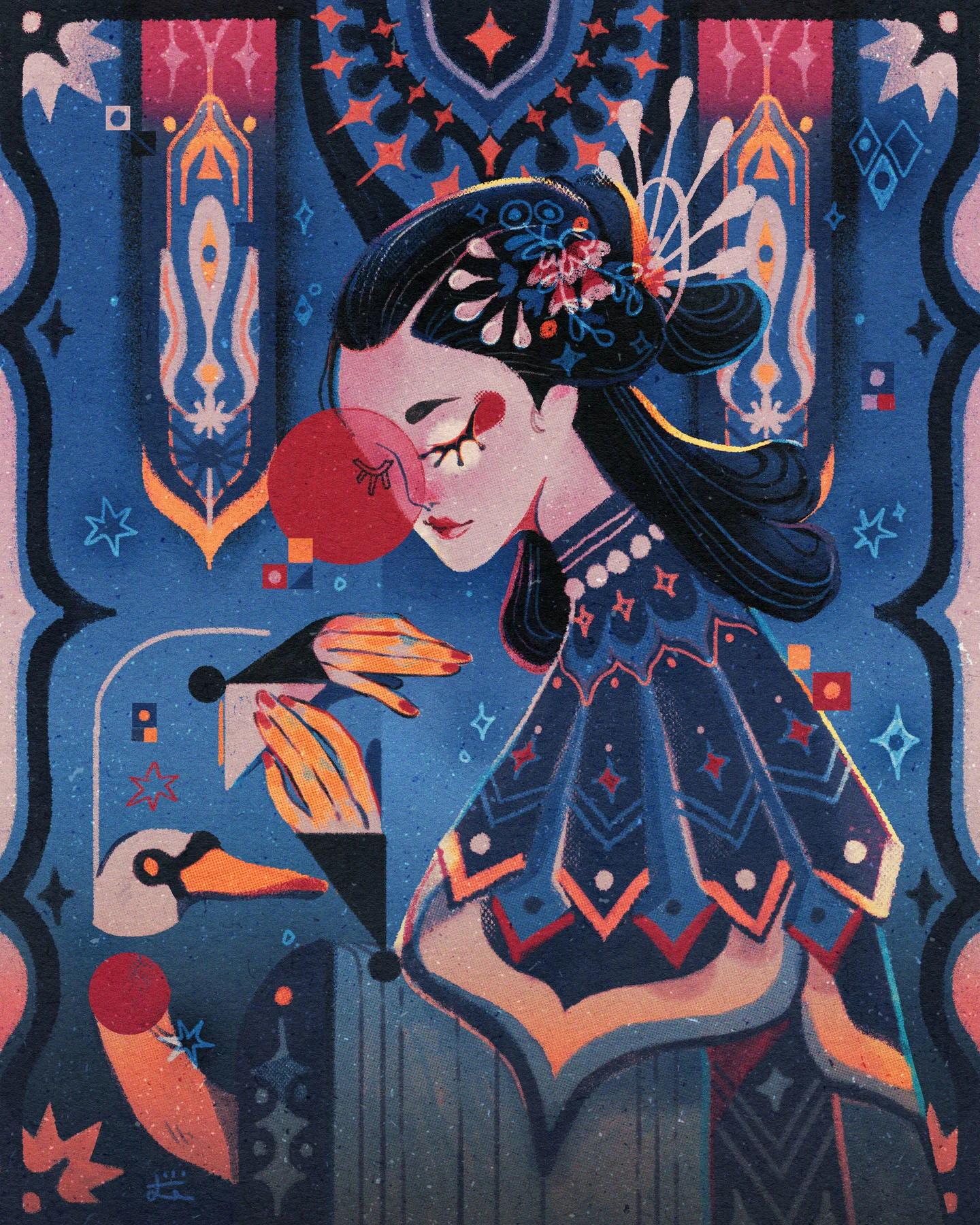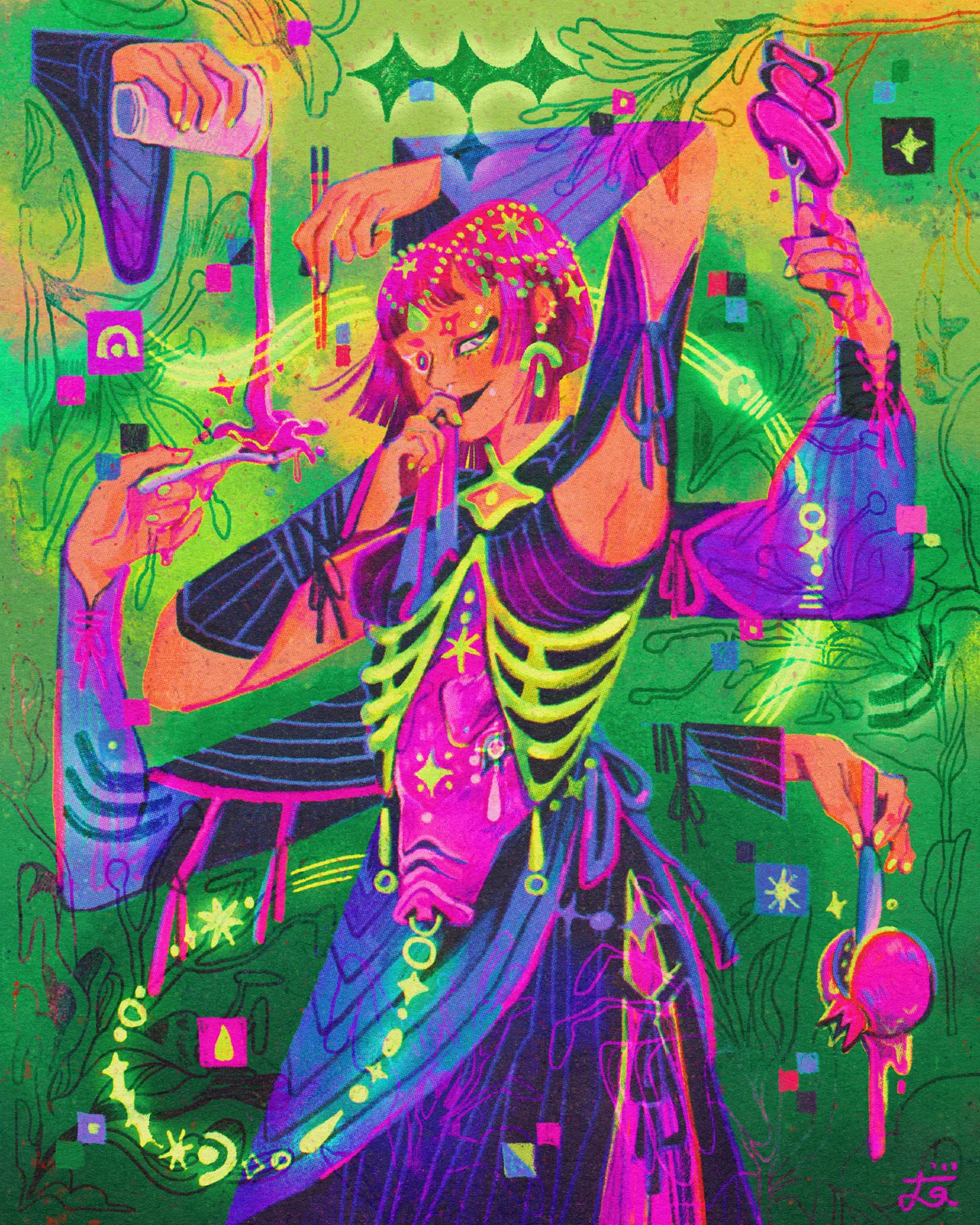

Camelia Pham’s mystical illustrations embrace the Vietnamese female perspective, bohemian colors and Tarot card-like symbolism. Specializing in character illustration, her practice turned a corner when she discovered the principles of “drawing with intention.” Here, she tells writer Jyni Ong about her trial and error process that blends a variety of styles and elements keenly observed in daily life.
Character illustration is central to the Hanoi-based illustrator Camelia Pham’s work. “With landscapes you see everything at once,” she explains, “but with characters, there’s something to look at directly. The eyes, then the face, then clothing.” It’s a line of sight that unpacks context and story along the way.


Born and raised in the Vietnamese capital to a family of architects, Camelia remembers a childhood immersed in voracious doodling, drawing Pokémon, manga and comics, “very basic things that kids in Asian countries do,” she laughs. Encouraged to follow in the familial tradition of technical, pragmatic art forms, she studied graphic design at Rome’s Academy of Fine Arts Frosinone. “But in the end, I found it too calculating: the rules and grid and whatnot.”
Though she didn’t find her place in design, in Rome she met a significant mentor in her psychology of art teacher. “She paved the way for me to draw with intention,” reflects Camelia. With this influence, she learned to craft a story behind every mark in each drawing, to consider what her character’s actions and expressions evoked in relation to background, color, composition. In turn, Camelia discovered what was to become her signature creative voice: transforming her daily doodles into thoughtful artworks with a myriad of details behind each line.

Fast forward some years and Camelia is an acclaimed freelance illustrator with clients including Disney, Google, Puffin Books and Yamaha. Currently working on illustrated books, she continues to draw with intention, imbuing her characters with subtle marks of their upbringing and personality traits. Shaped by her own experiences, drawing continues to be like a diary for everyday life.
Her latest personal project “Seven Deadly Sins” began as an exploration of the Vietnamese month-long holiday Vu Lan, a tribute to parents and ancestors. “I didn’t intend to make it into a whole project,” she says, but as the first illustration started to shape into a sin, she thought, “why not depict the others too?” When it came to depicting greed, the illustrator started off the creative process with the color green and let her imagination race with associated images from there. As a result she included a dragon, a pot of gold, and a Narcissus flower.


Though Camelia’s process is entirely digital, she’s uncovered ways to incorporate analog textures into her works. “I don’t like how clear and oblique digital looks,” she explains. “So I think of ways to bring back that traditional feeling.” She does this by creating several layers in Procreate which each add a different effect—likening the process to post production hair and make up—before adding final touches on Photoshop or Lightroom.
Camelia understands her practice as working within the confines of one still image, but cramming a score of information within it to tell a story and reveal a visionary world. Taking cues from editorial illustration, her drawings reflect nuanced stories. But instead of working from a text or article, Camelia gradually builds a narrative through experimentation, thoughtful color palettes and trial and error.
“The final work is never what I intend it to be,” she reflects. The first sketches outline a base idea, but through an organic process which is “never straightforward,” the artwork shifts and evolves to find its coherent voice. She might take inspiration from a hairstyle in one illustration, mix it with the color palette from a separate photograph, then add a dash of history through Renaissance symbolism to add a background story.


“Just trust the process,” the illustrator advises on her feeling-led creativity. “And get yourself out there.” Even if she has to recolor an entire image because it’s not working, the process is part of the creative adventure and only adds to the overall mysticism of her work. Trusting creative intuition is the consequence of constant drawing and experimentation—something she counsels any budding illustrators to continue to practice—playing with a mashup of differing styles and elements in order to develop a style that will, eventually, feel like you.

