IN PAID PARTNERSHIP WITH 99DESIGNS BY VISTAPRINT

Think of some of your favorite brands. Now think of how you recognize them. Chances are some of the most successful brands stick in your mind because of the colors that they use to visualize and translate their identity. Where would Coca-Cola be without red and white? And would Google have stuck in our minds as much in the beginning if not for its colorful logo? Or how about that certain shade of sage green that just is Harrods? In the second episode of our three-part series, The Power of Design, and the accompanying feature by design authority Madeleine Morley, we dive into the importance of color with Raissa Pardini, a designer who relies on its transformative power in her work, to discuss exactly why color is an integral part of any brand.
A joyous yellow. A luscious purple. A deep and exhilarating red. Colors have the power to make us feel in intensely emotional ways, and they can awaken distant memories inside of us. As blue’s most famous champion, the artist Yves Klein, once said: “All colors arouse specific associative ideas.” Selecting a color palette for a brand, too, is an intensely emotional undertaking, and one that leads a designer into the depths of a client’s personality and ethos.
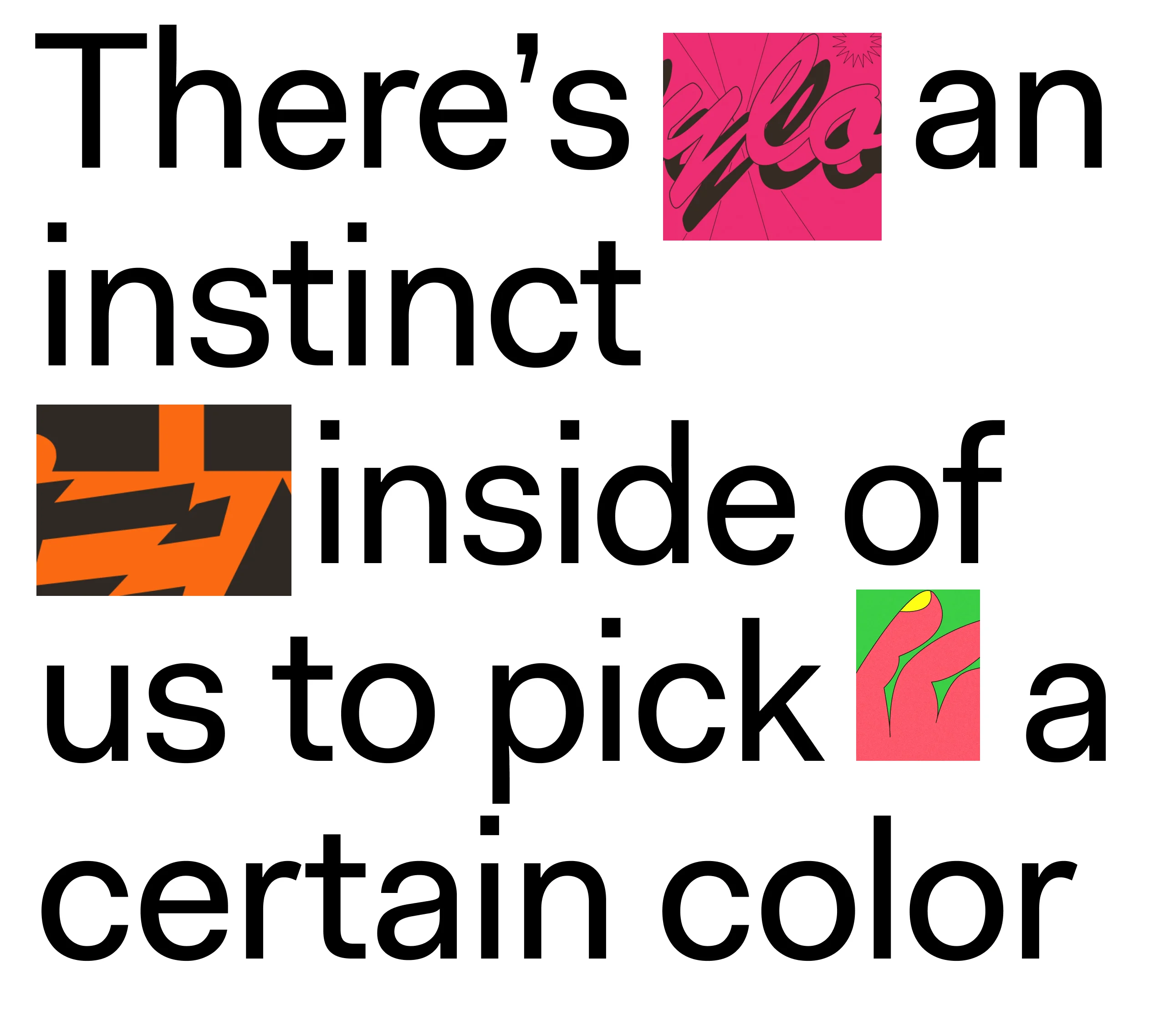
For the multidisciplinary designer Raissa Pardini, who has used highlighter yellow for a Dr. Martens collaboration and pastel pink for a book about Dolly Parton (of course), selecting hues is highly intuitive. “There’s an instinct inside of us that leads us to pick certain colors,” says Raissa, “but the more you work with color, the more those instincts sharpen. The more you begin to understand how people react to colors. What I’ve found is that experience is key.”
Working intimately with color over the years has attuned Raissa’s own eye to the richness of her immediate surroundings, whether when admiring the “bluest skies you can imagine” in her home town in Italy, “the rolling green grasses” surrounding her studio in Glasgow or the surprising “sock and trouser combinations” that she occasionally spies when glancing down at her feet. “When I started to work with colors, I started noticing things I didn’t before, like the details of a building or badly designed signs, which often give you the best combinations,” she says.
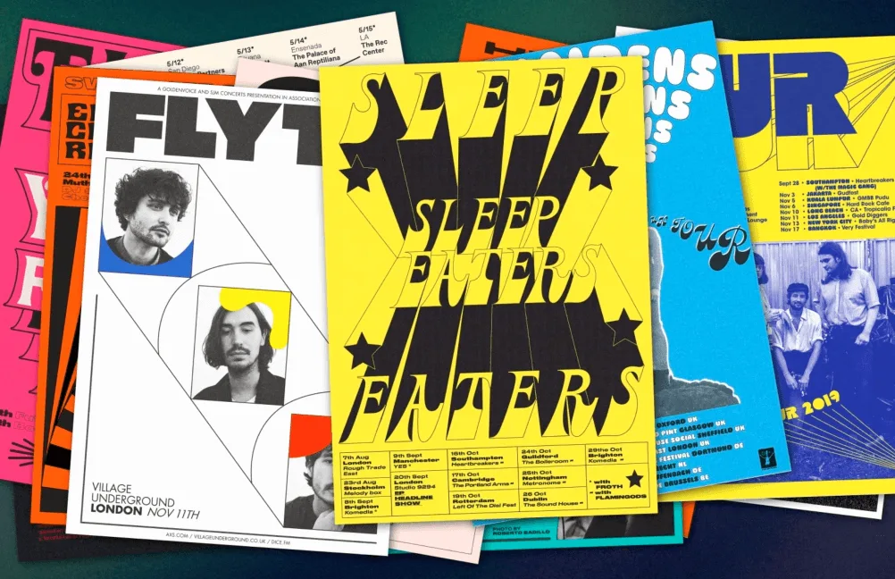
The designer’s intuitively-honed bright tones have become a staple for her contemporary arts and culture clients: Raissa’s vibrant posters light up the walls of music venues around the UK, and her collaborations with Dazed, Gucci, Vans, Fred Perry and The Standard Hotel in London radiate with the rainbow hues of the Swinging Sixties.
“I like to use bright colors because there’s something positive about them, and I always try to work with positive messages,” says Raissa. She’s also found the power of arresting colors all the more important in the digital age, helping brands stand out from the oversaturated scroll. “And of course certain colors can stick in your mind if they’re used well, and when people remember a brand’s color palette, they instantly know who is speaking to them.” Just think of the unmistakable blue and yellow of Ikea.
Tristan Le Breton, Creative Director of 99designs by Vistaprint, the global creative platform connecting freelance graphic designers and clients, also attests to the power of color for a brand’s identity. “Color is such an important tool for capturing and opening up the personality of your brand to your audience,” says Tristan. “Color is often about psychology and what people know about that color. Red, for instance, has a particular association. But then how you execute red can really vary and create different sorts of meanings.”
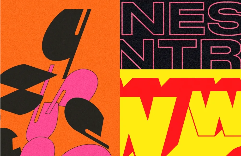
Case in point: For a recent album campaign for indie music band The Orielles, Raissa opted for a bold orange, black and green pairing. These colors might sound a bit Halloween-y, but the result was anything but that: Instead, the stripped-back, geometric execution is alternative, mellow and achingly cool, just like the band it represents. “What we then noticed was that the color became even more important than the design,” Raissa says, as fans on Instagram became adorning their own stories with orange and green dots using the paint tool. “Because of social media, people have started to become more involved in the use of colors, using them to associate themselves with a brand or a message. It taps into something very personal.”

“You can’t fake that kind of authenticity as a brand,” adds 99designs by Vistaprint’s Tristan. “Designers and brands need to go through the process of understanding what they’re about to get to that authenticity, using key elements like color as a vessel to represent a brand’s personality and build a lasting connection with an audience.” He cites home audio specialist Sonos as another example of a brand using color to stay true to itself: Rather than introducing a single brand palette to its identity system, its team rolls out seasonal palettes that adapt and evolve over time, not only keeping Sonos’ look fresh but also articulating its personality as a continually growing and flexible one.
“Getting to know and understand your client is absolutely so important for finding that right fit of colors,” agrees Raissa, “as is research. One color can have so many different meanings, and you need to research to make sure it’s the right choice – culturally and historically speaking, or even in terms of gender.”
The designer has worked with charities fighting for gender equity, and she often finds herself having to veer away from culturally loaded or binary associations (such as “pink for girls” and “blue for boys”), opting instead for colors with less overtly gendered connotations. “And for different communities, colors also have different meanings and histories, so we always need to make sure that we’re using choices and combinations that respect everyone.”
The more Raissa has developed a sensitivity to color in print, in digital and in different spaces, the more she notices how different hues make her feel, whether out on the street, in second-hand clothing shops or on the supermarket shelves. These individual, everyday encounters with color then filter into her work. “The emotions behind colors can be a very personal thing, and there’s no single theory of color or recipe to follow,” she says. “When designers consider colors, it’ll inevitably be subjective and personal. Knowing this and tapping into it helps unlock their power, because behind every color there’s a story.”


WePresent and 99designs by Vistaprint partnered to create a three-part documentary series on the power of design, focused on type, color and form to inspire design lovers around the world. 99designs by Vistaprint understands that memorable design sets brands apart from the competition to showcase what makes them unique. To illustrate the transformative power of design, they empowered 99 small businesses around the world with a refreshed brand identity. To see these stories of design revival, visit 99designs.com/99daysofdesign.