It's a real joy to try and spot the many weird and wonderful references in Nolan Pelletier's illustrations. He borrows, blends, patches and upcycles different visual cues to make work that’s completely his own. He's happy to travel through time and space, picking out bits and pieces that catch his imagination.
“I’ll steal a flower from a Medieval manuscript, a face from a Colonial gravestone, a hand from a 19th Century trade-sign, a pattern from a Victorian ironwork catalog and color it all using the palette from a 1970s polyester shirt,” he says.
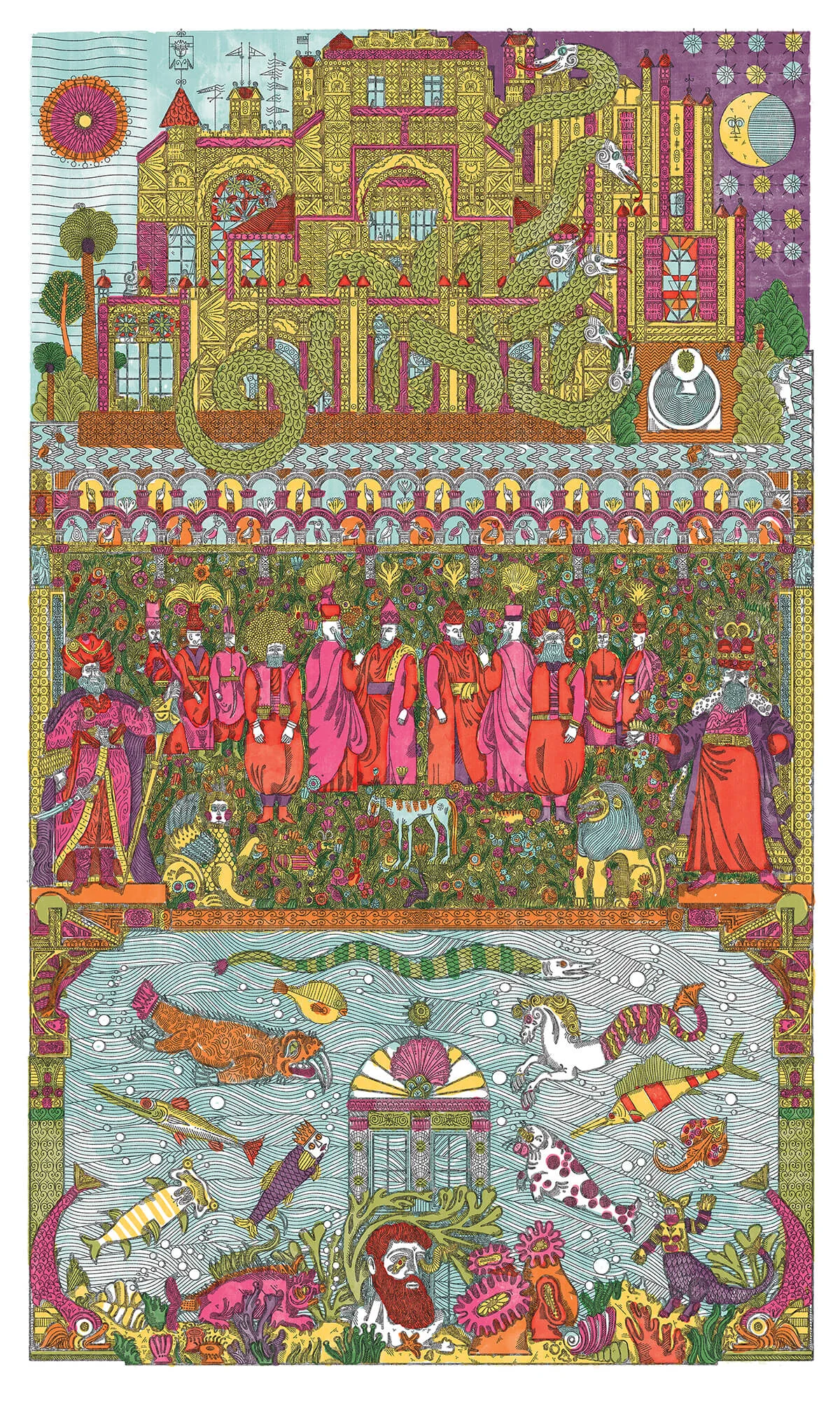
Nolan follows his creative nose, moving from one reference to another as the piece unfolds. Take Within the Palace Gates, an oversized poster illustrated in different panels, which started off with 19th Century Turkish soldiers and took in Persian miniatures, ancient Roman pictures of animals, the engravings of 16th Century Swiss naturalist Conrad Gessner , and Queen Anne style embroidery .
Other times Nolan focuses on a specific time and place – like American illustration of the mid 20th Century – but mixes different artists’ practices together. In this spirit he's put a new spin on Naiad and Walter Einsels’ characterful line work, John Alcorn’s flowers and Joseph Low’s habit of painting outside the lines.
Typography too proves an evocative time-traveling tool. “I find it’s a quick shortcut to create a nostalgic feeling,” he says. He loves 19th Century wood type and he mimics the visual effect of the paper absorbing the ink inconsistently to create a textured effect.
But surprisingly, in real life Nolan lives in a very minimal way. Just kidding, the Victorian house he shares with his illustrator wife Kaley McKean in Toronto is filled with antiques, plants, books and other things they collect.
“Our house is a bit of visual overload,” Nolan says, “but I like the constant visual stimulation. I love good design, but I find minimalism oppressive.”
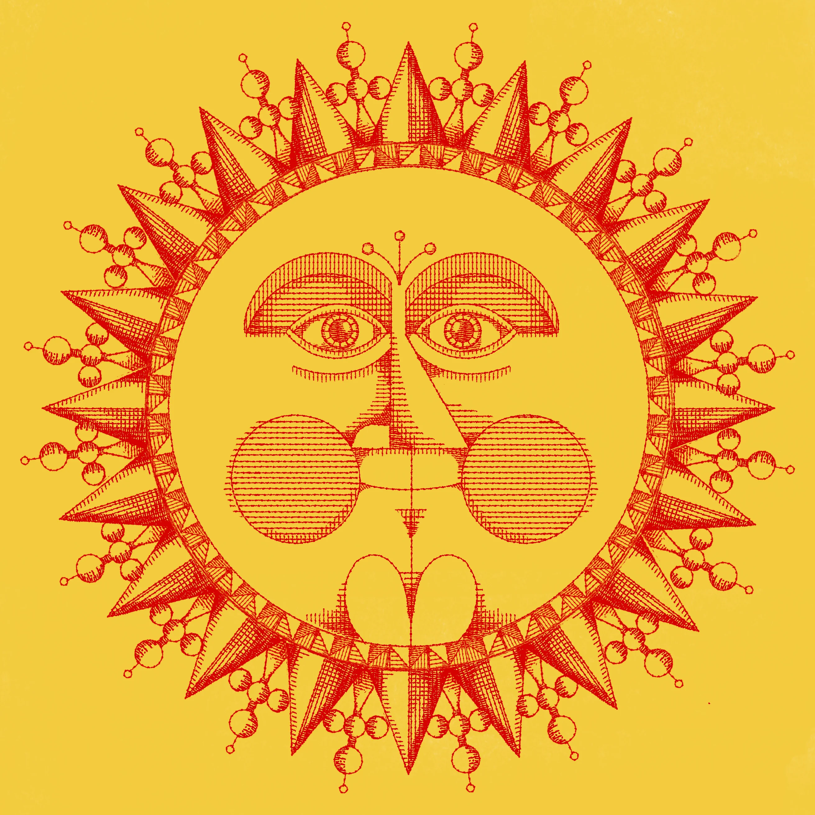
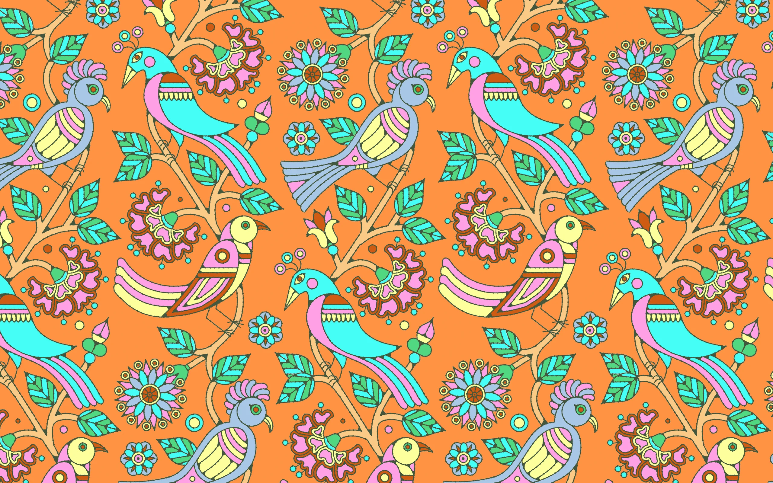
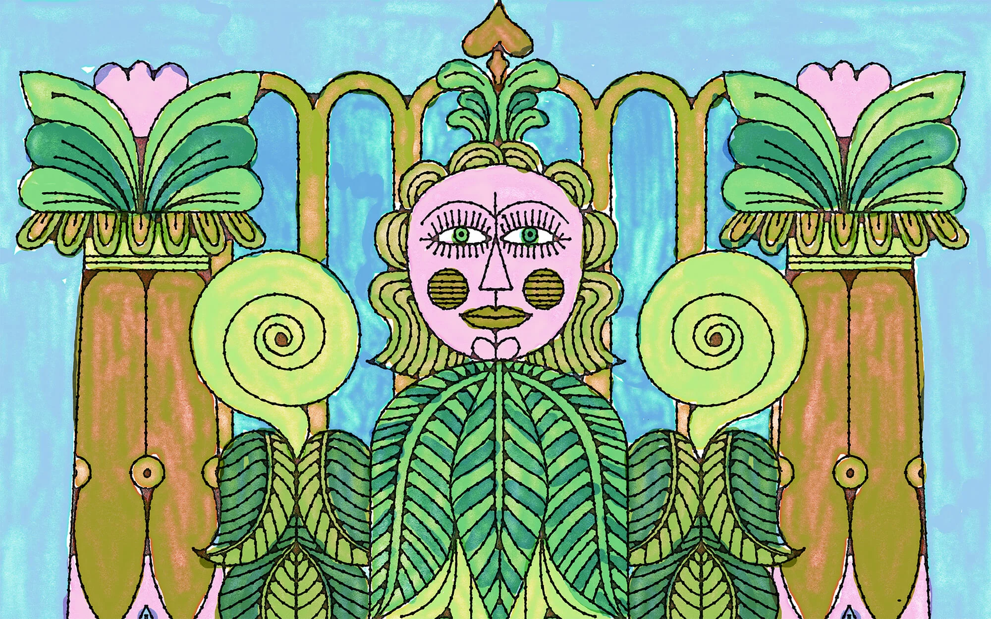
This overdose of visual stimuli finds its way back in his work. “I’d like my work to hint at a curious and beautiful world just outside the frame,” he says. “The natural world is so busy, detailed and complex. I try to capture a bit of that frenetic energy in my work. I want everything I make to buzz with color, pattern and detail.”
Nolan has been a collector his whole life. He saves pictures from auction catalogs, books and other old ephemera to work from. From a young age he loved design and illustration from the 1950s, 60s and 70s.

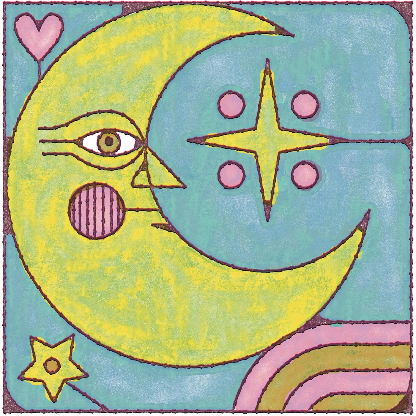
He particularly enjoys what he calls “Psychedelic Victoriana” – graphic design from the late 1960s that merged acid-inspired colors with art nouveau calligraphy. Naturally drawn to mustards, greens and pinks, Nolan’s own palette mixes pastels and bright vibrating colors, which often bleed out of his black contours.
Looking at Nolan's work and its apparent hand-made charm, it’s difficult to believe he does everything digitally. He's mastered custom brush tools on his drawing tablet and to emulate the look of woodblock prints, he uses scanned textures and layer masks, which allow him more control.


But when it comes displaying his work, Nolan still prefers the tactility of print. He missed seeing his work on paper, and so he started publishing The Somnolent Garden Rambler, a free illustrated newspaper available in Toronto and New York.
The text in the articles is a blend of his own thoughts and embellished snippets of authentic 19th Century newspaper articles which he alters for bizarre entertainment.
“My main goal was to create something I’d be intrigued by if I found it in a laundromat or on the subway,” he says. “I want to blend together the past and present to create something new.”
Words by Alix-Rose Cowie.